Inline prompts appear alongside a specific component on the screen. They help the user stay informed, fix something, or get more out of what they’re doing.
Use an inline prompt:
- if you have a message that relates to a single component.
Don't use an inline prompt:
- if the message relates to multiple components — use an info prompt.
There are 5 different types of inline prompts — error, warning, neutral, success and proposition. Each has a different use case and rules around their implementation.
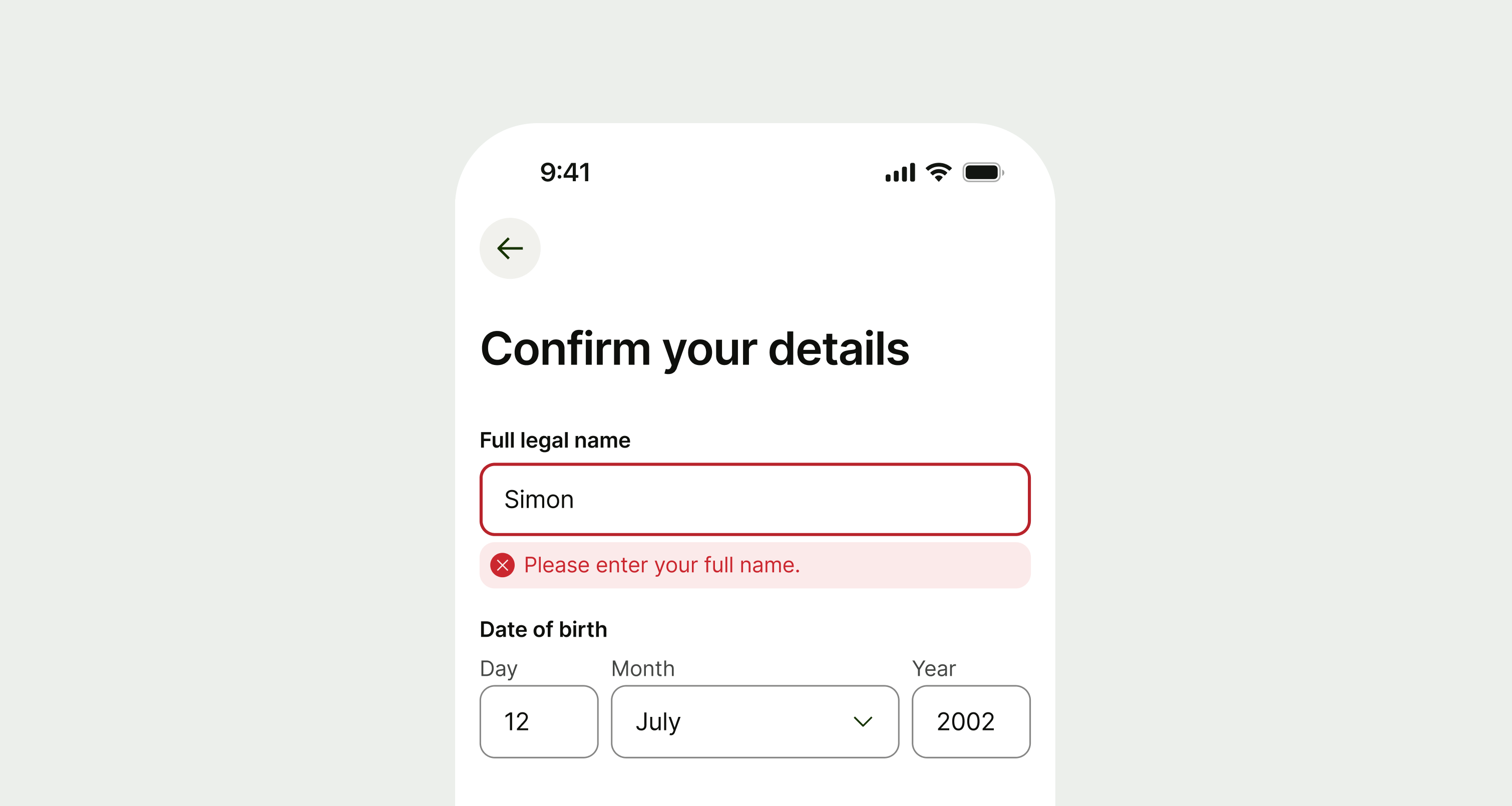
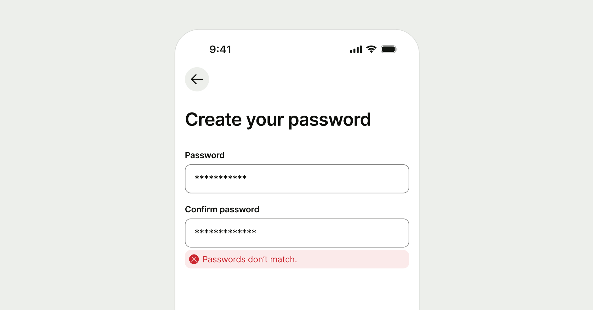
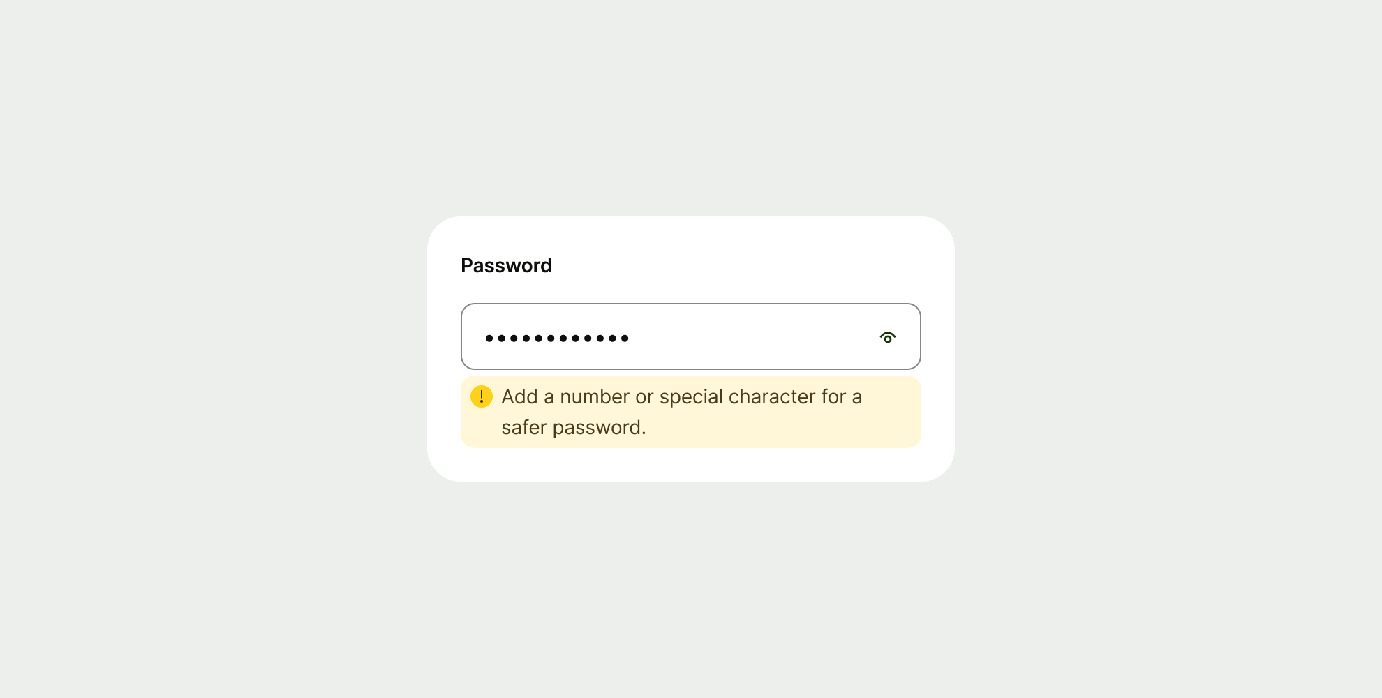
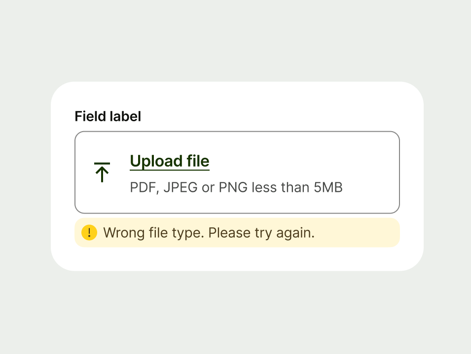
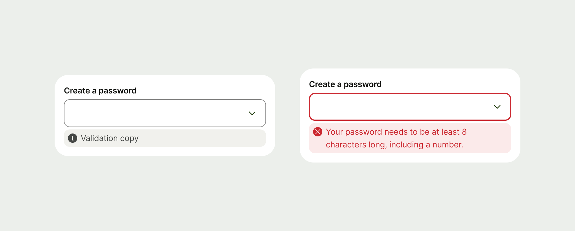
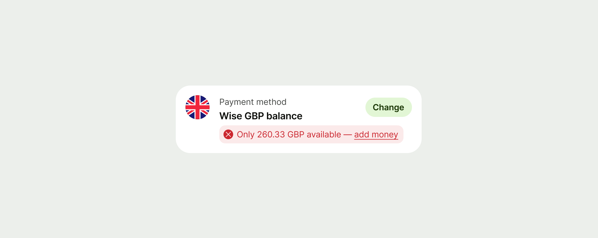
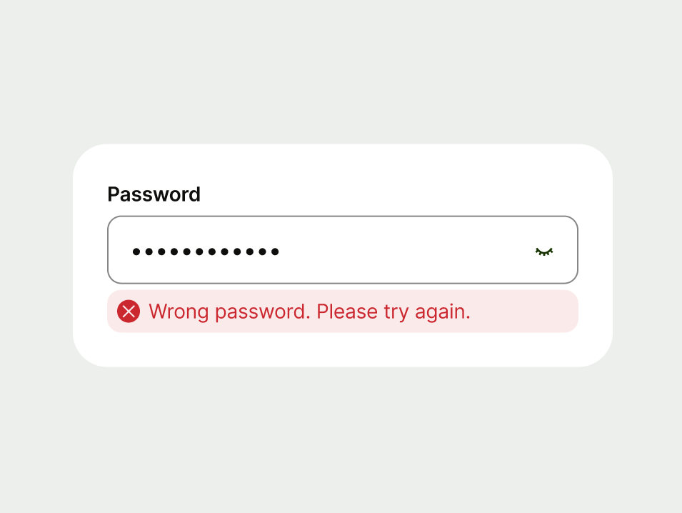
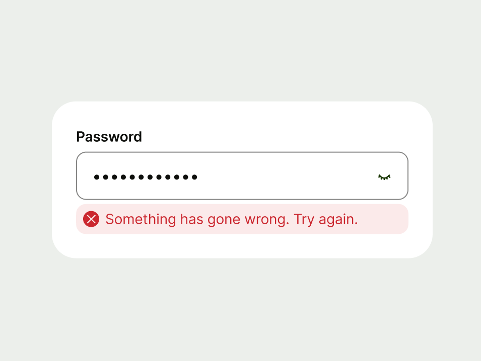
Error
Use an error to let users know when something has gone wrong and needs their attention.
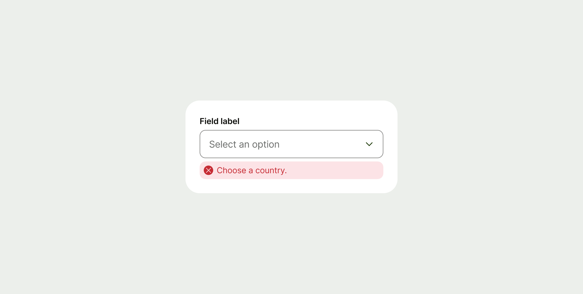

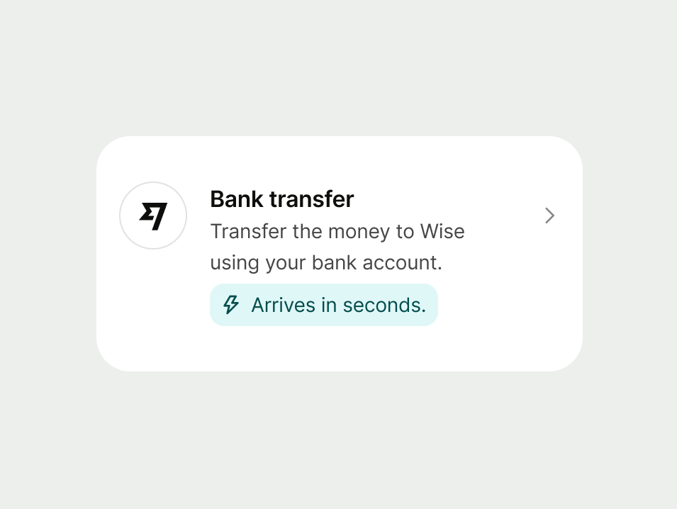
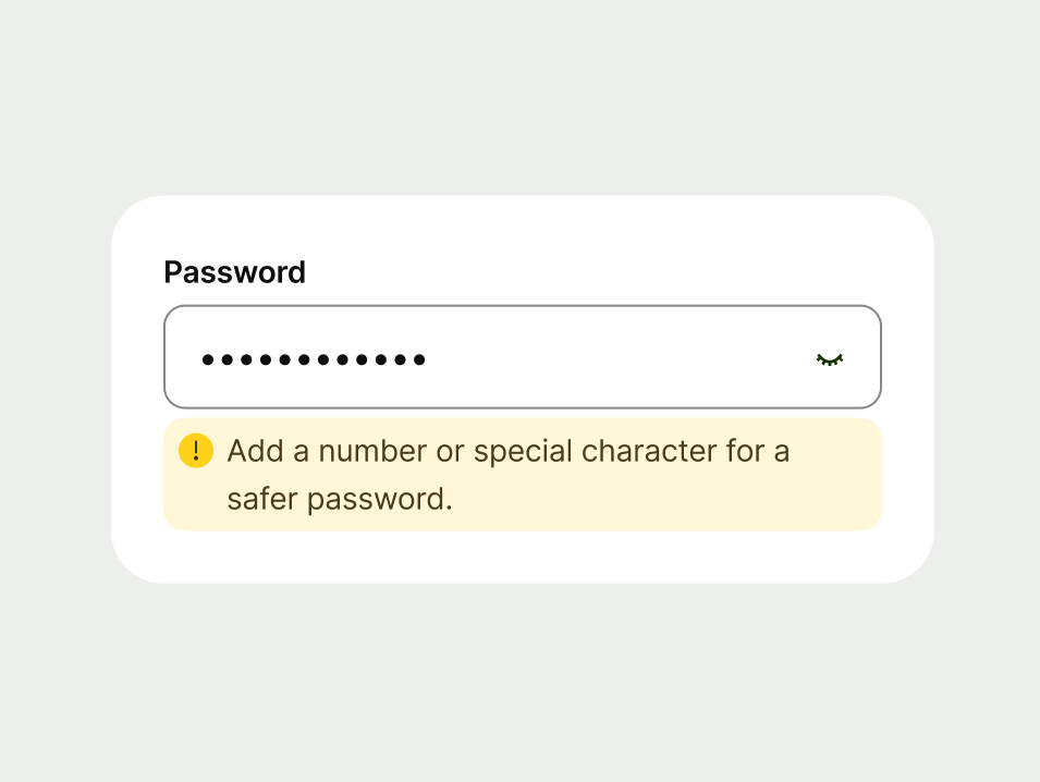
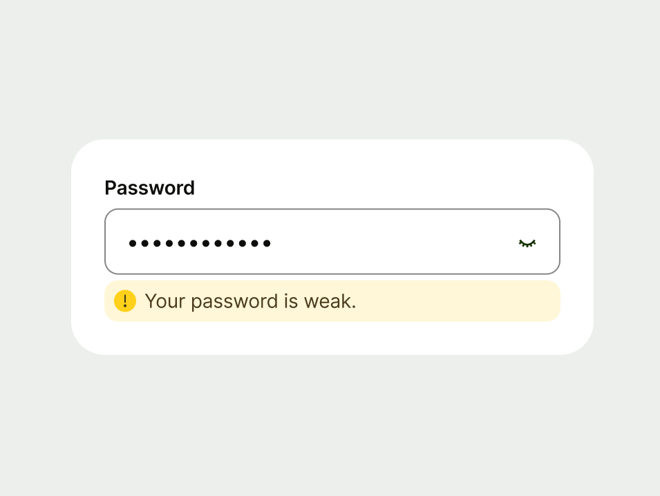
Warning
Use a warning when you need to alert users to potential issues that could impact their experience. These messages are preventative — they help users take action to avoid negative outcomes.
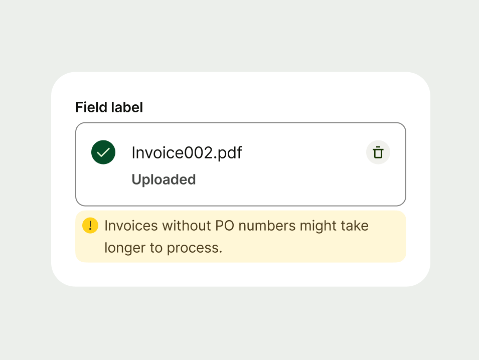
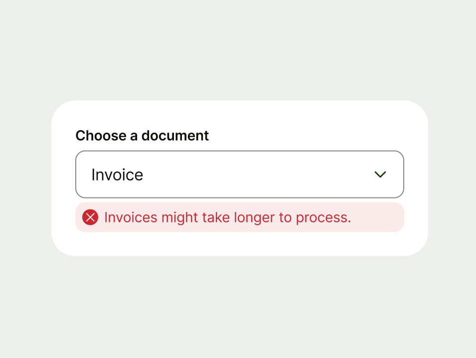
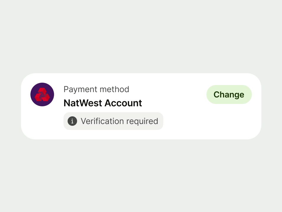
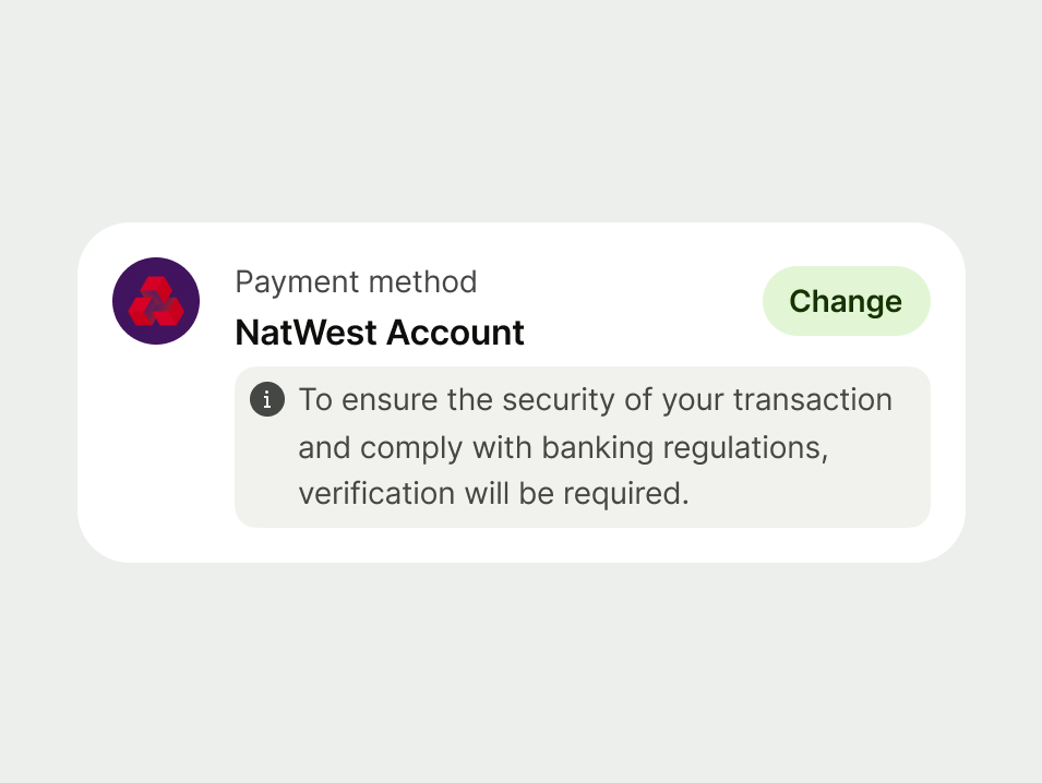
Neutral
Use a neutral prompt when you need to guide the user or give additional context.
Neutral prompts can transition to a success or error message when used in a form.
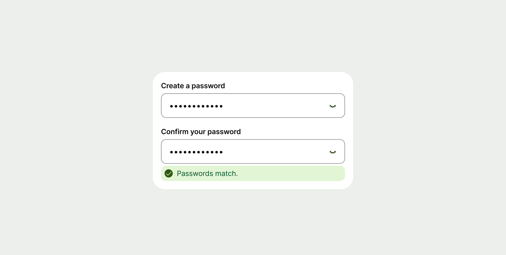
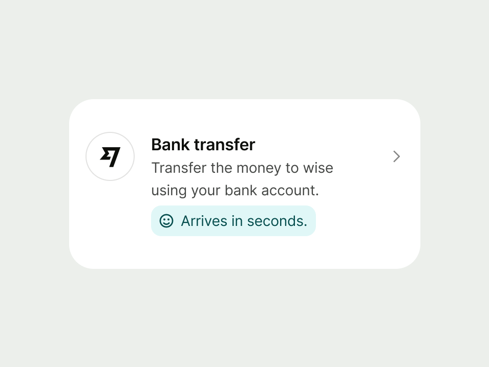
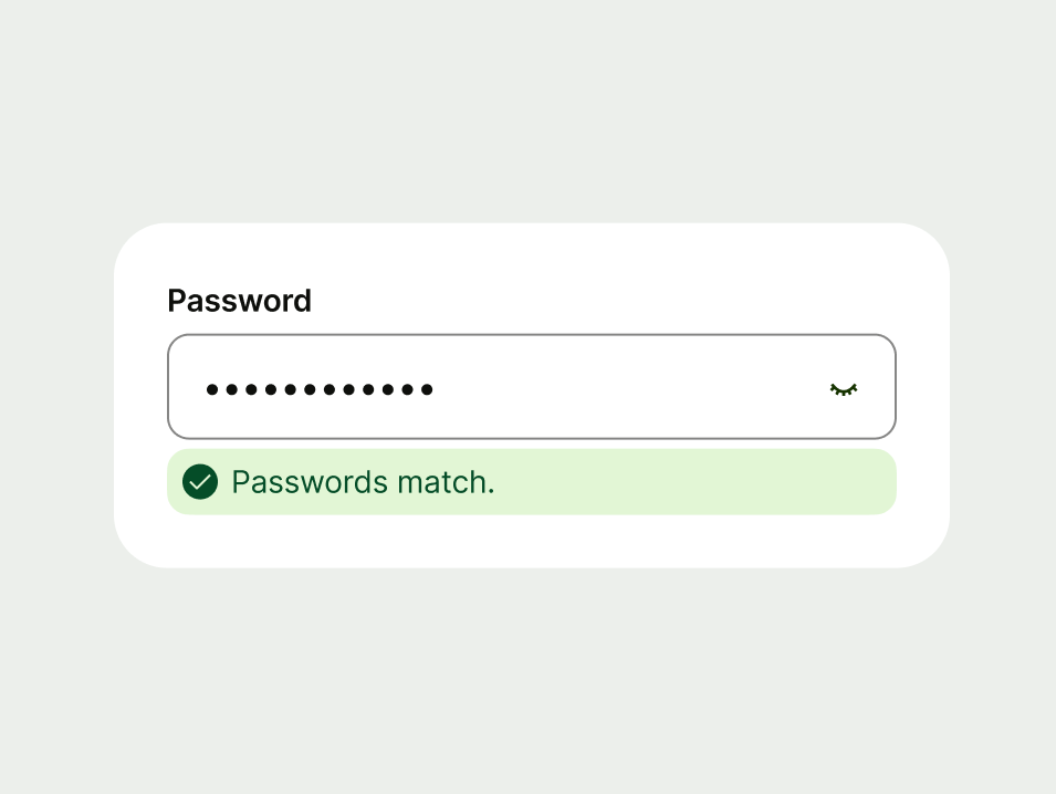
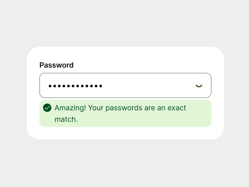
Success
Use a success prompt to communicate that an action or process was completed successfully. These provide positive reinforcement and closure for the user.
You can use a status icon alongside the message — just make sure to use one relevant to the message.

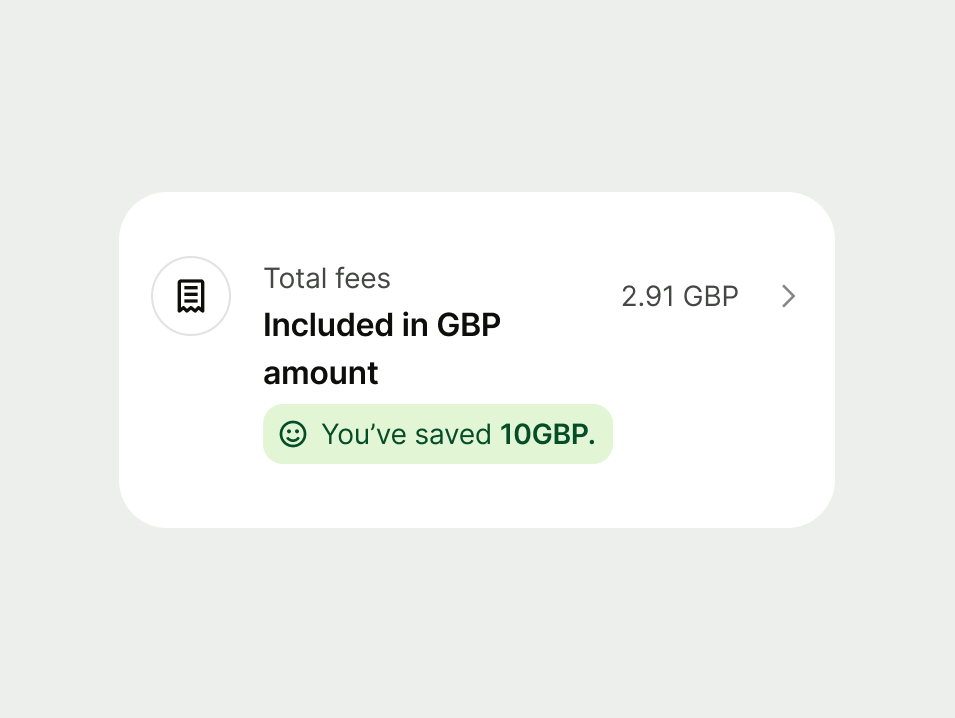

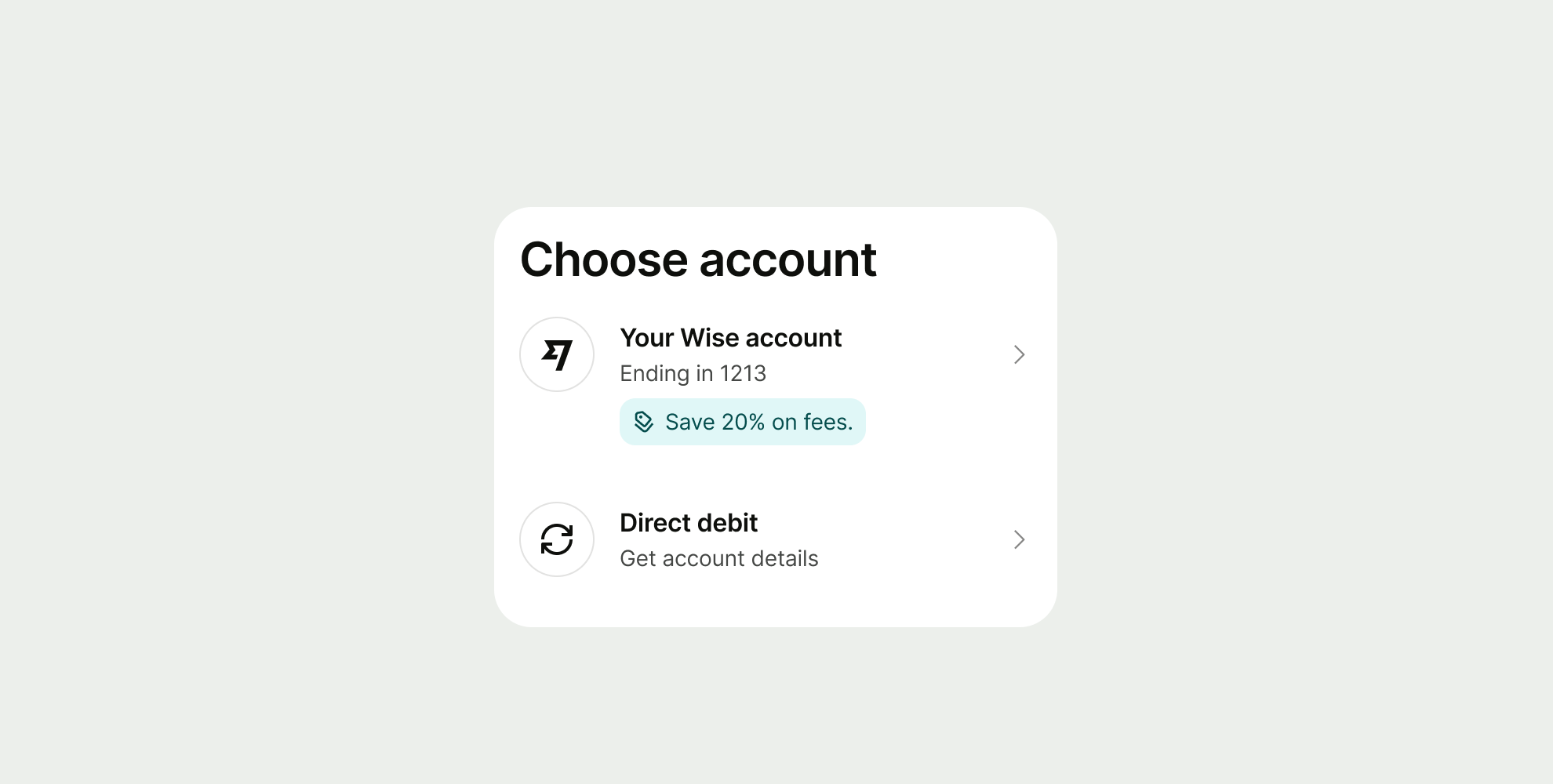
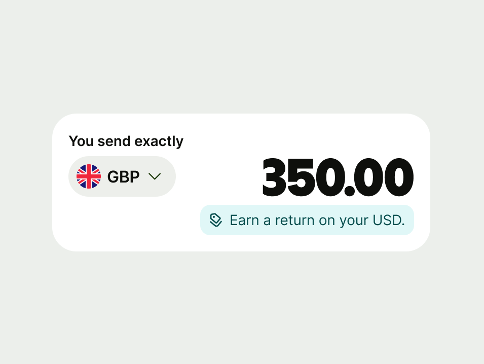
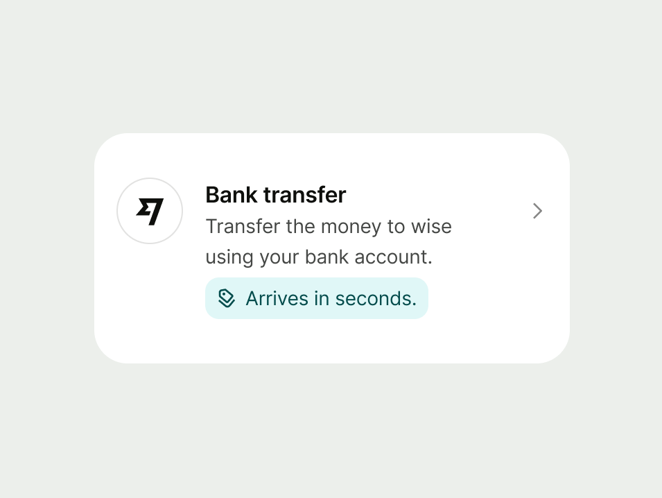
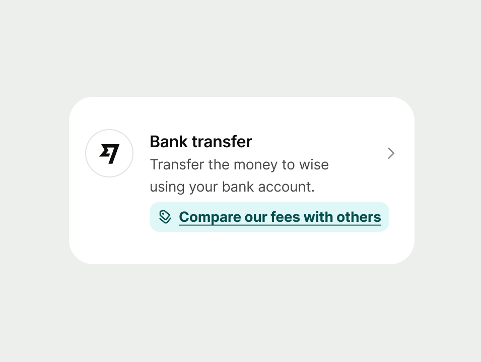
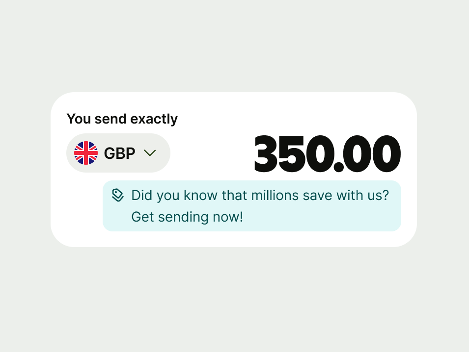
Proposition
Use a proposition to encourage the user to take an action that might benefit them.
These should only appear in list items. The feature or benefit should be clearly related to the action in the list.
Only include a proposition if it’s relevant to what the user is already doing. If we show too many of these prompts, or they feel off-topic, we risk undermining trust and the experience feeling like spam.

Inline prompts should appear next to the component they relate to. This helps users connect the message to a specific action.
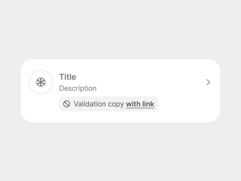
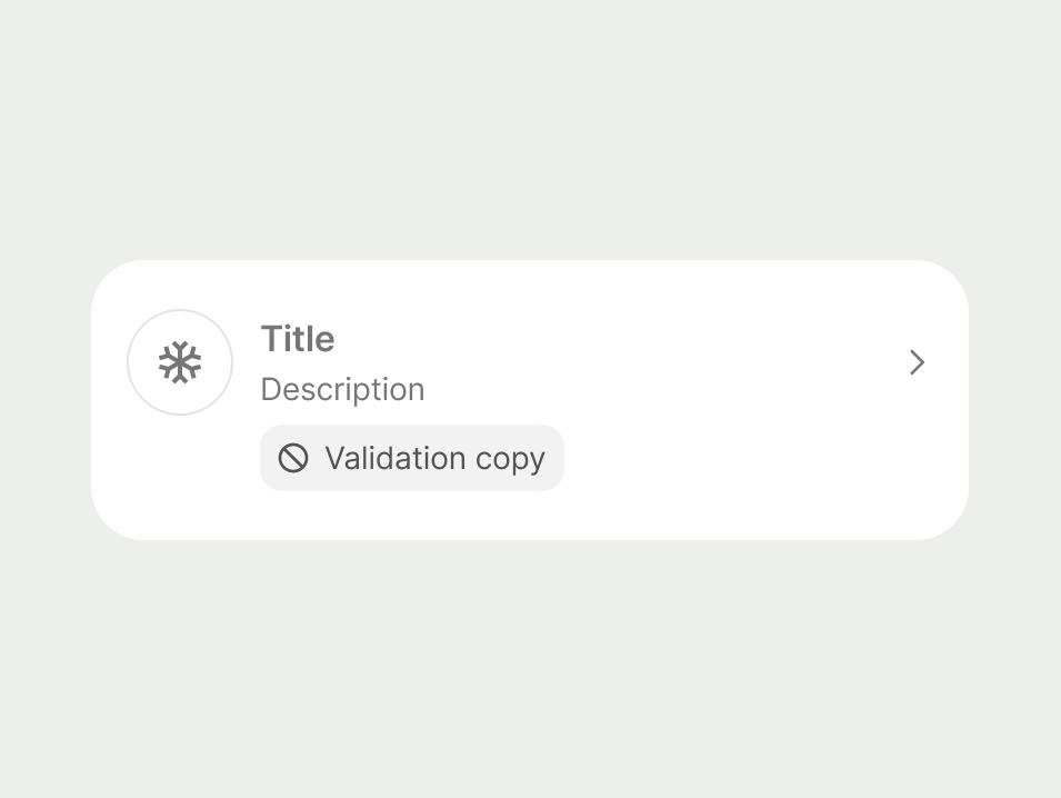
For components that are disabled, the inline prompt will be muted, and displayed with a backslash circle icon where the prompt icon was previously.
Links
Avoid adding a link to an inline prompt. These messages should help users complete their current task, not take them to another screen unless absolutely necessary.
Inline propositions should never include a link. This is because they’re designed to supplement an action in a list item with an offer or benefit.
Real-time checks
Inline prompts are also used when forms need to check something in the background, like verifying an account number is real.
We’ll show a loading message and icon while waiting for the check to finish.
- Only use background checks for things that need to be verified with external systems, like bank account numbers or IBANs.
- Use a neutral prompt to tell users upfront when we’ll check something.
- Don't use these types of checks for every field.


All inline prompts should:
Be specific – clearly starting what the customer needs to know or do.
Be concise – no more than 2 short sentences so users can quickly understand the message.
Include key details – use dates, names, or amounts when they add clarity.
Avoid headings or paragraph breaks – these messages should feel part of the experience, not separate from it.
Use full sentences with full stops – this helps keep the message clear and professional.
Tone
Your tone should vary depending on the type of message you’re giving. Sometimes you might be telling the user good news, and sometimes it might be a warning, or bad news. Use a tone of voice that matches the scenario.
Error
With any error message, be clear. Something has gone wrong and so the job of the prompt is to communicate what’s happened and how it can be resolved.
- Clearly state the issue – start by explaining what’s gone wrong.
- Tell the user how to fix it – be specific and actionable.
- Use an impartial, helpful tone – don’t blame the user for any mistakes.
Warning
Warnings help the user prevent future issues. They need to be clear and concise.
Use an impartial tone and try to distill your warning down to two parts:
Explain the potential issue – start by telling the user what could go wrong.
Give clear guidance – explain what the user can do to avoid a negative outcome.
Success
Although you're delivering good news, keep your message concise. This prompt only relates to one component, so avoid an over the top celebratory tone.
- Confirm the good news, but keep it brief and factual.
- Avoid over-celebration — a simple confirmation is enough.
Neutral
Keep the tone factual and straightforward. Focus on providing clear, relevant information that helps the user understand their situation or options. We don’t want to overwhelm them with unnecessary detail.
- State the key fact – keep it short and clear.
- Make important details easy to scan – if applicable, highlight relevant dates or amounts.
- Avoid unnecessary explanation – users should understand this at a glance.
Proposition
These messages should feel like helpful suggestions. Keep them short, relevant to what the customer is doing, and easy to scan.
Use a warm, inviting tone but don’t overdo it. The benefit to the user should be obvious and immediate. Avoid wordplay or anything that sounds like a hard sales push.
If the feature is genuinely helpful, including the benefit in plain English will do the work for you.
- Frontload the benefit — make the value clear in the first few words.
- Match the tone to the context — friendly and informative, not pushy.
- Don’t use vague phrases like “Check this out”.
- Don’t oversell — if the feature is useful, you won’t need hype.

Platform | Available | Developer documentation |
|---|---|---|
Android | ||
iOS | ||
Web | Web documentation |