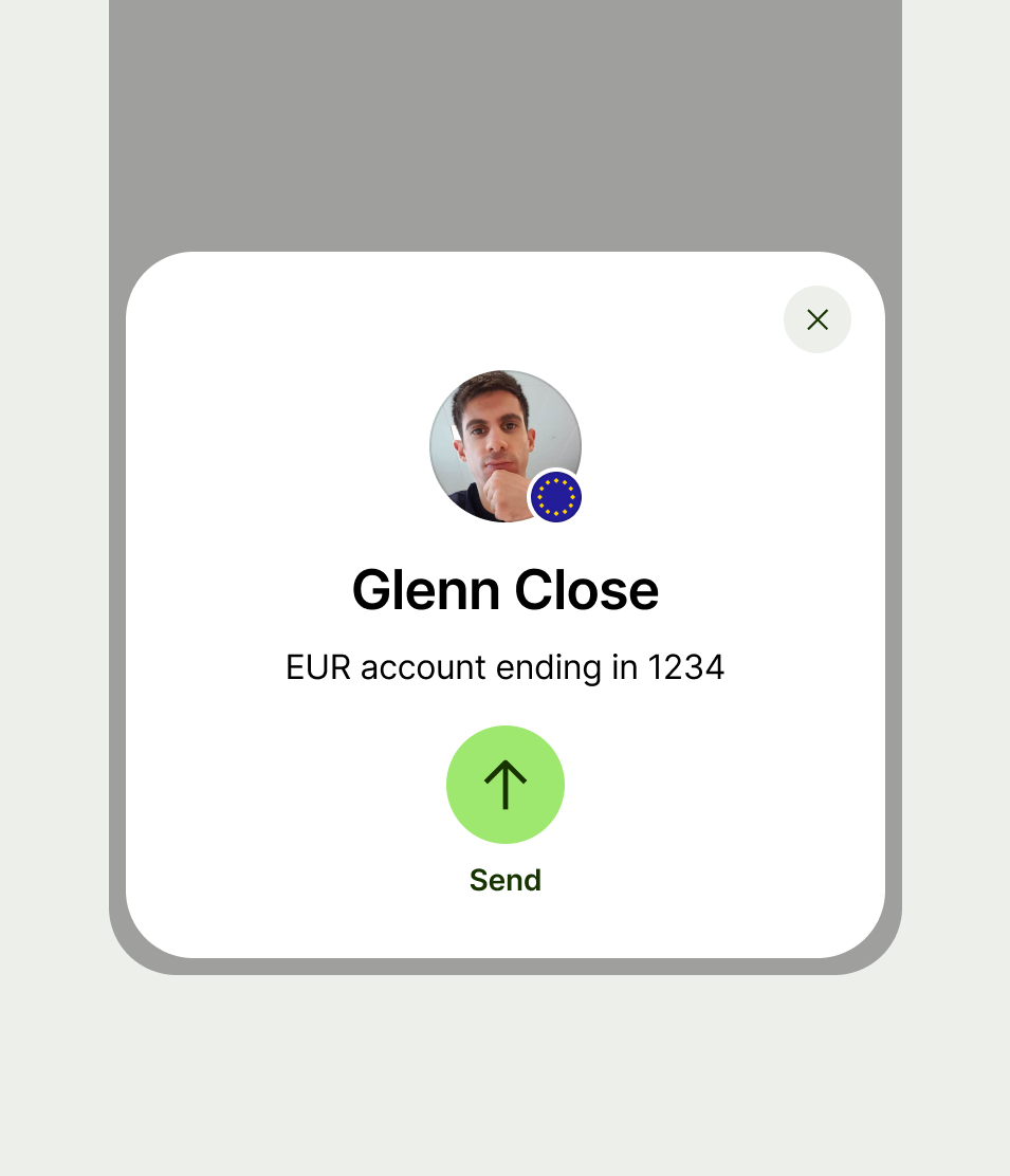
Circular button

A circular button lets the user perform an action with a tap or a click.

Circular button
When to use

Use a circular button:

  • when the user can perform multiple equally important actions related to an entity that's on screen

Don't use a circular button:

  • just so you can display an icon with a button (use a regular button instead)

Types

Types are designed to emphasise the nature of the action.

Circular buton default state
Default

Default is the standard button type that conveys a general action. Use this by default.

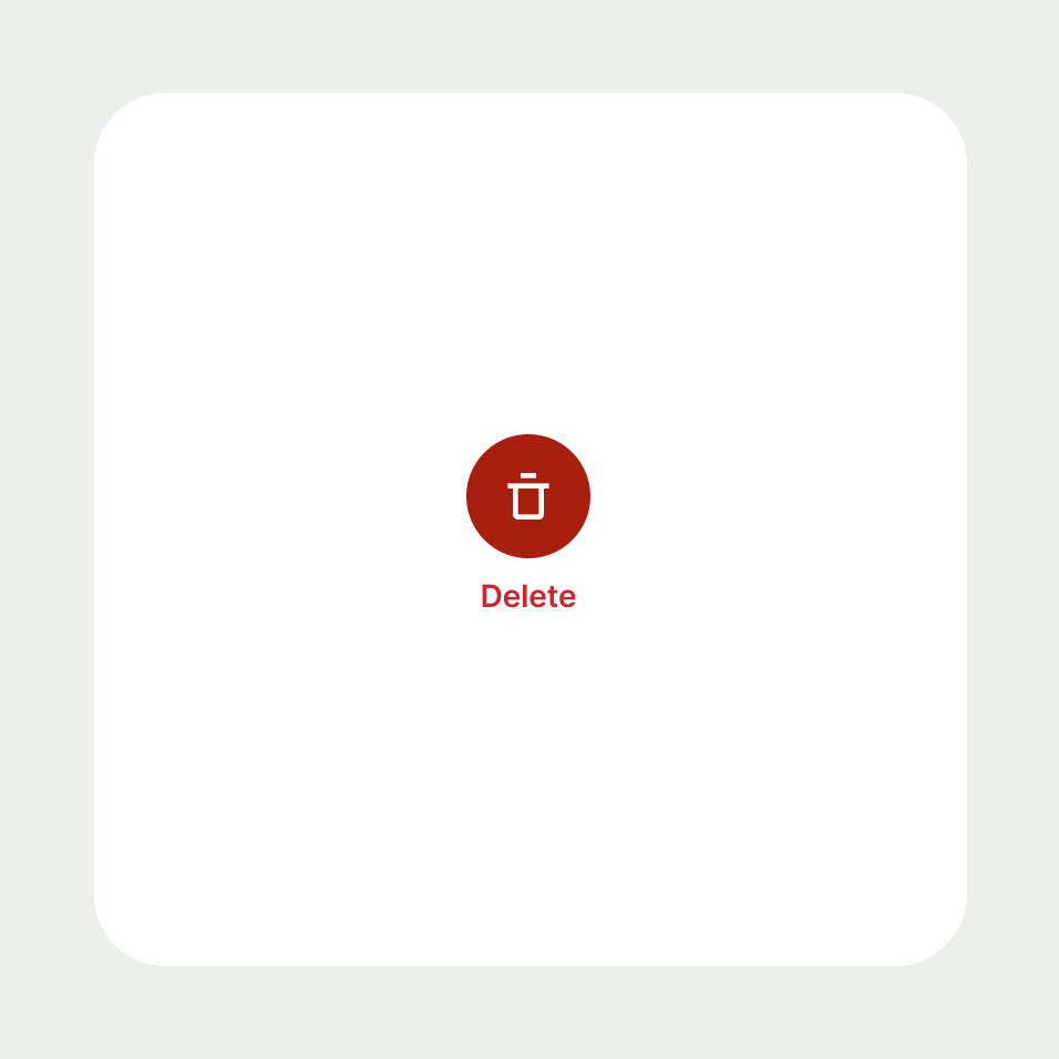
Circular button negative state
Negative

Use negative for confirming destructive actions, like canceling a transfer or closing a balance.

Priority

Priorities set a visual hierarchy amongst the buttons displayed on the screen to help more important buttons to take precedence over others.

Circular buttons support 2 different priorities that can be combined with 2 different types.

Circular button primary state
Primary

Use primary for displaying the most important action of the screen, such as confirming something or submitting a form. You may have multiple primary actions depending on your use case.

Circular button secondary state
Secondary

Use secondary for providing alternatives to the primary action, or when none of your actions are more important than the others.

Best practice
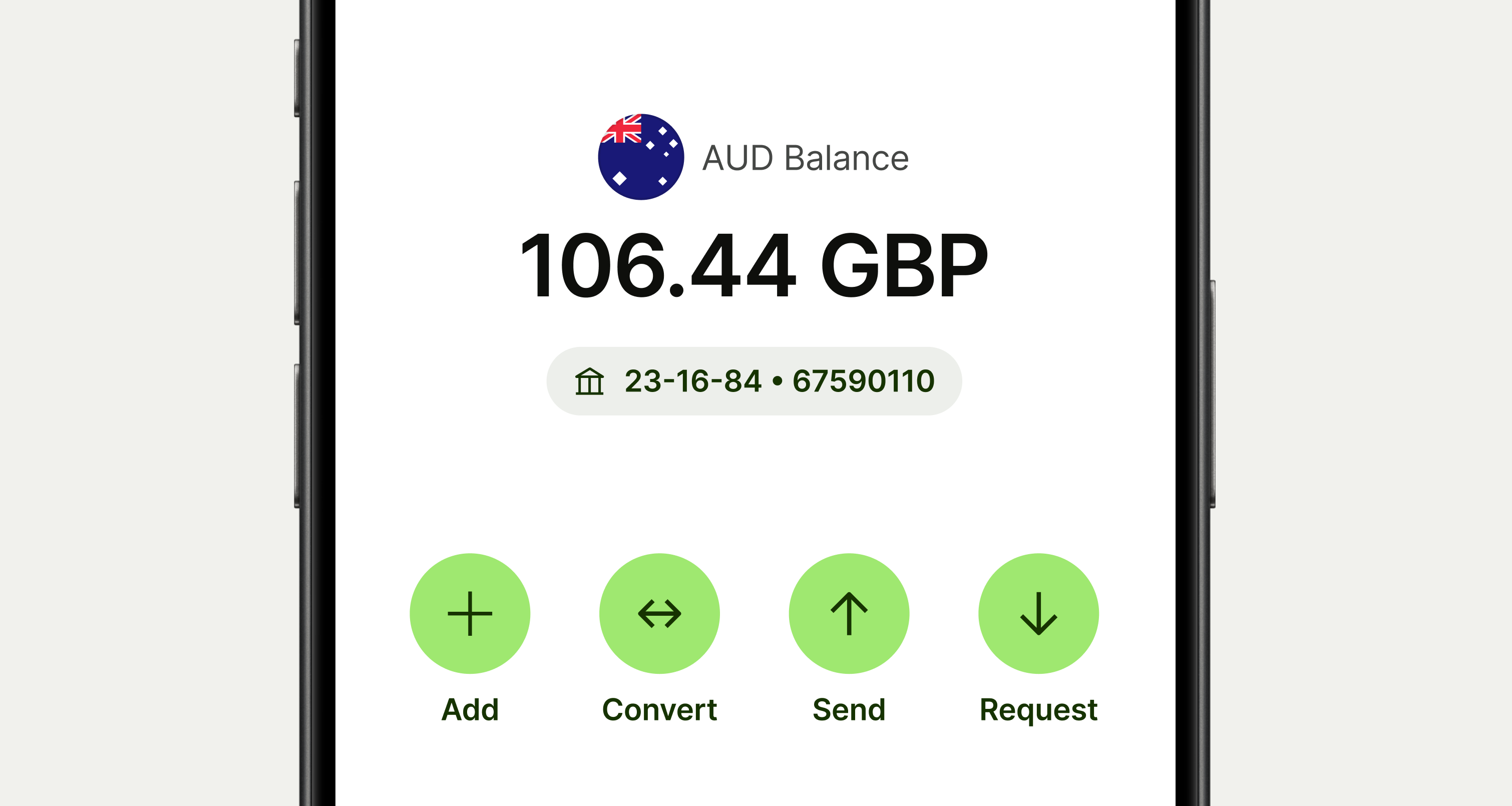
  • Don't have just one circular button on its own.

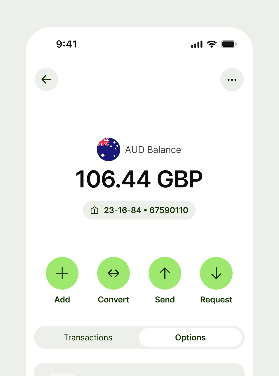
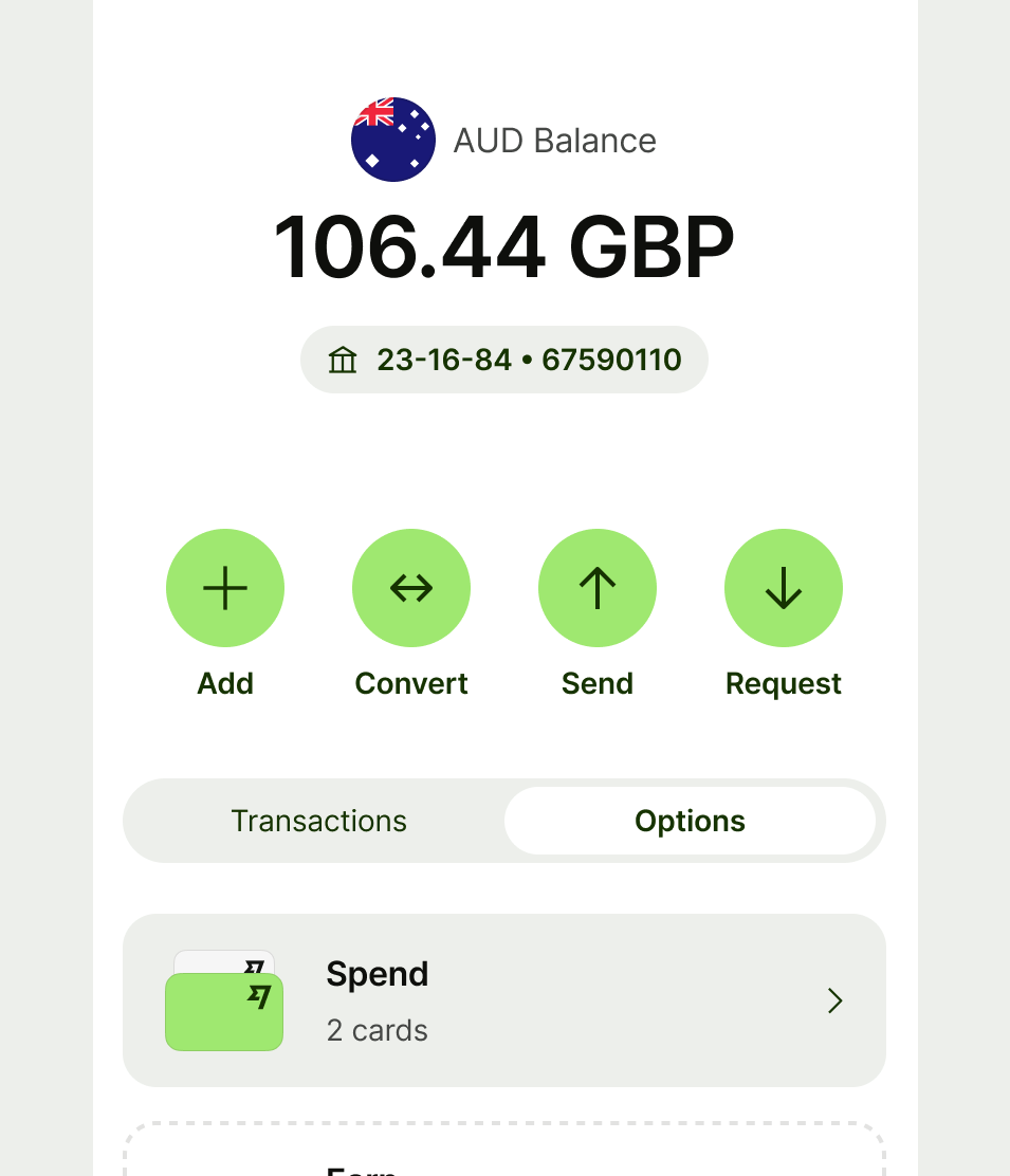
Balance page with circular button actions

Pair circular button with other circular buttons.

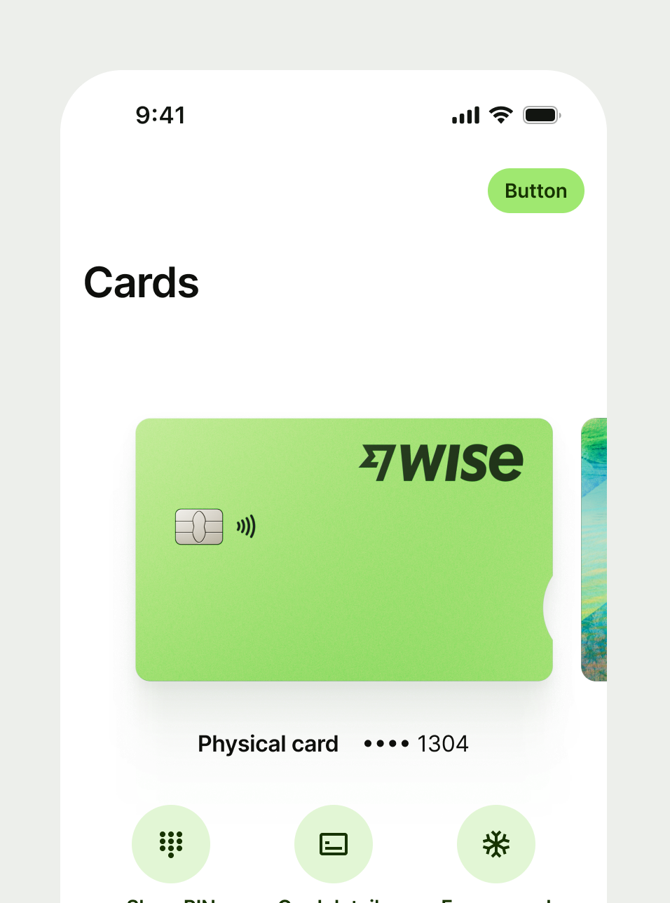
Standalone circular button

Don’t use circular button on it’s own, unless it’s an edge case where other icons would usually be displayed.

Interaction

Unless the button is disabled, the user can tap or click on it to perform the action assigned to it.

Accessibility

Both the icon and font size can change based on the user’s accessibility preferences. When you put circular buttons in a horizontal layout, make sure to flip them to a vertical layout when a huge font size is preferred by the user, so the content still fits on the screen.

When using a screen reader, the text of the button will be read out loud and the icon will be ignored. Make the title contextual, so people completely relying on the screen reader will also understand what the action is related to.

Content

Button

Button copy should:

  • start with a verb, like ‘Pay’ or ‘Send’

  • be just a few words (ideally 1 or 2)

  • describe the action (if someone only reads the button, they should know what will happen next)

  • connect to the content around it — for example, it might use the same words as the title

  • avoid using first person pronouns like ‘me’, ‘my’ and ‘I’

  • be in sentence case (only capitalise the first letter of the first word)

  • have no full stop

Circular button with 'send' label
Circular button with 'give me money' as label
Availability

Platform

Available

Developer documentation

Android

iOS

Web

Web documentation