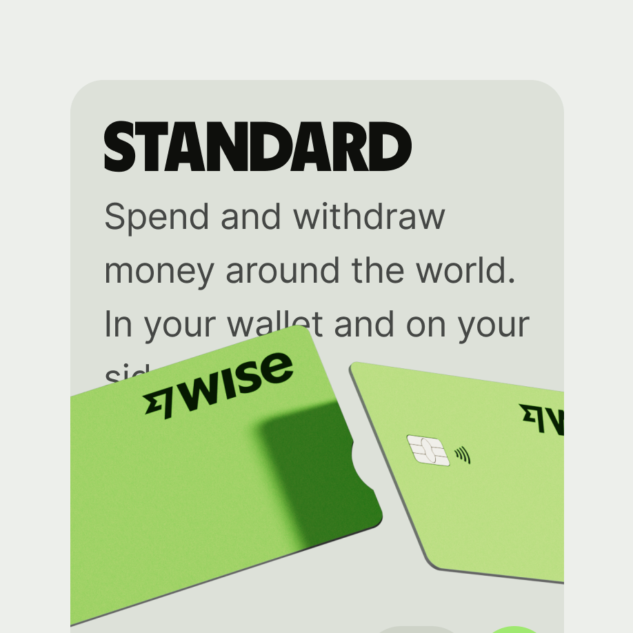
Promo card

A promo card is used to promote products and features.
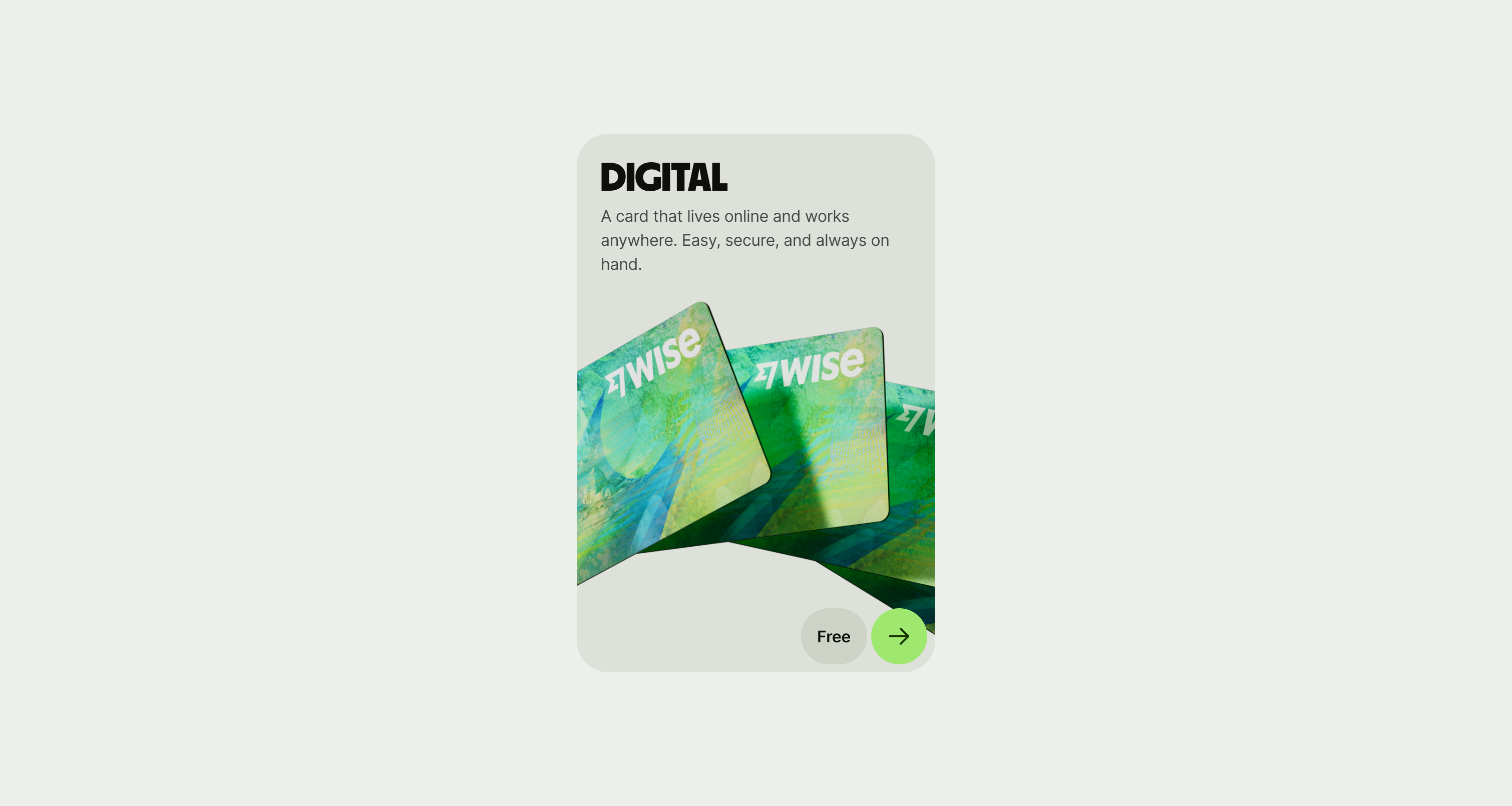
Promo card
When to use
  • Used for highlighting products and features, as well as giving high level information on them.
  • Don’t use as a navigation option when choosing between items in a flow.
  • Don’t use as replacement for a list of content.
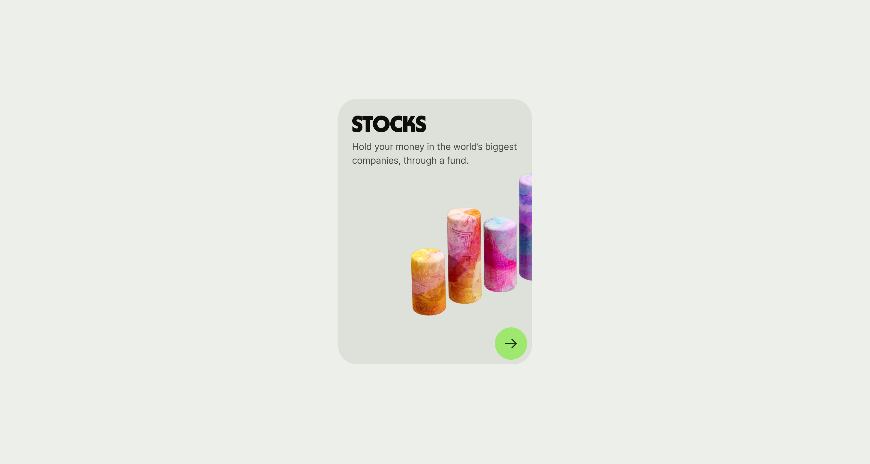
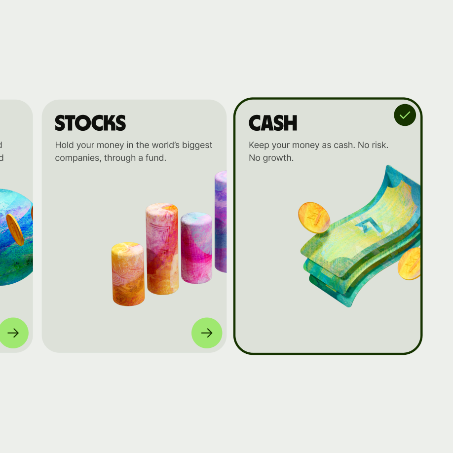
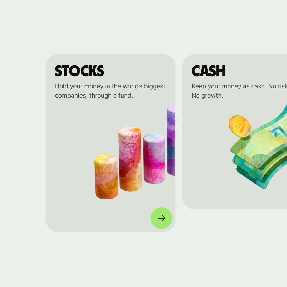
Promo card for stocks

Used for highlighting products and features, as well as giving high level information on them.

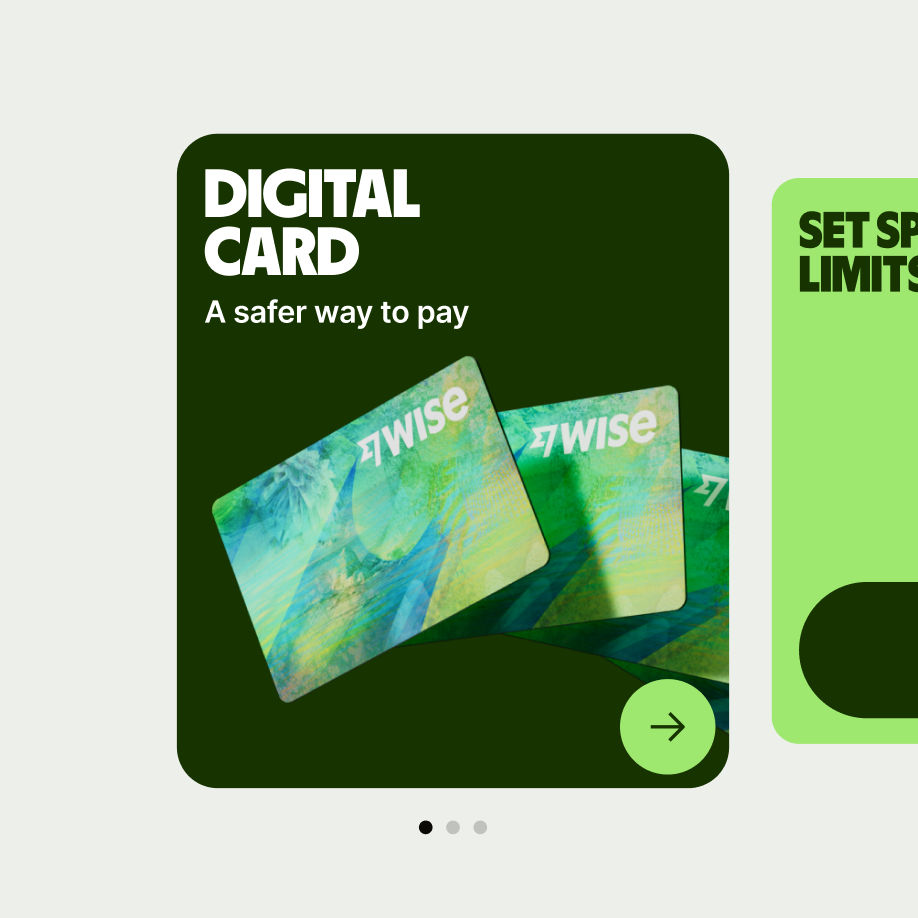
Promo card in carousel

Cards can be showcased collectively horizontally on a grid on desktop and vertically stacked or in a carousel on mobile.

Promo card selected

Can also be used with other cards as a selection tool.

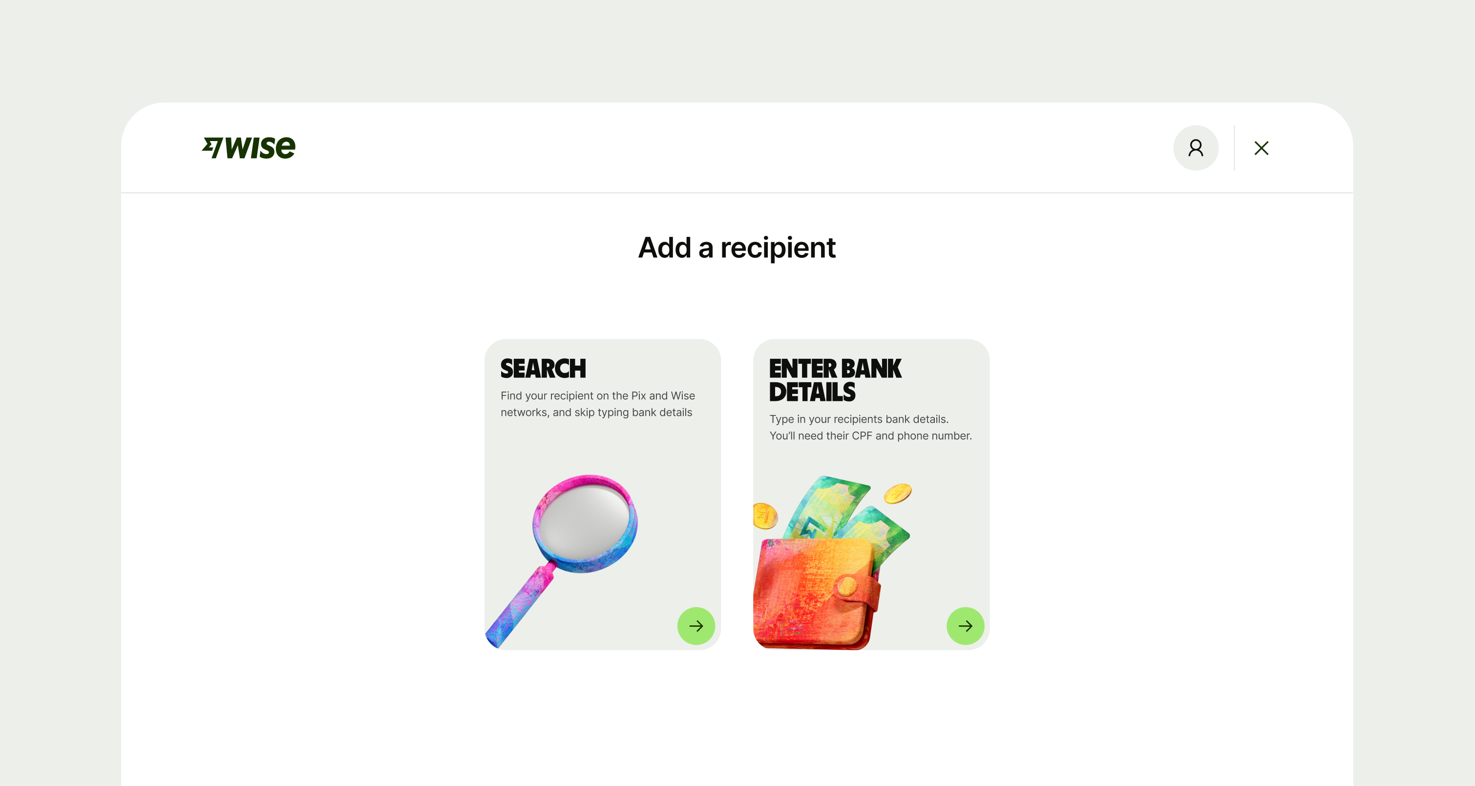
Promo card in a flow

Don’t use cards for as navigation option when choosing between items in a flow.

Best practices

Content and actions should be related to a specific topic. 


Content such as text and images on the cards should be used to communicate their hierarchy effectively.

Ensure content is scannable and non-obtrusive.

Promo card

Cards can function as entry points into deeper layer of information or navigation.

Promo card with text under image

Be aware when using images to not overpass the text.

Placement
  • Cards can be showcased collectively horizontally on a grid on desktop, vertically stacked on mobile or in a carousel.
  • Don’t place in a carousel if the cards have different height values.
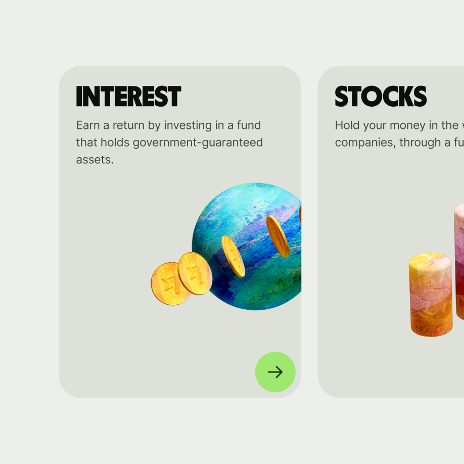
Cards aligned next to one another

Cards can be showcased collectively horizontally on a grid on desktop, vertically stacked on mobile or in a carousel.

Promo cards misaligned in height

Don’t place in a carousel if the cards have different height values.
Interaction

The whole card can be clickable, as well as links and buttons.
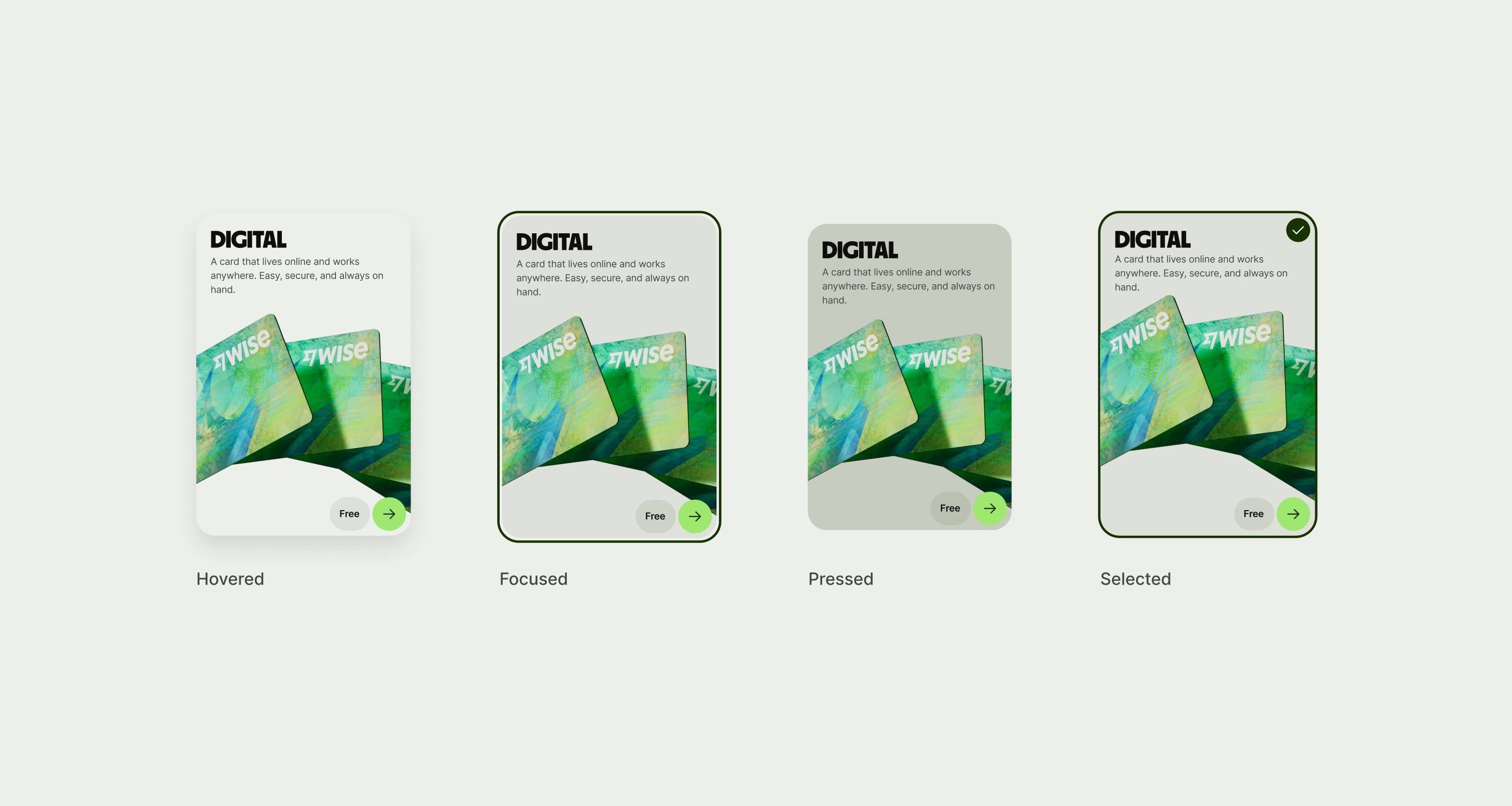
Promo card states
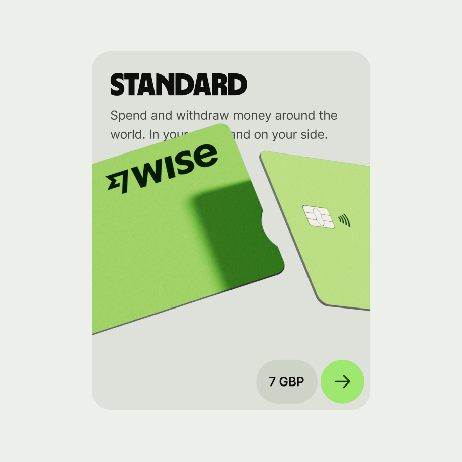
Promo card button

Promo card has an optional interactive icon as an accessory.

Accessibility

The card component scales in height with dynamic text.
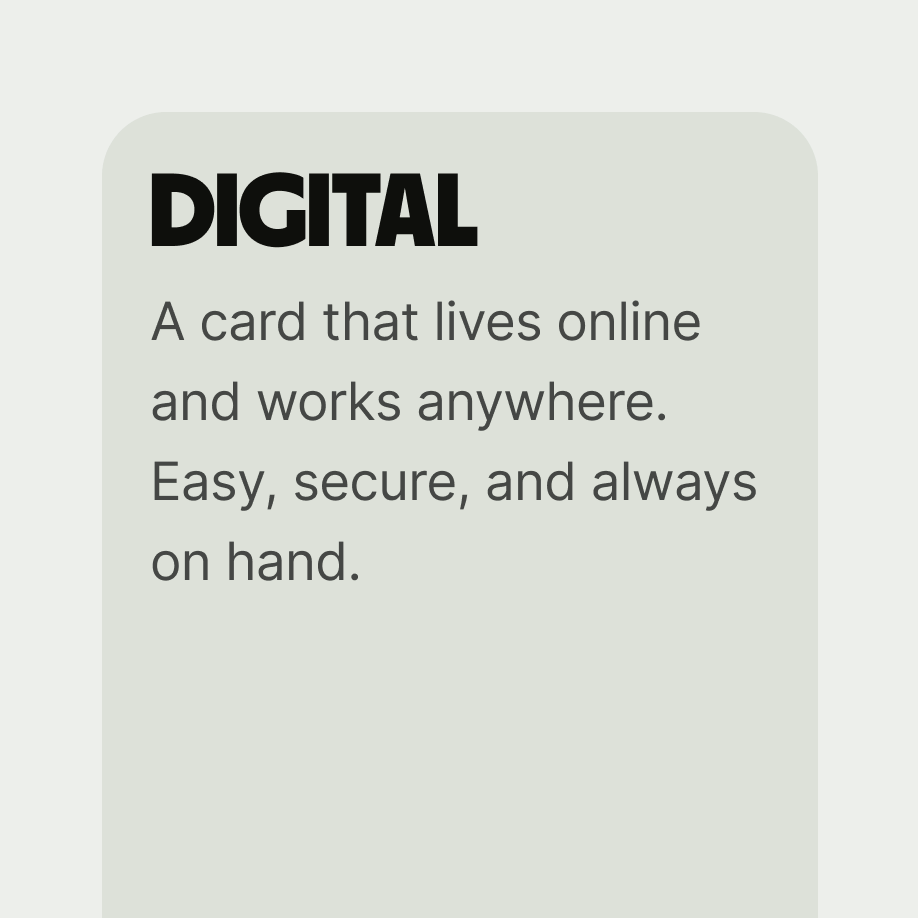
Promo card enlarged text no image

Longer content or dynamic text can run over 
2 lines

Promo card with image over text

Your scaled text should never fall behind your image.

Availability

Platform

Available

Developer documentation

Android

iOS

Web

Storybook