Primary
Use primary for the most important action to move forward in a flow, acknowledge and dismiss, or finish a task.
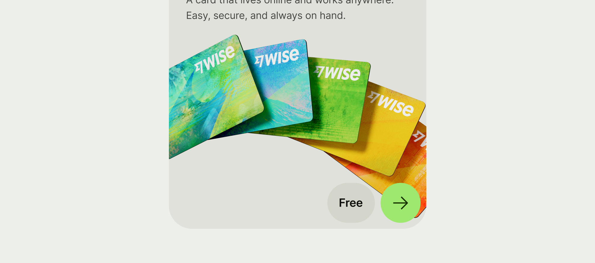
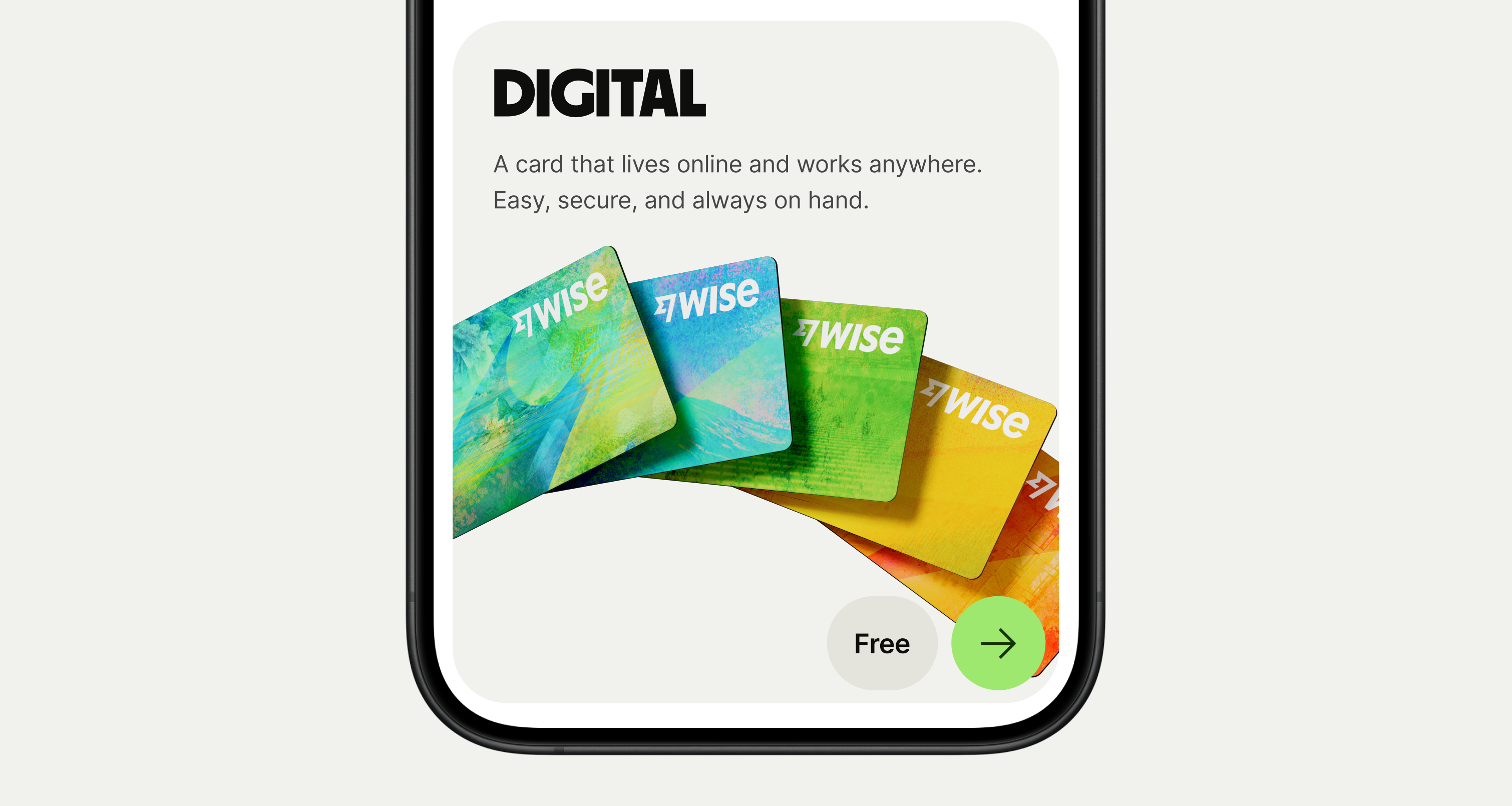
An icon button lets the user perform an action with a tap or a click.
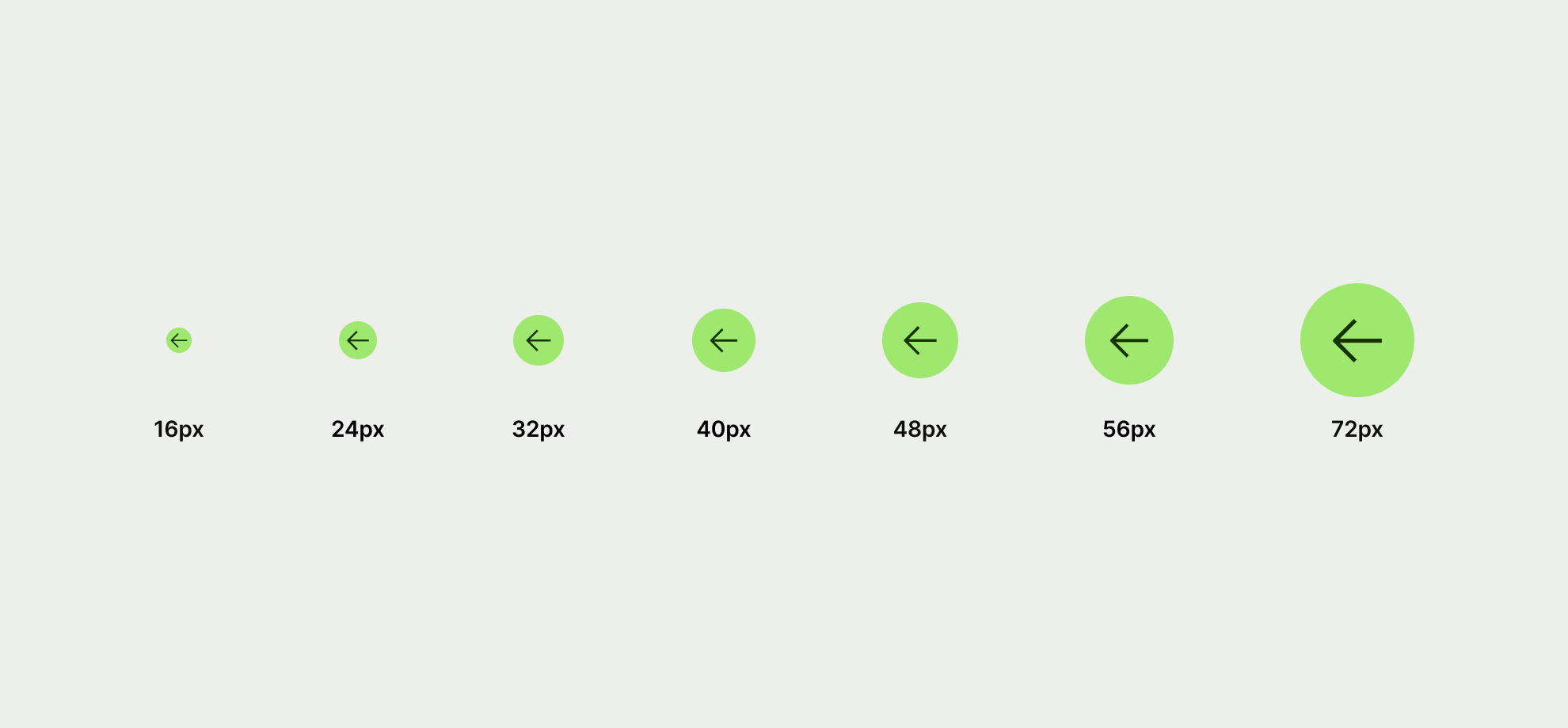
Supported sizes are 16, 24, 32, 40, 48, 56, and 72.
Priorities set a visual hierarchy amongst the buttons displayed on the screen to help more important buttons to take precedence over others.
Icon buttons support 3 different priorities that can be combined with 3 different types.


Use primary for the most important action to move forward in a flow, acknowledge and dismiss, or finish a task.

Use secondary for providing alternatives to the primary action, or when none of your actions are more important than the others.
Used for controls and views, such as back button or a currency selection.
Used for dismissive actions like dismiss, or skip. As well as supplementary controls like copying or viewing tooltips.
Types are designed to emphasise the nature of the action.

Icon buttons work best if they are recognisable without accompanying copy.


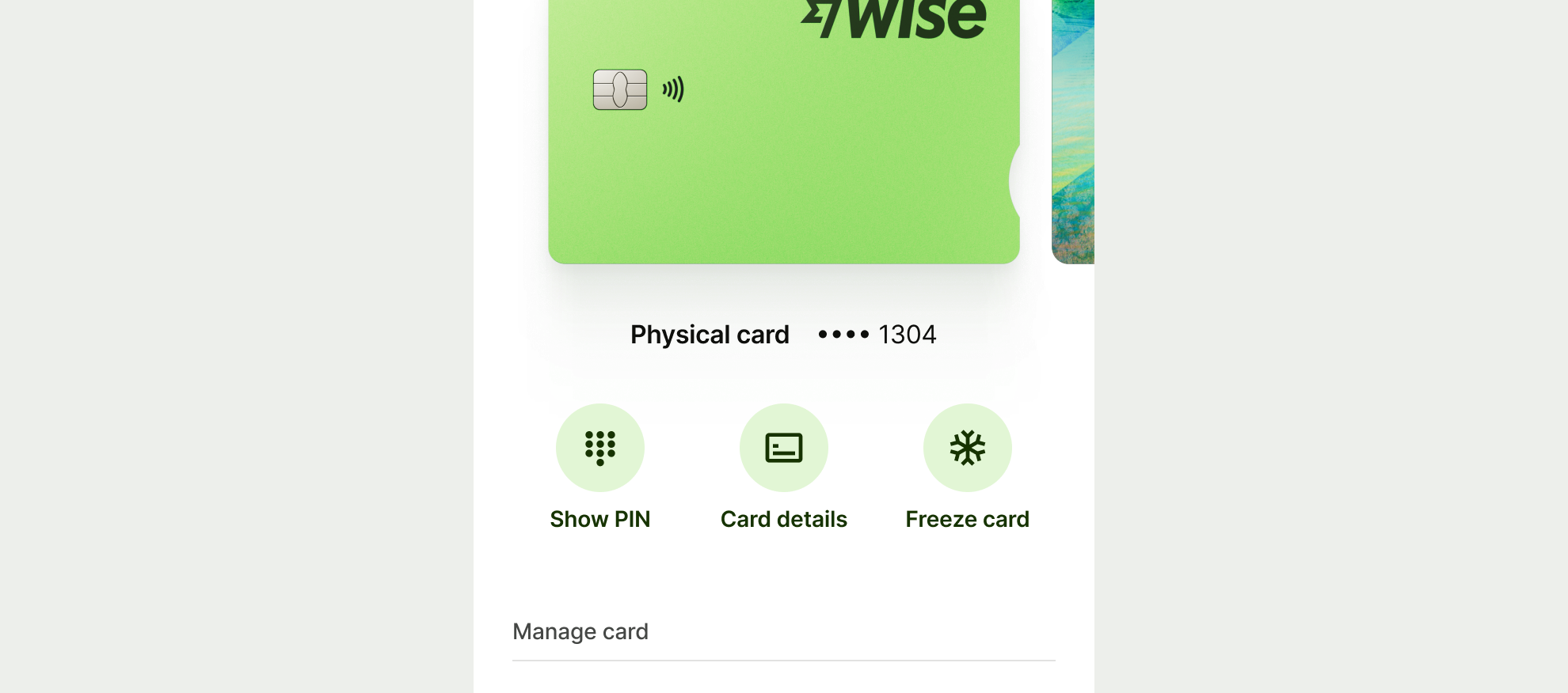
Different icons are used across different use cases. Here are some of our most common use cases


