Nudge

A nudge directs users to take an action on something that might be relevant at the time they see it.

Nudge
When to use

Use a nudge:

  • to suggest a new feature or action that a user might not be aware of
  • if there's an optional feature or action that's relevant to what the user is currently doing

Don't use a nudge:

  • if the information is critical, or requires time sensitive action
  • if the feature is something that everyone needs
  • if there's no action for the user to take

Variants

There are 7 different variants of nudge, each with a different illustration.

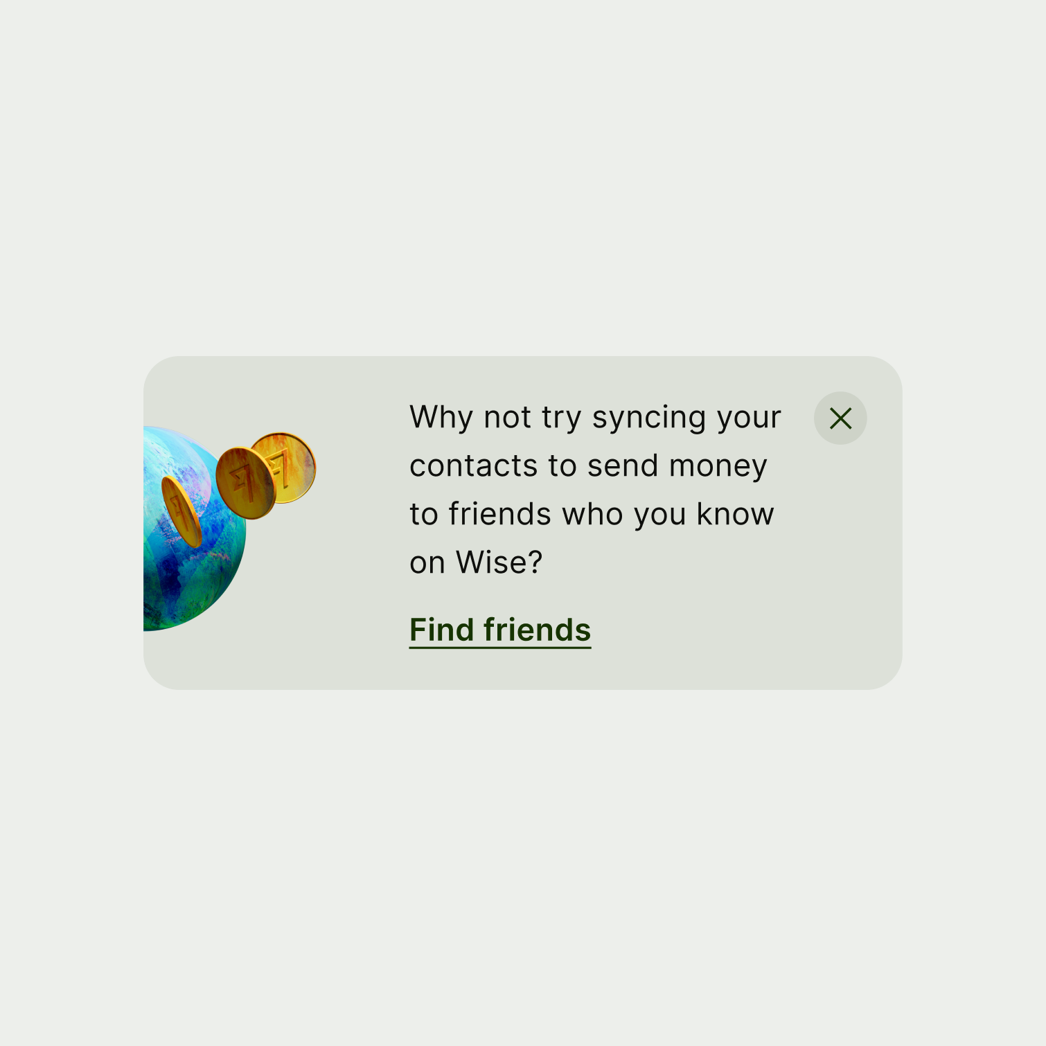
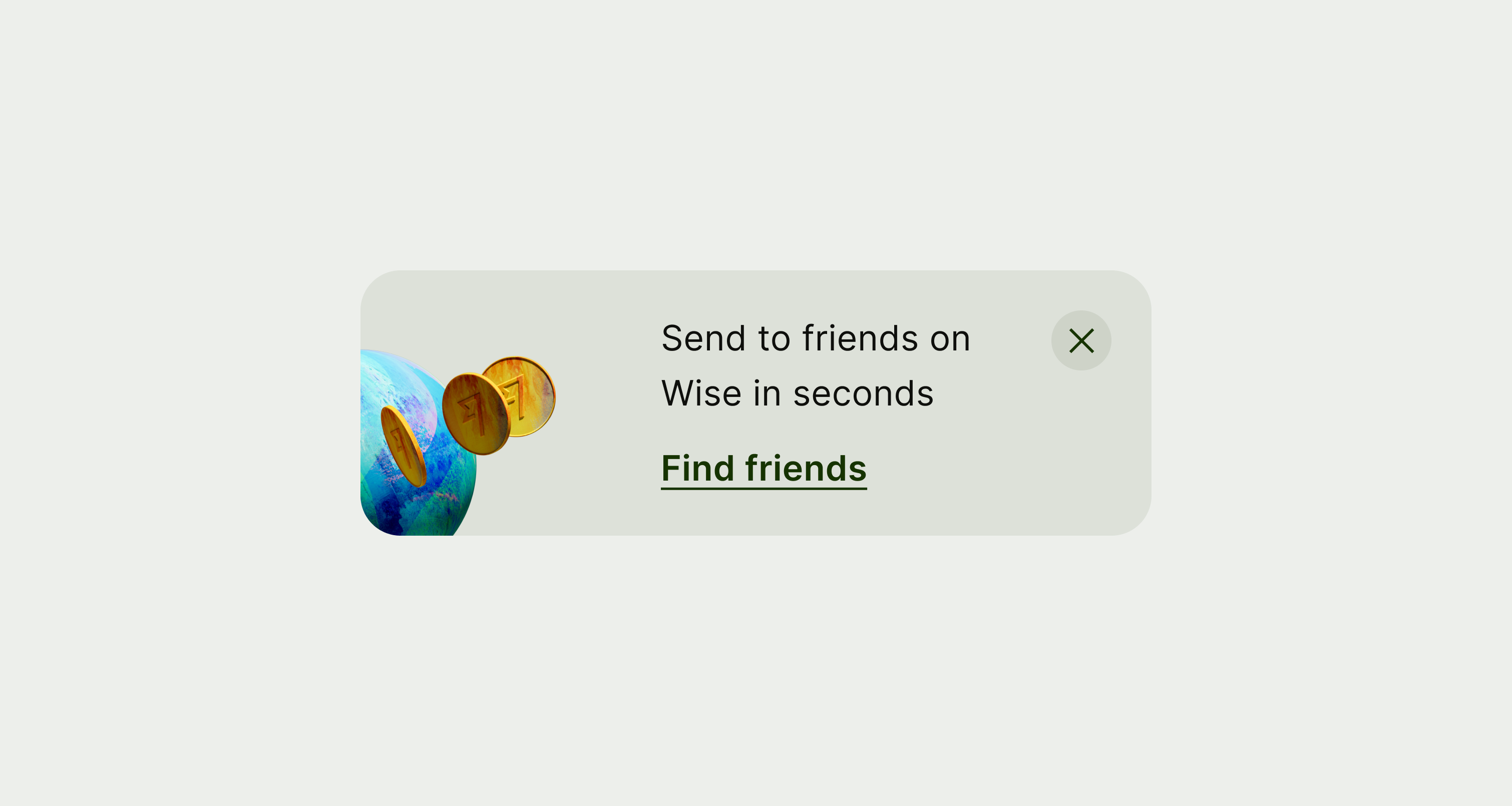
A nudge component with a globe illustration.
Globe

Use the globe if you're referring to moving money around the world.

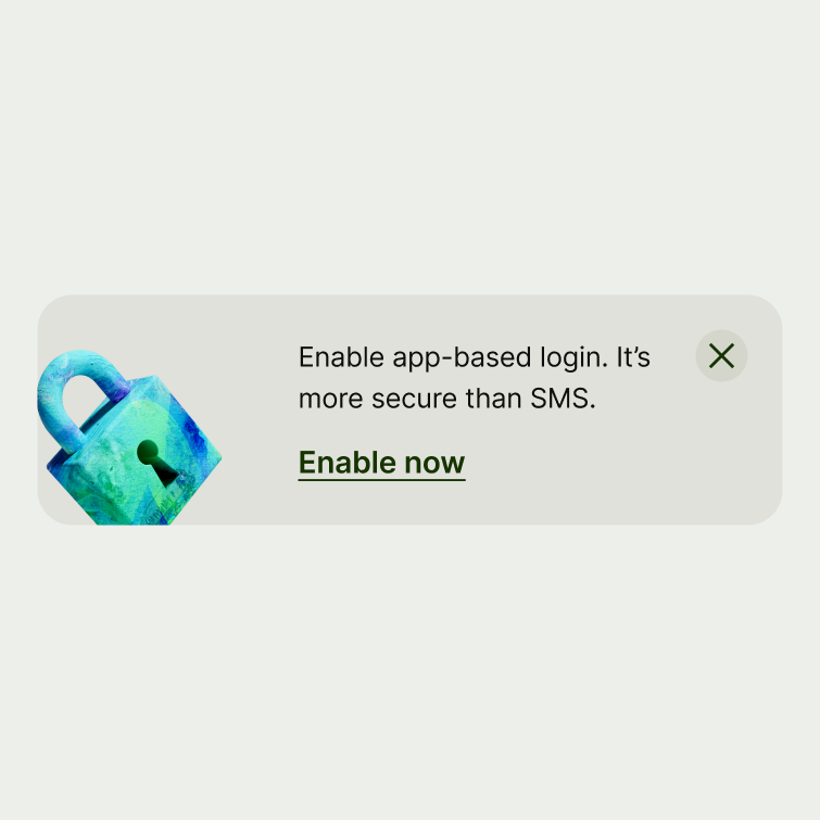
A nudge icon with a padlock illustration.
Padlock

Use the padlock if you're referring to account security.

A nudge with a wallet illustration.
Wallet

Use the wallet if you're referring to spending.

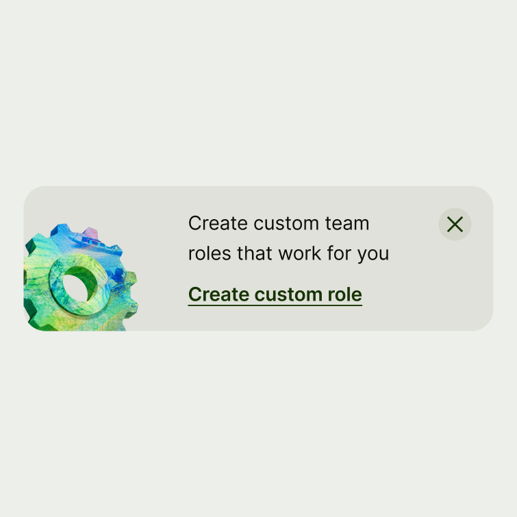
A nudge with a cog illustration.
Cog

Use the cog if you're referring to settings, or account setup.

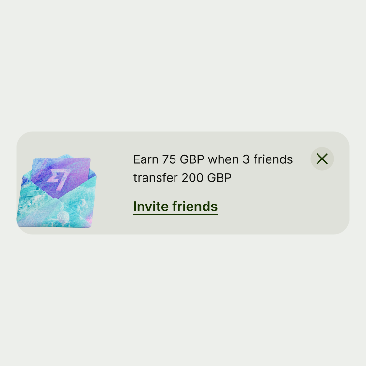
A nudge with an envelope illustration.
Envelope

Use the envelope when referring to the invite scheme.

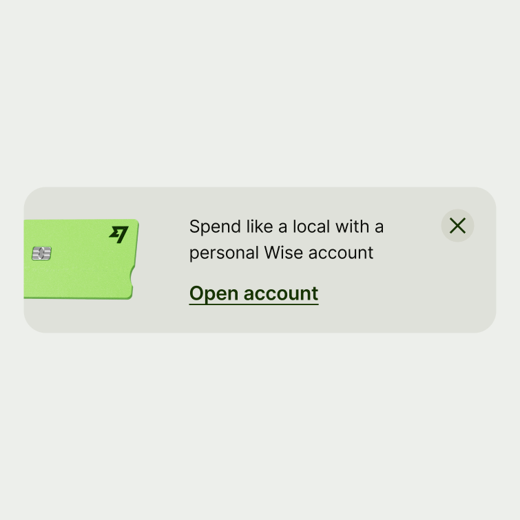
A nudge with a personal account card illustration.
Personal account card

Use the personal account card when referring to the personal account.

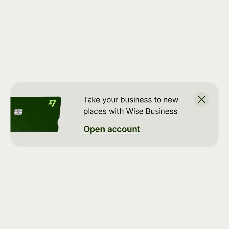
A nudge with a business account card illustration.
Business account card

Use the business account card when referring to the business account.

Placement

Place a nudge at the top of the screen or section it applies to, or below a section header.

Never have more than one nudge on the same screen.

Interaction

Nudges direct users to another view to complete an action.

Tapping anywhere on the nudge triggers the action — except for the area around the close button, which dismisses it.

Content

Nudges are for suggesting new features or actions, not for communicating negative or critical information. So while nudge copy should be short and sweet, it's ok to add some energy and colour. Try to have maximum impact, with the minimum amount of words.

See our tone of voice.

Title

Title copy should:

  • start with a verb

  • describe the action the user might like to take

  • include a clear benefit for the user — like making something quicker, safer, or cheaper for them

  • be short (4–7 words)

  • capitalise the first letter of the first word

  • not have a full stop

If you can't fit the action and the benefit in one sentence, you can include a second sentence. Just make sure it:

  • explains the benefit to the user

  • includes full stops as there are 2 sentences

  • is short — no more than 6 words

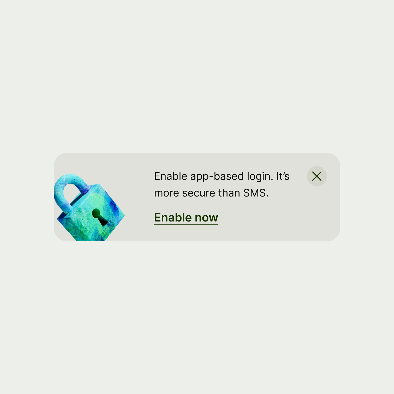
A nudge with a single sentence for a title.
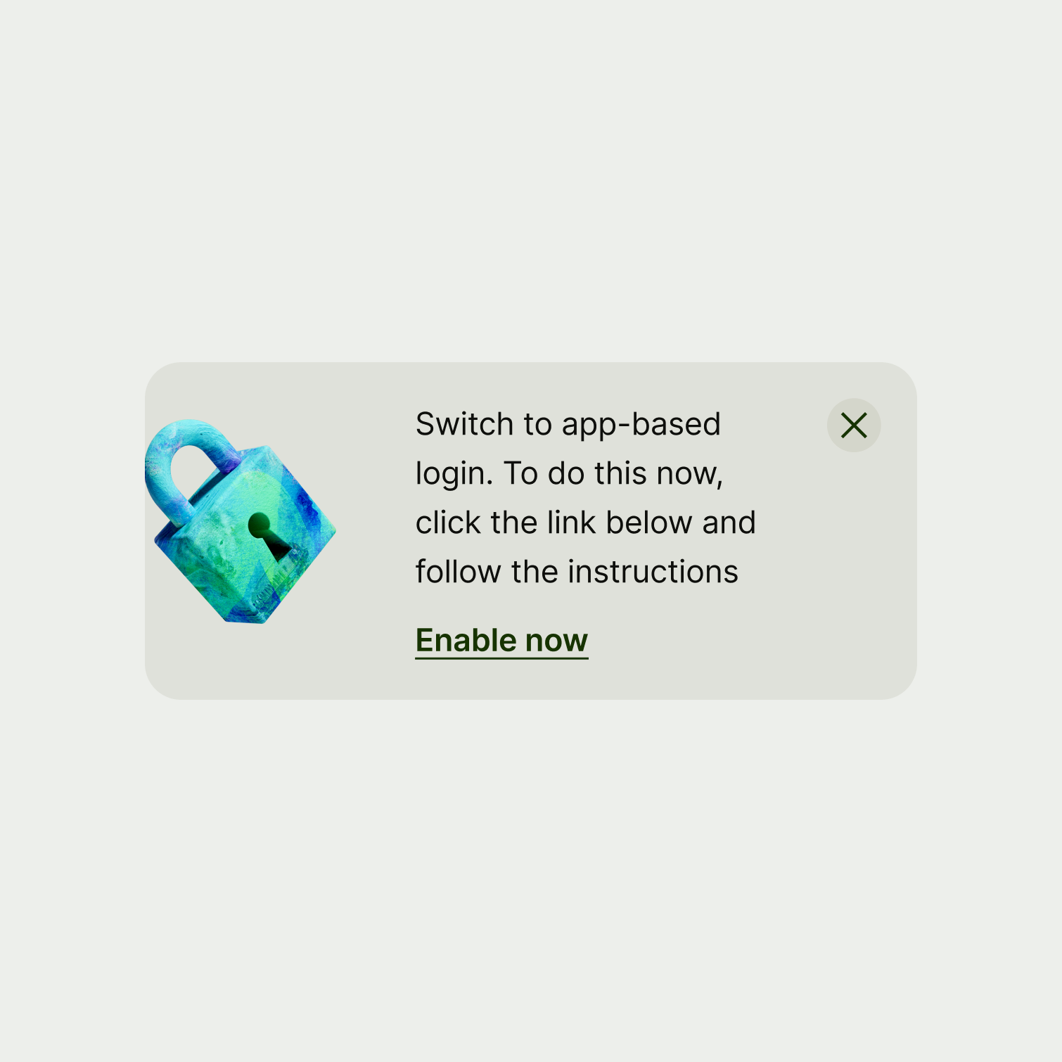
A nudge with a very long sentence for a title.
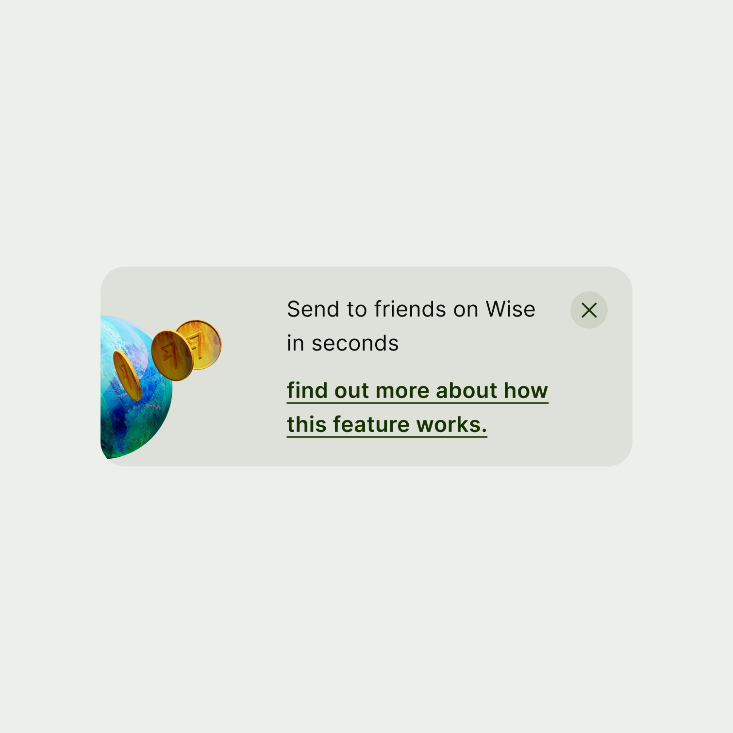
A nudge with two short sentences.
A nudge with a lengthy second sentence.

Action

Action copy should:

  • start with a verb — like ‘add’, ‘enable’, ‘find’

  • describe a specific action the user will take — it shouldn't be vague

  • be no more than 3 words

  • capitalise the first letter of the first word

  • have no full stop

A nudge with short and succinct action copy.
A nudge with very long action copy.
Availability

Platform

Available

Developer documentation

Android

iOS

Web

Web documentation