Tables allow users to review large amounts of sequential information at a glance.
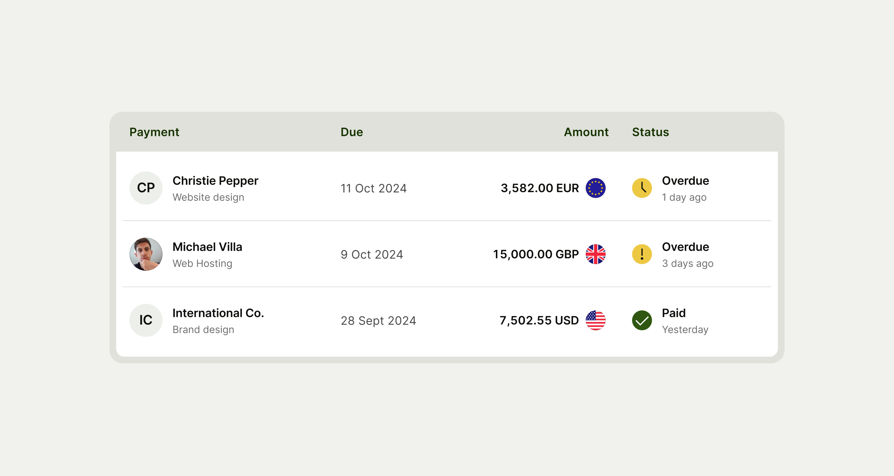
Tables are useful for organising data in grids and can be used to: Compare data points, Find insights, Find specific information within a large data set, and Show long lists of sequential or structured content.
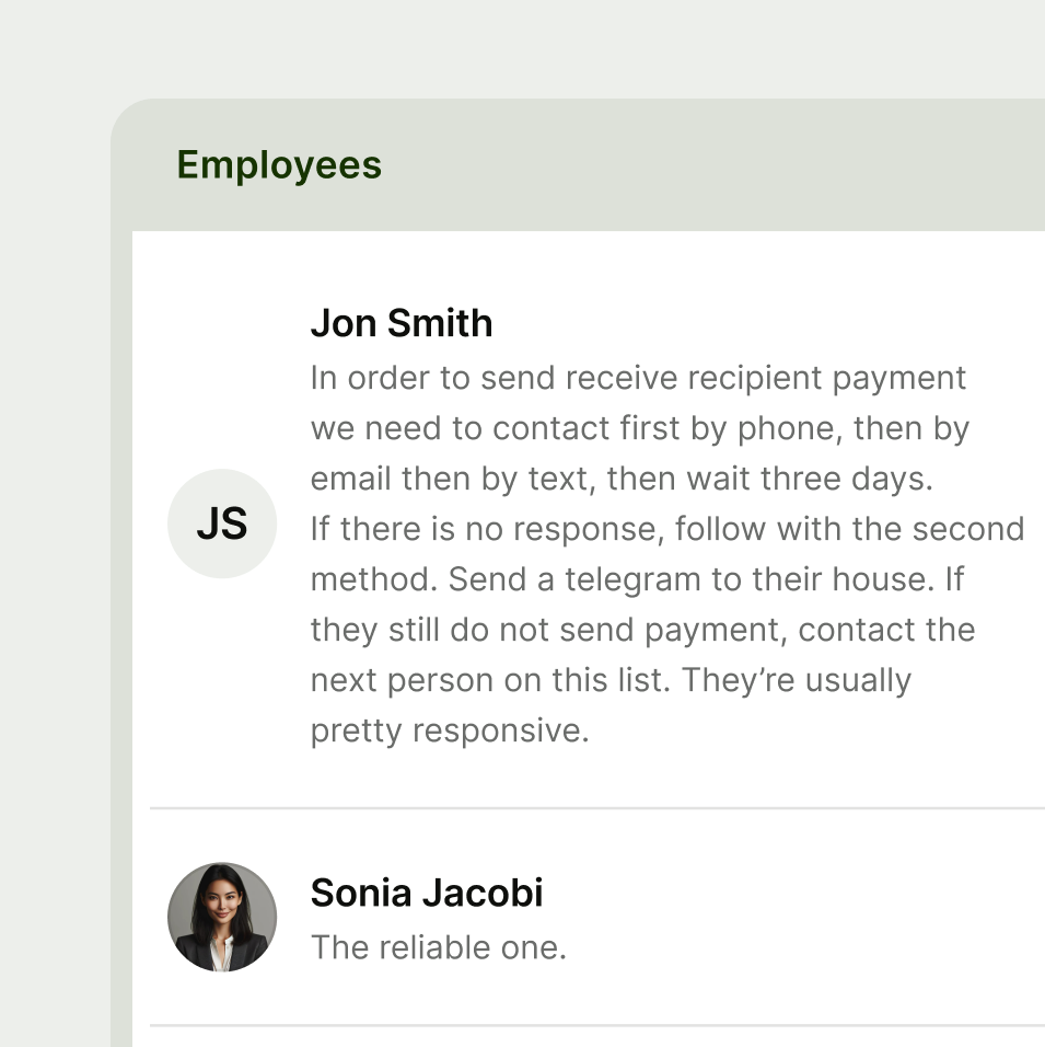
- Keep cell content short and succinct
- Don’t write long form content inside of table cells
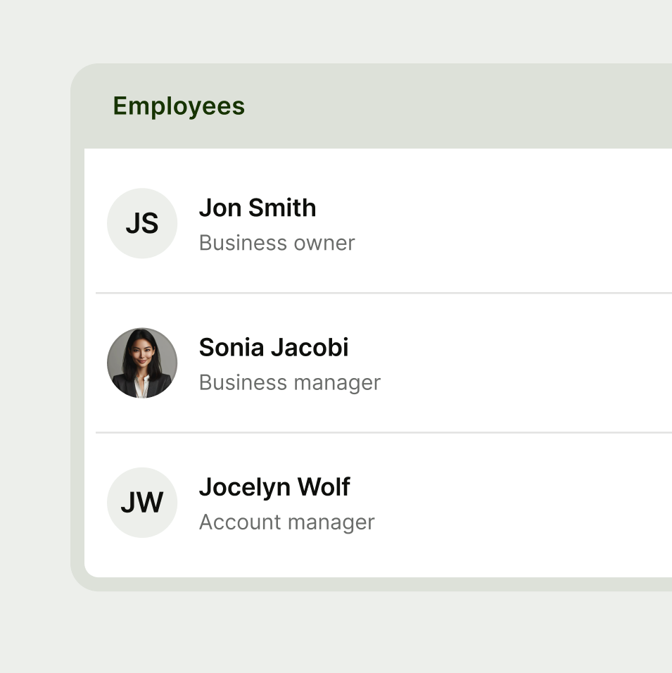
Use tables when you need to display comparison information across columns and rows.
- Don’t put a table inside of another table
- Don’t use tables for minimal information where you can use a list item component instead
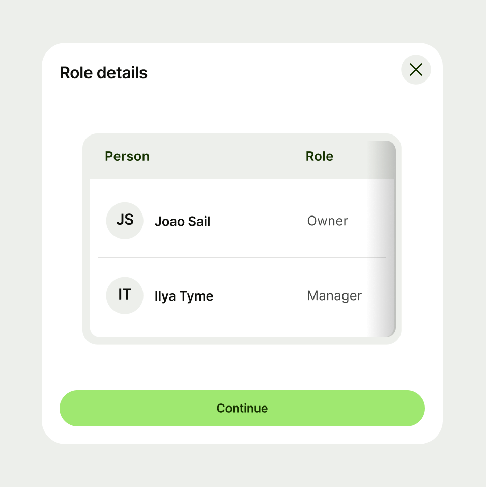
- Avoid using detailed tables in small spaces like modals or drawers
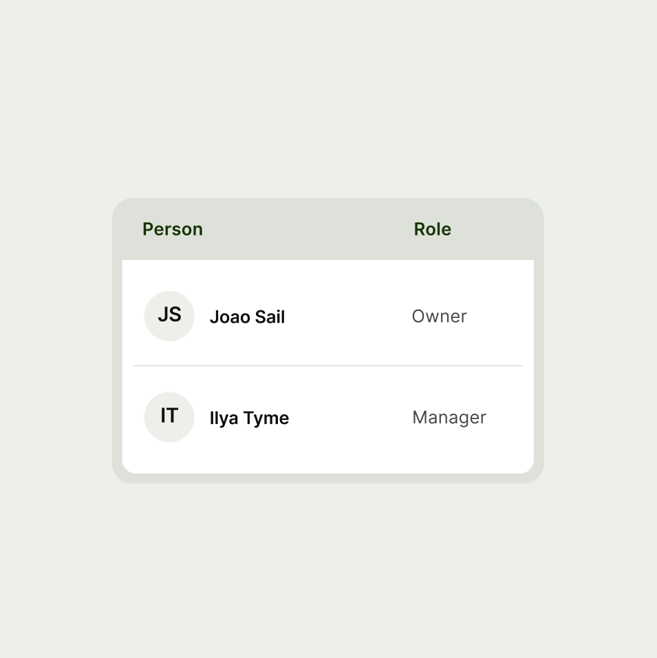
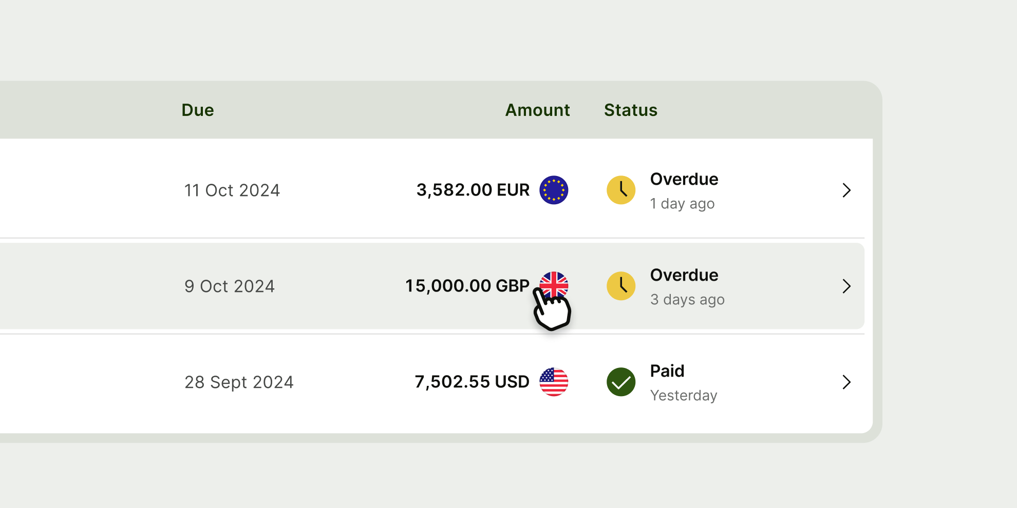
Users can perform a single action across a row.
The table component is a mobile responsive web component — at smaller screen widths it activates a horizontal scroll, so that the user can still scan all information.
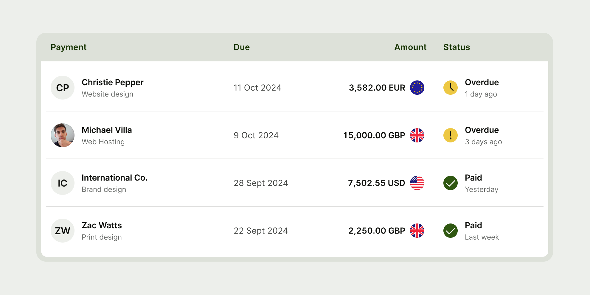
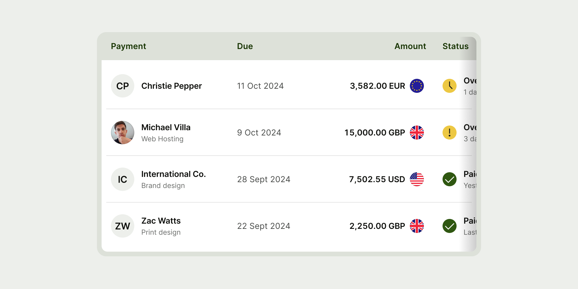
Table has 5 different cell types used for different types of information — header, leading, text, currency and status.
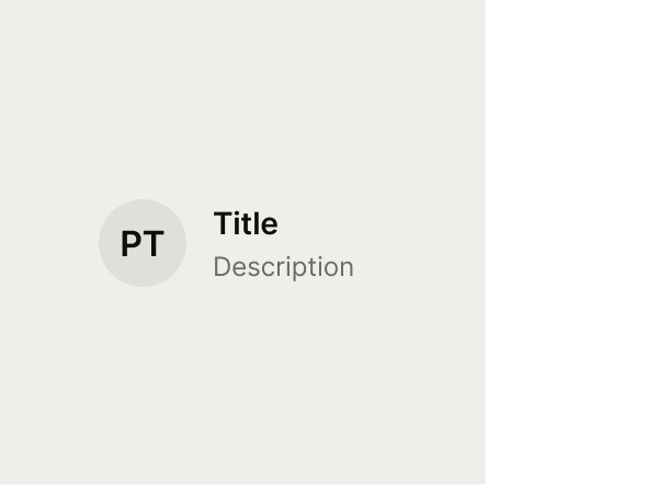


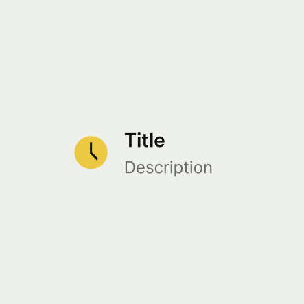
Leading
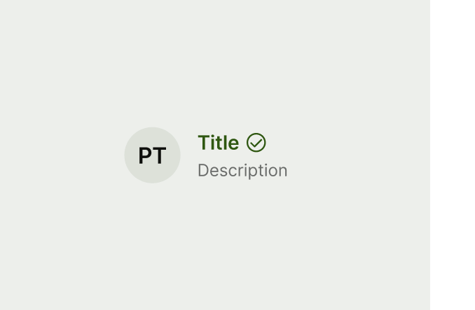
The leading cell is used for your first table cell to lead the rest of the content.
While your leading cell should be used as your first cell type, depending on your use case you can use different cell types as your leading cell.
Leading supports default, error and success states.
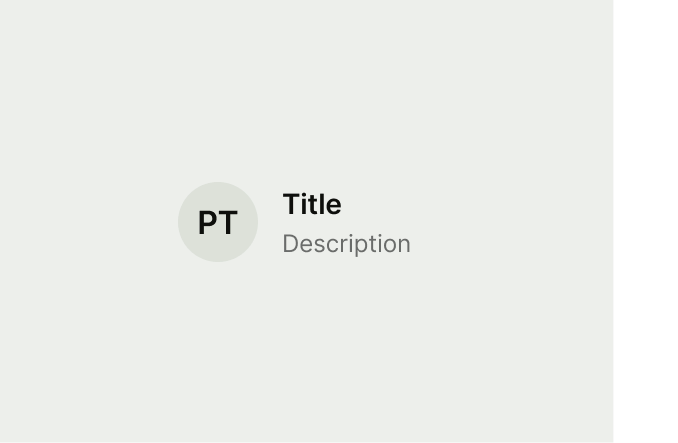
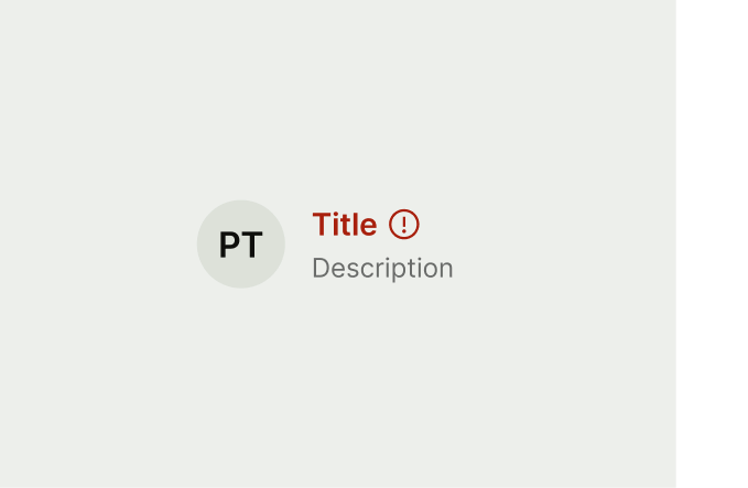
Text
The content cell is used for text based information.
Content supports default, error and success states.



Currency
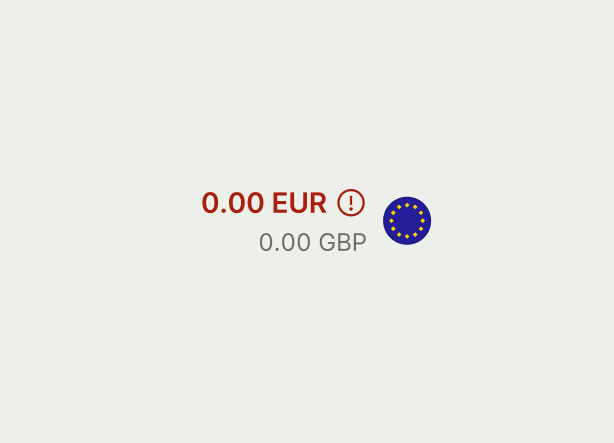
The currency cell is used for displaying currency and currency flags.
This cell is always right aligned to conform to numerical display standards in tables.
Currency supports default, error and success states.


Status
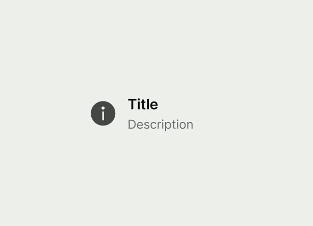
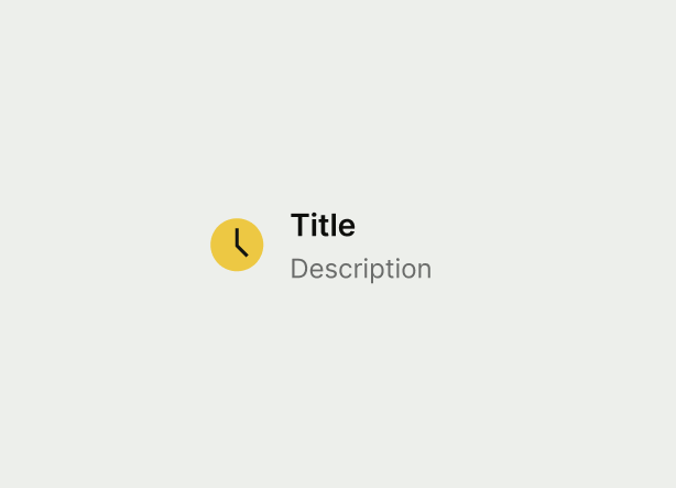
The status cell is used for indicating the status of a row.
Status supports info, pending, warning, error and success states.
Header
Table headers are used for identifying the tables primary content.

