Critical banner

A critical banner tells the user that they need to either unblock their account, or stop it from being blocked or closed.

Critical banner
When to use

Only use a critical banner:

  • if the user's account is blocked or closing (or at risk of either)
  • if the user has a short time frame in which to act
  • if a user's account could be blocked, remain blocked, or closed permanently if they fail to act

Don't use a critical banner:

  • just because the situation is negative (try an alert instead)
  • if the situation relates to just one activity, like a failed transfer
  • if the situation isn’t time sensitive

Best practice
  • Only use one critical banner at a time, and only ever for a single message.
  • Don’t rely on a critical banner — if the situation is urgent, think how else to contact the user.
  • Only include a description when really necessary, like to give a time frame.

Placement

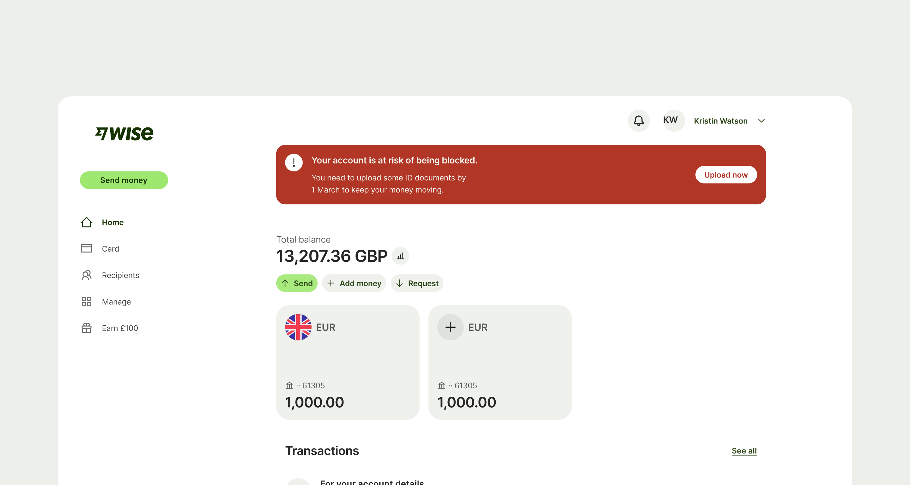
A critical banner should sit across the top of each screen, and be shown on all root screens within the logged in experience (but don’t show it on screens that open on top of other screens).

Critical banner placement top of desktop
Interaction

In most cases, the button should take the user to a screen where they can fix the issue.

In situations where there are multiple things the user might need to do (for example, if their account is closing) consider having the button open a modal, so that you can provide the user with more information.

A critical banner is not dismissible — it should remain until the user has addressed the issue.

Accessibility

When using the critical banner on mobile, keep in mind that its height might change based on the preferred font size that the user has set system-wide for accessibility purposes.

Content

Title

Title copy should:

  • explain the situation and what the user needs to do

  • be short and clear

  • be 1 or 2 full sentences

  • use plain language

  • be in the active voice

  • be in sentence case

  • have a full stop

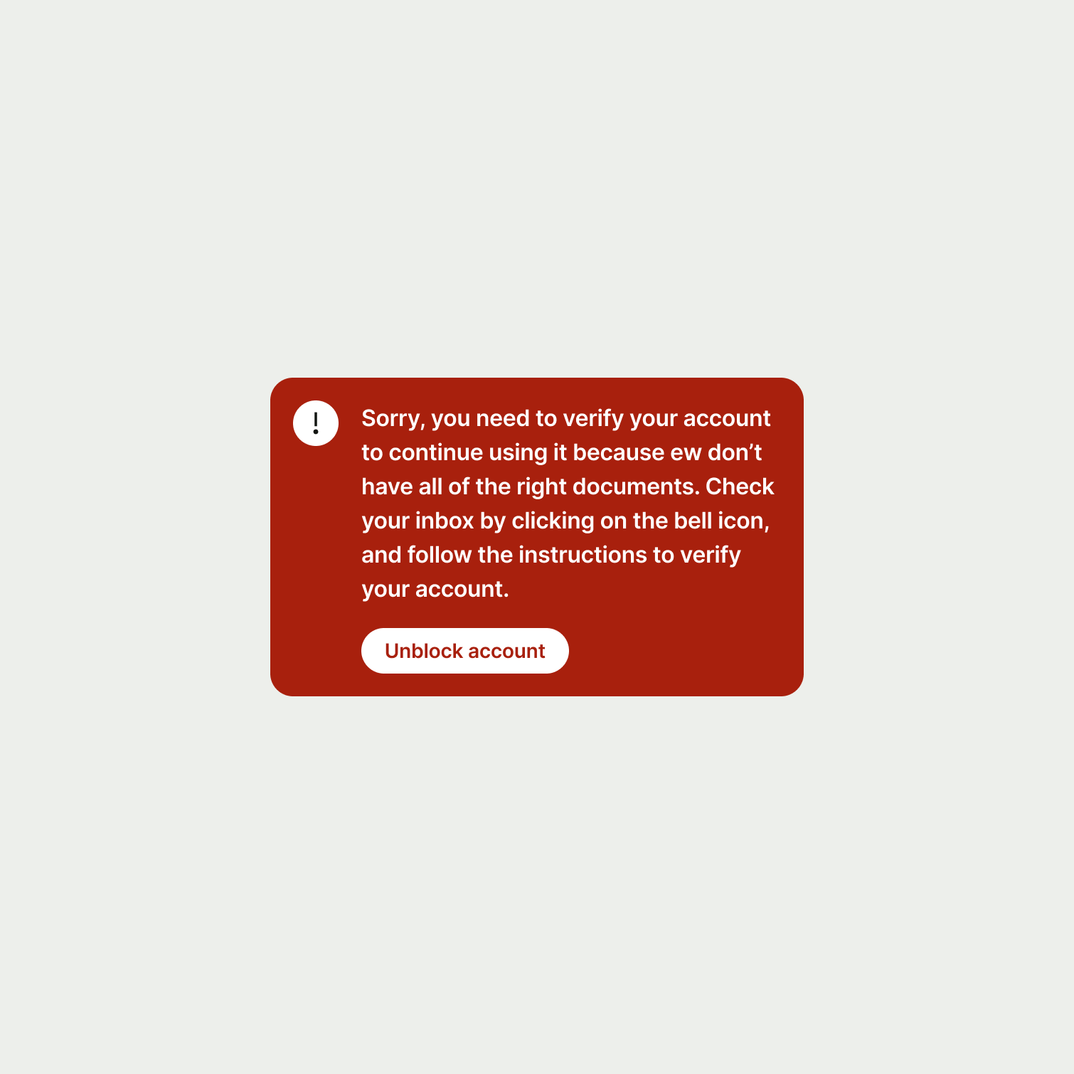
A critical banner with a very long title.
A critical banner with a short and succinct title.

Description (optional)

Description copy should:

  • give the user a time frame in which to act

  • be short and clear

  • be 1 sentence

  • use plain language

  • be in sentence case

  • have a full stop

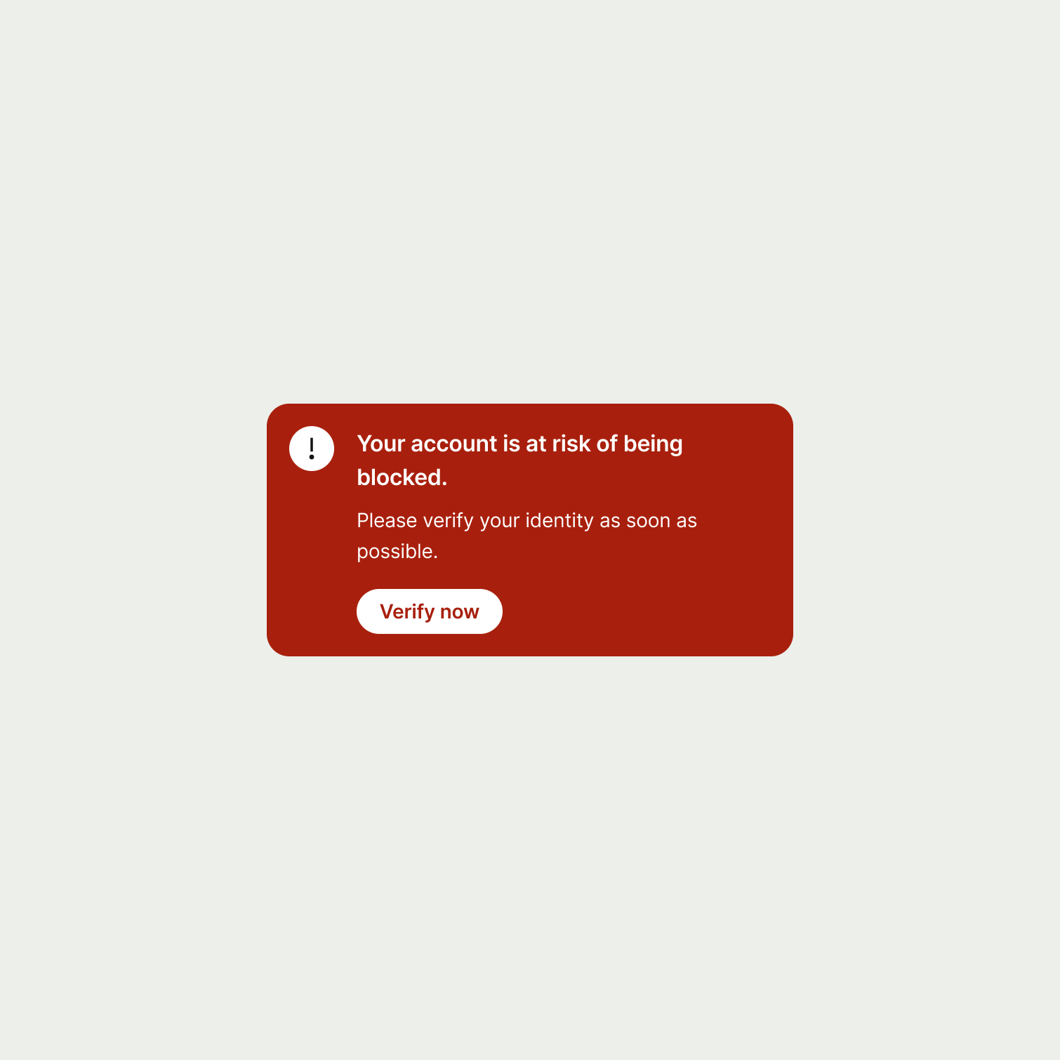
A critical banner with a description that doesn't mention a time frame.
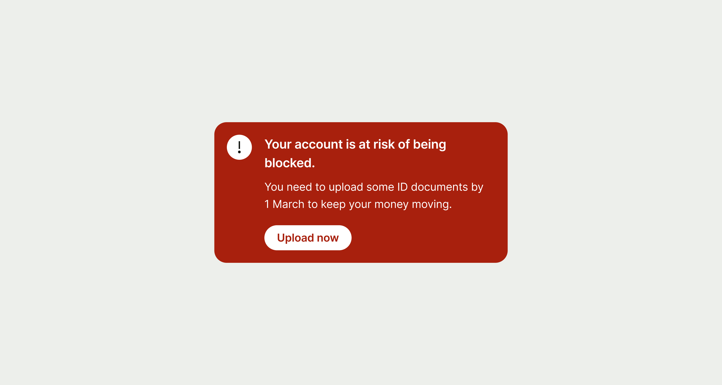
A critical banner with a description that mentions a time frame.

Button

Button copy should:

  • start with a verb, like ‘Pay’ or ‘Send’

  • be just a few words (ideally 1 or 2)

  • describe the action (if someone only reads the button, they should know what will happen next)

  • connect to the content around it — for example, it might use the same words as the title

  • avoid using first person pronouns like ‘me’, ‘my’ and ‘I’

  • be in sentence case (only capitalise the first letter of the first word)

  • have no full stop

Content patterns

Suggested copy for common scenarios where a critical banner might be used.

Account blocked

A user won’t be able to use their account when it’s blocked, and any existing activities — like transfers or direct debits — will also fail.

So as well as the critical banner, you should consider using contextual alerts or emails to tell the user about specific activities that need their attention.

Title

Description

Button

We’ve temporarily blocked your account because [reason].

N/A

Unblock account

Your account is at risk of being blocked.

You need to [action] by [date] to keep your money moving.

[Action]

Availability

Platform

Available

Android

iOS

Web