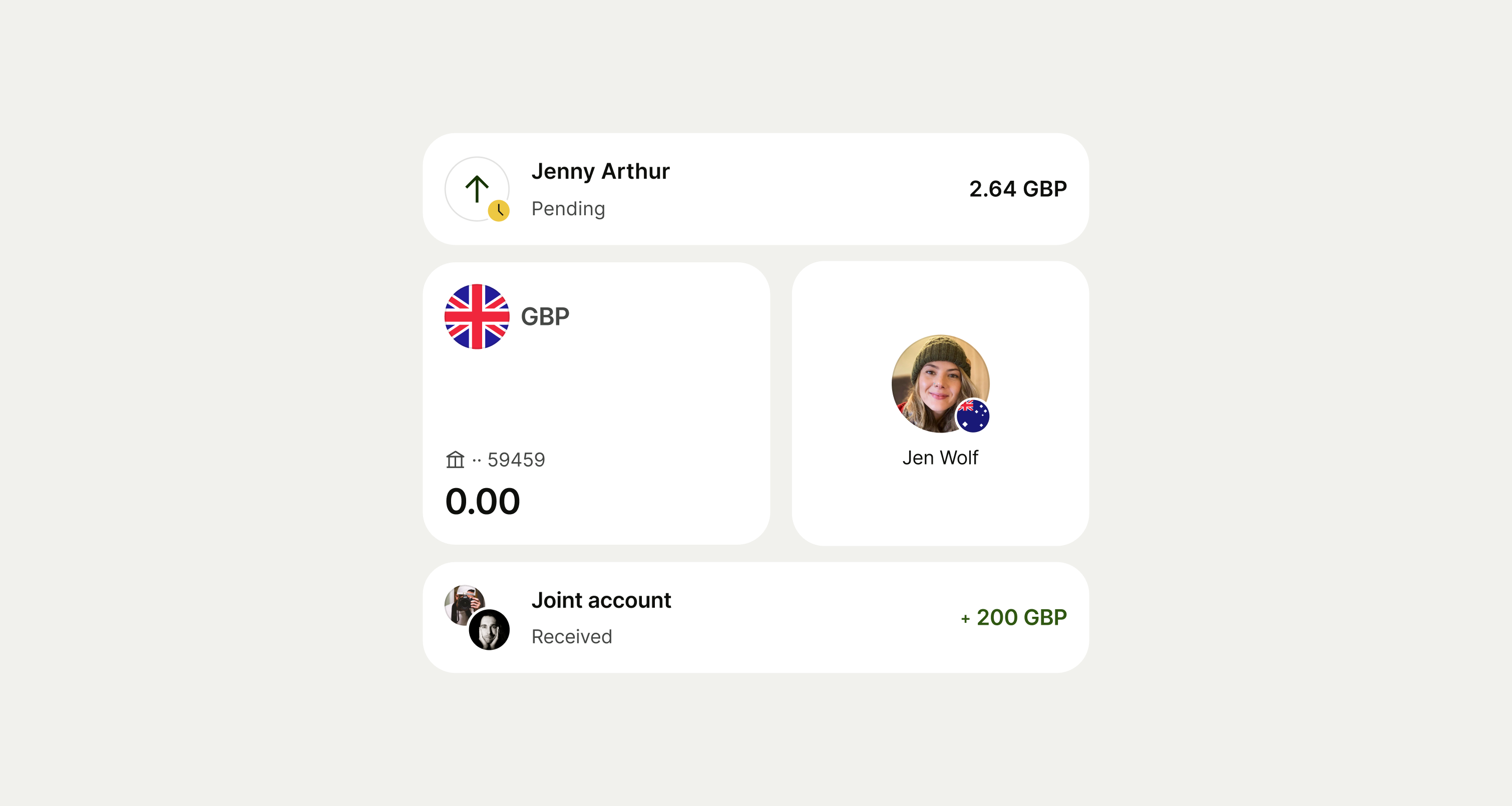
An avatar is a representation of a unique entity — like a person, a business, or an object. It can contain initials, images, icons, or flags.
Supported sizes are 16, 24, 32, 40, 48, 56, and 72.
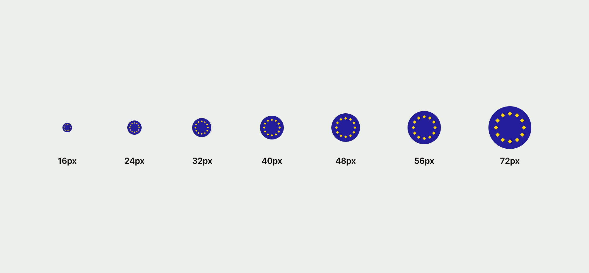
Avatar sizes
List item supports five different avatar sizes with 48px as the default, other avatars supported include 32px, 40px, 56px and 72px.
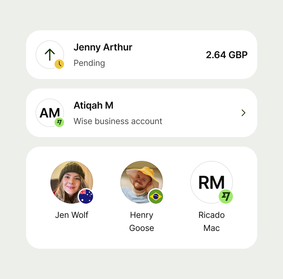
There are 4 media types available for avatar. Image, flag, icon and text.




Image
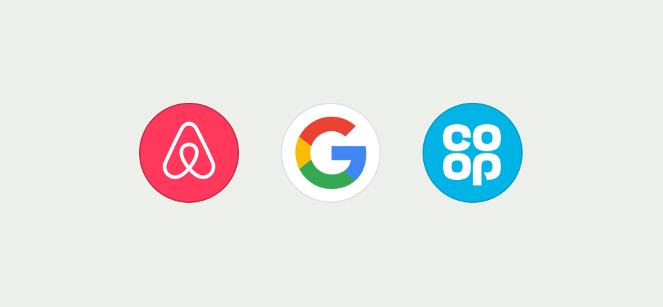
Images are used to represent either a person or a brand by utilising their logo.
- If no profile image is available fallback to initials on the text avatar type.
- If no logo is available fallback to category icon on the icon type.
- Do not stretch or allow logos to bleed outside of the avatar shape.



Flag
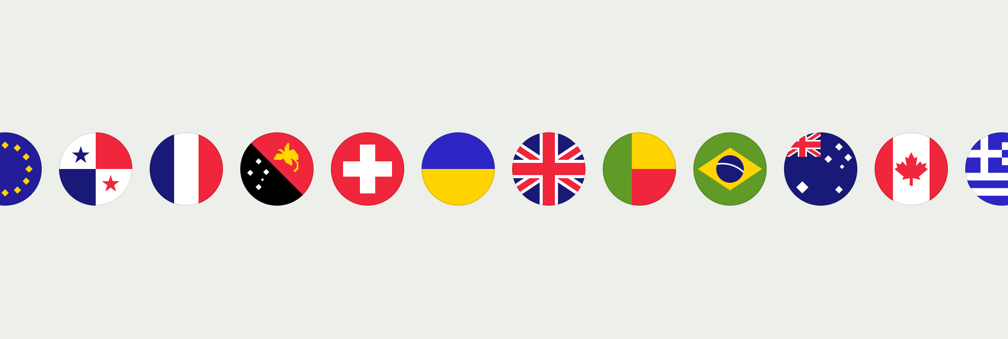
Flags are used to represent either a currency or a country. We support all global flags in our libraries.
Icon
Icons are used to illustrate information or as an entry point.
Icon avatars come in an interactive and non interactive state, see more information under interaction.
- Use icons that clearly represent the action being presented.

Text
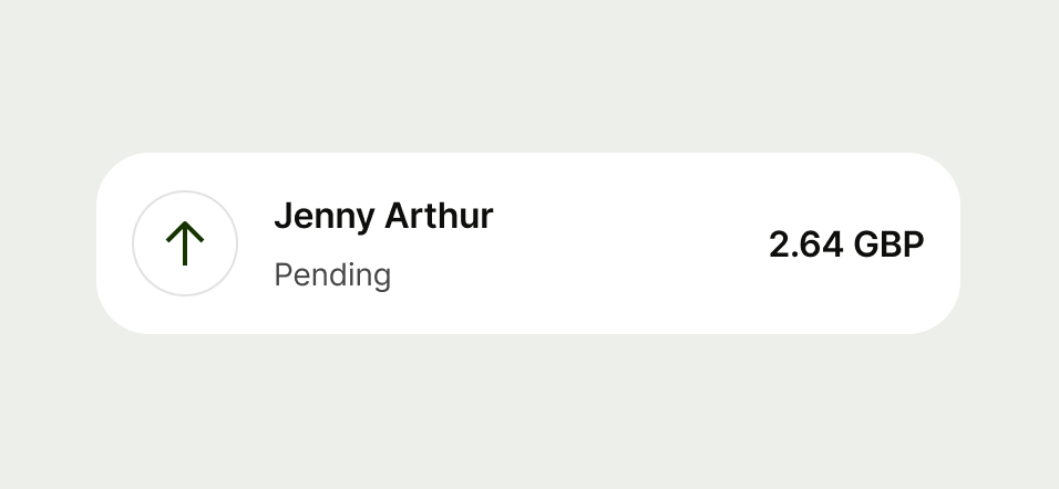
Text is used to represent a person or to showcase there are more than 2 items in a collection on a double avatar.
Text avatars come in an interactive and non interactive state, see more information under interaction.
Size 16 avatar does not support the text variant as it doesn’t pass accessibility standards.
- Use text for initials
- Use text to reflect more than 2 items in a double avatar
- When you need to display more than 9 additional items display it as +9
- Don’t add more than 2 characters


There are 2 different types of avatar with multiple subtypes underneath each.


There are 3 types of single avatar, standalone, with a badge or with a notifications.


Standalone
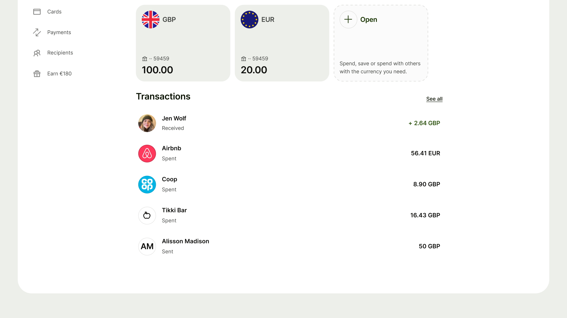
When you need to make it easier for a user to identify content, like a recipient or currency.
With badge
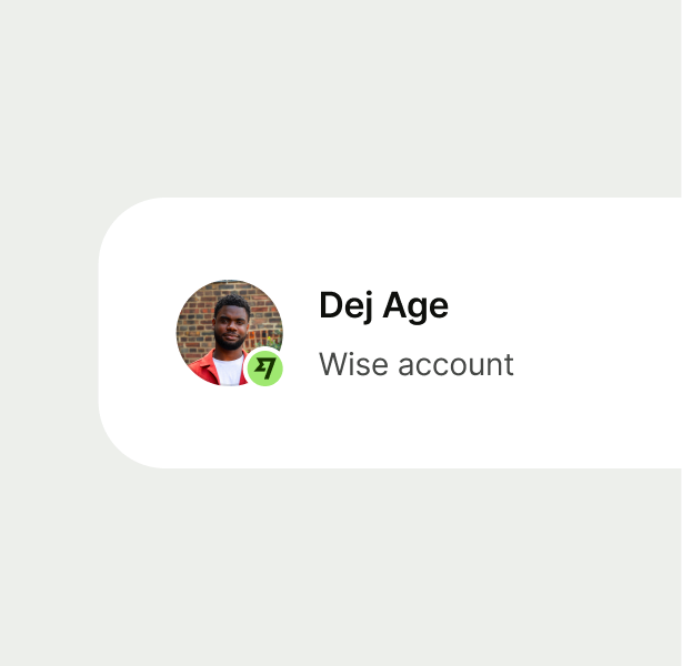
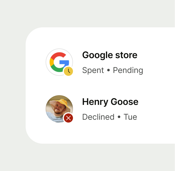
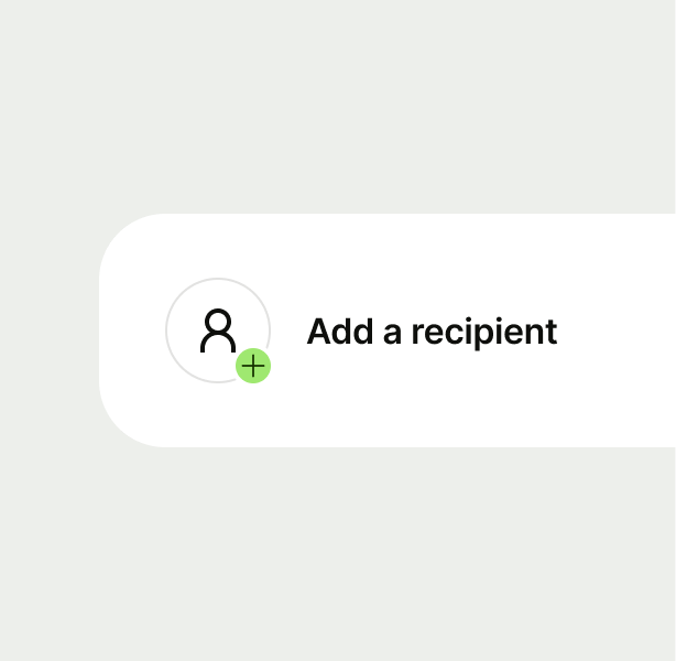
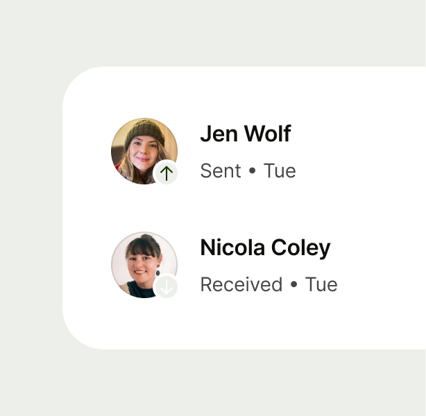
Badges contain additional information to support avatars, such as flags, the Wise logo, images, statuses actions and references.
There are 6 different types of badges you can use.



With notification
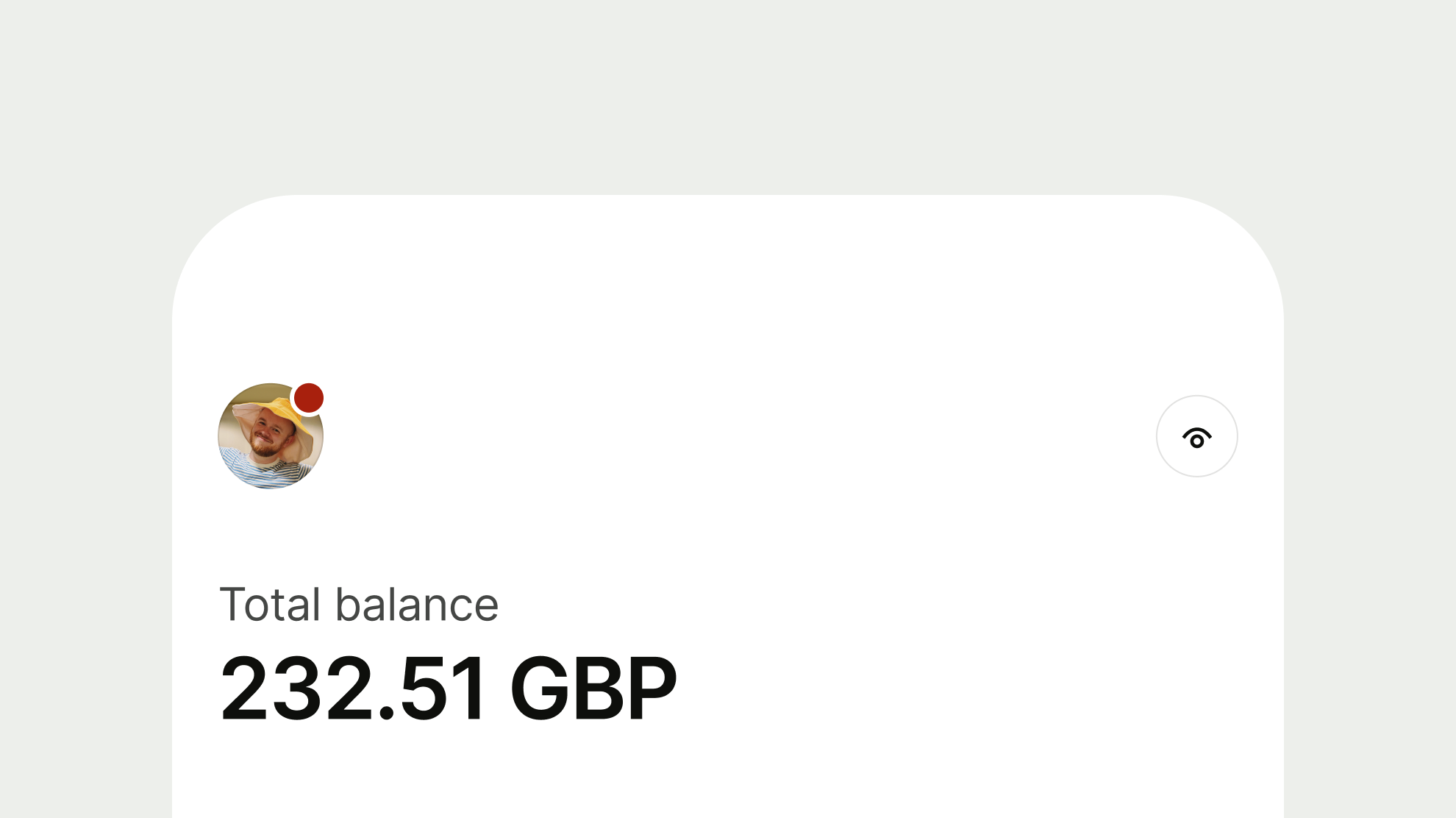
Notifications are used to indicate to the user that there is a notification behind the avatar that requires their attention.
These are primarily used for the profile avatar.
Double avatars are used when you need to display more than one avatar at the same level of hierarchy.
This can be useful for representing recipient and currency or for currency conversion.


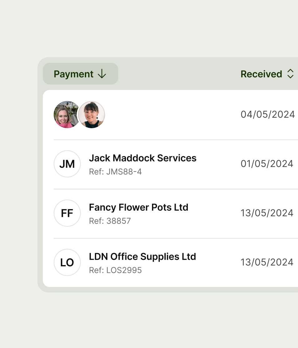
Double horizontal
When you don’t need to retain width alignment with other avatars to keep content aligned — for example in action buttons or tables.

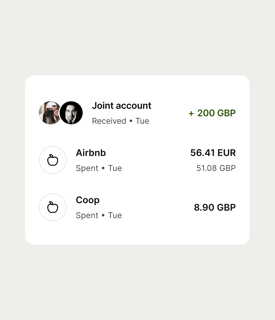


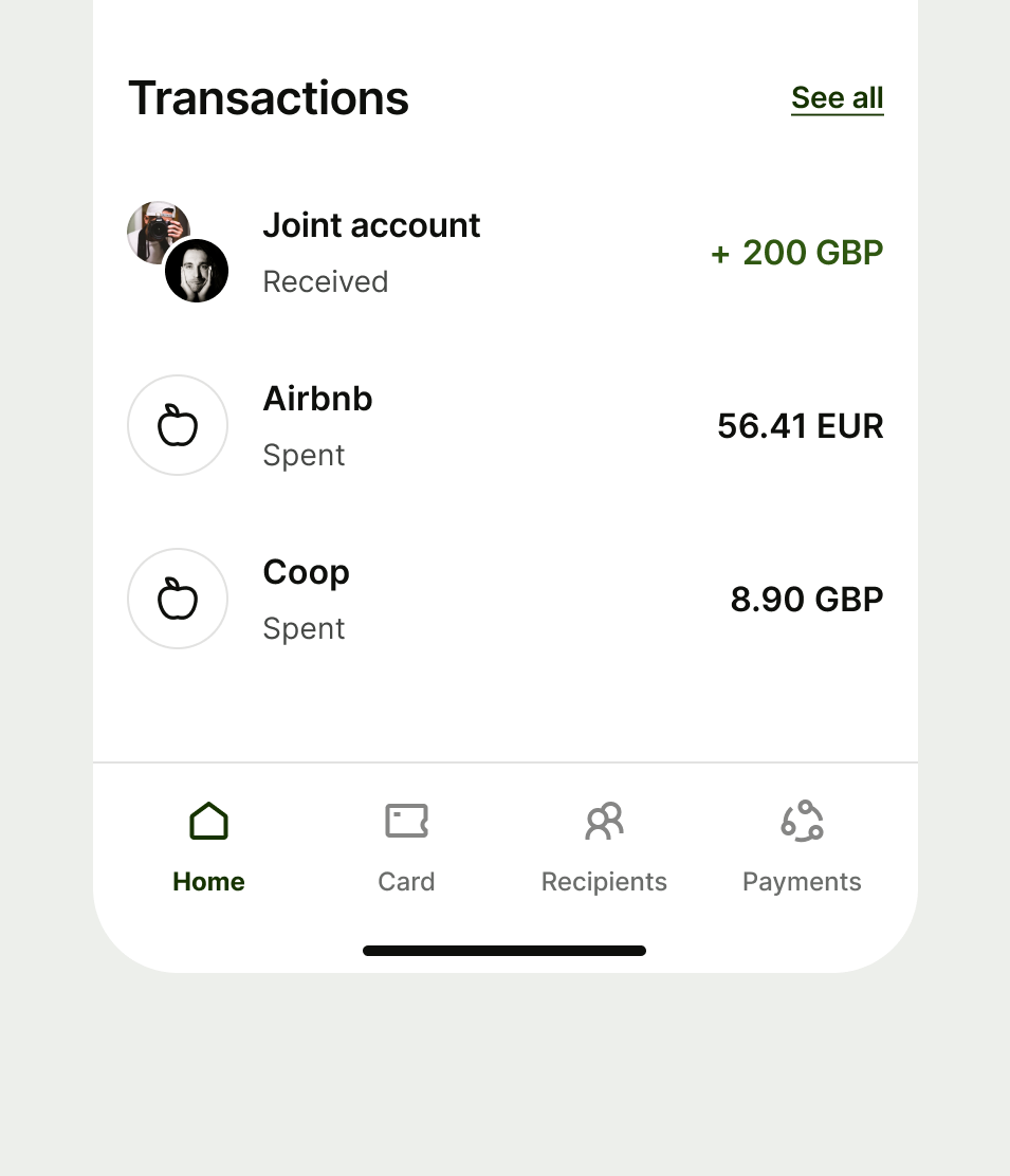
Double diagonal
Use when you need to retain width alignment with other avatars — for example in navigation options.

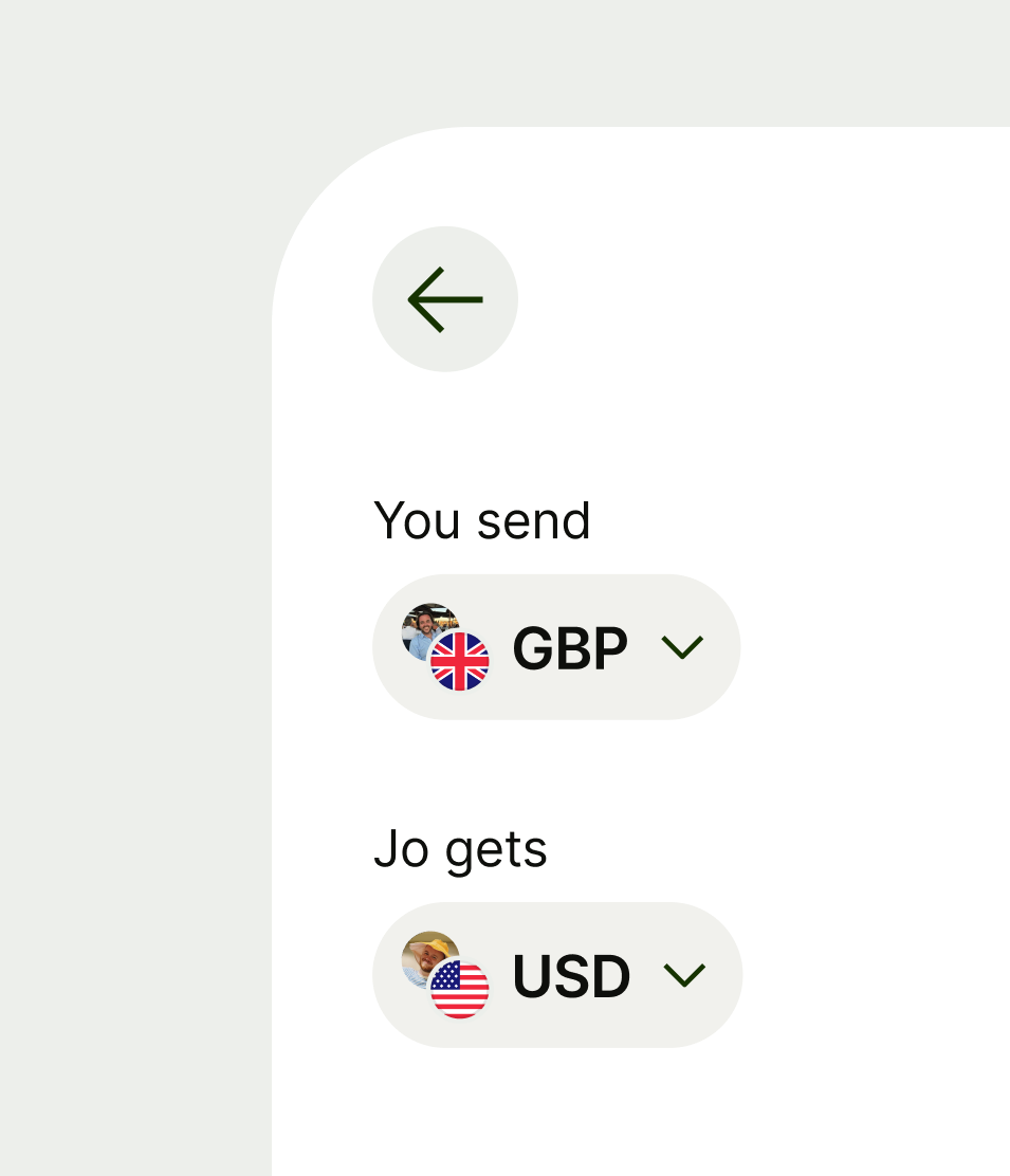
Avatar is used as supporting information, and can be interactive depending on the content it’s paired with or the context it’s in.
- Use interactive avatar as a standalone interactive component acting as a button.
- If the avatar is sitting in an interactive surface use a non-interactive avatar.
These rules only apply to the initials and icon variation of avatar.

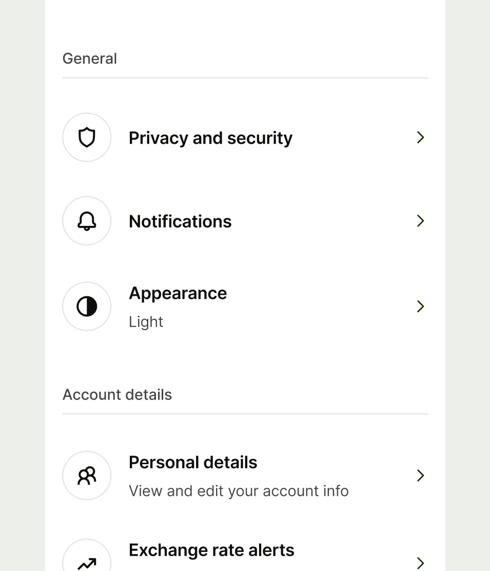
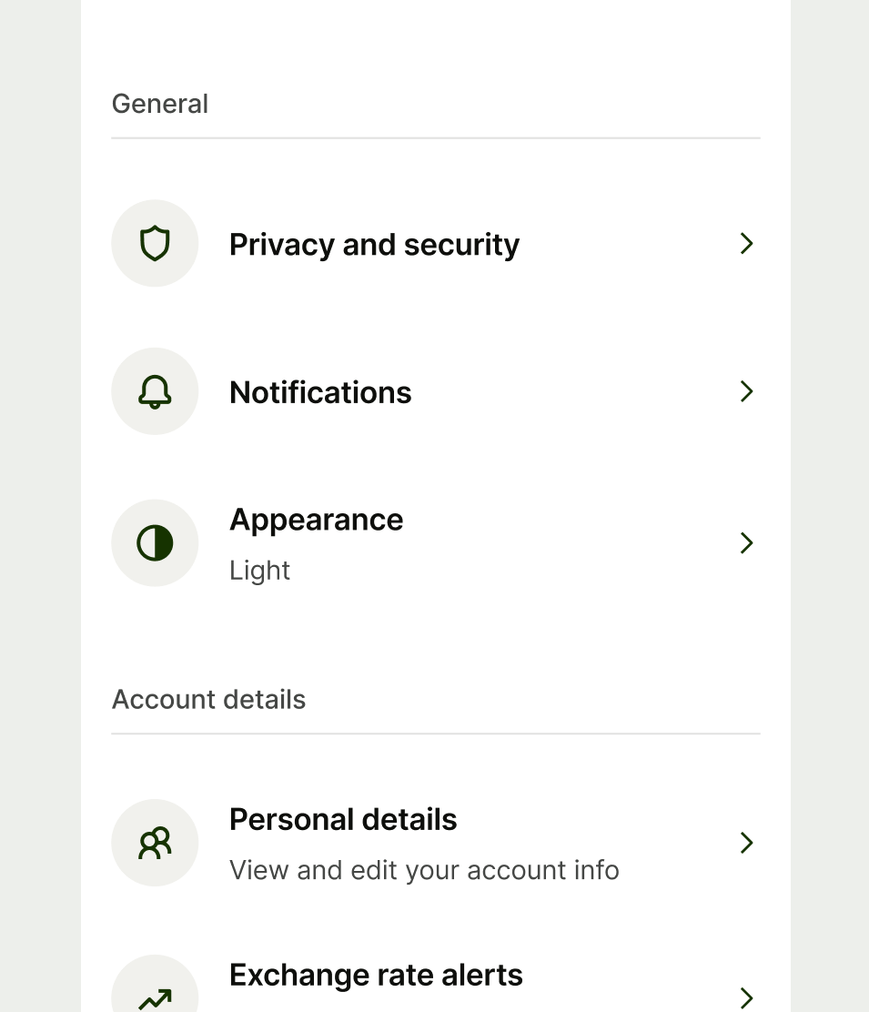
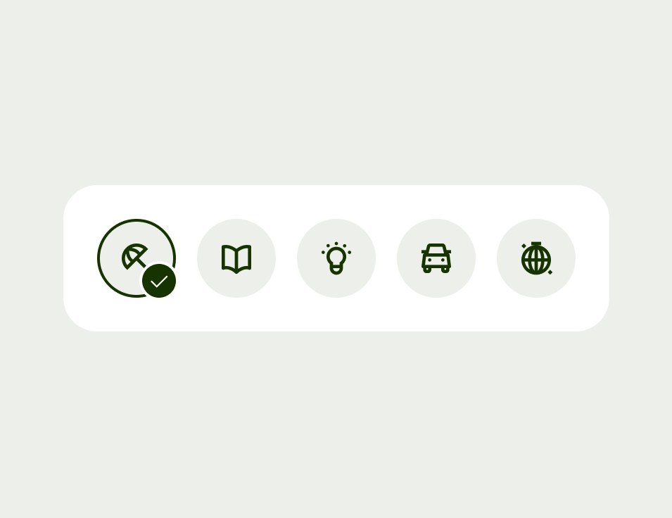
Selected
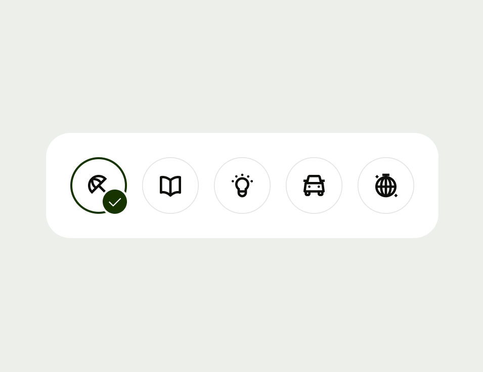
Avatars have an optional selected state which can be used when you’re selecting from a list of options. For example choosing a spending category or an icon for your Jar.
Selectable avatars always need to use the interactive background state.
Never use an avatar in isolation without copy or interaction cues (such as a chevron icon). This is so that they are clearly identifiable, and aid comprehension and interaction.
Platform | Available | Developer documentation |
|---|---|---|
Android | ||
iOS | ||
Web |