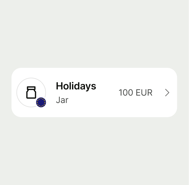
List Item

List items let users review or select options from a dynamic list, adaptable to different use cases.

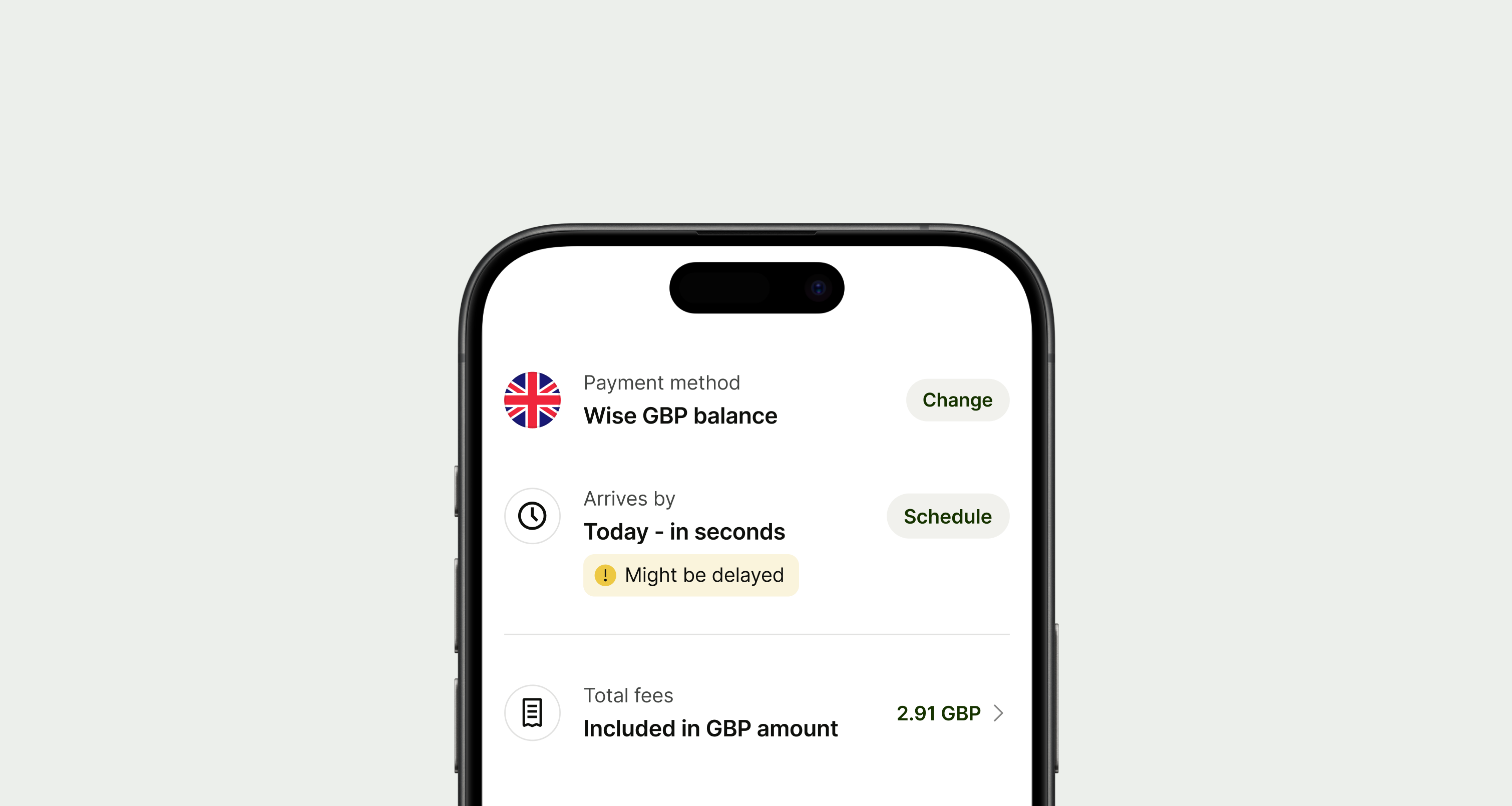
List Item hero image (list items on a phone)
When to use

Use a list item when you want to display different options grouped as a list.

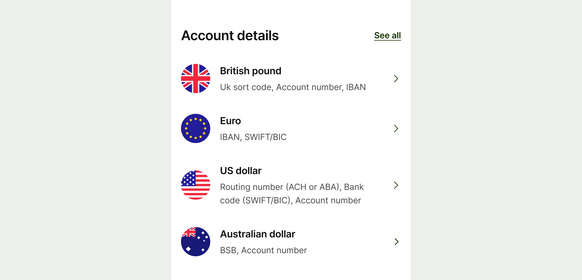
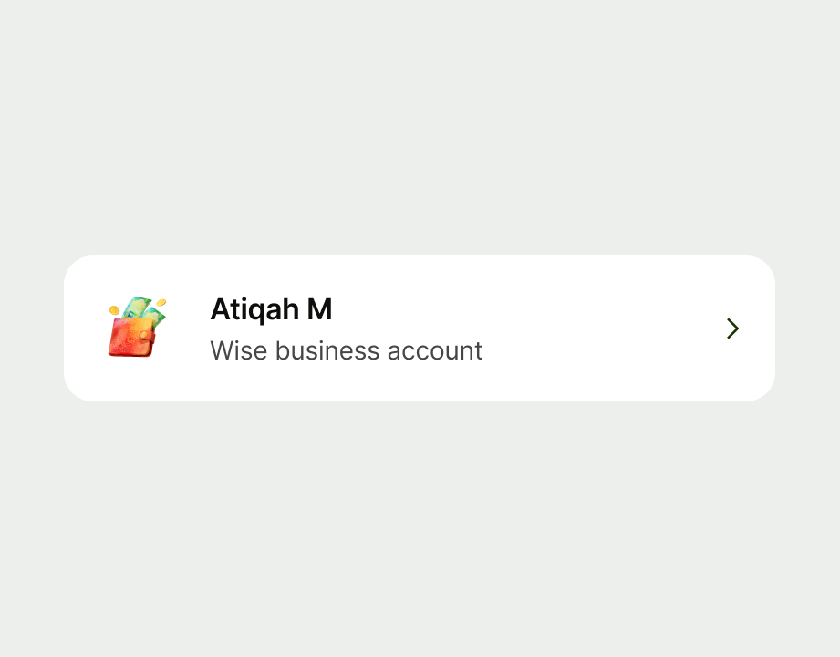
A list of list items on account selection page
Types

There's six ways to use a list item — navigation, radio, checkbox, switch, icon button and button.

When a list item is non-interactive with no accessory, it should only display information.

  • Use section headers to separate lists with different accessory types on the same page.
  • Don’t mix different accessory types in the same list

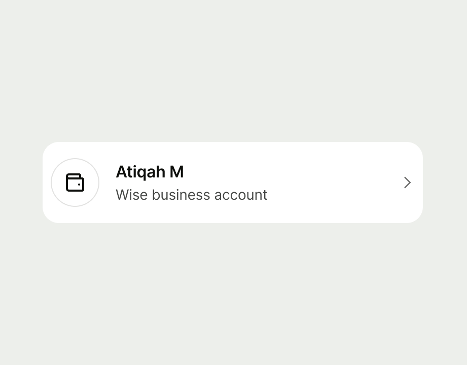
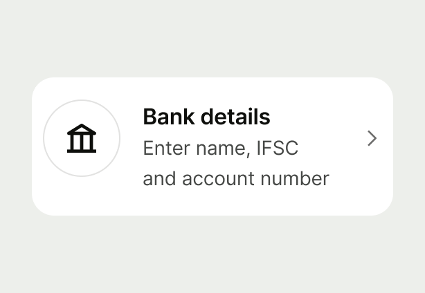
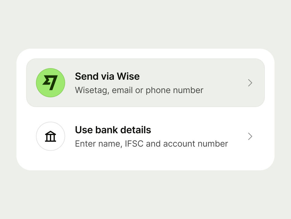
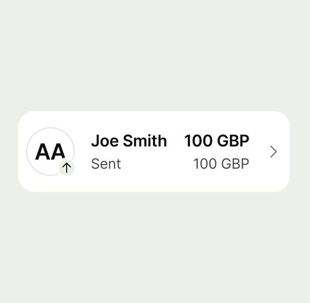
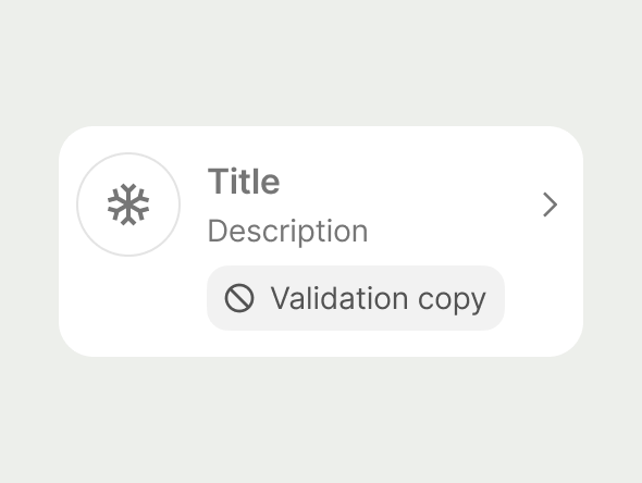
List Item Navigation example
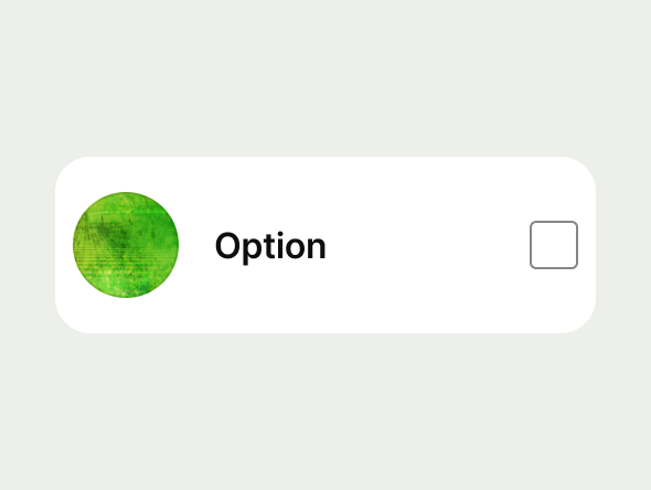
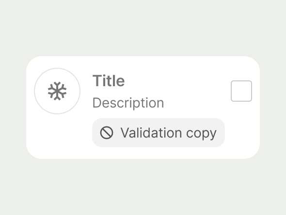
ListI tem Checkbox example
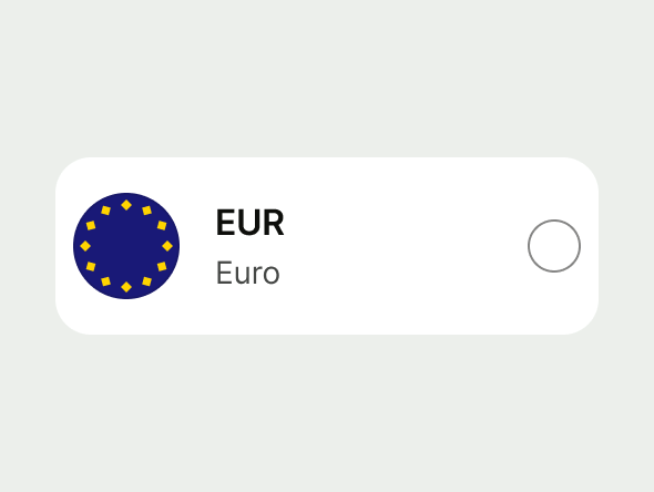
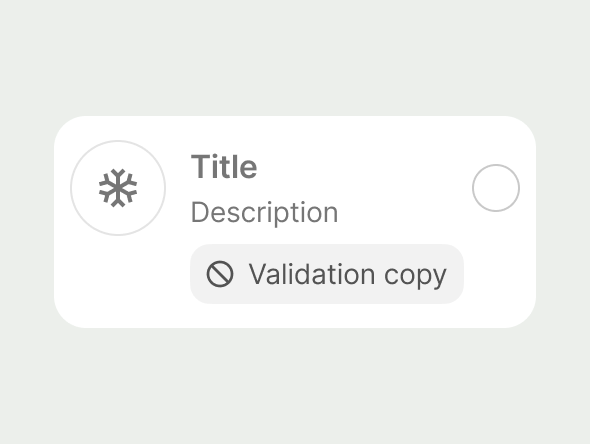
List Item Radio example
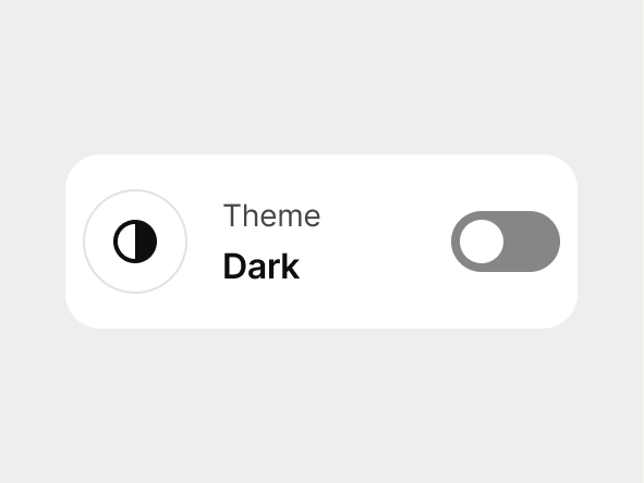
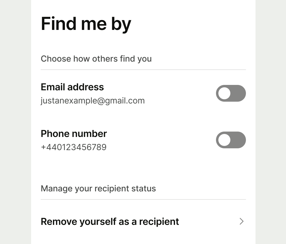
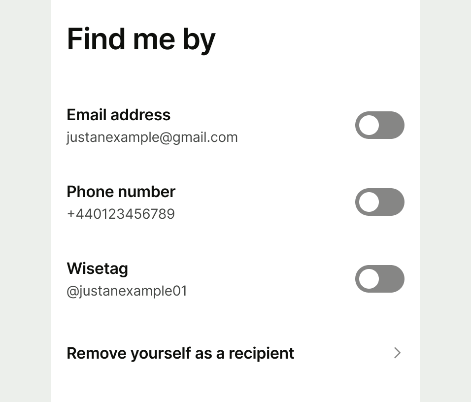
List Item Switch example
List Item Button example
List Item Non Interactive example
Do example for section headers
Don't example for mixing different types of list items
Avatar

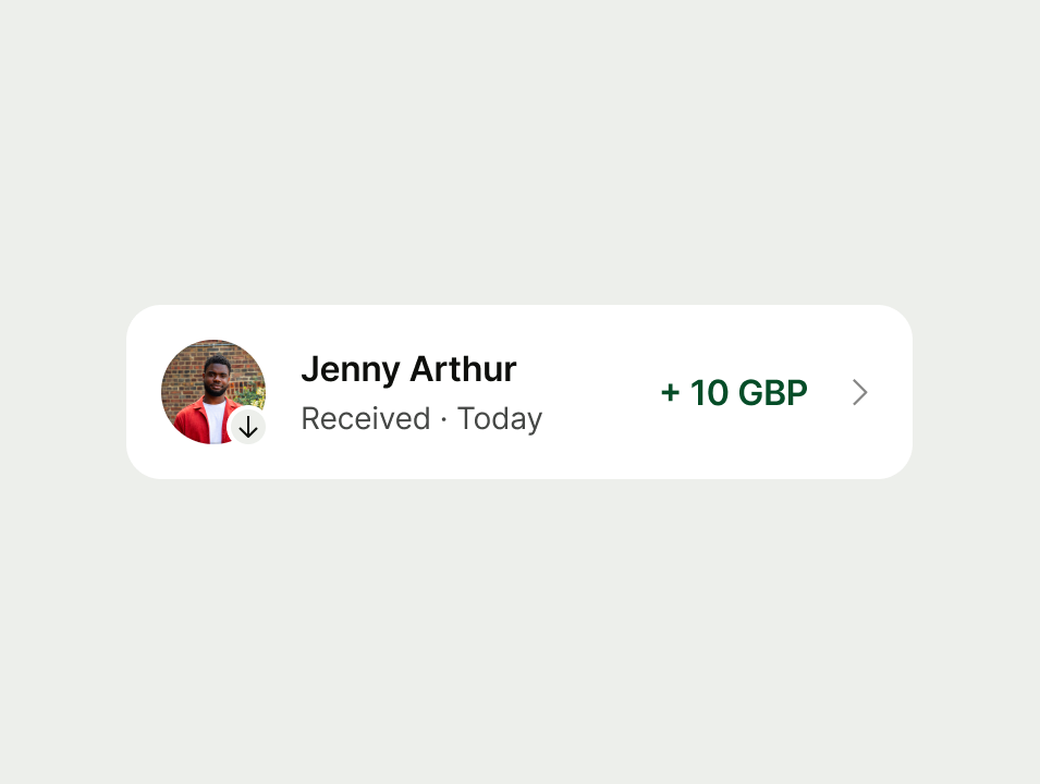
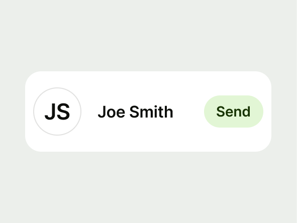
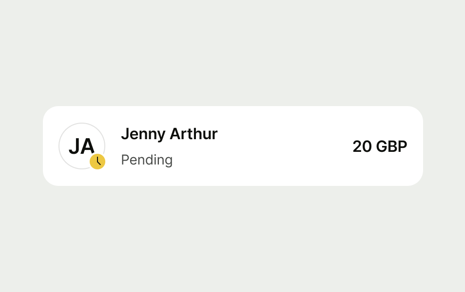
Avatars are optional and are used as a visual aid to the list item.

Refer to the Avatar usage guidance.

Do:

  • Use relevant media to support content

Don't:

  • Use an illustration in place of the avatar

example of a list item with an avatar
example of how to use an avatar in a list item
example of how not to use an illustration in a list item

Avatar sizes

List item supports five different avatar sizes with 48px as the default, other avatars supported include 32px, 40px, 56px and 72px.

32px avatar examples
40px avatar example
48px avatar example
56px avatar example
72px avatar example

Double avatar

Do:

  • Use double horizontal avatars where more prominence is required, outside of a list
  • Use double diagonal avatars in lists with single avatars

Don't:

  • Don’t mix double horizontal with double diagonal or single avatars

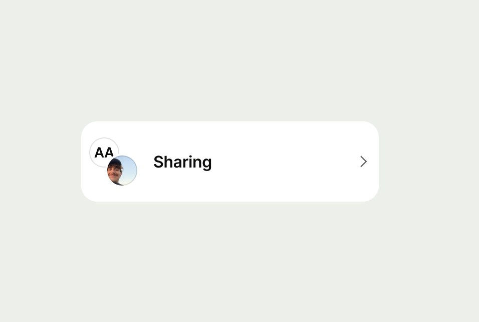
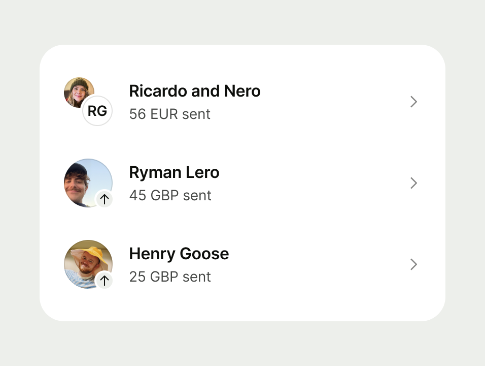
diagonal avatar list item example
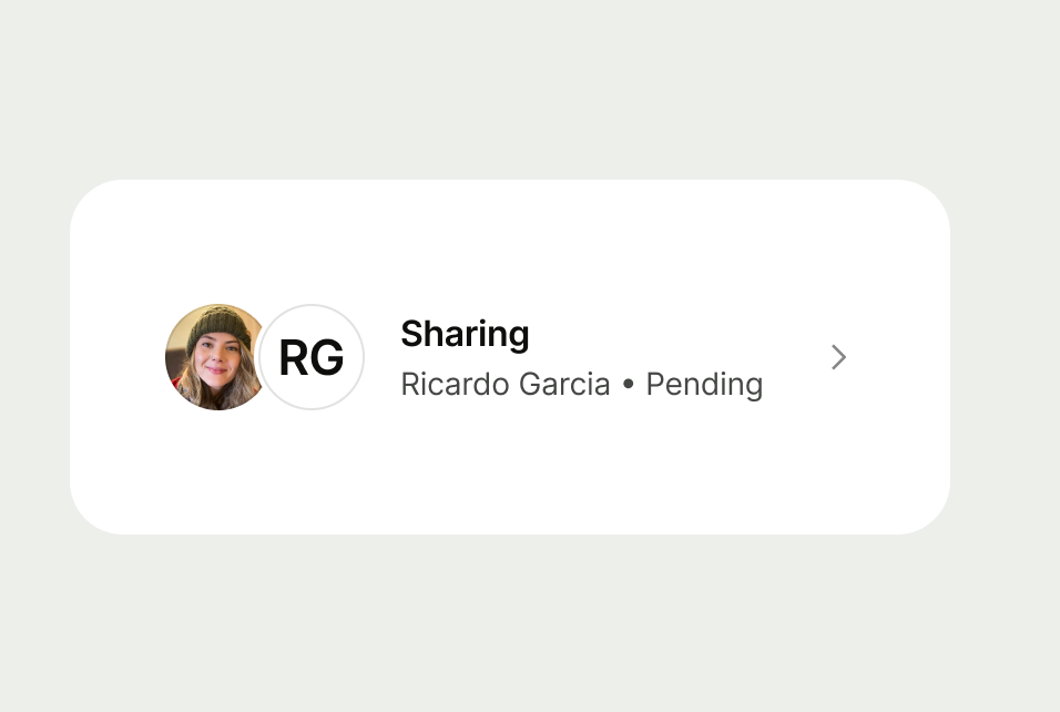
horizontal avatar list item example
do example for diagonal avatars
don't example for double avatars
Prompt

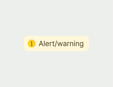
There are 4 different sentiment types for the inline prompt — neutral, positive, warning and negative.

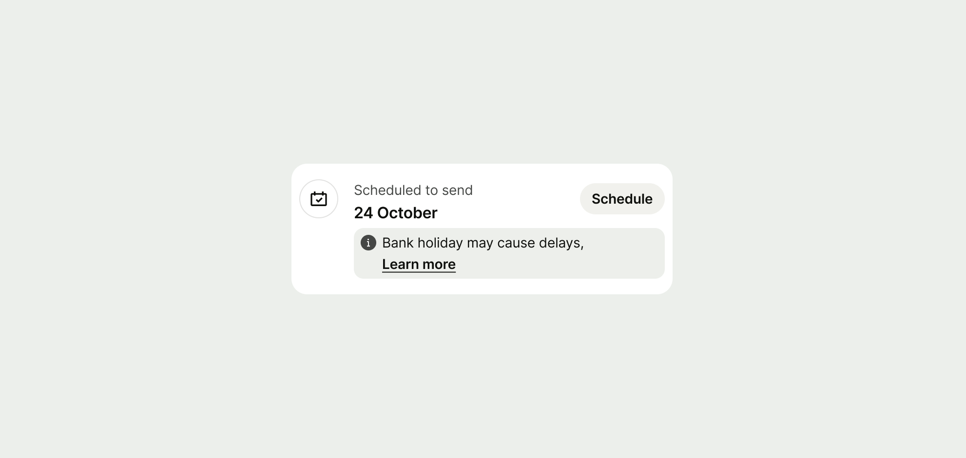
neutral prompt example
positive prompt example
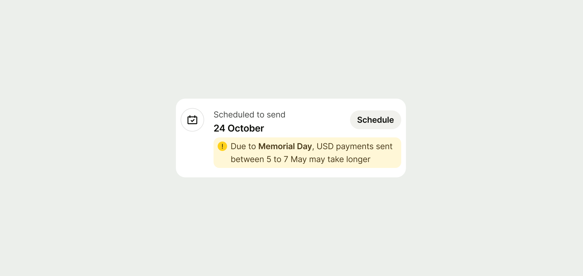
warning prompt example
negative prompt example

Single line

When the content is short and succinct, the container adjusts to match the width of the content.

single line prompt example

Multi-line

When the content has multiple lines the validation will stretch to the full width (minus the Avatar).

Multi-line prompt example
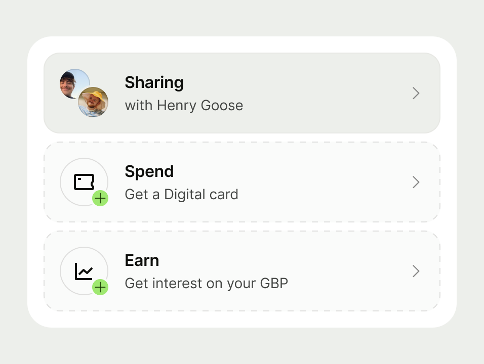
Spotlight

Interactive list items can alternatively be displayed with a spotlight.

Inactive

Use to suggest an action the user hasn't done

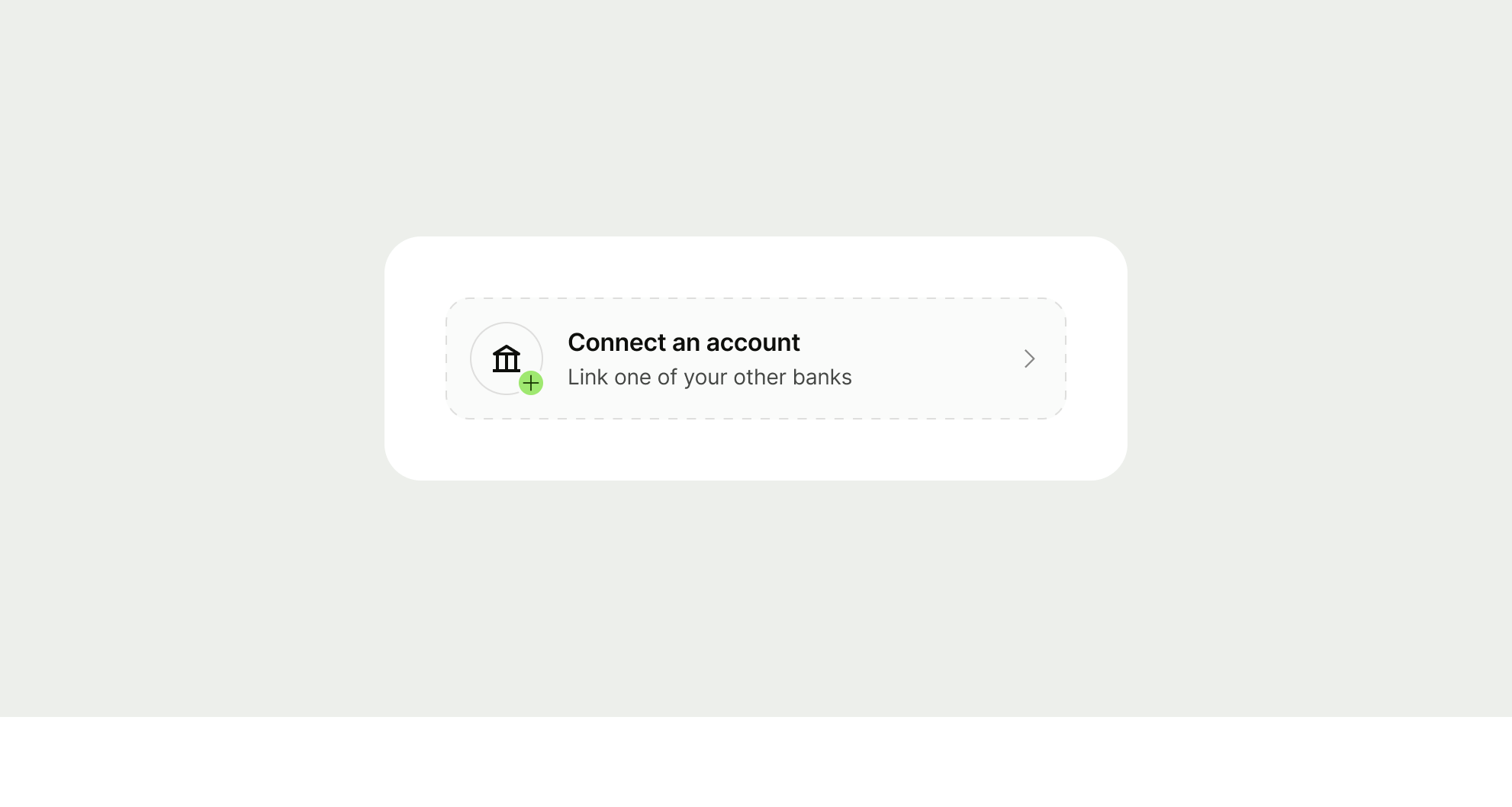
inactive spotlight example

Active

Use to show an option the user has activated

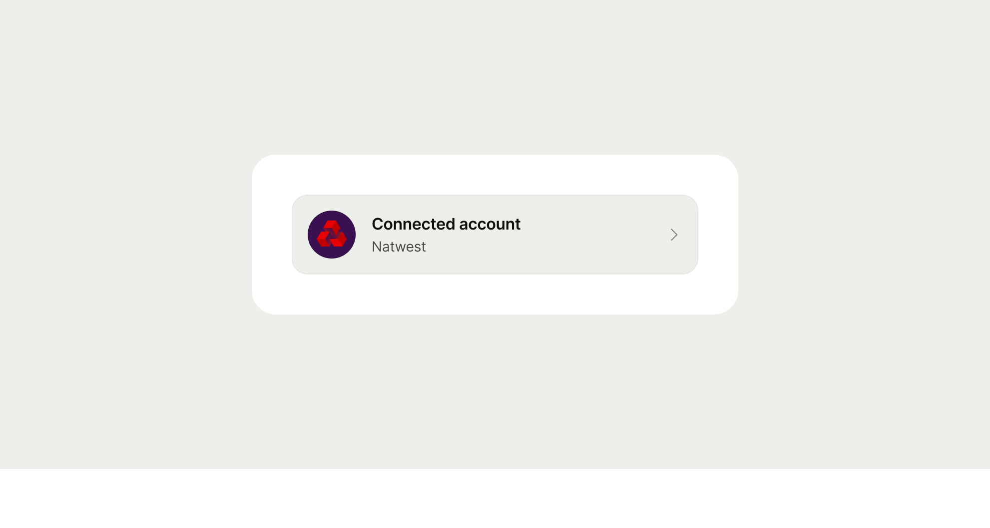
active spotlight example
do example for spotlight
don't example for spotlight
Interaction

The list item can be either fully or partially interactive based on the accessory used and the use case.

Don't:

  • Combine fully interactive and partially interactive list items in the same list

Fully interactive

All accessories will make the list item fully interactive by default.

Interacting anywhere on the list item will trigger both the full components associated state as well as the state of the associated accessory.

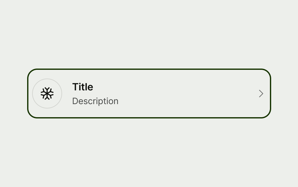
Fully interactive list items are supported by hover, active, disabled and focus states.

fully interactive hover state
fully interactive active state
Fully interactive disabled state
fully interactive focus state

Partially interactive

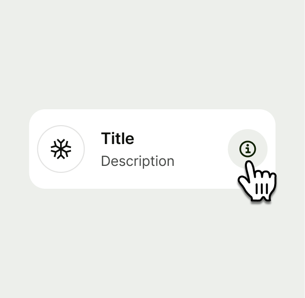
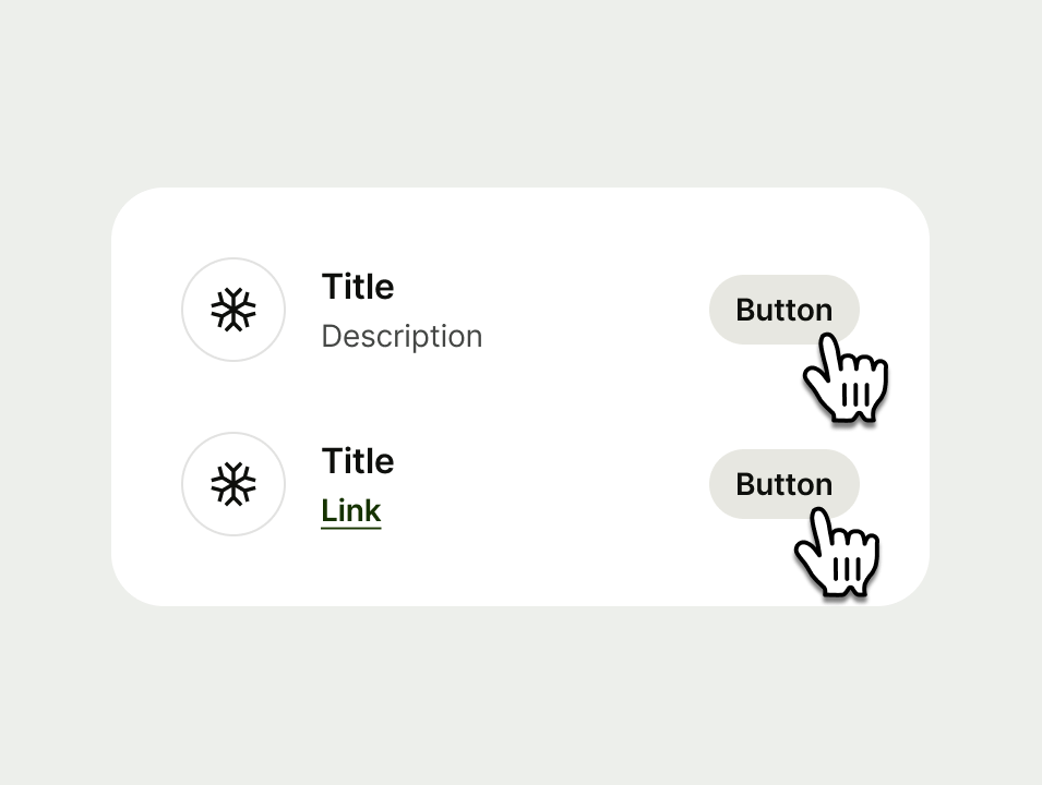
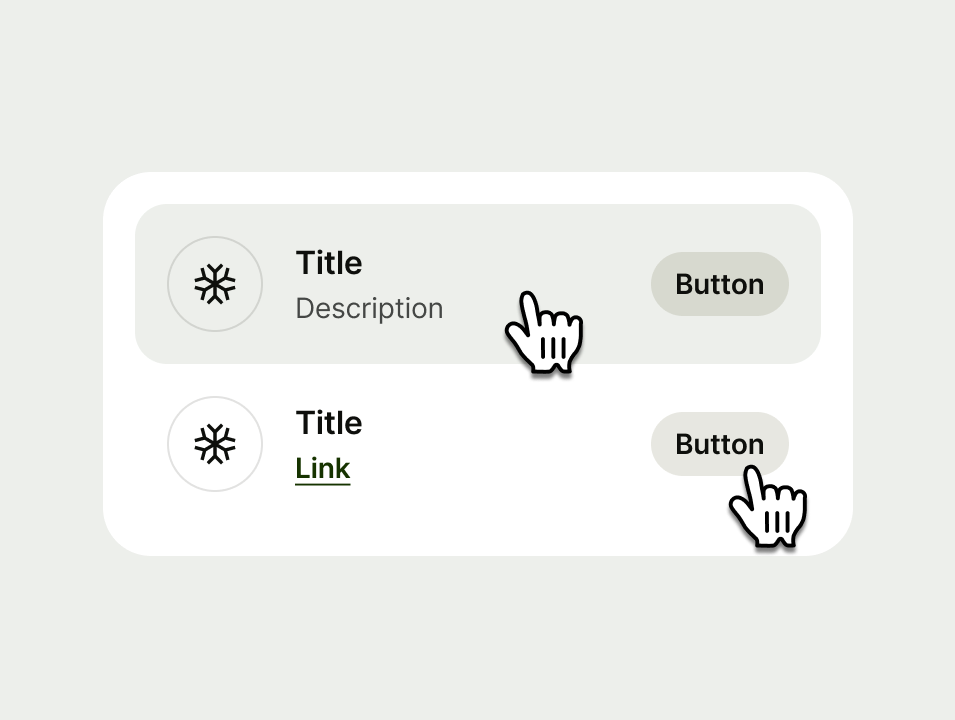
Icon button and button accessories can also be partially interactive, where the touch area area is targeted on the accessory.

The interaction states of these areas depend on the style of the component or text link. Here's how it works:

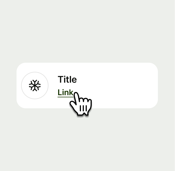
  • Non-interactive list items without any accessory can include inline links.

  • Icon button and button can optionally target specific touch areas.

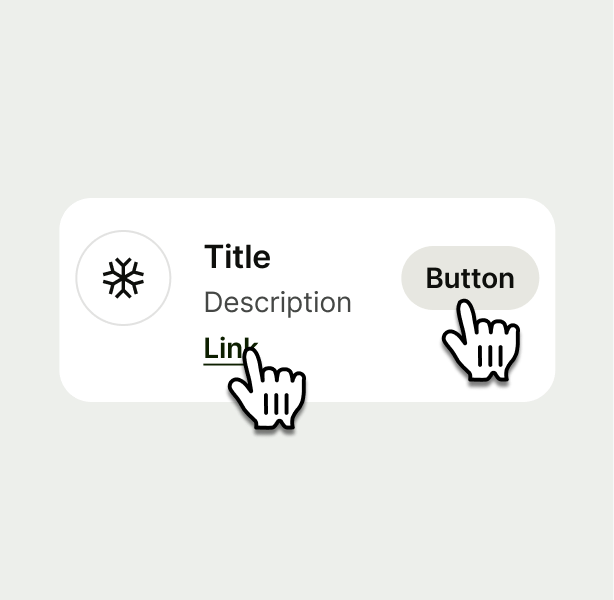
  • If a button or icon button list item includes both inline links and accessories, it must be set to partially interactive.

an interactive pointer gloved hand hovering over a link
a gloved hand hovering over the icon button
two gloved hands, one over button and one over link
two list items, both partially interactive
a fully interactive list item above a partially interactive list item
Content Hierarchy

List item supports default and inverted title and description to allow for further flexibility in the component.

Default content hierarchy on a list item
Inverted hierarchy on a list item

Default values

Title and description values are supported on the default hierarchy of list item.

They can be used together or in isolation dependant on your use case.

Both title and description values support sentiment colours as vwell as strikethrough and bold styles.

list item with title and subtitle
list item with only title
list item with only description

Inverse values

Only the title value is supported on the inverse hierarchy of list item.

list item with inverted values
Content

List item supports title, description, supporting info and values.

Title

Title copy should:

  • be just a few words

  • put the most important words first

  • summarise or introduce the content it relates to (imagine the user only reads the title)

  • be a statement rather than a question (unless the content is asking the user something)

  • be in sentence case (only capitalise the first letter of the first word)

  • have no full stop

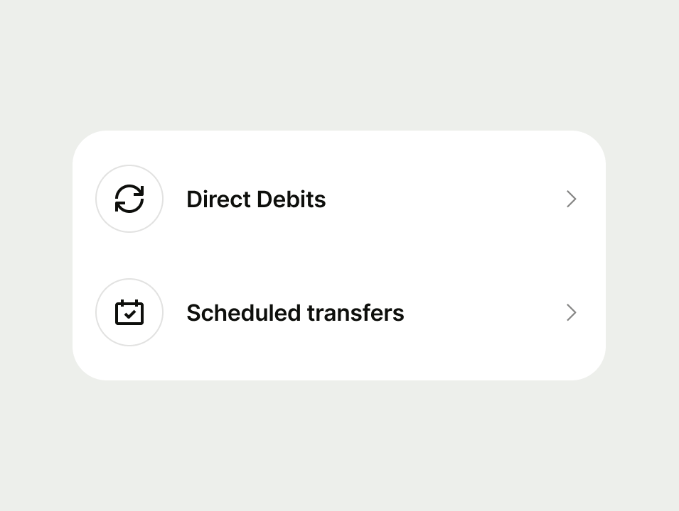
list items with good titles
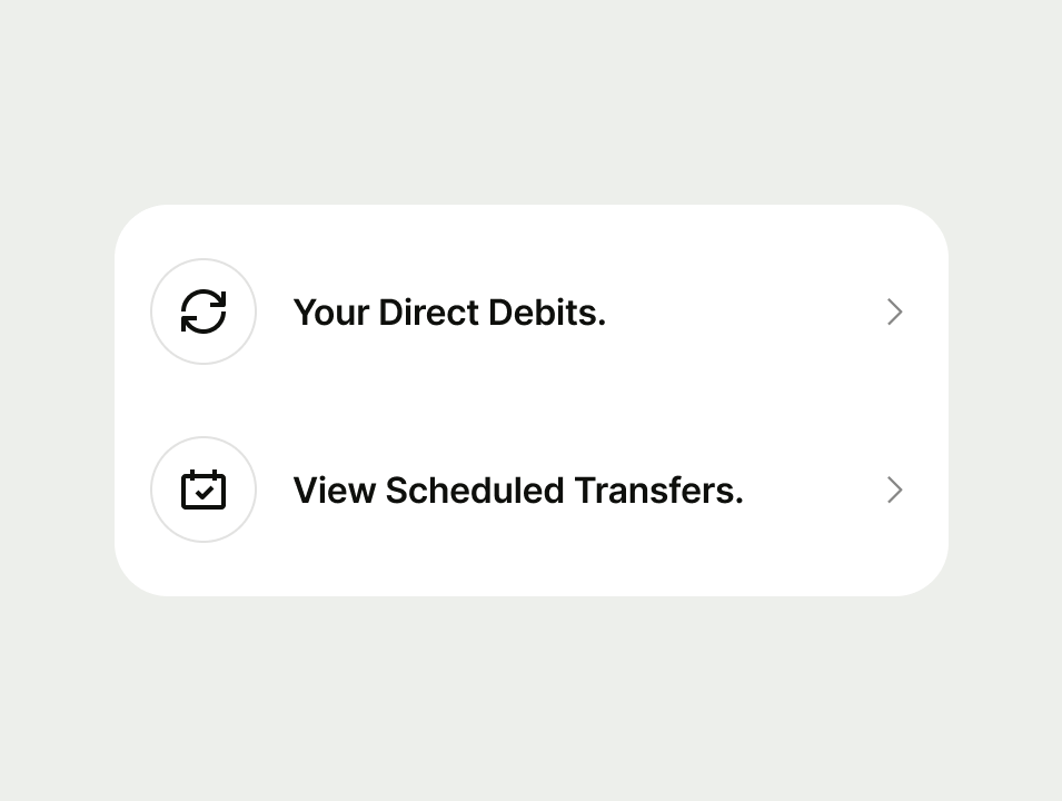
List item with bad titles

Subtitle

Include a subtitle if you have evidence that users need a little more context in order to understand where the navigation option with navigate them. If you include a subtitle for one option in a set, then include it for all of them. Subtitle copy should:

  • be short — aim for a maximum of 2 sentences and remember that content might expand when translated and look different in a list vs tiles

  • be plain text — that means no bold text, links, or other fancy formatting

  • include a full stop

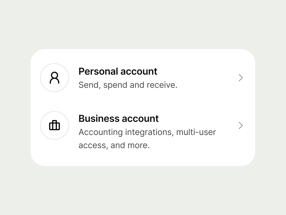
list items with good subtitles
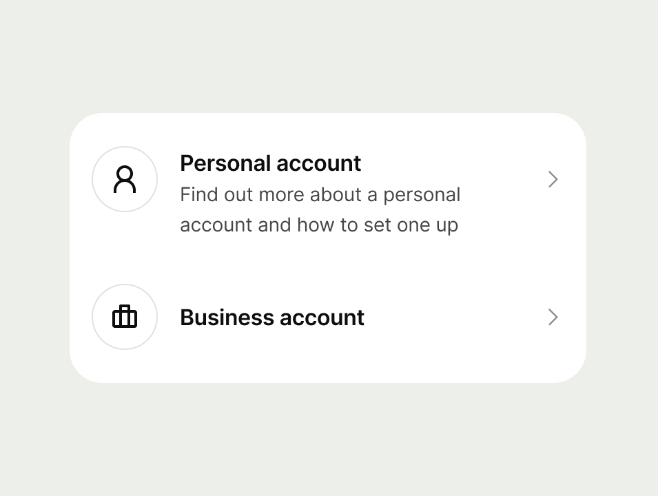
list items with bad subtitles

Additional information

Use additional information to add extra details that help make the information clearer for users. Use additional information only after you’ve used the subtitle. Additional information copy should:

  • be clear — aim for a maximum of 2 lines and remember that content might expand when translated and look different in a list vs tiles

  • provide a link where relevant – due to technical accessibility constraints, we can only allow for 1 link and it must be appended to the content.

Don't use supporting info:

  • if you haven’t already used description

List item with additional information

Value(s)

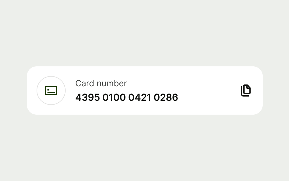
Values (optional), can be displayed when you need to display amounts related to the content.

They can be displayed with text formatting (sentiment colours & strikethrough) to enhance a message.

Do:

  • Use for supporting numerical information.

Don't:

  • Avoid allowing values to break over two lines.
  • Avoid relying on colour alone to convey information. Use text and/or iconography alongside colour. This ensures accessibility for the colour blind, accounts for cultural differences in colour interpretation, and supports screen readers.

list item with values on the same line
list item with values that wrap to two lines
list item that uses color to enhance the message (green for + value)
list item that uses red for the color but omits the minus sign
Accessibility

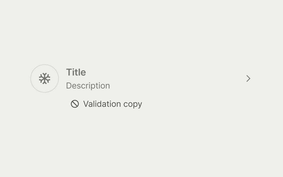
Provide clear contextual cues to why a list item is disabled by adding a description.

Provide clear feedback when checkboxes or radios are required but left unchecked, by displaying an error validation.

Disabled states

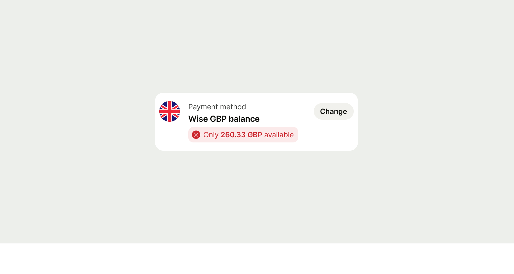
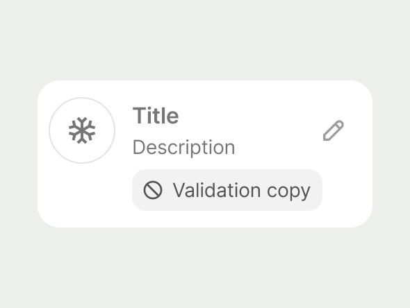
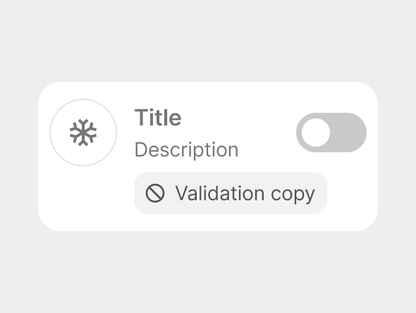
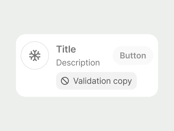
When using disabled states for list item, the action on the list item should be in it’s disabled state, and an inline prompt should be displayed indicating why it’s not available.

The high contrast ratio allows the user to understand exactly why the list item isn’t selectable.

disabled navigation list item
disabled checkbox list item
Radio disabled list item
disabled icon button list item
Disabled switch list item
disabled button list item

Screen-readers

Depending on the platform and screen reader used, the List Item contents can be read out in a different manner. Some screen readers might treat separate parts of the content (e.g. title or subtitle) as a continuous string of text, so it's important to include punctuation whenever applicable to introduce pause and different enunciation.


For more complicated List Items, e.g. those with values, it may be more user-friendly to change the order of announcements (e.g. title > value > subtitle). All engineering platforms support custom labelling, so care should be taken to ensure good VO experience.


Do not duplicate the content - if, for example, your List Item's title says `EUR to USD`, remove accessible labels from the associated flag avatars.