Upload input

An upload input lets users upload a single file, or multiple files, within a form.

TBC
When to use

Use an upload input:

  • in forms alongside other fields or inputs
  • when there's no need for the user to see a preview or thumbnail on screen of what they've uploaded

Don't use an upload input:

  • if the only input on the screen is for uploading files
  • if you need to show users a thumbnail or preview image of their upload on the same screen

Types

You can use the upload input to let users upload a single file or multiple files.

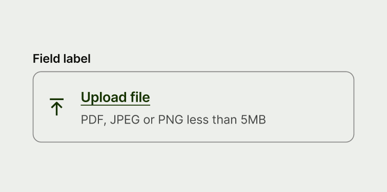
An upload input with a single file.
Single file
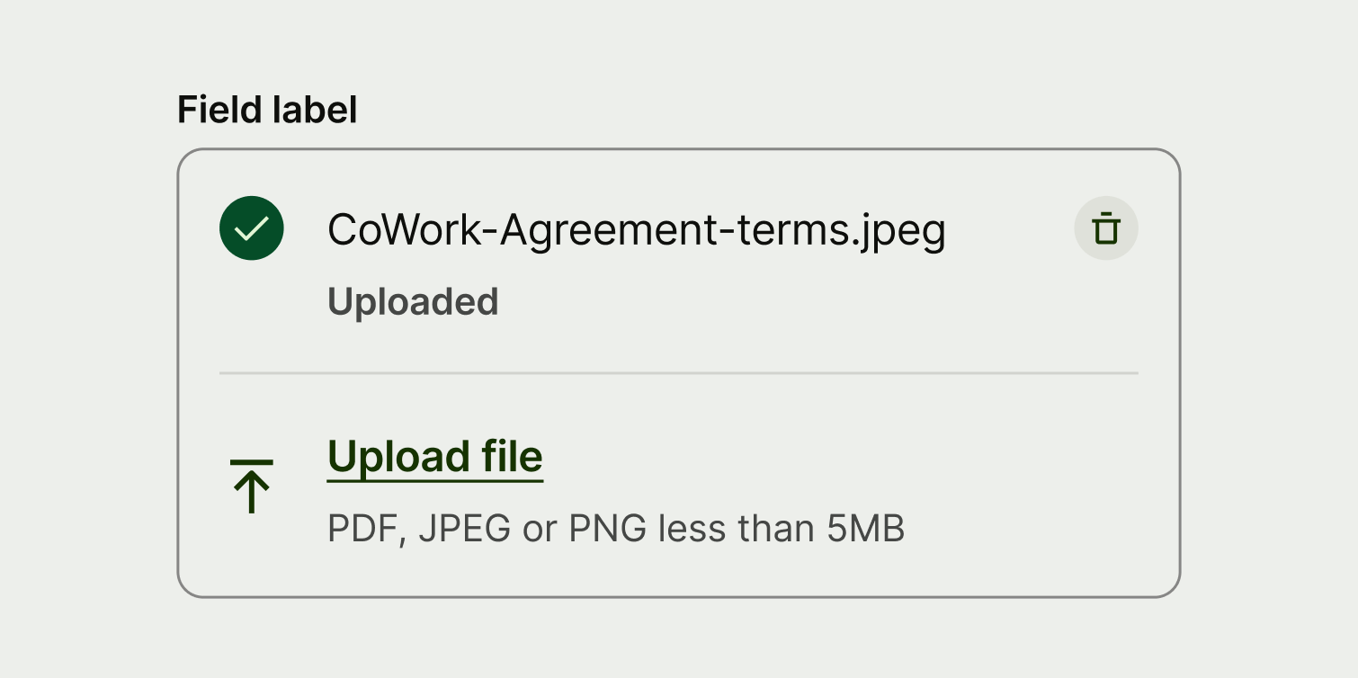
An upload input with multiple files.
Multiple files

For each new file the user uploads, a new cell is added to the bottom of the list. The initial default state always stays at the bottom of the list so that the user can upload more files.

Best practice
  • Only use the upload input within forms.
  • If the user removes a file, display a prompt alert to confirm the action.
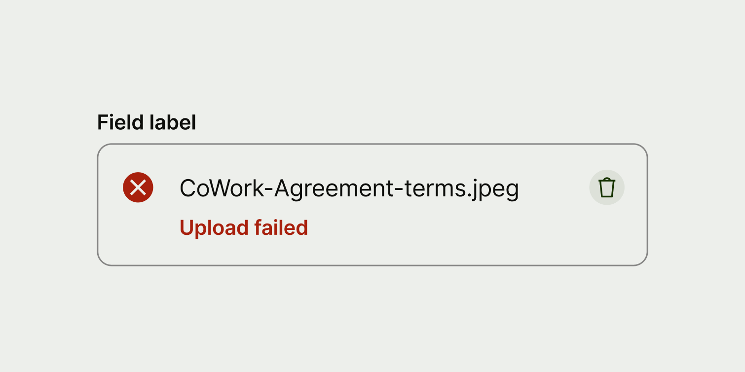
  • If an upload fails, make sure the description text on the failed state is specific, so user understands what went wrong.
  • When truncating long file names, make sure the ellipsis is in the center of the string to avoid truncating essential identifiers, like the end of the name and the file extension.

Placement

You can use an upload input on both desktop and mobile screens. Its width should be aligned with the other input fields in a form.

Interaction

Users can tap or click anywhere on the input field to trigger the upload as the whole area is interactive. This allows them to select the file(s) they want to upload from their device.

Once a file has been successfully uploaded, users can click or tap on the cell to see a preview of the file, allowing them to double check what they uploaded.

Users can also remove a file by pressing the clear button, at which point we should display a prompt alert to confirm the action. This is a native dialogue alert on iOS and Android, or a modal on web.

States

The upload input has 4 different states.

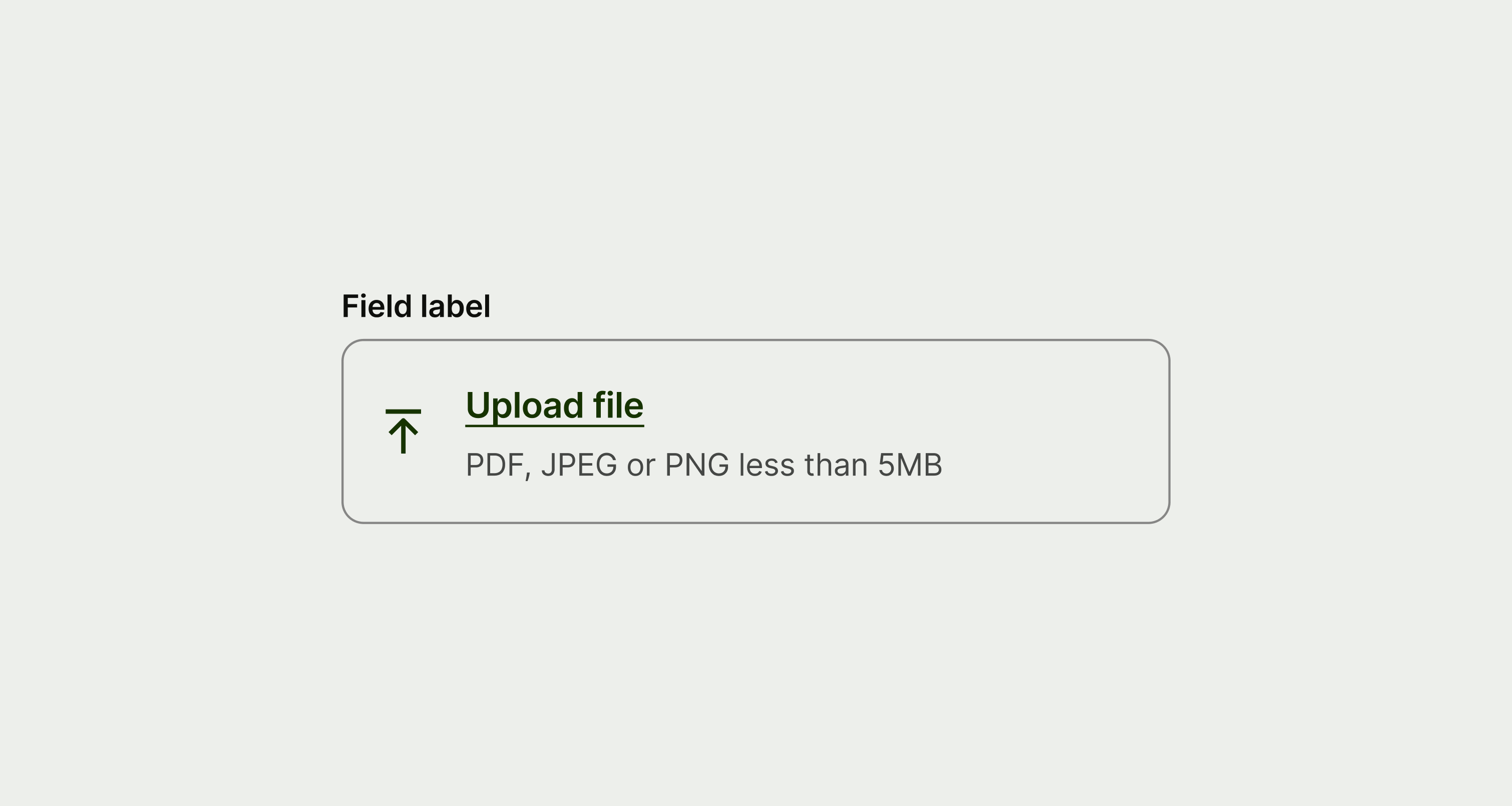
An upload input in the default state.
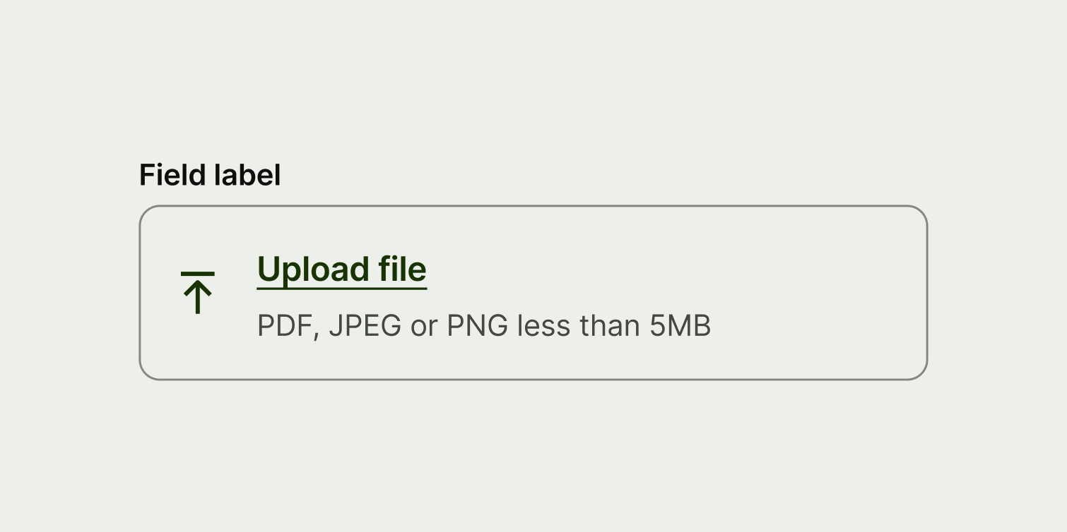
Default

The default state is always visible before the user interacts with the component. The title is a call to action that instructs the user to upload files, and the description communicates any upload constraints the user should be aware of, like file type and size.

An upload input in the loading state.
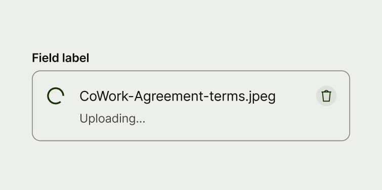
Loading

When the user submits a file to upload, the title changes to the name of the file. The description and icon also change to communicate the loading status.

An upload input with an uploaded state.
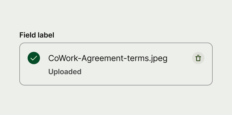
Uploaded

Once the file has successfully uploaded, the icon and description change to communicate this. A clear button also appears allowing the user to remove the file if they want to.

An upload input where the upload has failed.
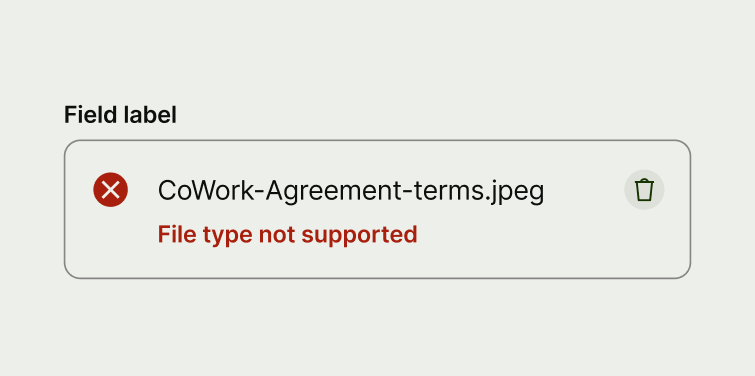
Failed

If there's an error and the upload doesn't work, the description tells the user why the file failed to upload.

Content

Label

The label describes the type of file the user needs to upload, for example 'Invoice'. It should also be consistent with the other labels in the form.

An upload input with a descriptive label.
An upload input with a question as the label.

Title

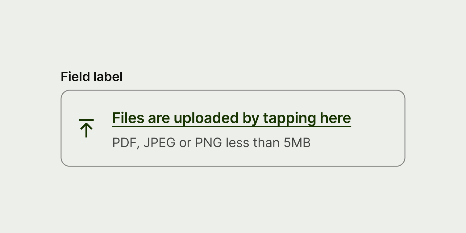
In the default state, the title is a call to action. The default copy for this state is 'Upload file' or 'Upload files'. But if you need to change this, treat it like writing button copy. That means starting with a verb, and using as few words as possible.
An upload input with a short instruction as the title.
An upload input with a long title.

Description

The description describes the state of the upload. For the failed state, it's important to make this copy as specific as possible so the user understands what went wrong and what they can do to fix it.
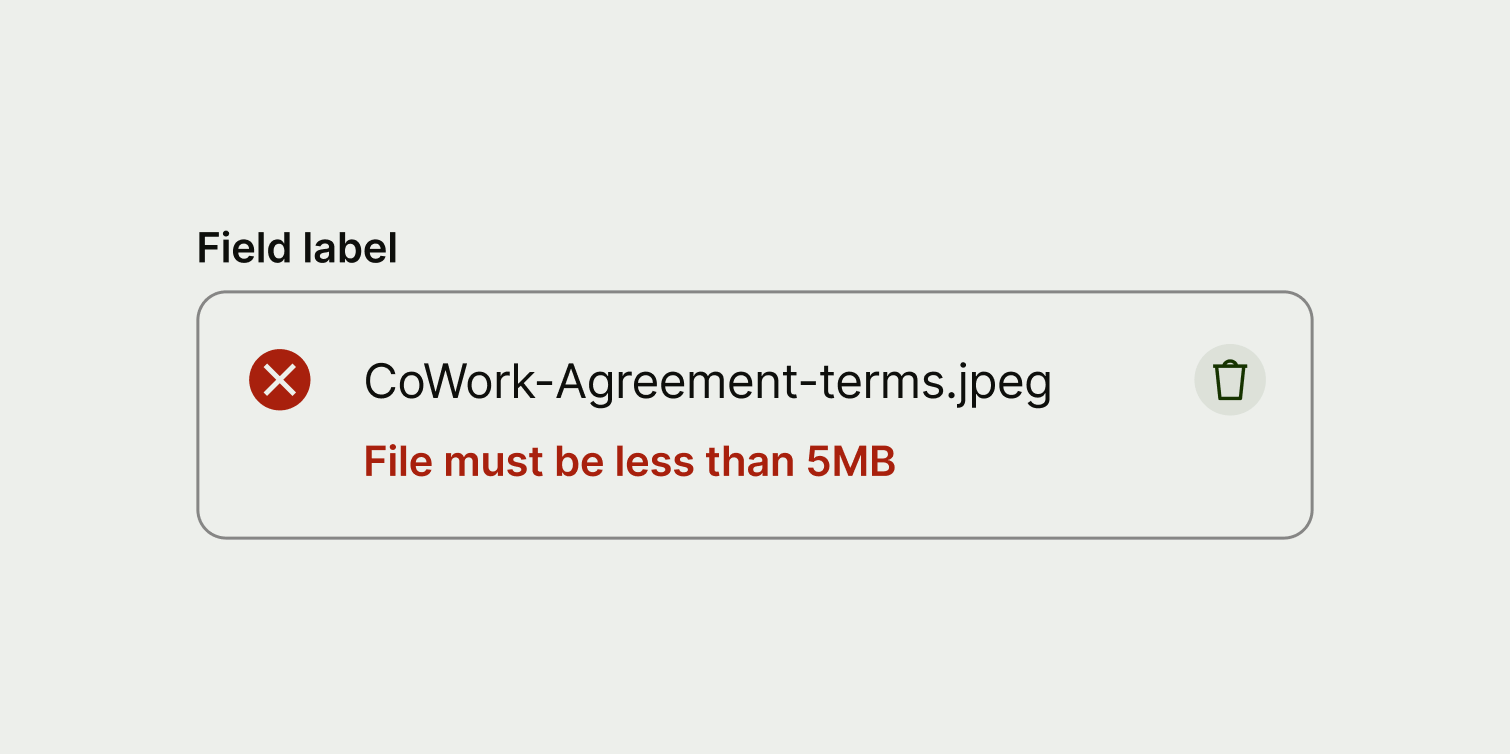
A failed upload where the description tells the user why the upload has failed.
A failed upload where the description just tells the user that it's failed.
Availability

Platform

Available

Developer documentation

Android

iOS

Web

Web documentation