Select

A select lets a user pick an option from a long list of options — typically 6 or more.

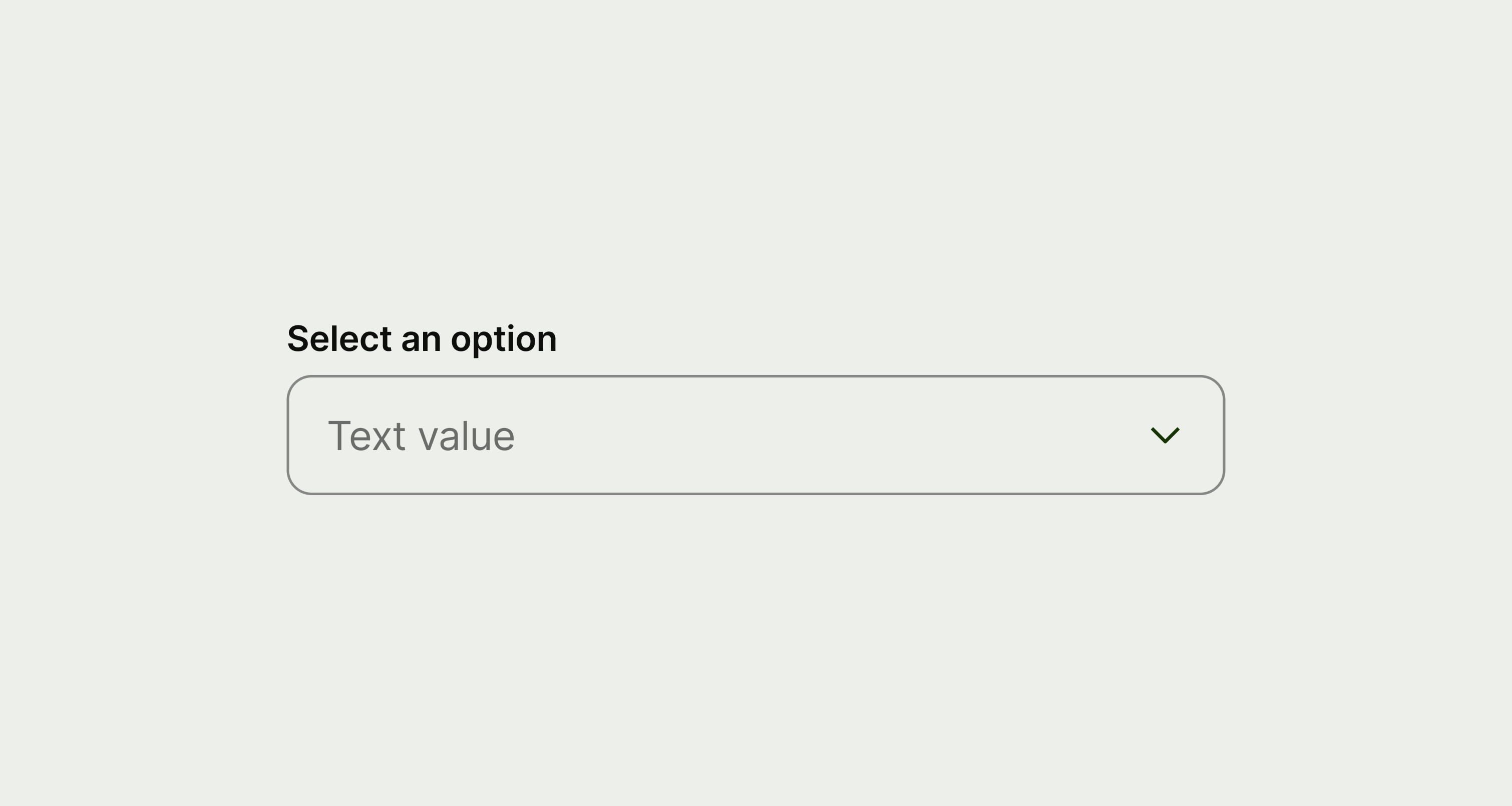
A select component.
When to use

Use a select:

  • when a user needs to pick a single option from a long list — typically 6 or more options

Don't use a select:

  • for shorter lists — use a radio instead
  • if the user needs to select multiple options — use checkbox instead

Placement
  • Select is typically used alongside other fields, like in a form.

  • On larger screens, you can display multiple fields side by side, but on mobile you should only have one per row.

Interaction
  • Users can use a keyboard to tab through and open a select.

  • The select can open different things depending on the platform, such as a dropdown.

Accessibility
  • Select supports TalkBack on Android, and VoiceOver on iOS.

Content

Label

Label copy should:

  • be no more than 3 words

  • be a noun that describes the information the user needs to enter, not an instruction

Information message (optional)

Information message copy should:

  • be a single sentence

  • give some extra context to help the user enter the right information
Availability

Platform

Available

Developer documentation

Android

iOS

Web