An info prompt is a message that appears in a specific part of the screen. It relates directly to a section or multiple components. They help the user stay informed, fix something, or get more out of what they’re doing.
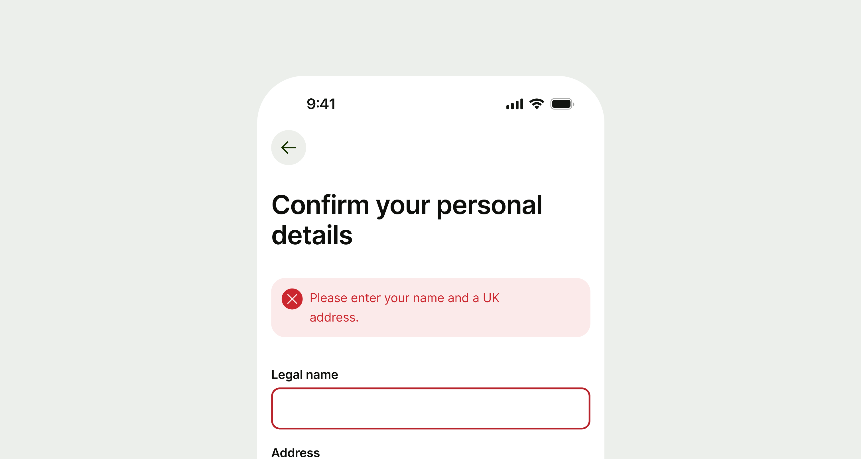
Use an info prompt if your message is about one specific part of a screen or the user's current activity. Use them to give more context, confirm success, explain a problem, or highlight a benefit related to what the user is doing.
- Don't use info prompts for messages about just one component. Use inline prompts for single components instead.
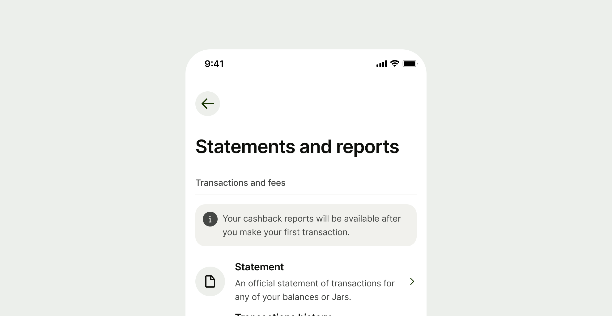
There are 5 types of info prompts — error, warning, neutral, success and proposition. Each has a different use case and rules around their implementation.
Error
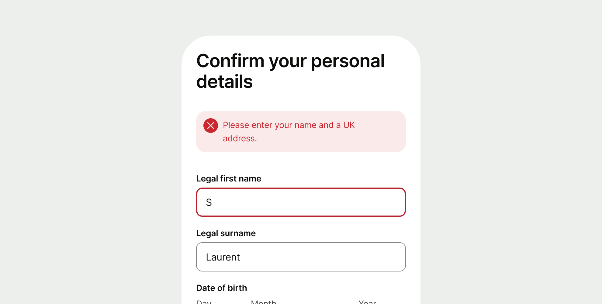
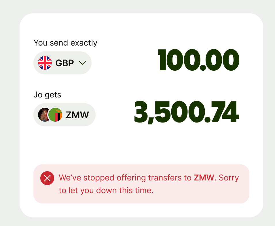
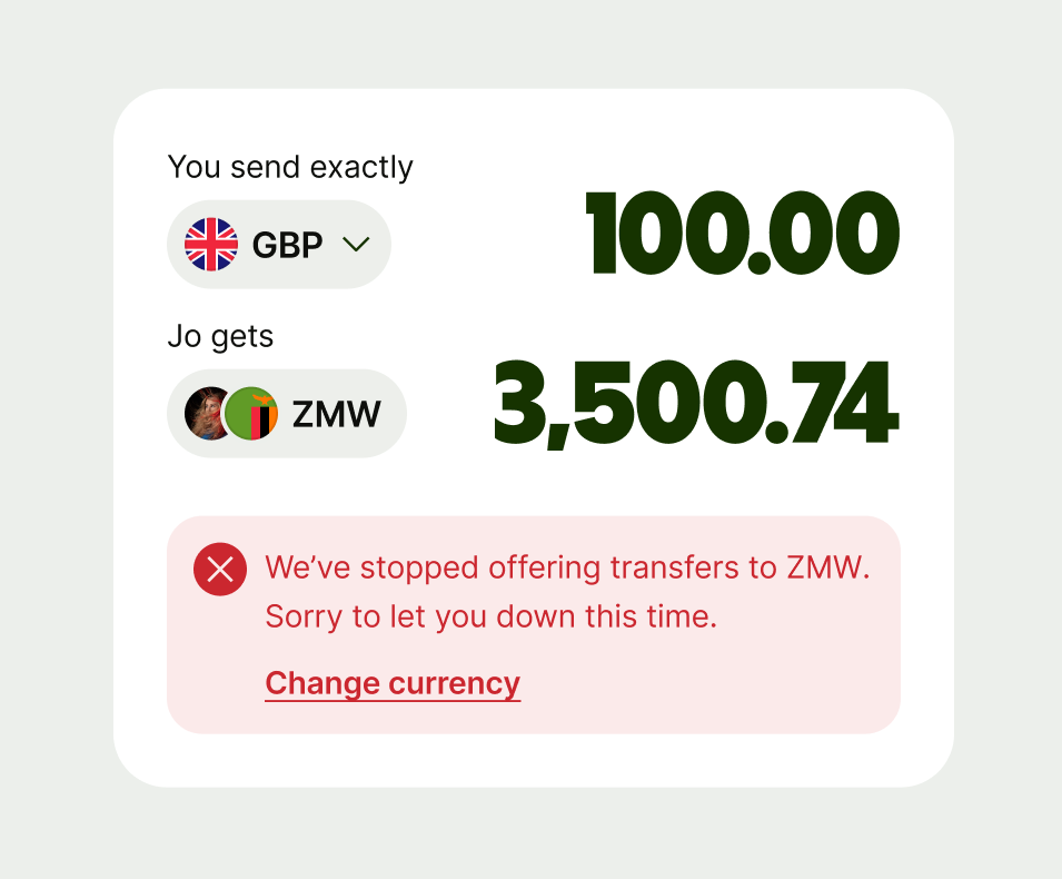
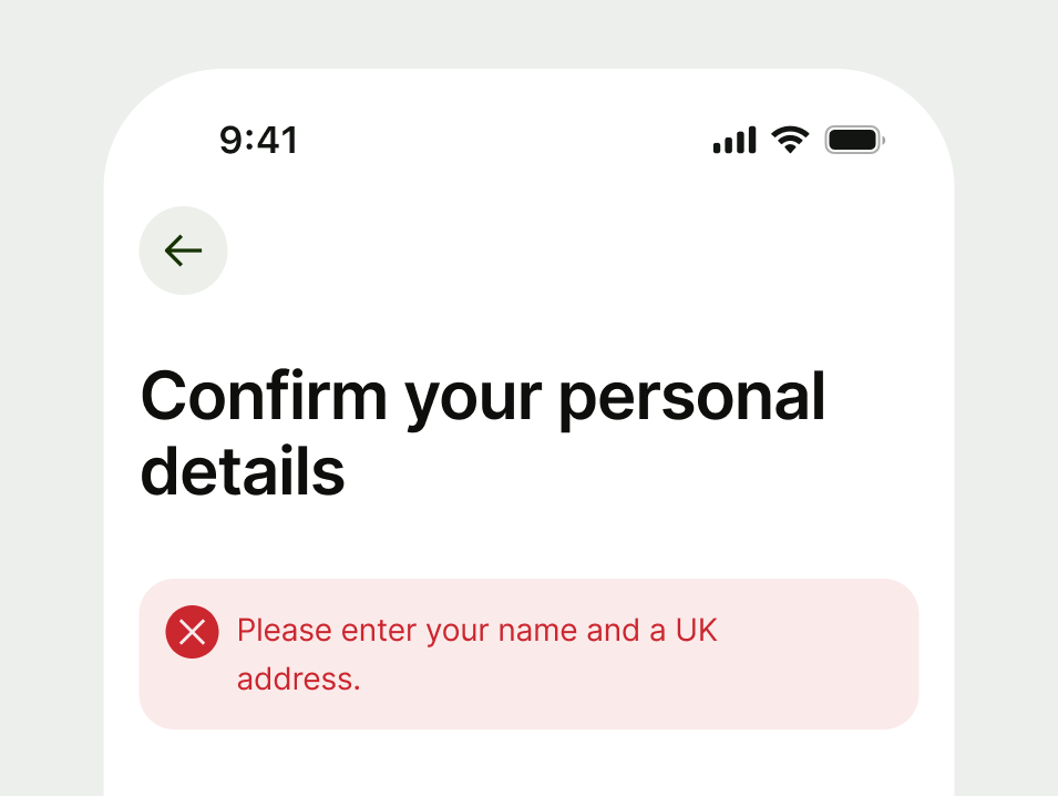
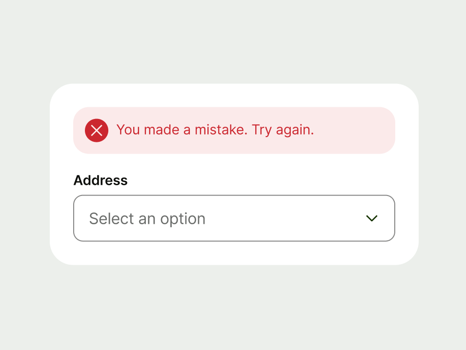
Use an error to let users know when something has gone wrong and needs their attention.
Warning
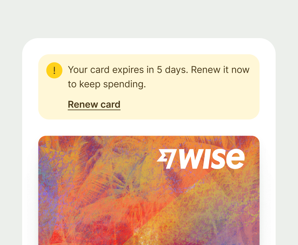
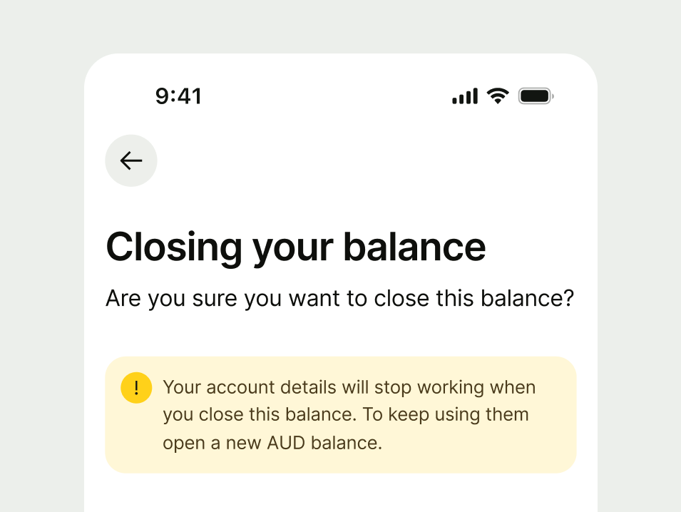
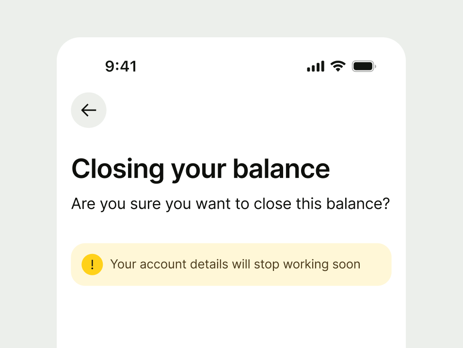
Use a warning when you need to alert users to potential issues that could impact their experience. These messages are preventative — they help customers take action to avoid negative outcomes.
Neutral
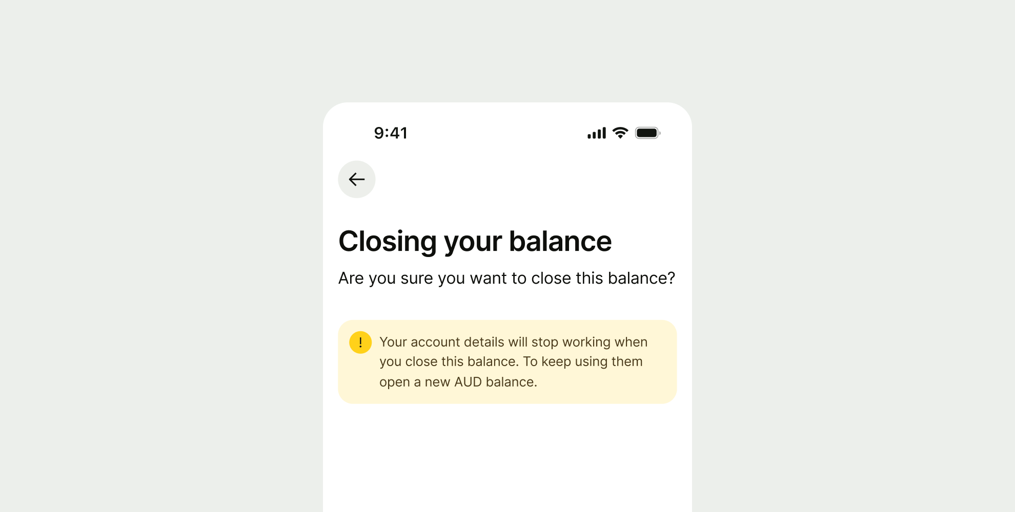
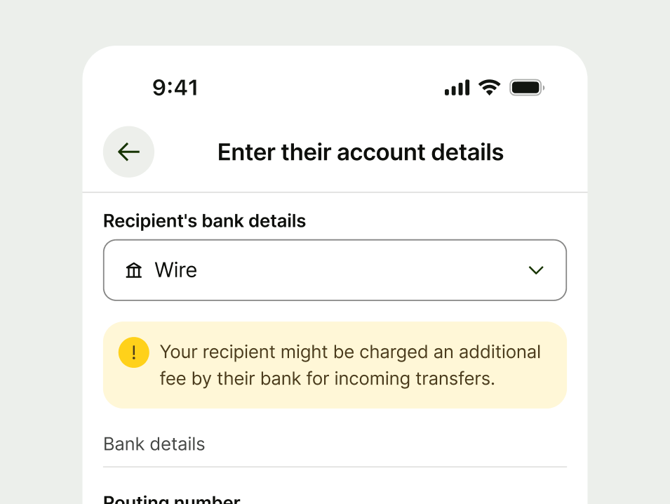
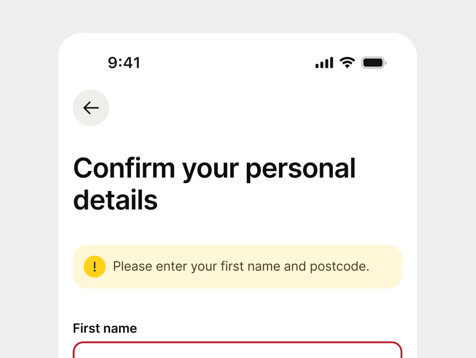
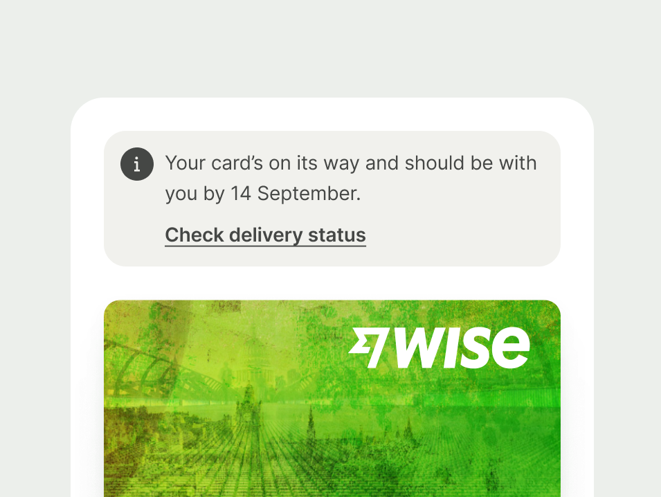
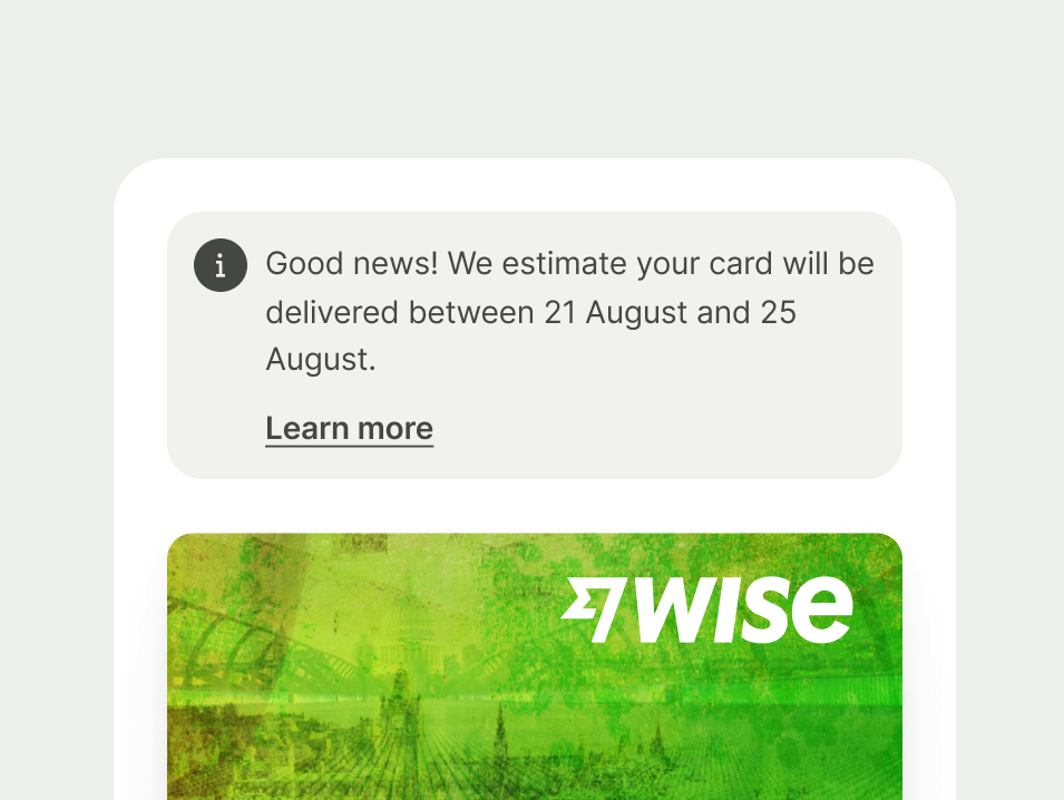
Use a neutral prompt when you want to guide the user or give additional context. These messages are informative rather than corrective.
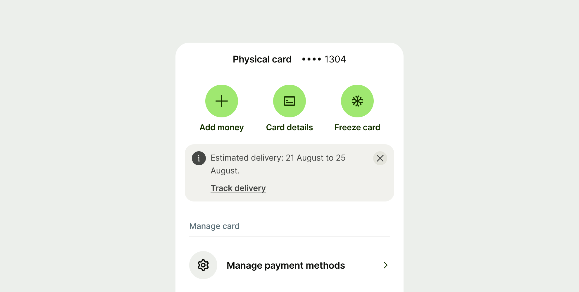
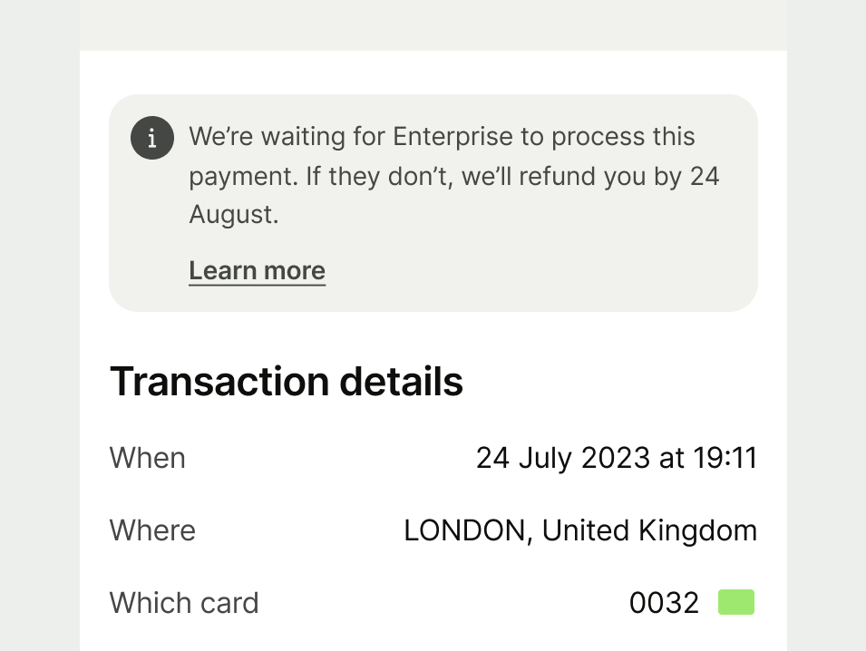
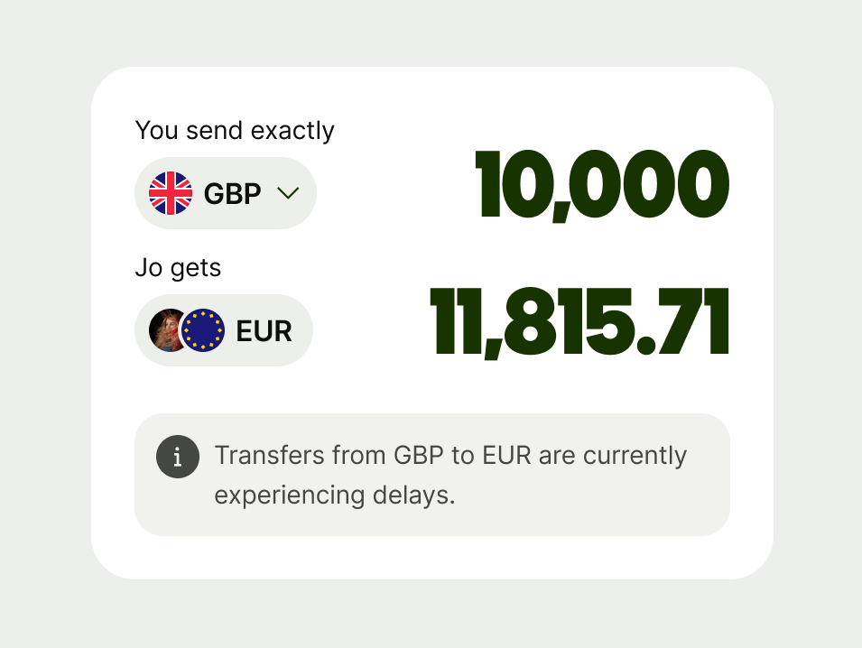
Success
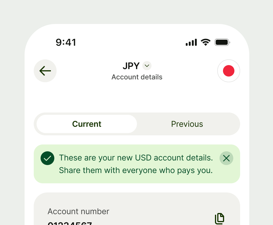
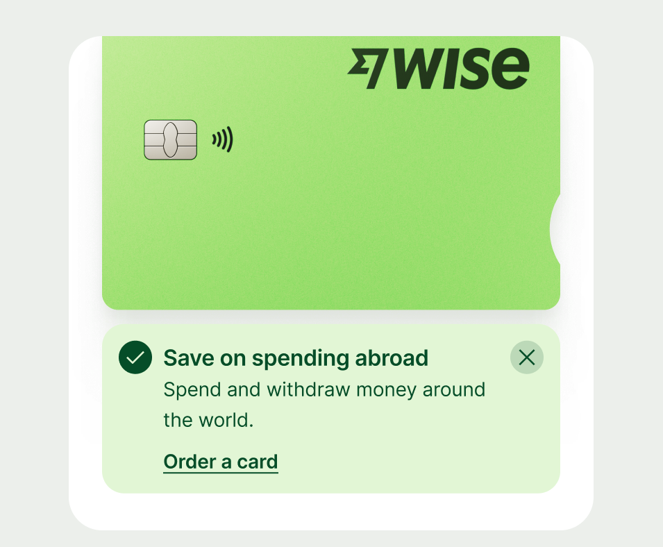
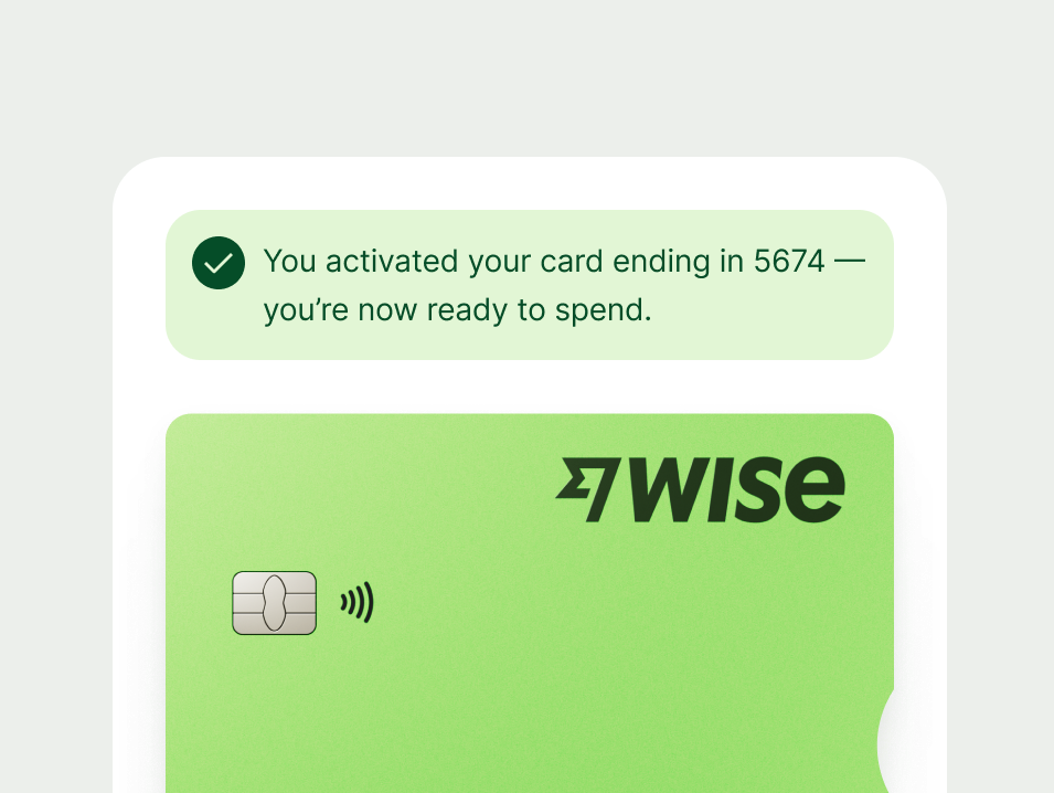
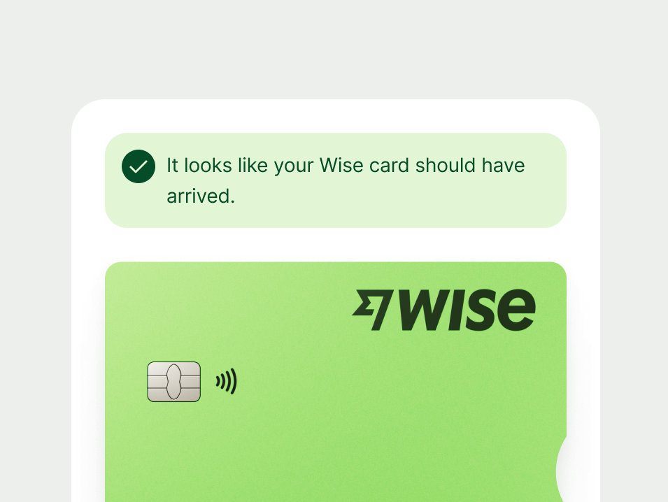
Use a success prompt to communicate that an action or process was completed successfully. These provide positive reinforcement and closure for the user, especially when there's no dedicated success screen.
This prompt's main job is to confirm success, but it can also guide the user to the next logical step — especially if that helps them benefit from what they just did.
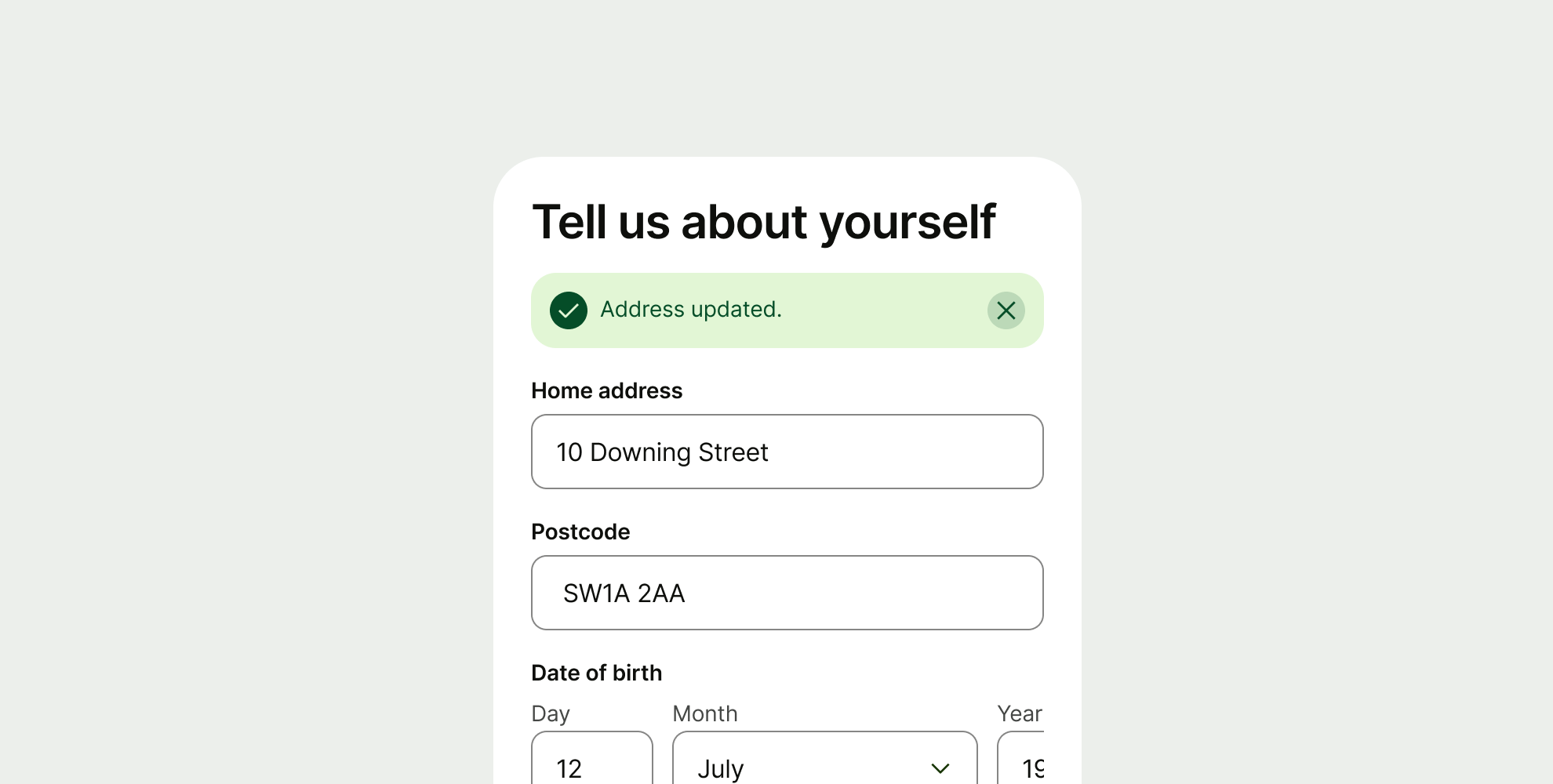
Proposition
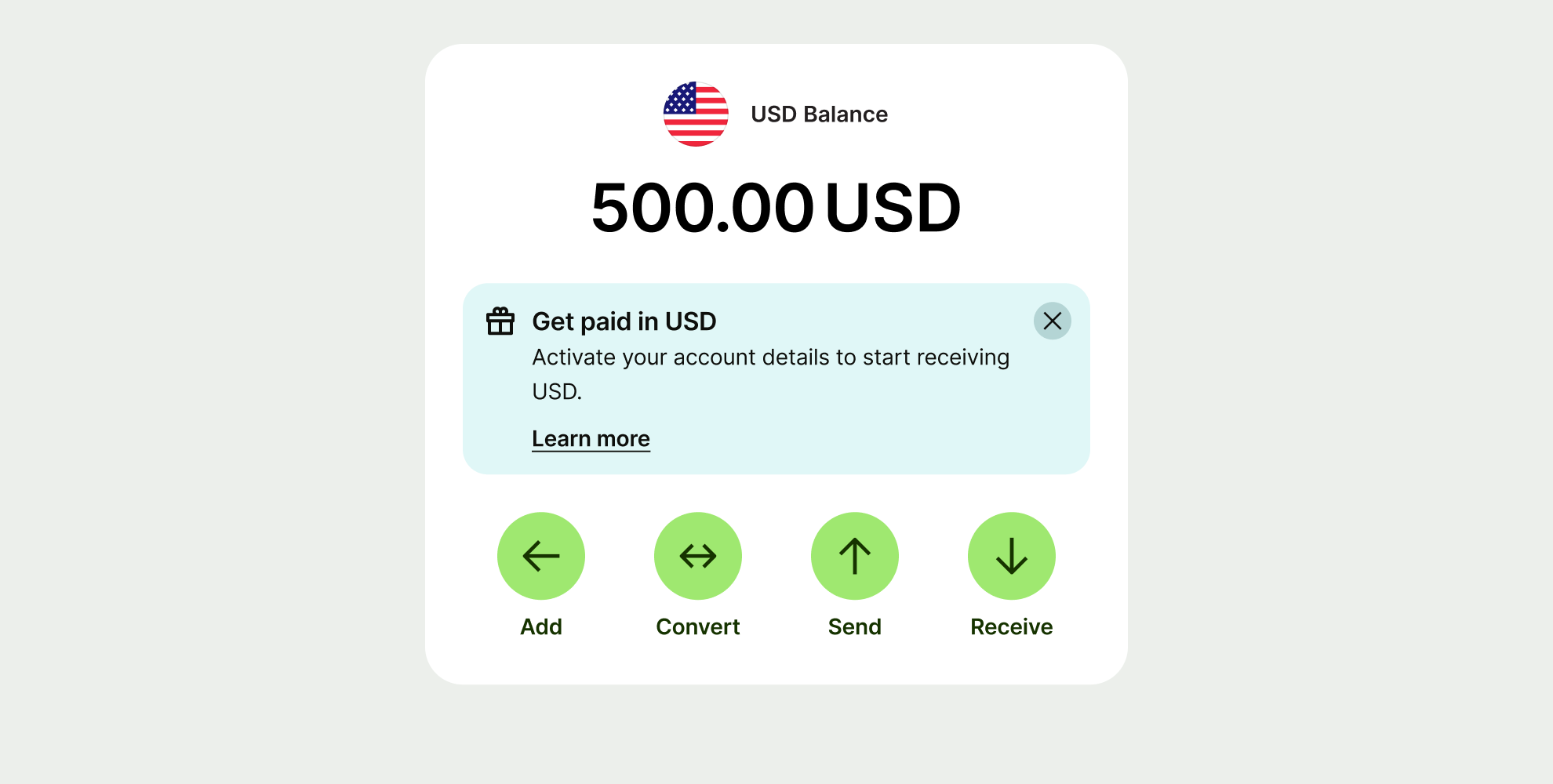
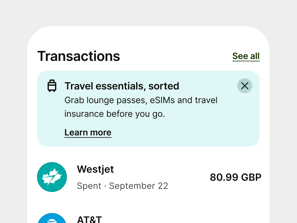
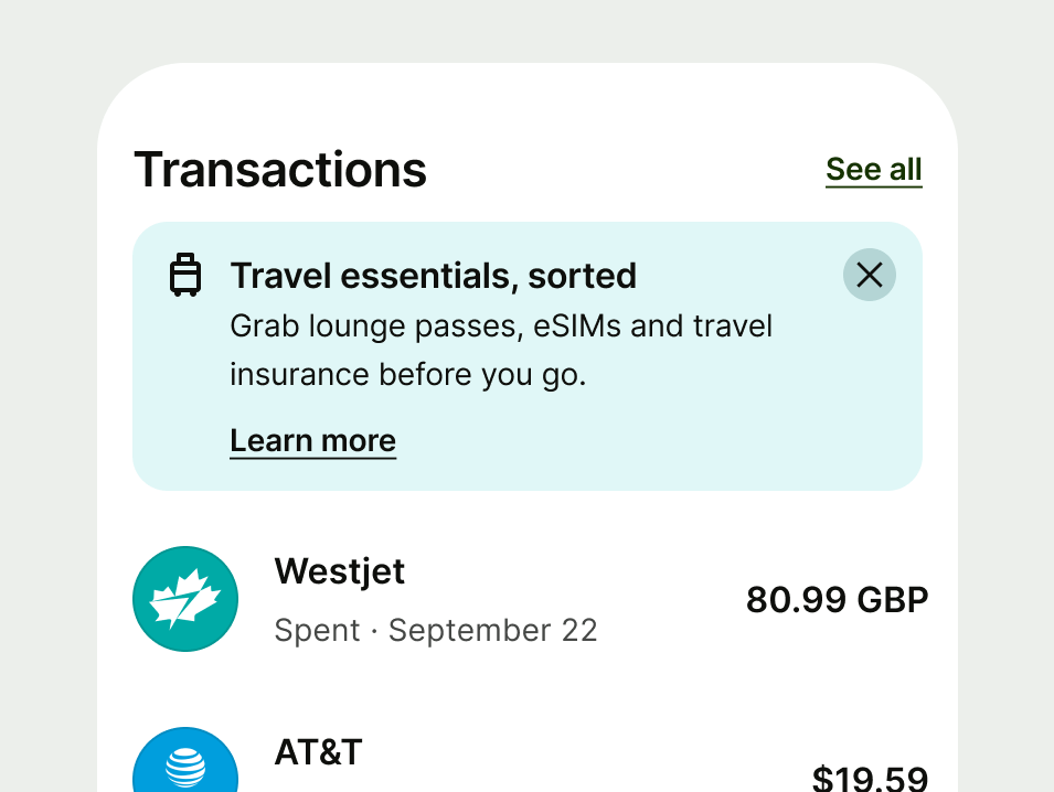
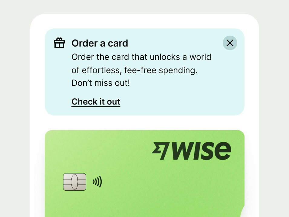
Use an info proposition to encourage users to learn more about a feature that might benefit them.
Unlike action prompts which drop users straight into a flow to start a task, info propositions lead to an educational page where they can read the details first.
Only surface a proposition if it’s relevant to what the user is doing. If we show too many, or they feel off-topic, we risk undermining trust and the experience feeling like spam.
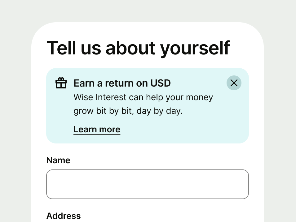
Info prompts relate to what the user is doing in the moment, so place them next to the section where they’re the most relevant.
Users can dismiss specific info prompts and interact with those that include a link.
Dismissibility
Users can only dismiss an info prompt if it’s a success, neutral or proposition.
Errors and warnings provide more urgent information — removing them could lead to a negative outcome for the user.
Links
Only add links if users need extra information to finish their task. Most info prompts should provide enough context so users can stay focused on what they’re doing.
If the prompt includes an action link, it makes the whole component tappable on Android and iOS, as well as mobile web touchscreen devices.
On web, the link is also clickable and underlined, so it works for click-based interactions too — like using a mouse or keyboard.
- Avoid using more than one link within the Info prompt.
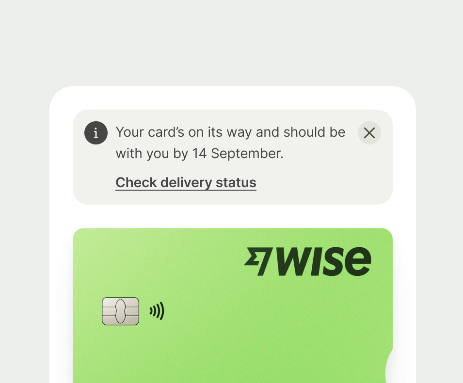
All info prompts should:
Be clear — explain what’s happened and what to do.
Be concise — try and use no more than 1-2 short sentences.
Include key details — if relevant, specify dates, amounts, or names to make the message actionable.
Use full sentences — write in complete sentences with full stops.
Headings
These prompts can include headings when they help users scan and understand content faster. Keep them short and clear so they support rather than compete with your main message.
Tone
Vary your tone depending on the type of message you’re giving. Sometimes you might be communicating good news, and sometimes it might be a warning, or bad news. Depending on the scenario, you'll need to use a suitable tone of voice.
Error
With any error message, clarity is key. Something has gone wrong and so the job of the prompt is to communicate what’s happened, and how it can be resolved.
- Always give a clear next step — explain what the user needs to do to fix the problem.
- For more complex problems, include a brief explanation of why this problem occurred.
- Don't make the user feel at fault for the error - Don’t use blame and make the user feel at fault.
Warning
We’re highlighting something that could negatively impact the customer’s experience.
It’s important we communicate the issue clearly, explain why it matters and how to avoid any negative consequences.
- Explain the potential issue — include in your message what could happen to the user.
- Give a clear action — tell the user what they can do to avoid the problem.
Success
You’re communicating good news, so don’t be afraid to add energy and colour to the copy. But as with other info prompts, keep this concise — quick positive reinforcement rather than lengthy congratulations.
- Reassure the user — above all else, confirm the action was successfully completed.
- Use a warm tone — as if you’re telling someone good news, but avoid phrases that feel casual and might not translate well.
- Include key details — like amounts, names or dates — so the user knows exactly what action we’re referring to.
Neutral
Keep the tone factual and straightforward.
Focus on providing clear, relevant information that helps the customer understand their situation or options, without overwhelming them with unnecessary details.
- Prioritise the key information — avoid including any lengthy explanations or background.
- Use a neutral tone — you’re relaying information, so avoid adding colour or urgency to your message.
Propositions
These messages should feel like helpful suggestions. The goal is to surface value clearly, without coming across as pushy or overwhelming.
Make sure the message is relevant to what the user is doing and easy to scan.
A more playful or friendly tone can help grab attention and communicate value. But make sure that tone doesn’t come at the expense of clarity.
Above all else, you want the user to be able to understand the benefit to them without having to guess.
- Frontload the benefit — make it immediately clear why this might help the user.
- Match the tone to the context — friendly and informative, not pushy.
- Keep it brief — one sentence is usually enough, but add a second if it helps clarity.
- Don’t use generic language — avoid phrases like “Check this out”.
- Don’t oversell — if the feature is useful, the benefit should speak for itself.
Platform | Available | Developer documentation |
|---|---|---|
Android | ||
iOS | ||
Web |