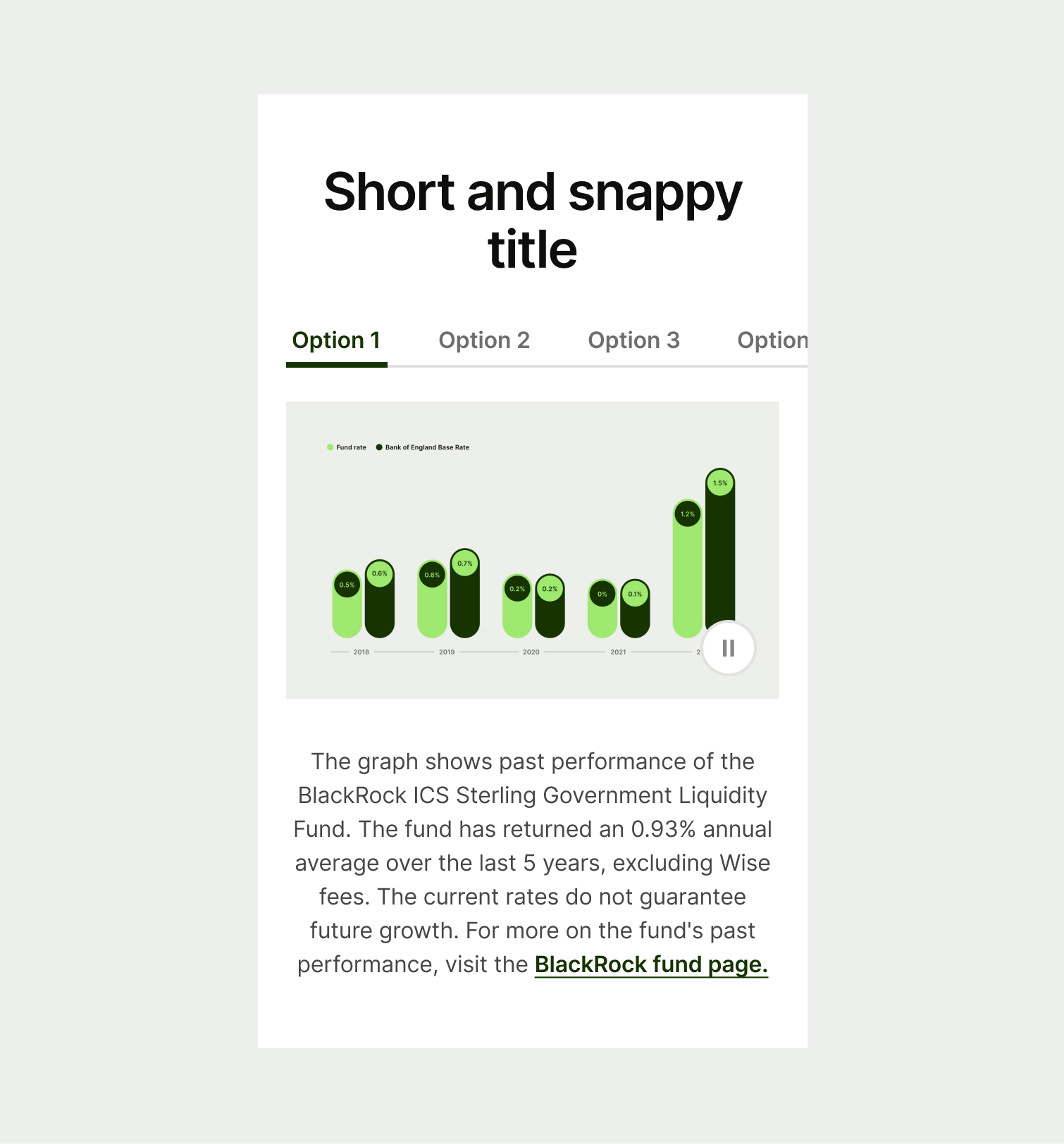
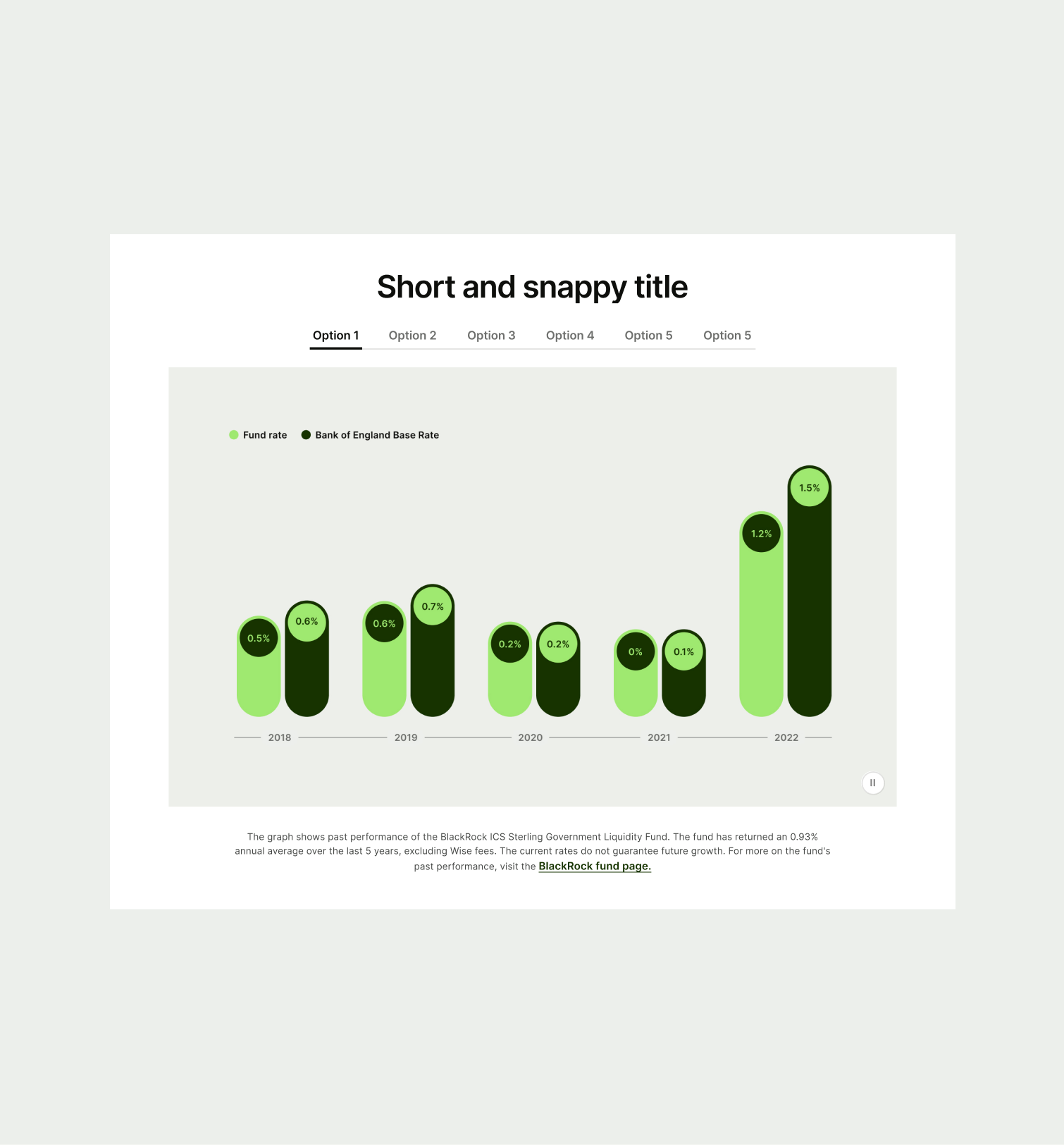
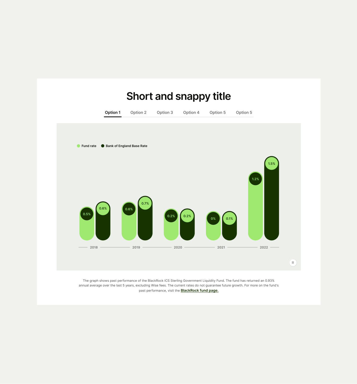
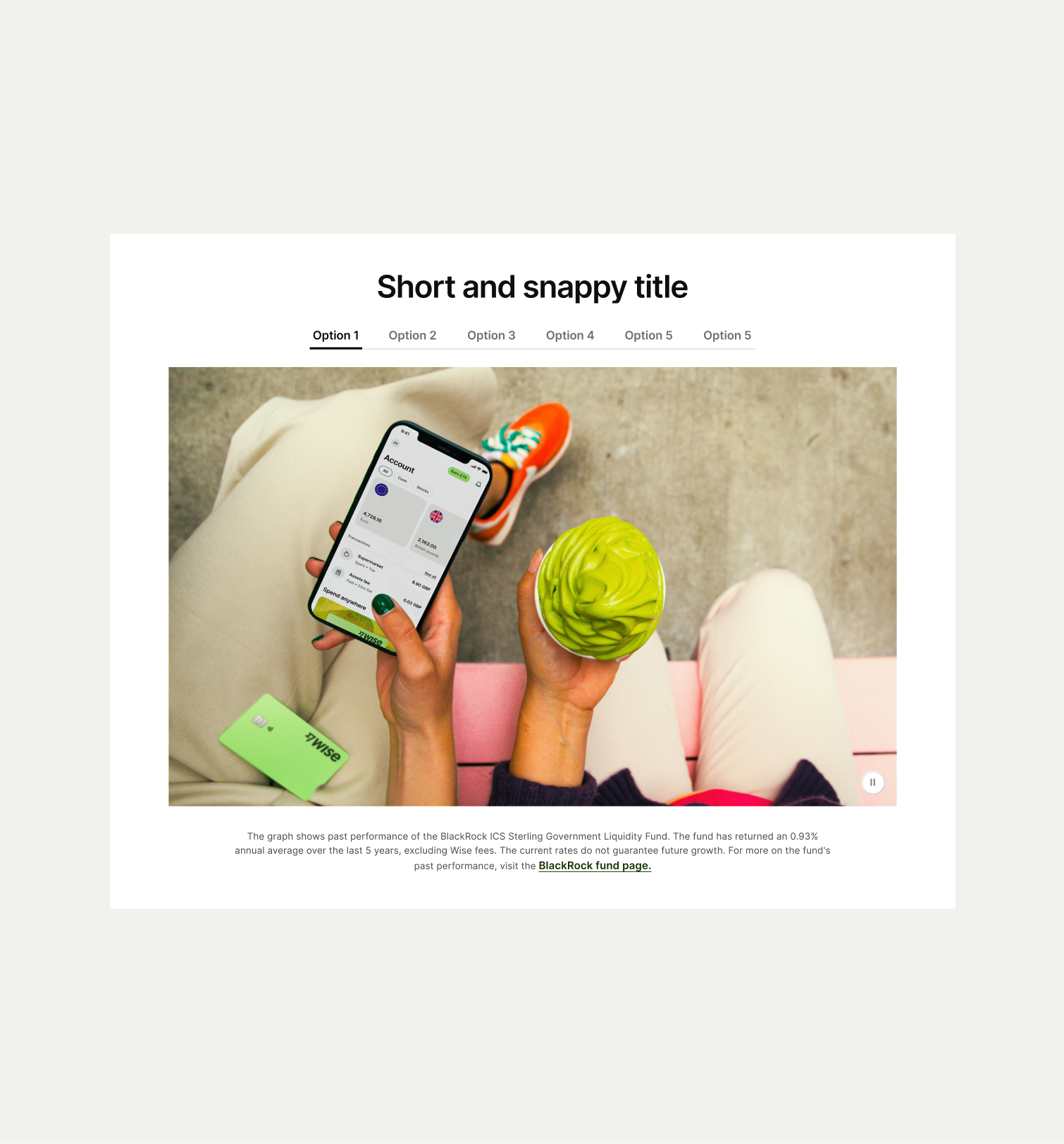
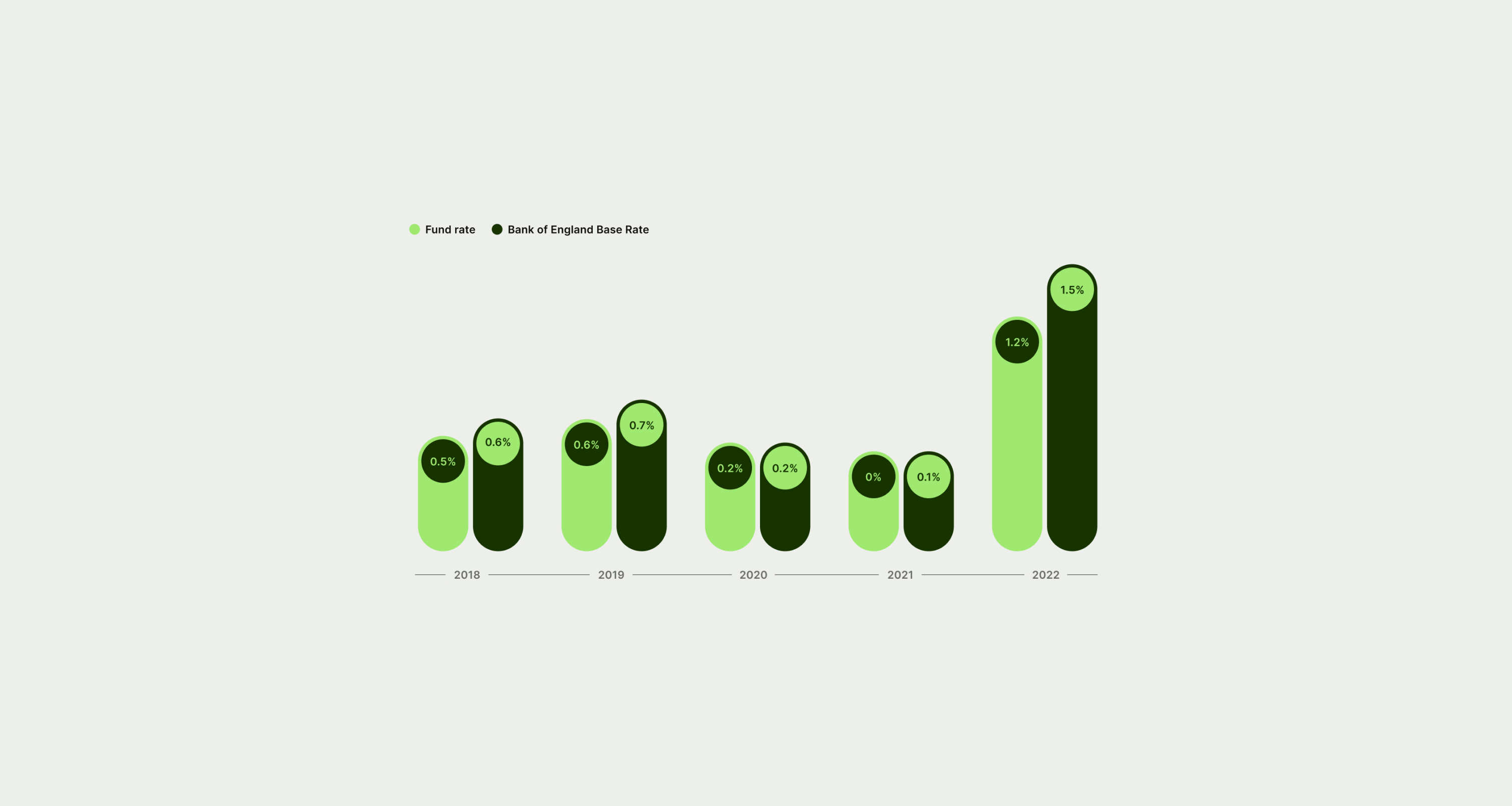
This component can be used to showcase multiple forms of data such as charts of graphics.
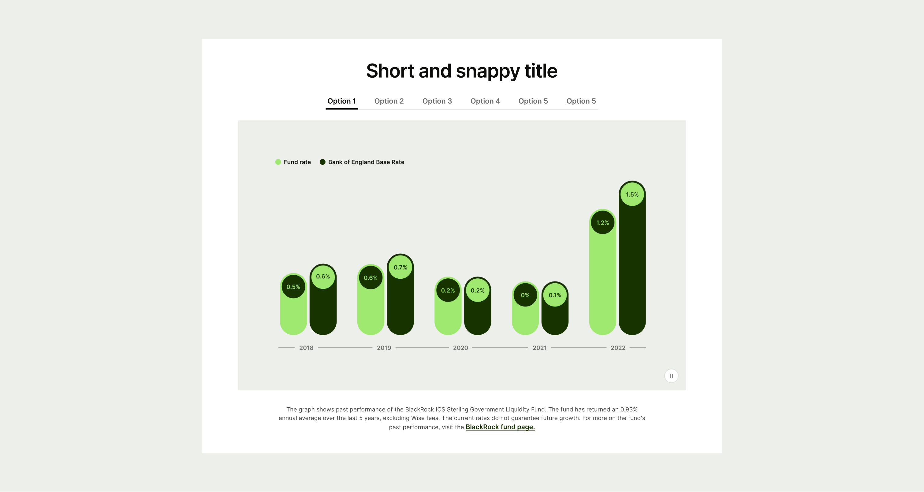
The Tab Data component can be used to highlight multiple different visual assets to help illustrate data. It can have multiple tab options, although for best user experience this number shouldn't exceed 6 options. It also has an optional secondary text that sits under the image to add more information.
- Craft a concise and compelling headline that clearly communicates each option.
- Do not use lifestyle imagery in place of the data graphic
To ensure maximum accessibility for our users, use plain language in accordance with our tone of voice for an inclusive reading experience. The text should be precise and informative. Ensure that images are accompanied by appropriate alternative text (alt text) for screen readers. An ideal alt text is descriptive and concise to convey the meaning and purpose of the image to users who may not be able to see it.
To ensure that the Card Cluster Images component remains visually appealing and accommodates different languages, adhere to the following content limitations:
Headline: The headline should be short and precise. Ideally fitting across two lines.
Body Copy: The body copy should be precise and clear, keeping in line with our tone of voice. Avoid adding paragraphs of text that might overwhelm the user.
By following these guidelines, you ensure that the Card Cluster Images component can comfortably accommodate different languages while maintaining a consistent and visually pleasing design.
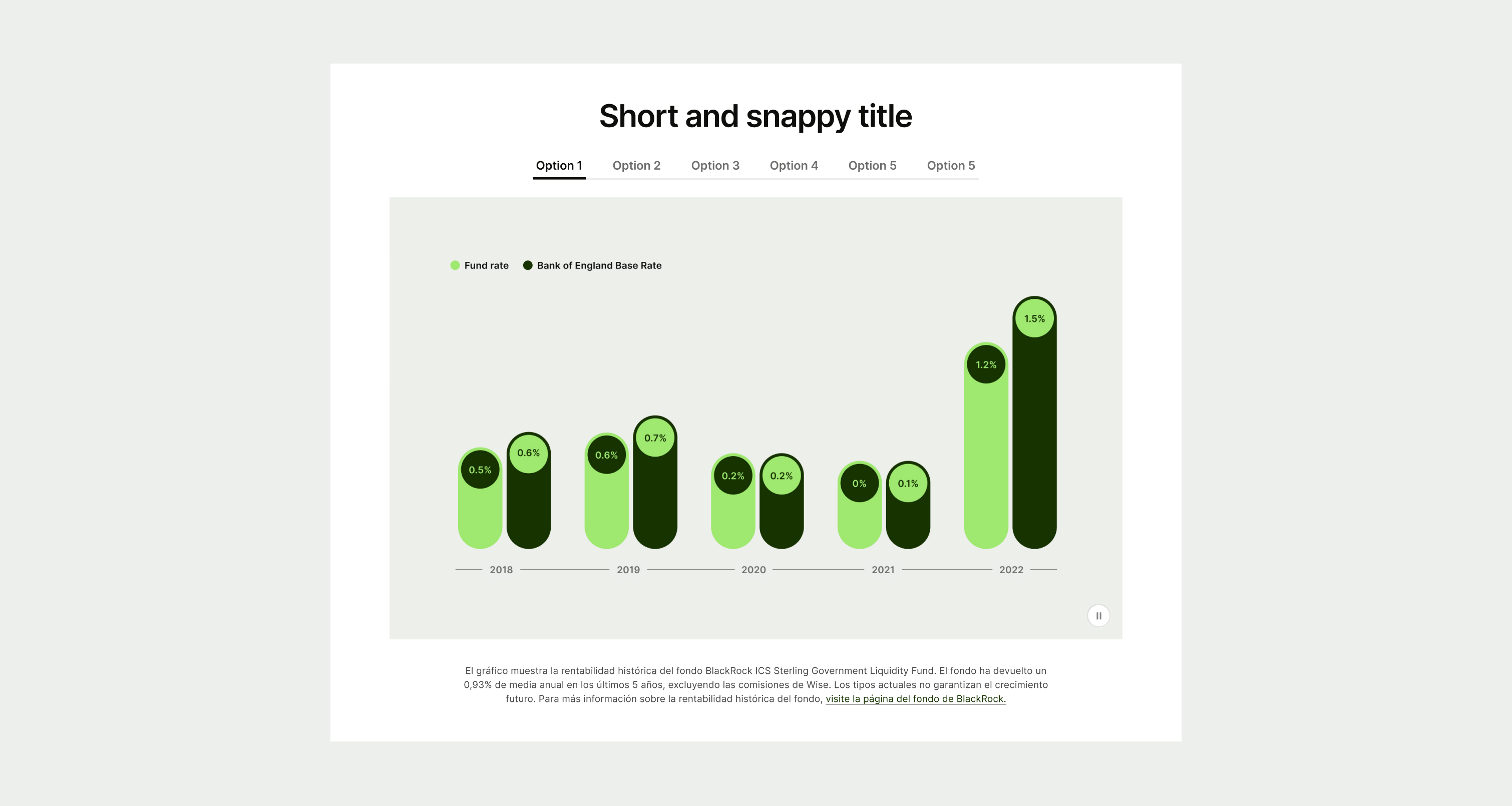
These are the examples of the Tabs Data component across different screen sizes.