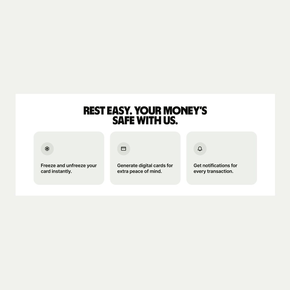
This is a versatile component that can be used throughout the site to display data or specific information around a feature.
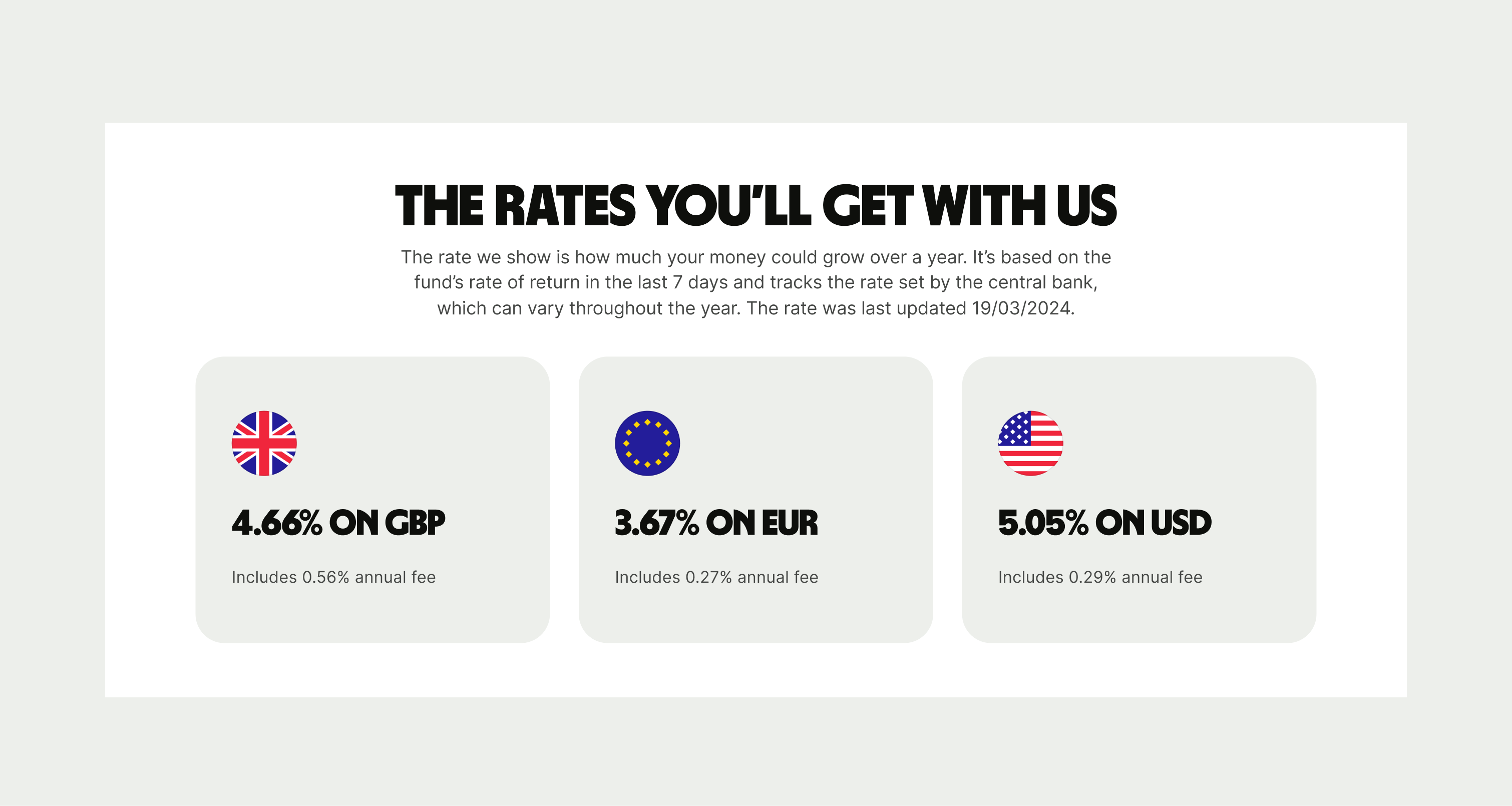
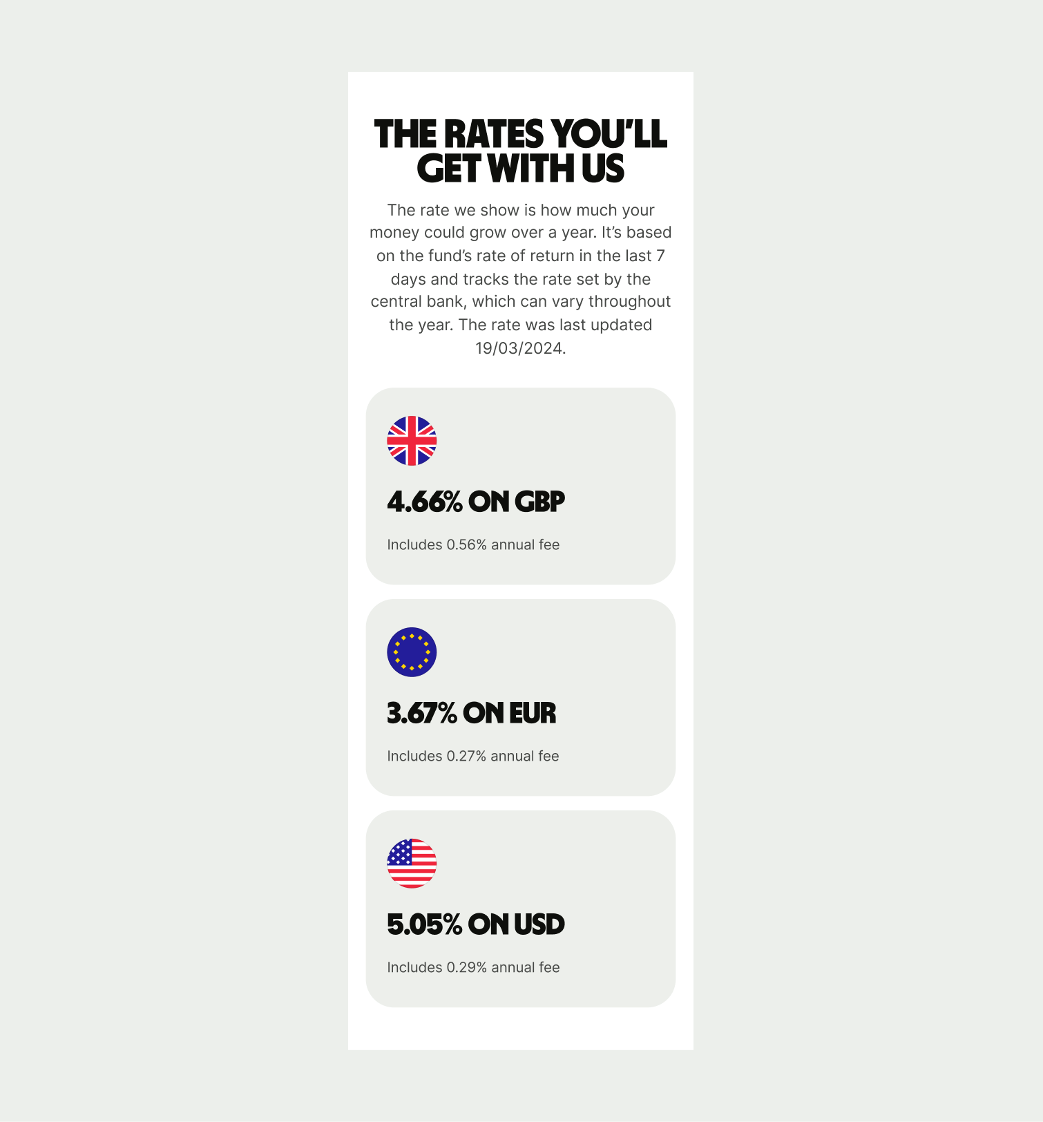
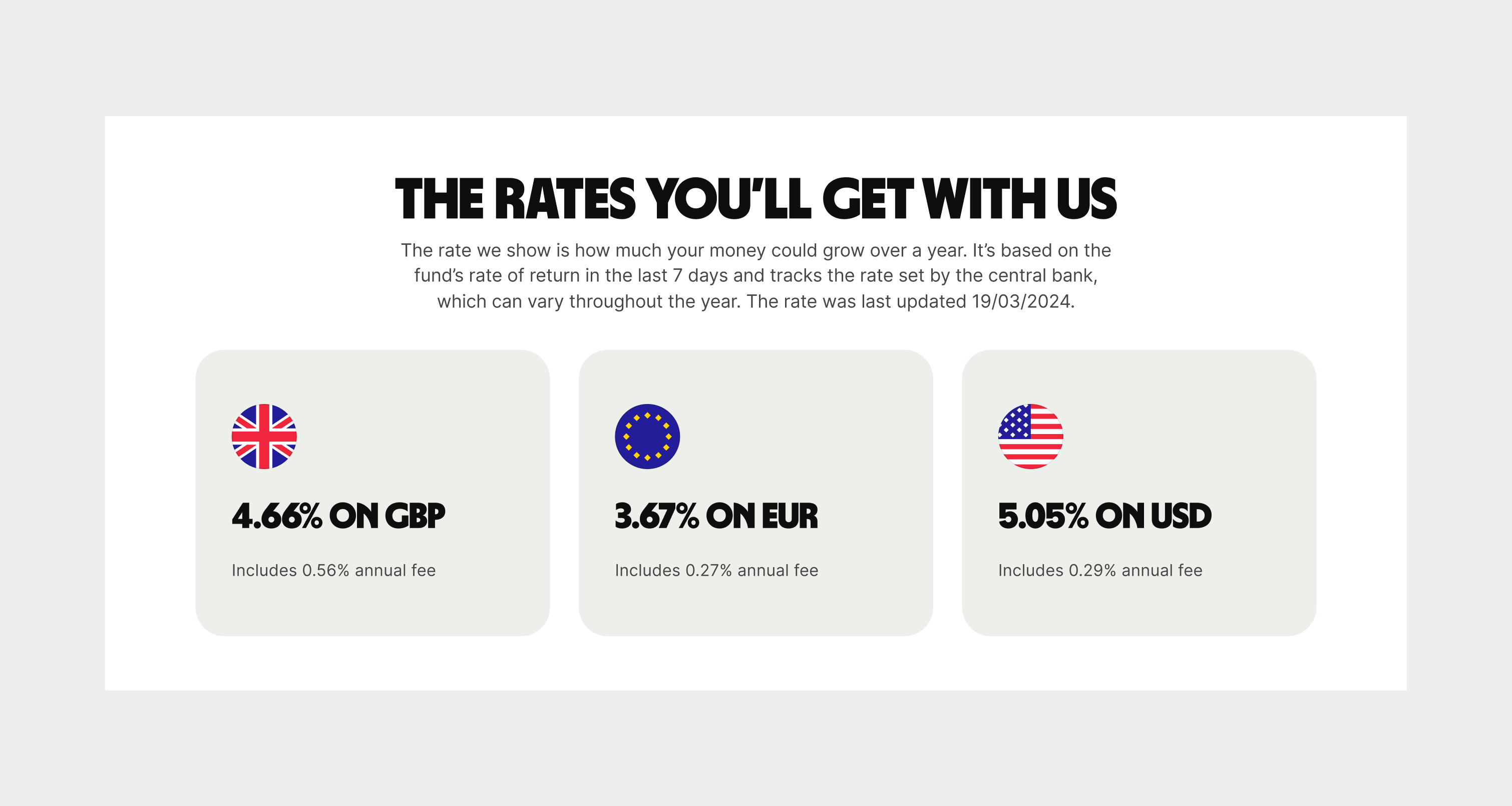
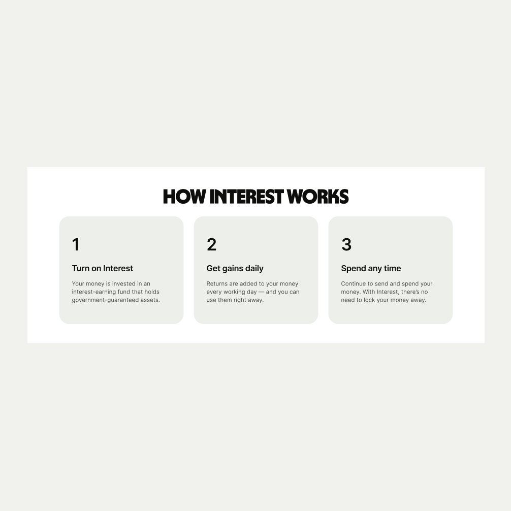
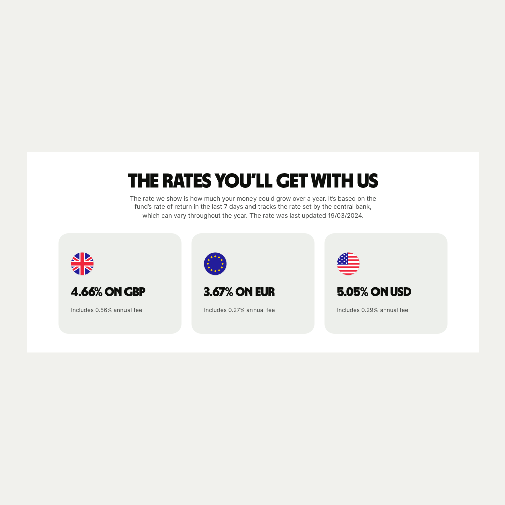
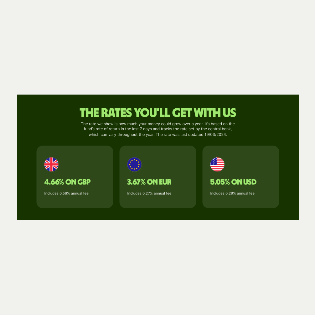
The Card Cluster can be used on pages to display more information around a particular feature. It comes in three different variants of Rates, Stepper and Icons and is available in Light, Neutral and Forest Green. It also has an optional secondary line of copy under the header and optional buttons.
- Use precise and informative language that is in keeping with our tone of voice.
- Do not include too much information on each card that might overwhelm the user.


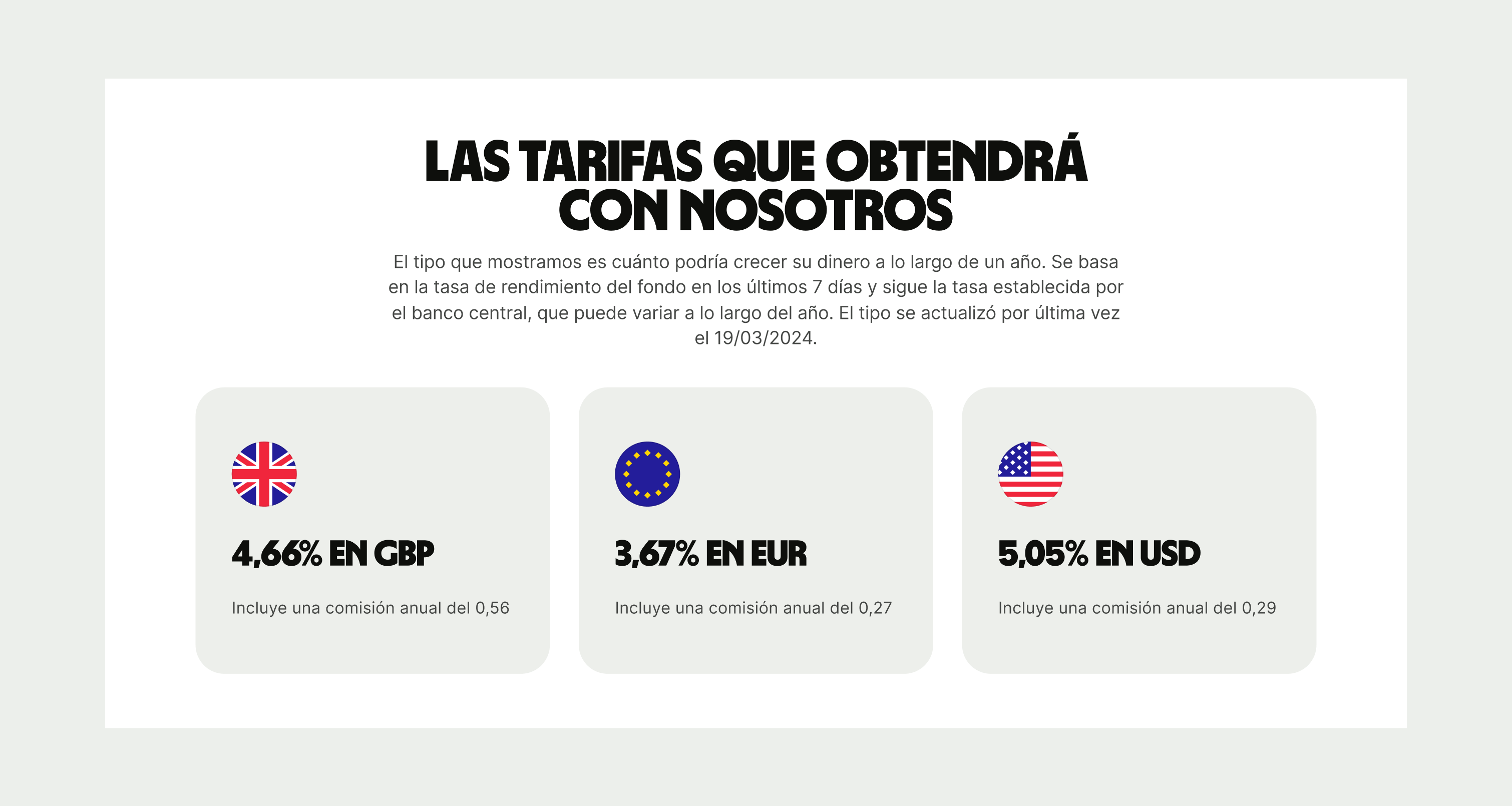
To ensure that the Card Cluster component remains visually appealing and accommodates different languages, adhere to the following content limitations:
Headline: The headline should be short and precise. Ideally fitting across two lines.
Body Copy: The body copy should be precise and clear, keeping in line with our tone of voice. Avoid adding paragraphs of text that might overwhelm the user.
By following these guidelines, you ensure that the Card Cluster component can comfortably accommodate different languages while maintaining a consistent and visually pleasing design.
These are the examples of the Card Cluster component across different screen sizes.