Empty state pattern

Empty state patterns are used inside of pages to denote when there is "nothing" to display.
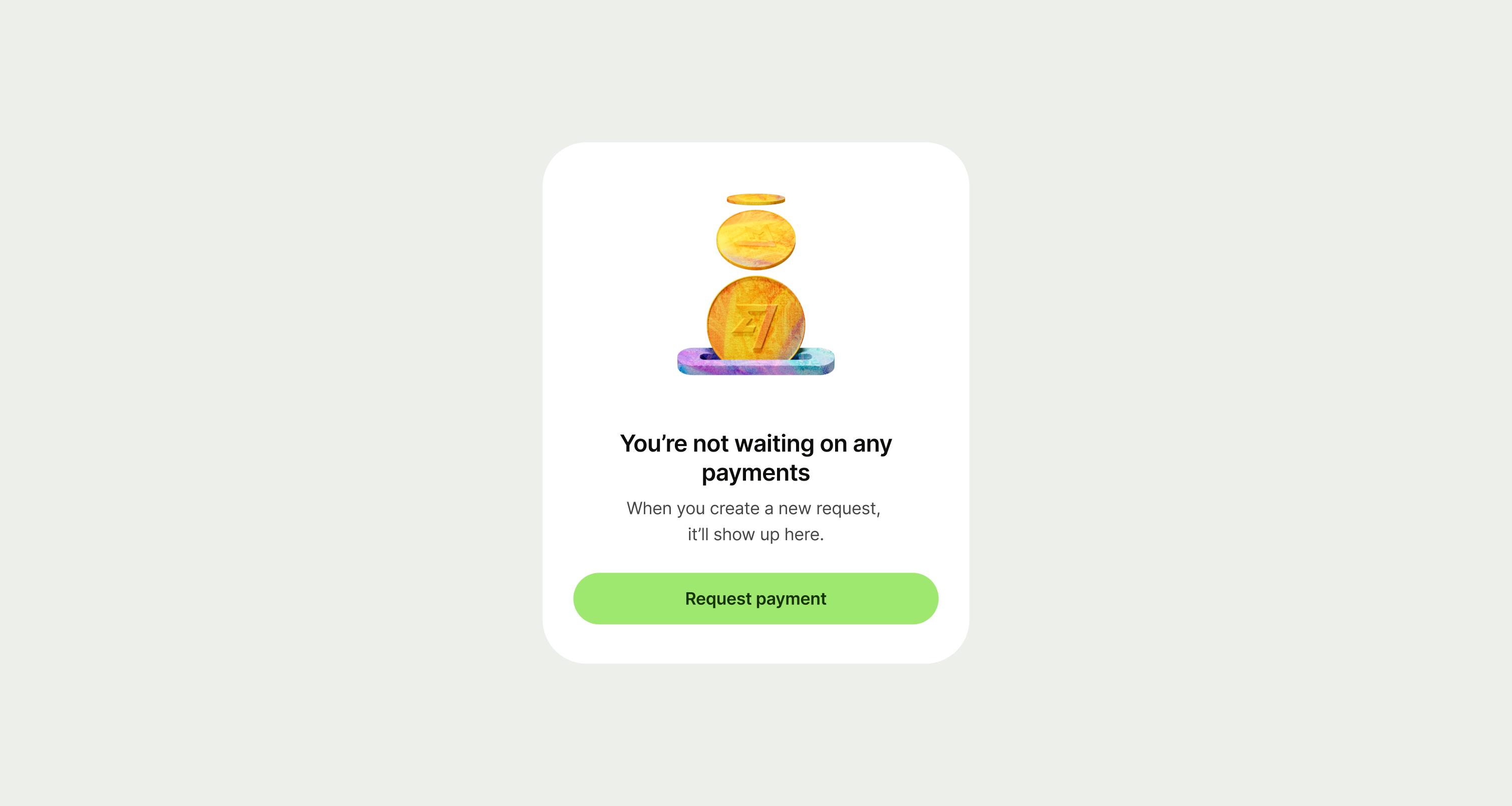
Empty state pattern example
Best practice

An empty state pattern should be used inside of another screen that uses a screen title at the top of the page.
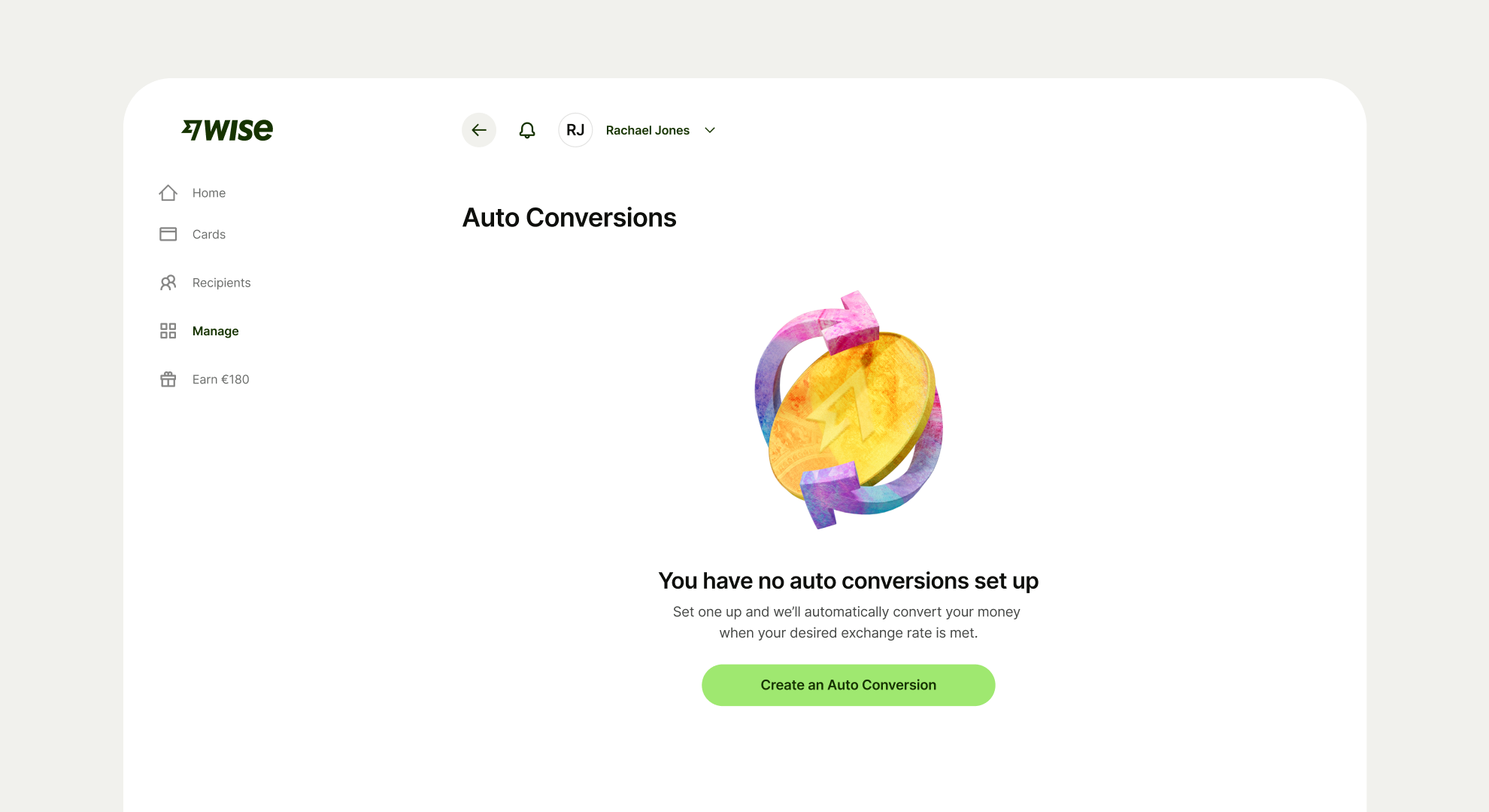
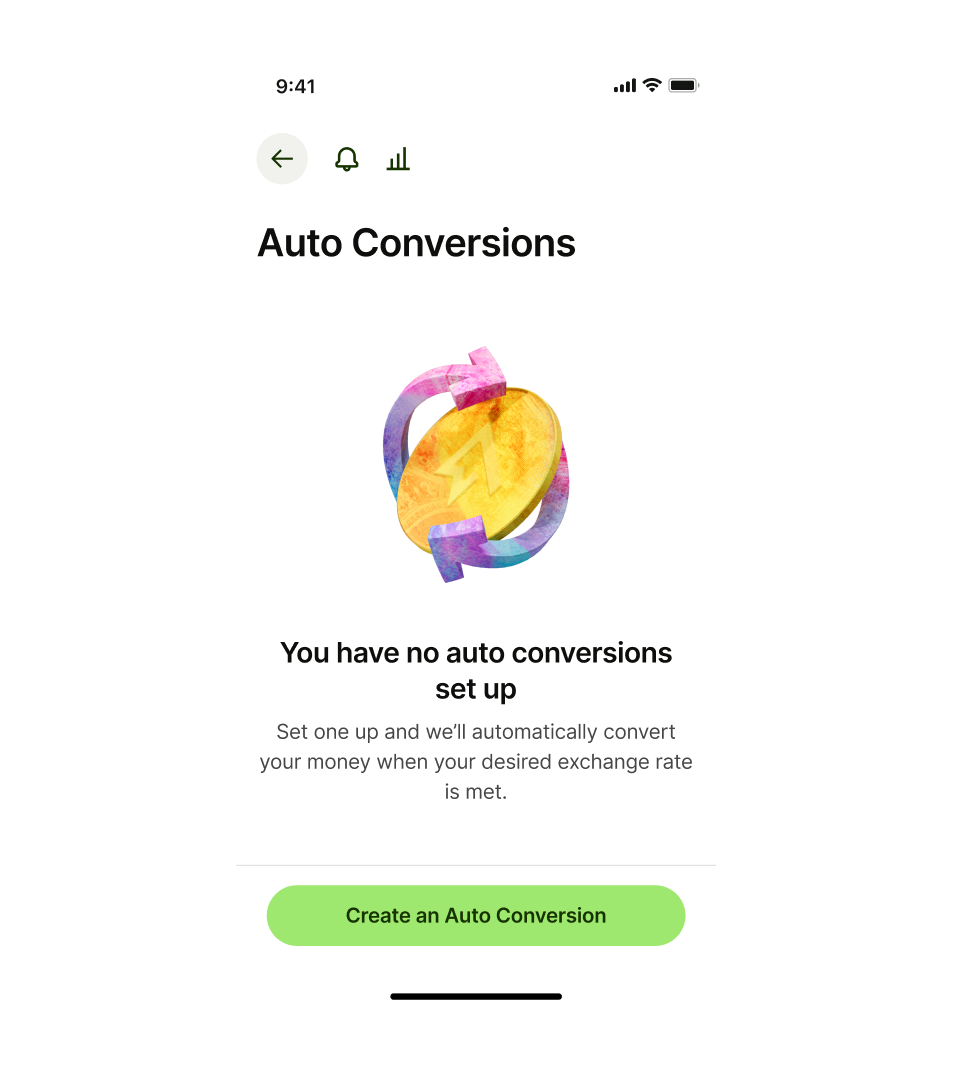
Usage

  • Align the pattern to the top of the main content with the right spacing.
  • Use a secondary or tertiary button if there’s a related step that the user could take.
  • Maximum 2 buttons at a time — standalone primary or combined with a secondary or tertiary
  • Do not use sticky footer buttons in patterns that are integrated into existing screens that have a page title. Use sticky footer buttons exclusively with full-screen templates.

Empty state pattern best practice desktop
Empty state don't use a sticky footer
Don't use a sticky footer
Empty state do use floating buttons
Use floating buttons
Design and content

Illustration

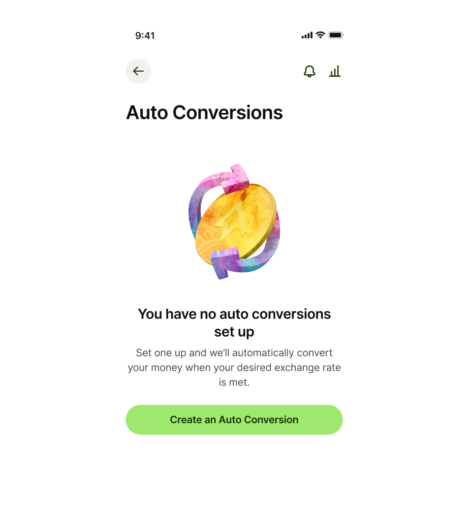
Choose an illustration that matches the content of the message. 


Go to illustration guidelines.

Title

Title copy should:

  • be just a few words

  • summarise what’s happening

  • not have any punctuation at the end

  • let the user know why there is no content on the screen at a glance.
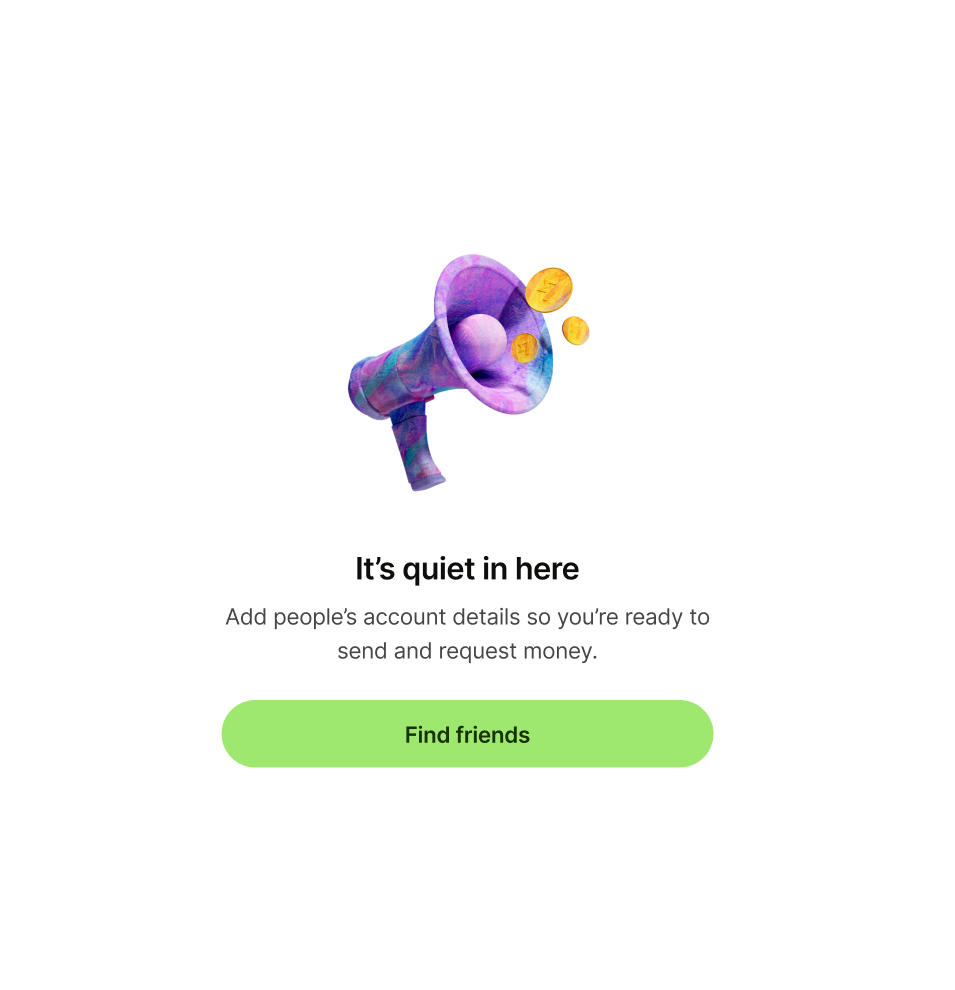
Empty state pattern with megaphone illustration and 'It's quiet in here' as title
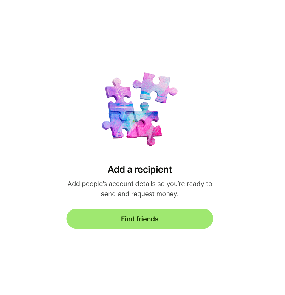
Empty state pattern with jigsaw illustration and 'Add a recipient' as title

Description

Description copy should:

  • explain the situation in more detail, and tell the user what to do next, if possible

  • be short and sweet — one or two lines is perfect

  • have a full stop at the end

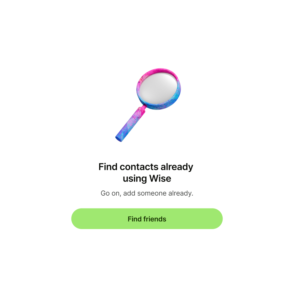
Empty state pattern with 'Go on, add someone already.' as description
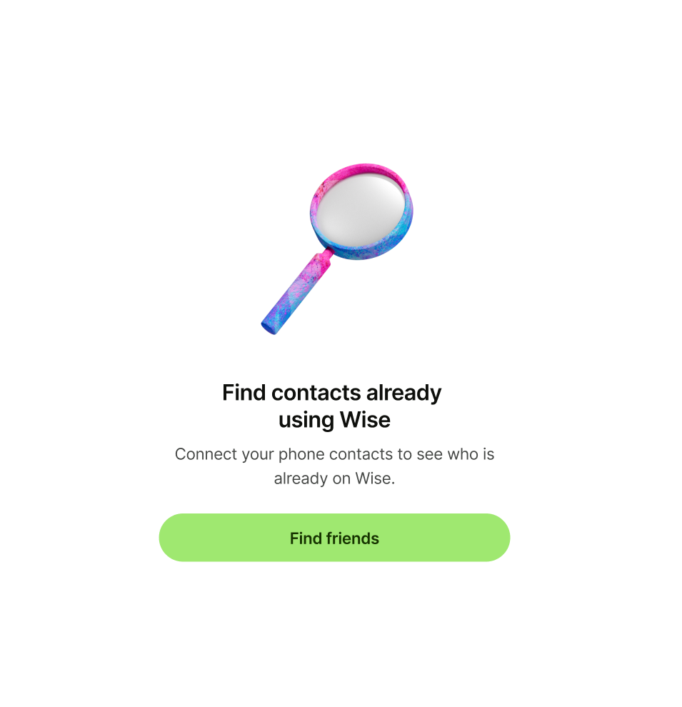
Empty state pattern with 'Connect your phone contacts to see who is already on Wise..' as description

Primary button

Primary button copy should:

  • be one or two words

  • either dismiss the screen, or take the user to a logical next step

  • have no full stop

Empty state pattern with 'Ask someone for money.' as primary button
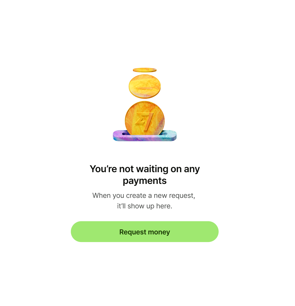
Empty state pattern with 'Request money' as primary button

Secondary or tertiary button (optional)

Secondary or tertiary button copy should:

  • be one or two words

  • give an alternative but relevant next step that would take the user to another place in the app

  • have no full stop

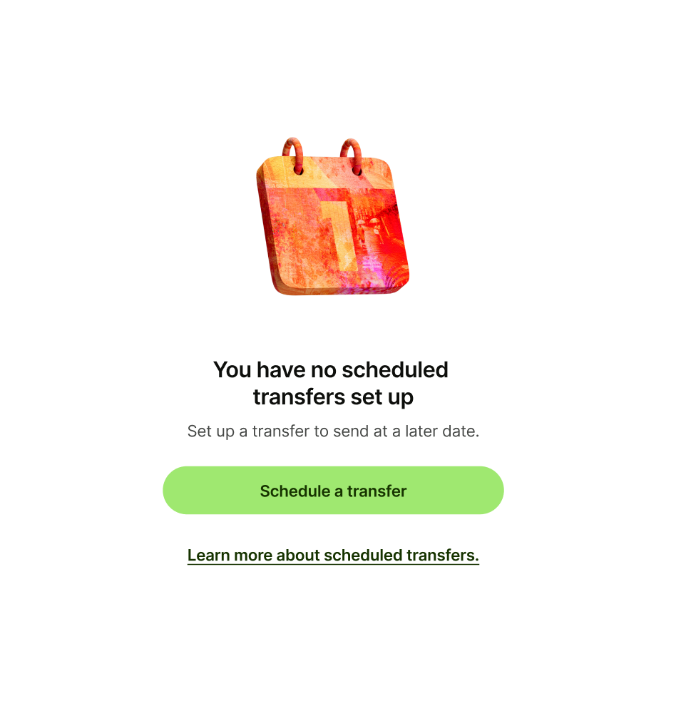
Empty state pattern with 'Learn more about scheduled transfers.' as secondary button text
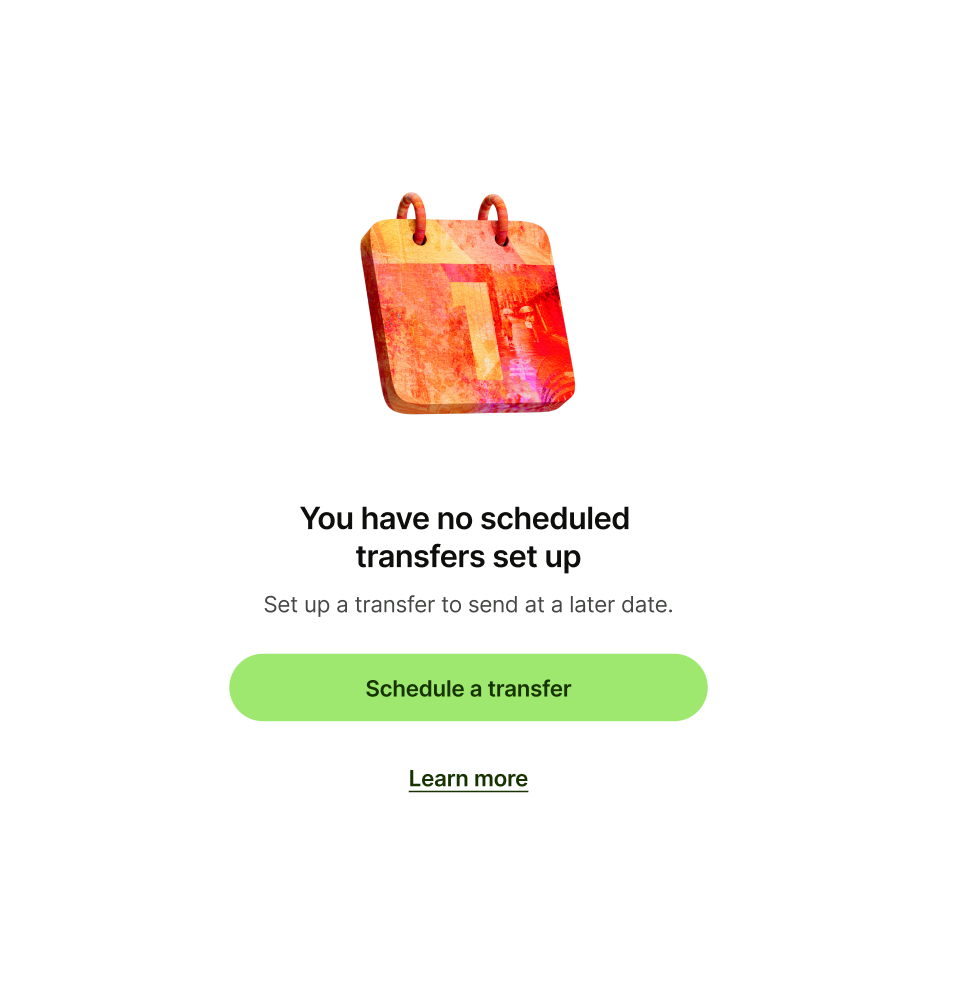
Empty state pattern with 'Learn more' as secondary button text