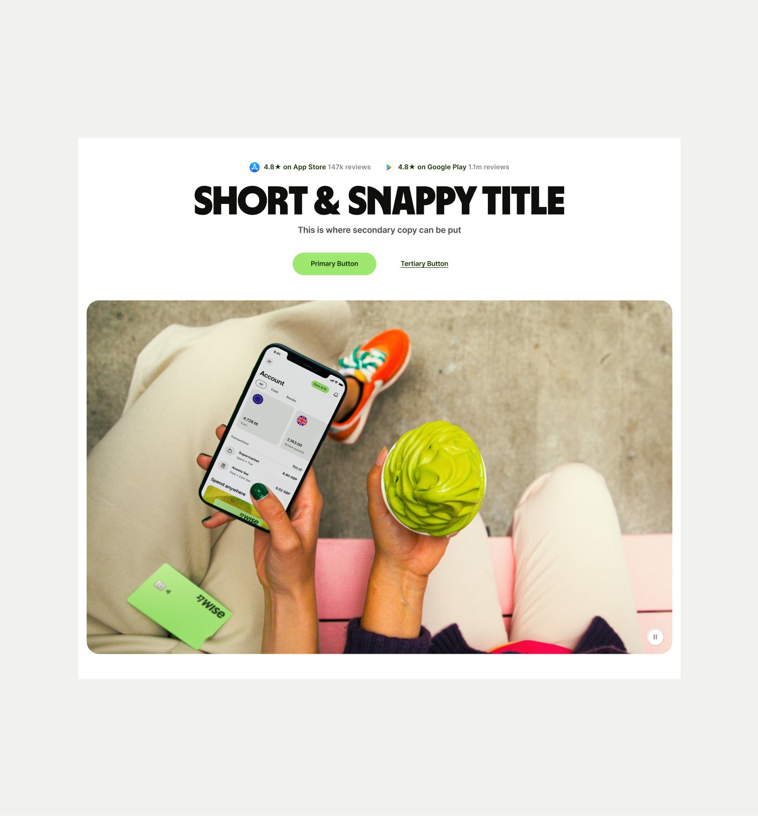
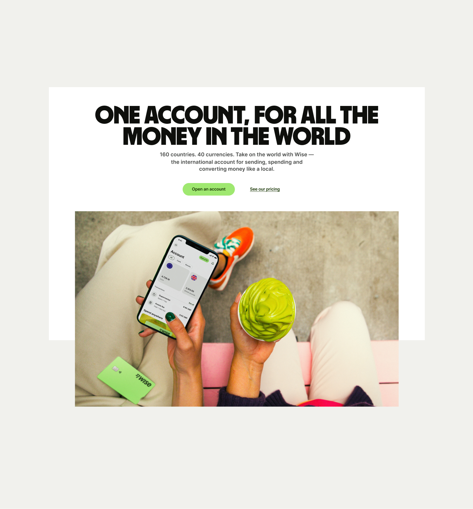
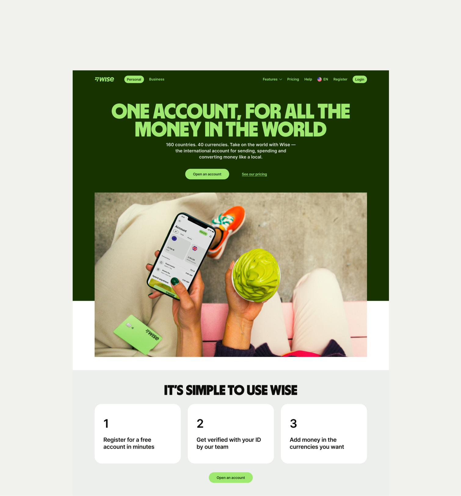
Use this component to introduce a page with a large lifestyle image or animation
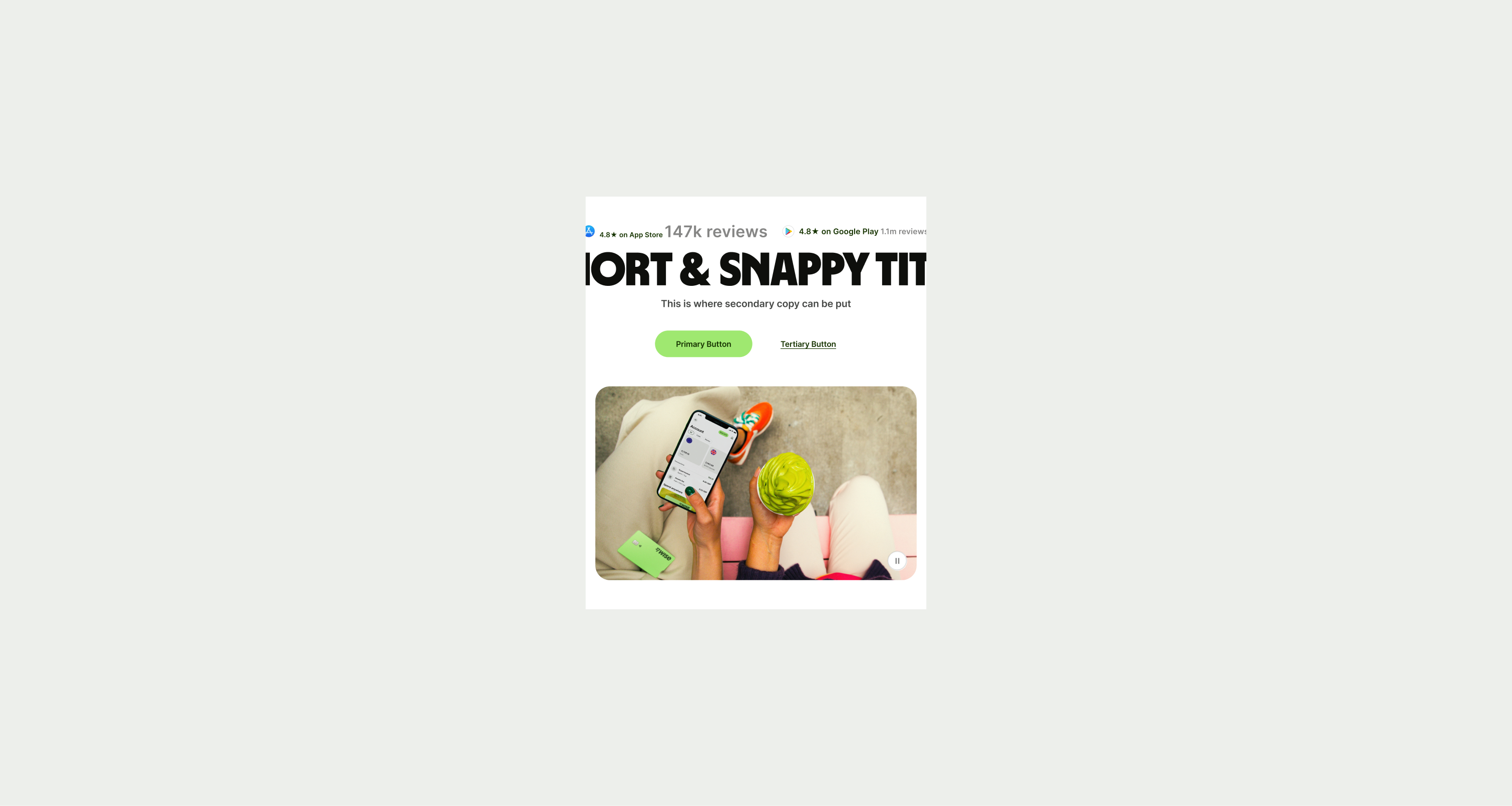
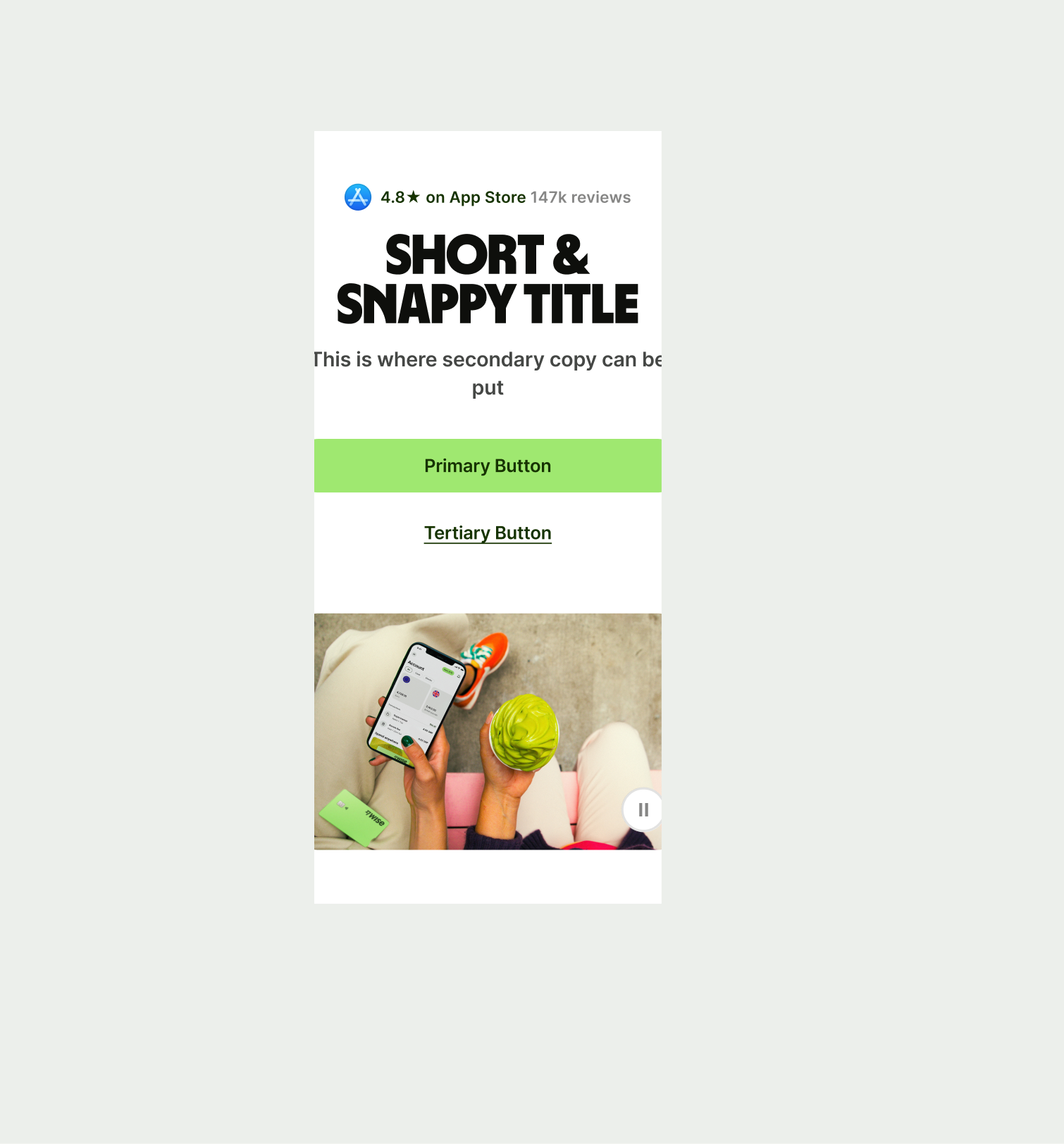
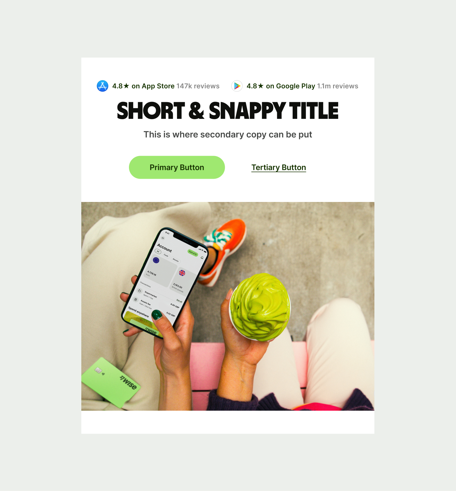
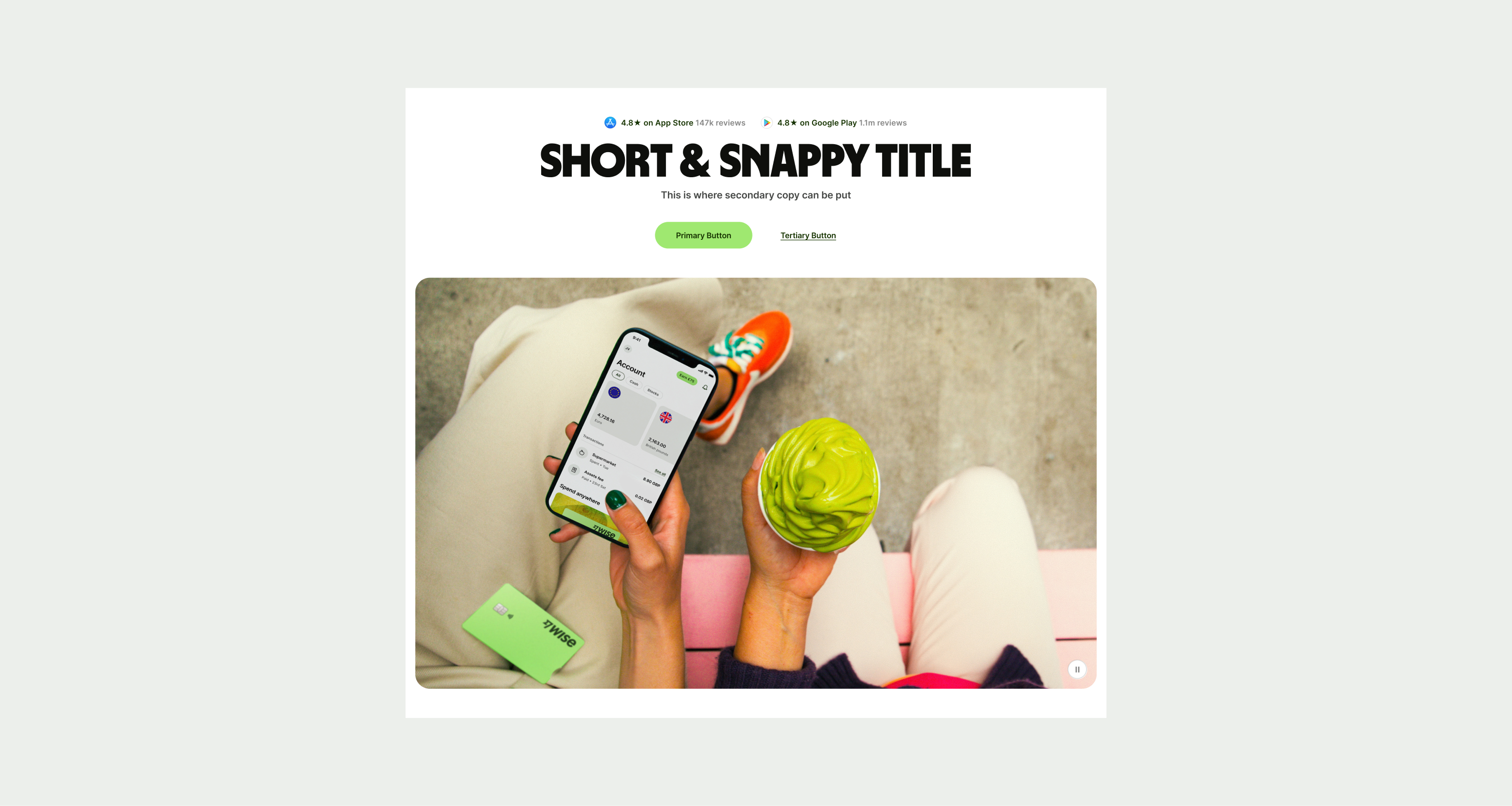
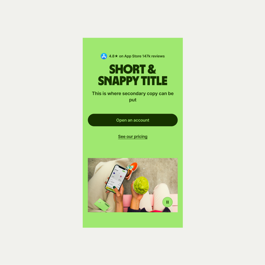
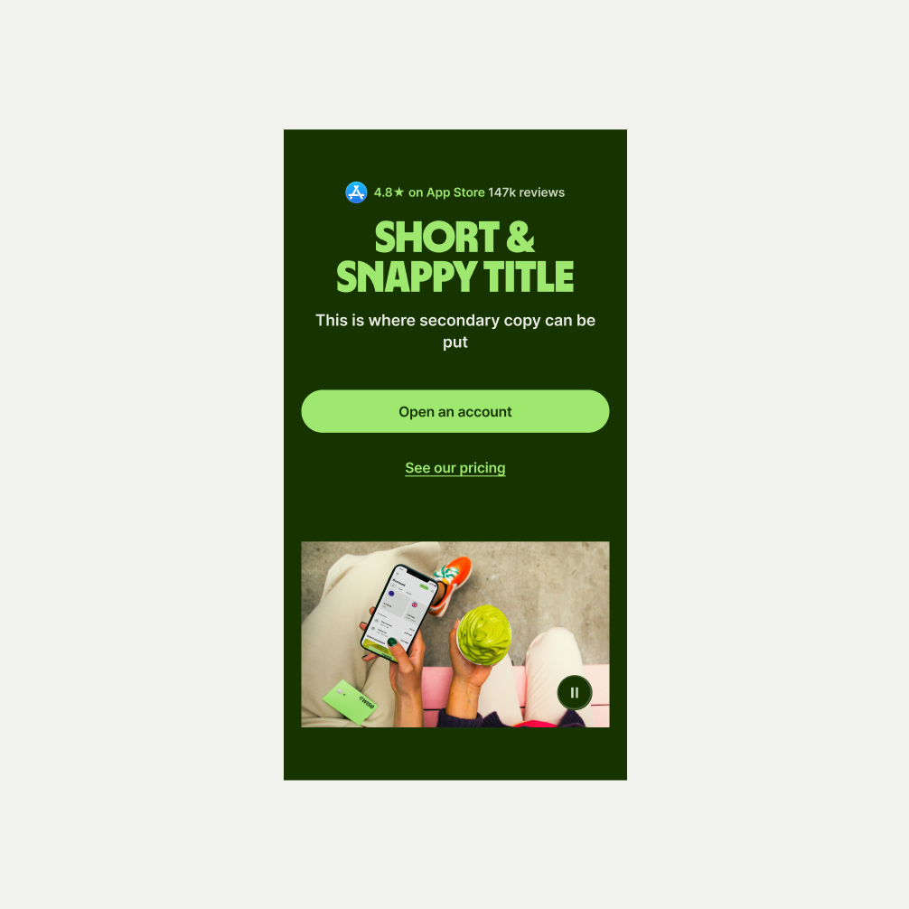
The Hero Large component is typically used at the start of editorial pages to introduce the page. It has a large lifestyle image and optional buttons to help guide the user to specific content. The component comes in our three colour themes of Light, Bright Green and Forest Green. The component has the option to have the asset either overlapping the background colour or for it to be fully behind the background colour.
- Ensure the lower half colour matches to the corresponding component.
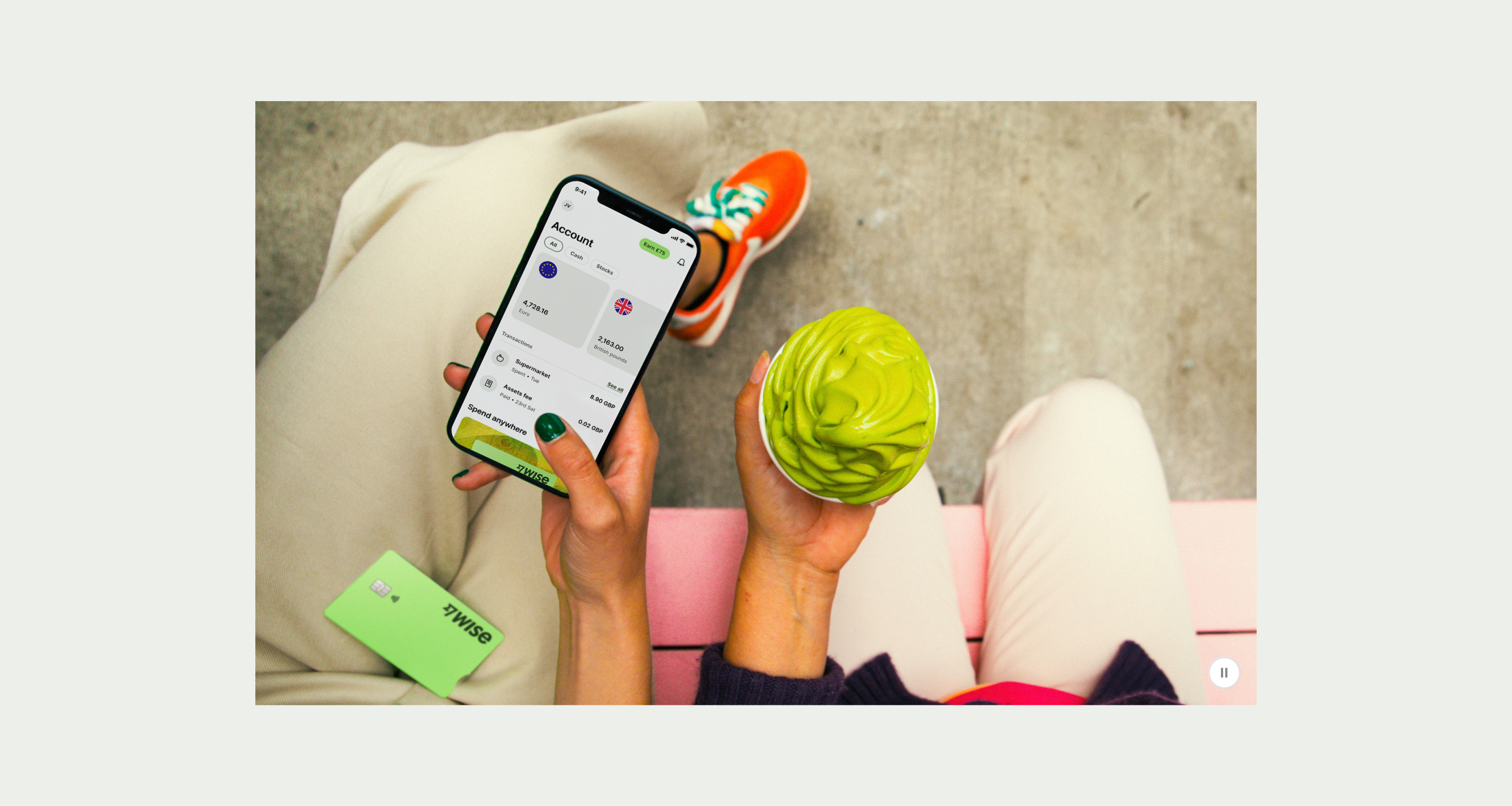
- Use appropriate images that stick to our photography guidelines.
- Dont make the copy text too long to risk overwhelming the user, or too short that it isn’t helpful.

To ensure maximum accessibility for our users, use plain language in accordance with our tone of voice for an inclusive reading experience. The text should be precise and informative. Ensure that images are accompanied by appropriate alternative text (alt text) for screen readers. An ideal alt text is descriptive and concise to convey the meaning and purpose of the image to users who may not be able to see it.
To ensure that the Hero Large component remains visually appealing and accommodates different languages, adhere to the following content limitations:
Headline: The headline should be short and precise. Ideally fitting across two lines.
Body Copy: The body copy should be precise and clear, keeping in line with our tone of voice. Avoid adding paragraphs of text that might overwhelm the user.
By following these guidelines, you ensure that the Hero Large component can comfortably accommodate different languages while maintaining a consistent and visually pleasing design.
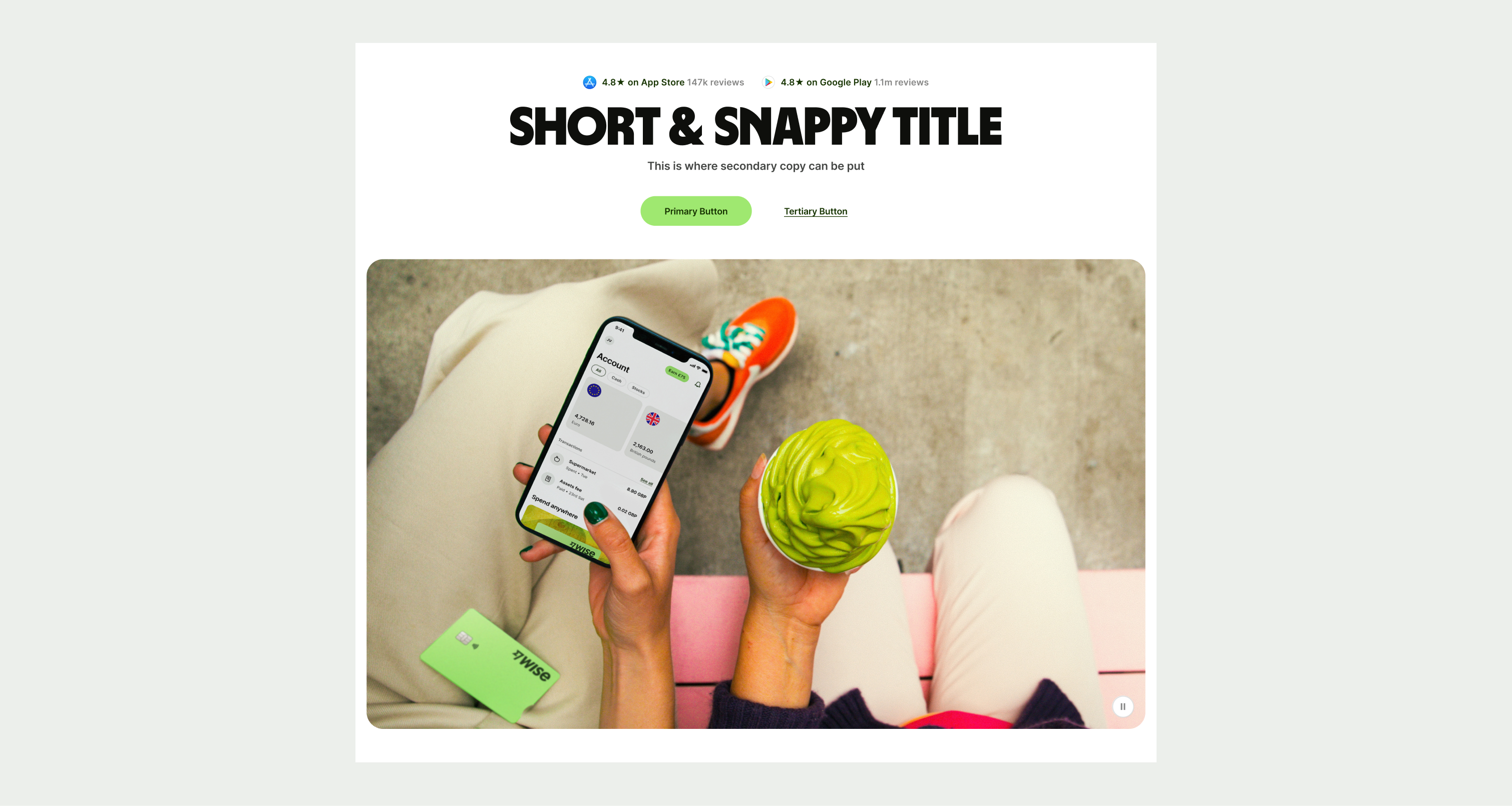
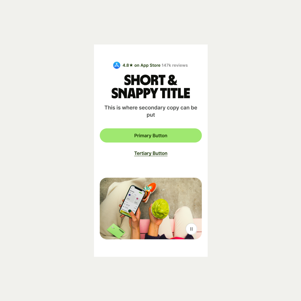
These are the examples of the Hero Large component across different screen sizes.