This component can be used to highlight information in a colour banner on the page.
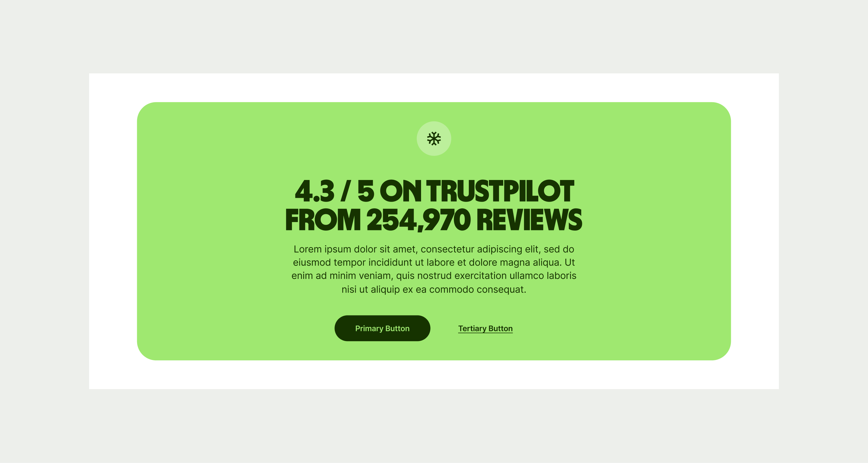
The Banner Info component can be used across the site to highlight and showcase information such as reviews. It has optional secondary text and a minimum height to ensure legibility and an optional secondary button. The Banner should always have one call-to-action for users to find out more and it comes in one colour.

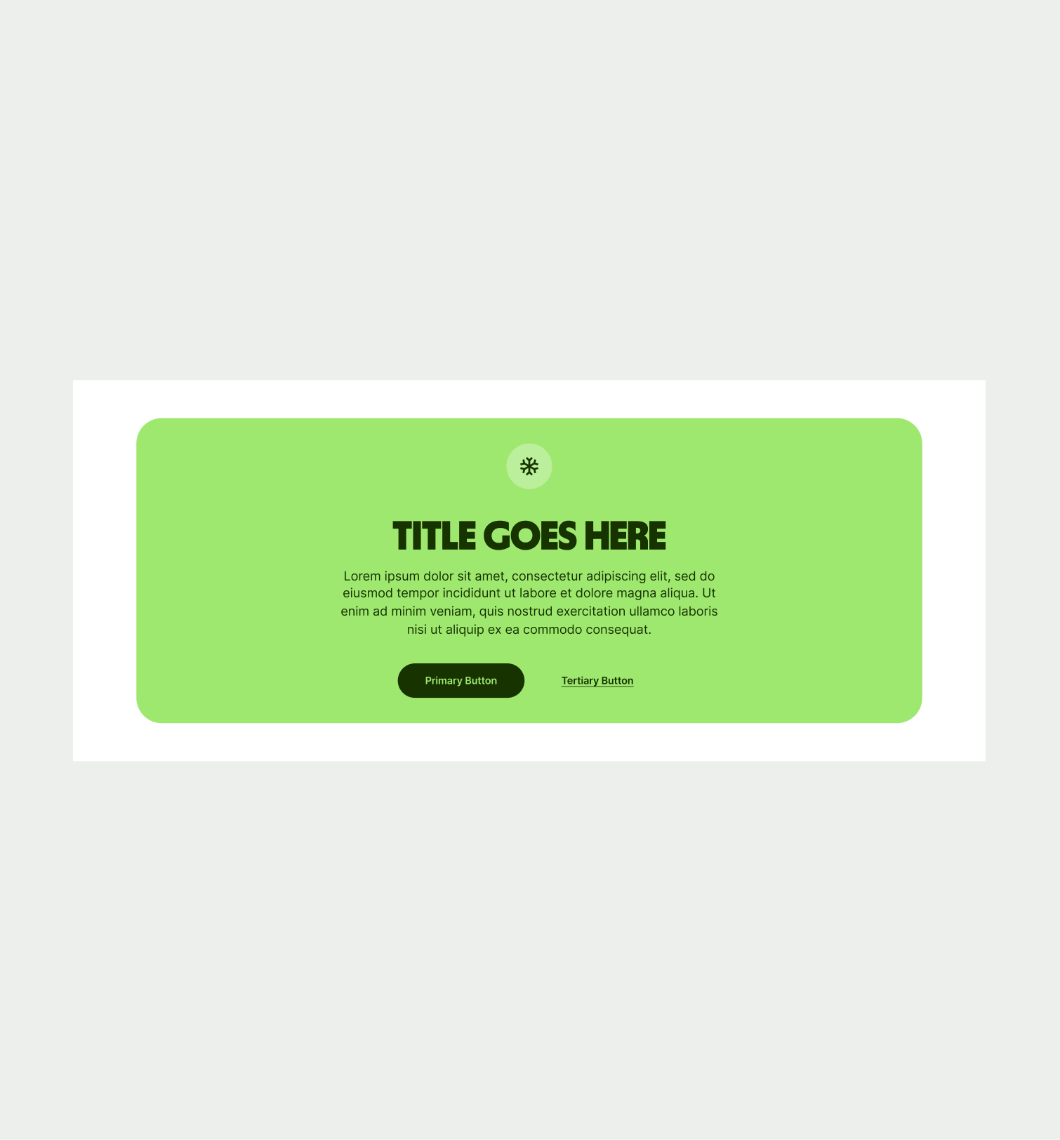
To ensure that the Banner Info component remains visually appealing and accommodates different languages, adhere to the following content limitations:
Headline: The headline should be short and precise. Ideally fitting across two lines.
Body Copy: The body copy should be precise and clear, keeping in line with our tone of voice. Avoid adding paragraphs of text that might overwhelm the user.
By following these guidelines, you ensure that the Banner Info component can comfortably accommodate different languages while maintaining a consistent and visually pleasing design.

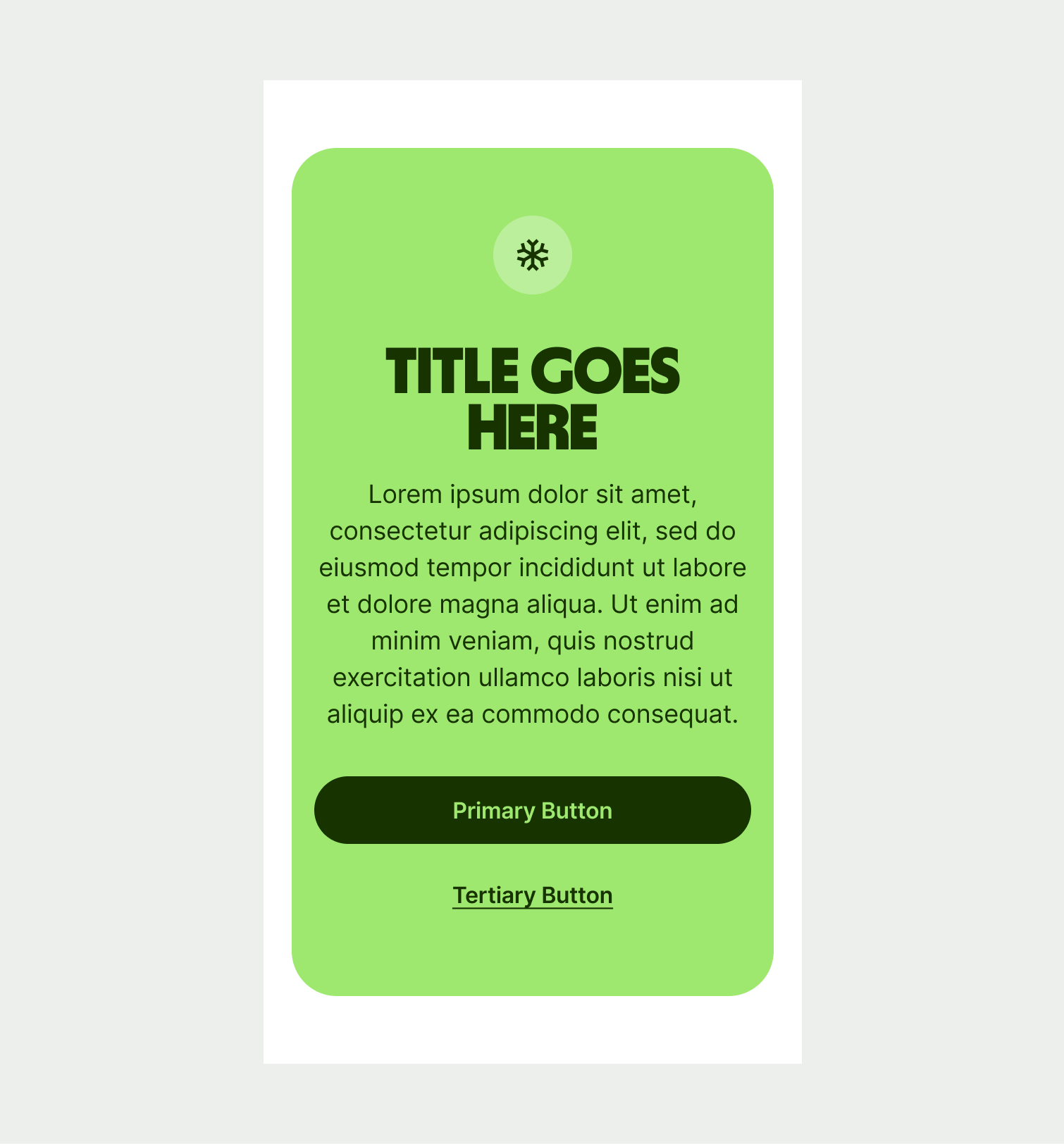
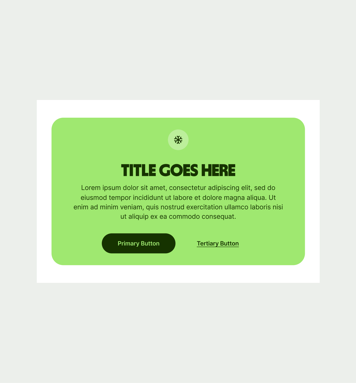
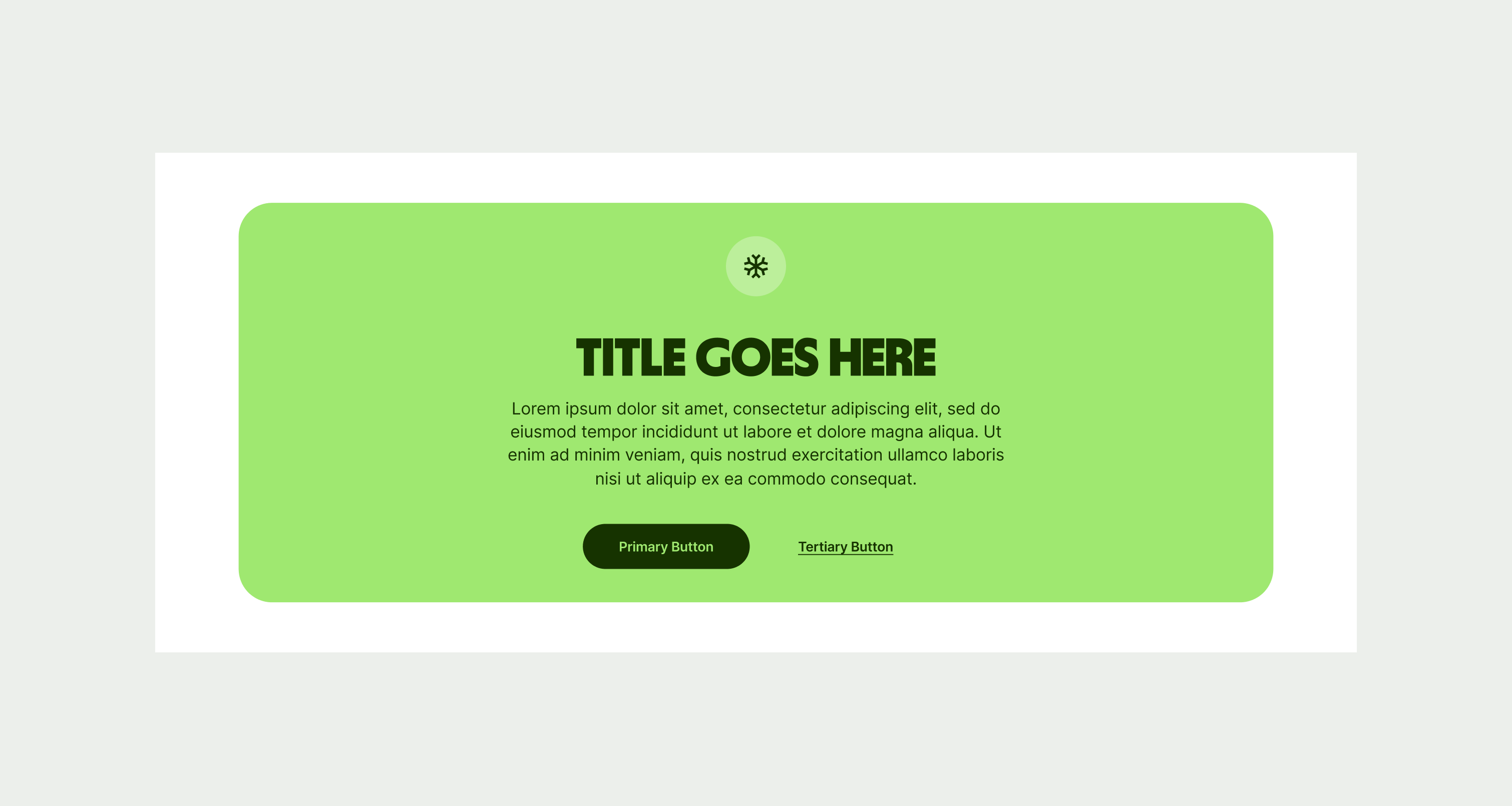
These are the examples of the Banner Info component across different screen sizes.