Primary button
Primary button copy should:
be one or two words
either dismiss the screen, or take the user to a logical next step
have no full stop
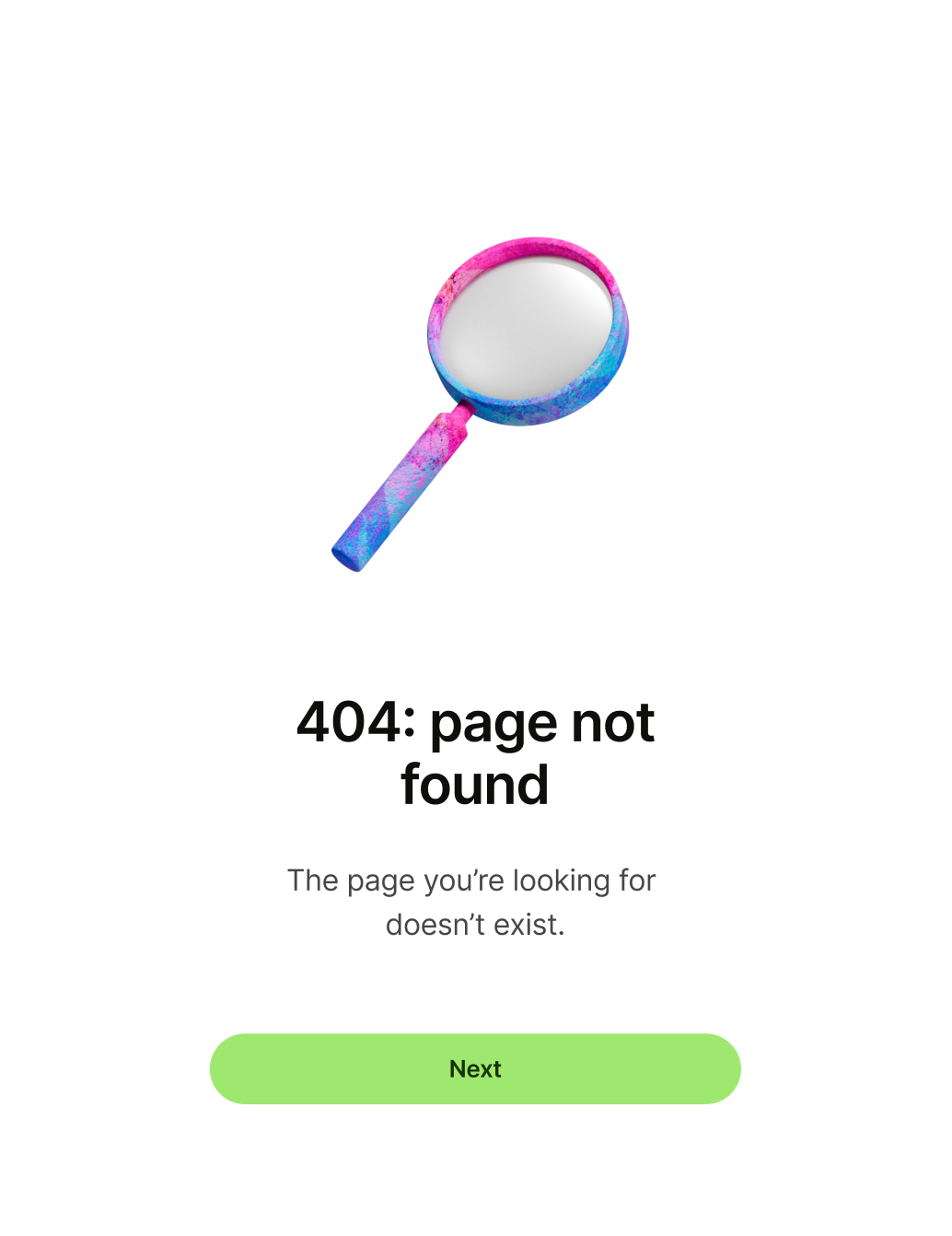

Use an error screen to tell the user that an error has occurred during a flow.

There are 6 different illustrations that you can use on an error screen. Each one has a specific use case.
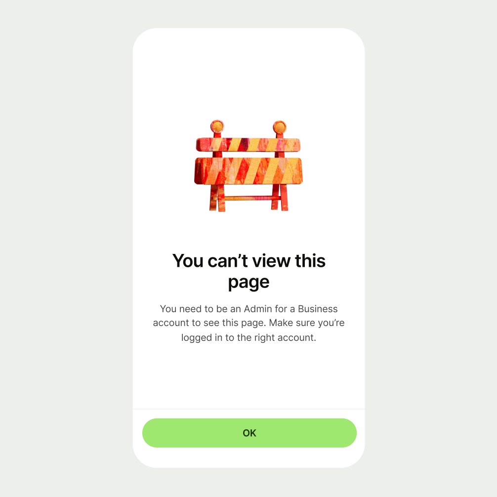
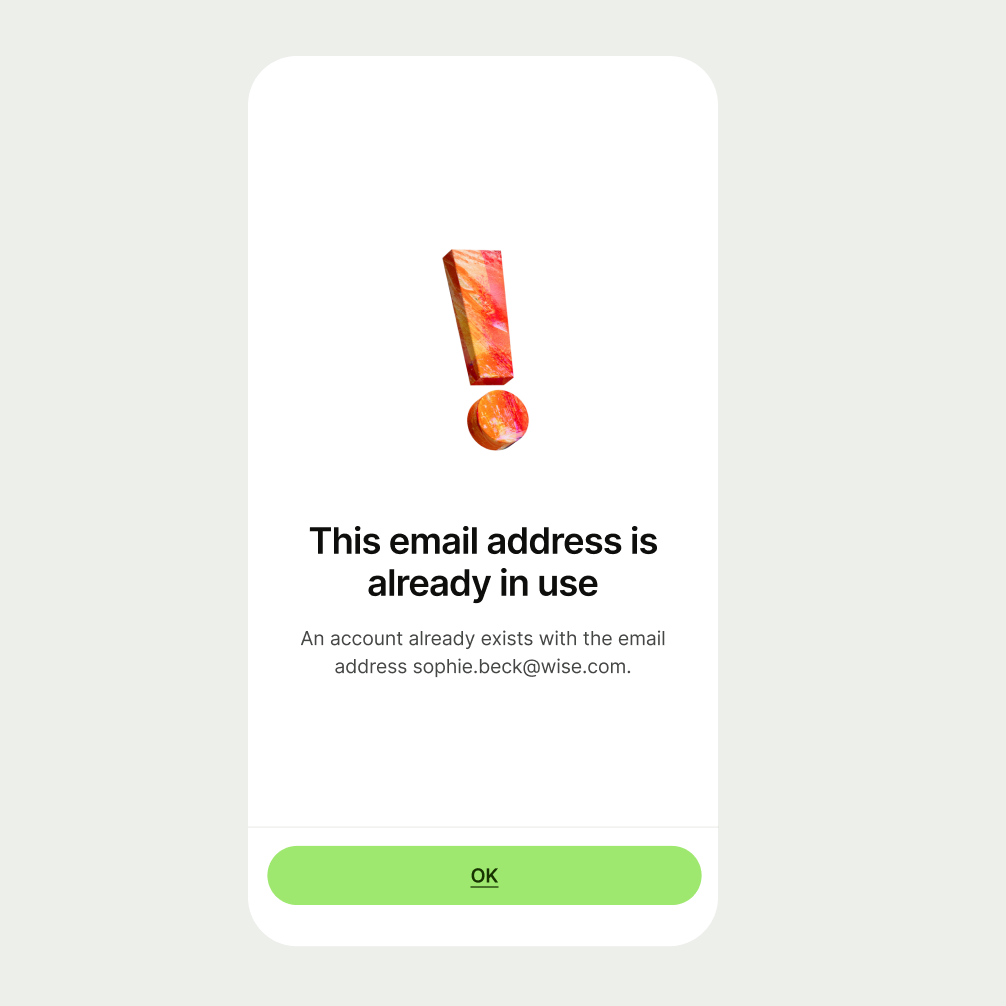
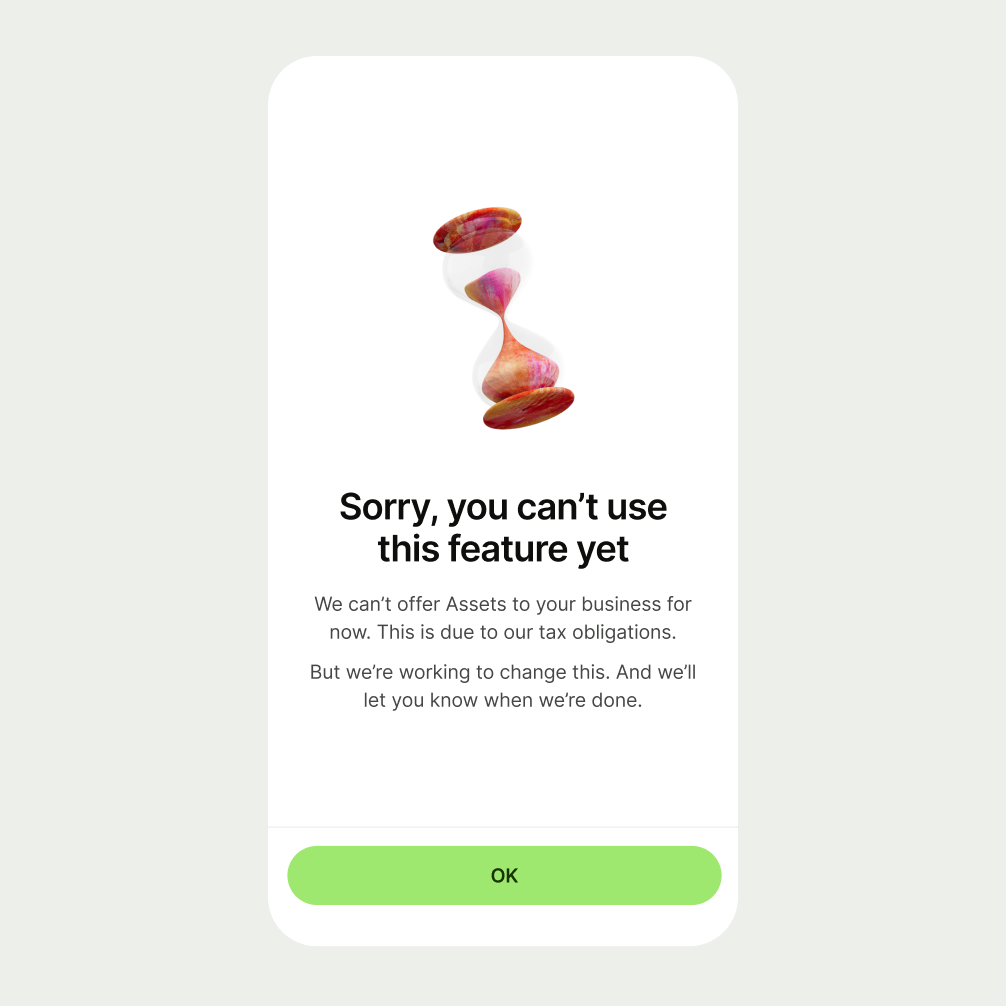
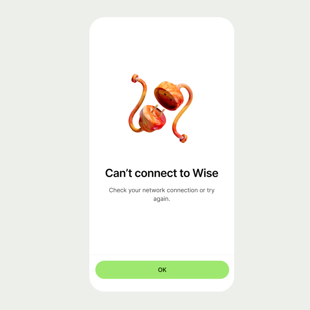
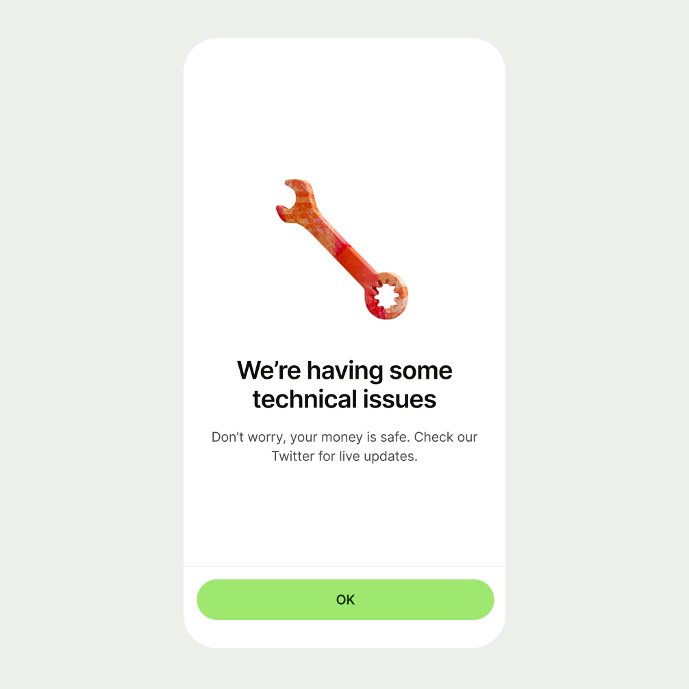
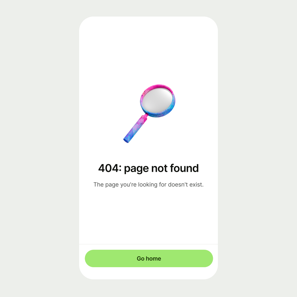
Title copy should:
be just a few words
clearly explain the error — the user shouldn’t need to read the description to understand the issue
not have any punctuation at the end
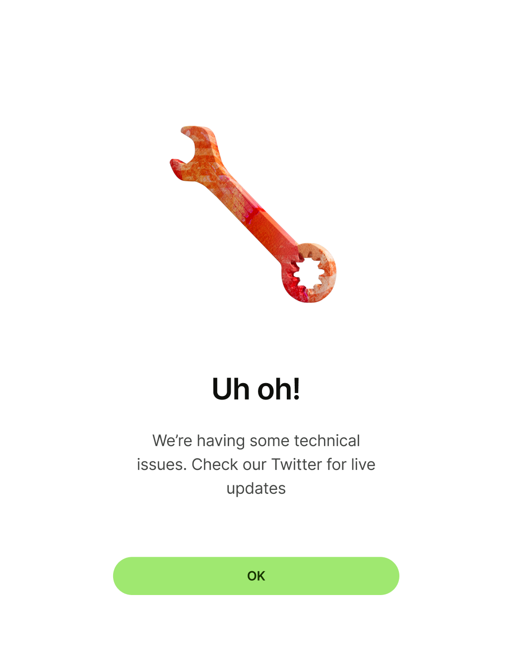
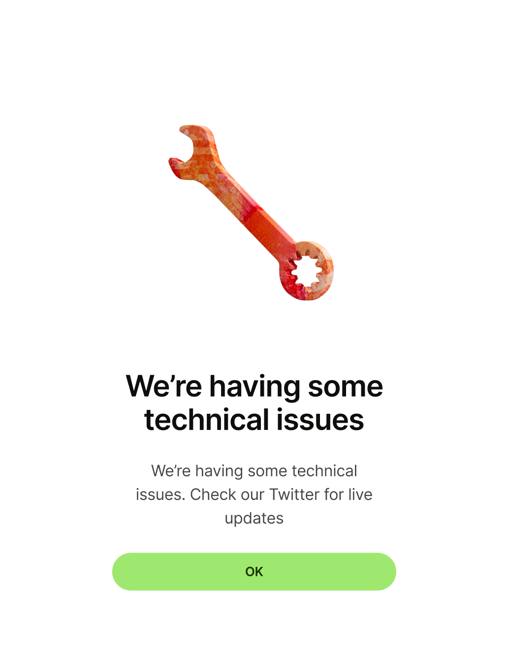
Description copy should:
explain the issue in more detail, and tell the user what to do next, if possible
reassure them their money is safe, if relevant
be short and sweet — one or two lines is perfect
have a full stop at the end
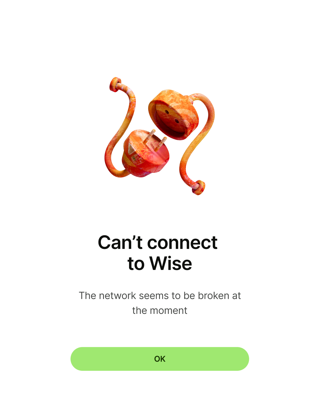
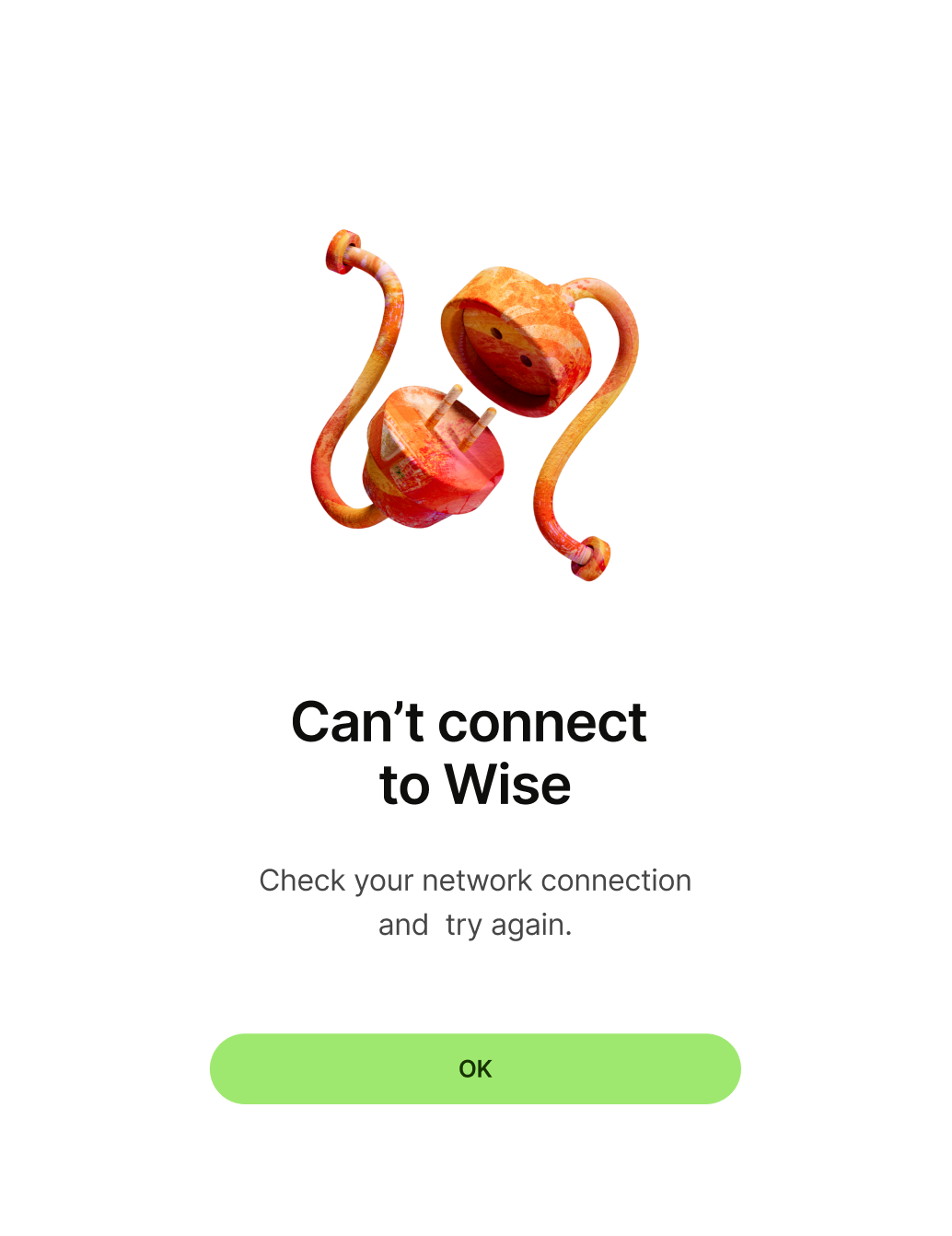
Primary button copy should:
be one or two words
either dismiss the screen, or take the user to a logical next step
have no full stop


Platform | Available |
|---|---|
Android | |
iOS | |
Web |