Error pattern

Error patterns are used inside of pages to denote when there is an issue or error with the target content.
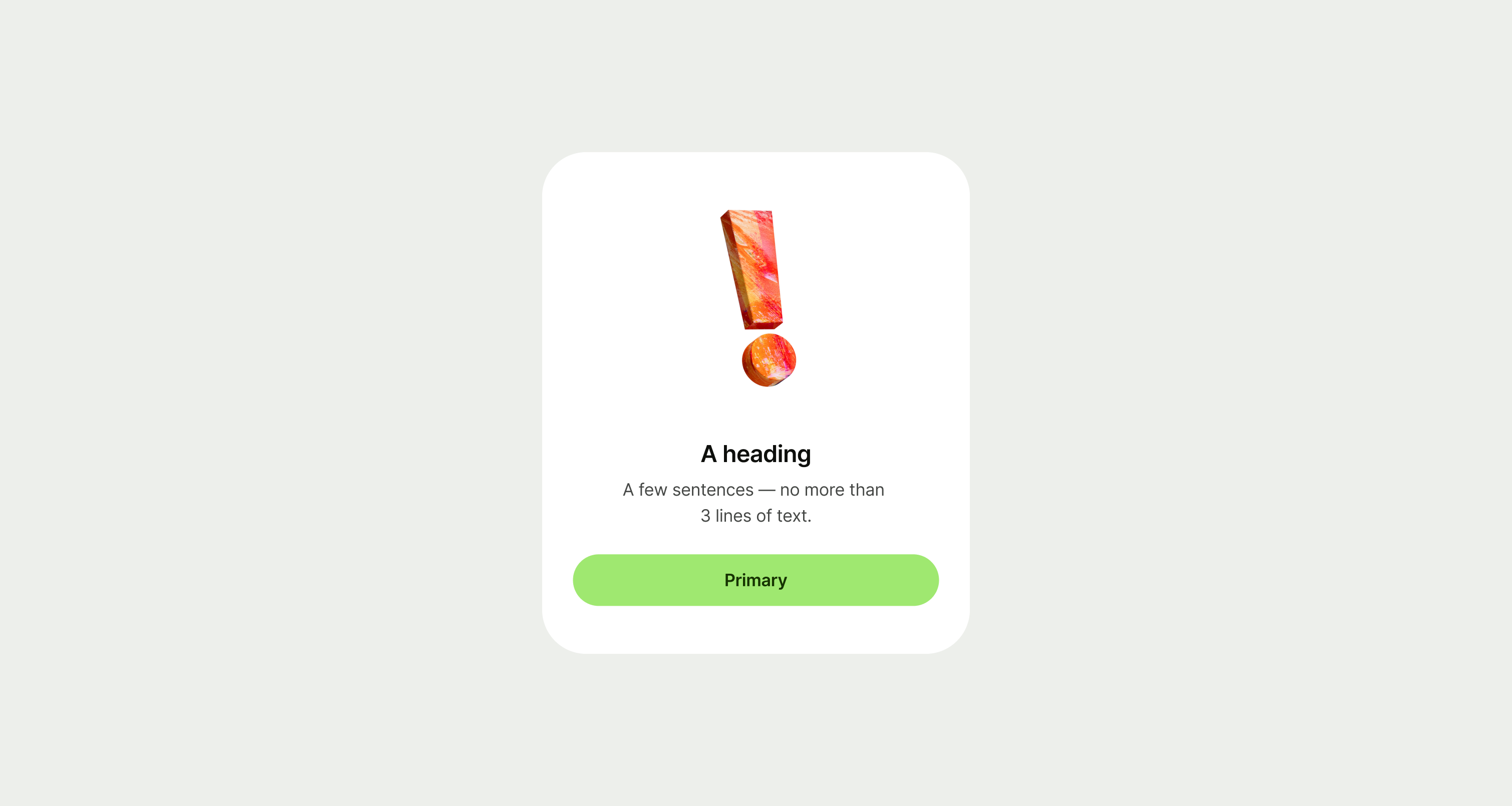
Error pattern example
Best practice

A error pattern should be used when placed inside of another screen that uses a screen title at the top of the page. If you need a standalone error screen, use the error screen template.
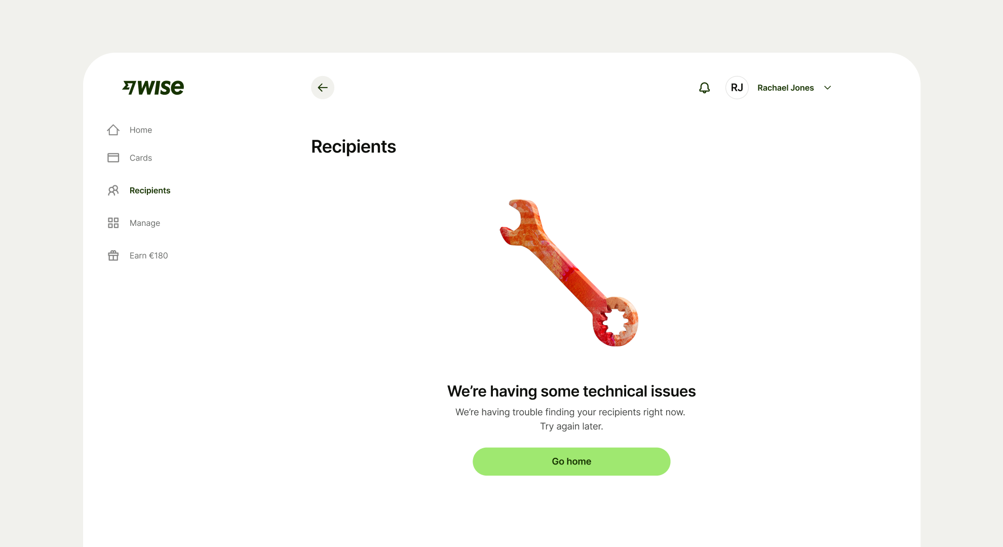
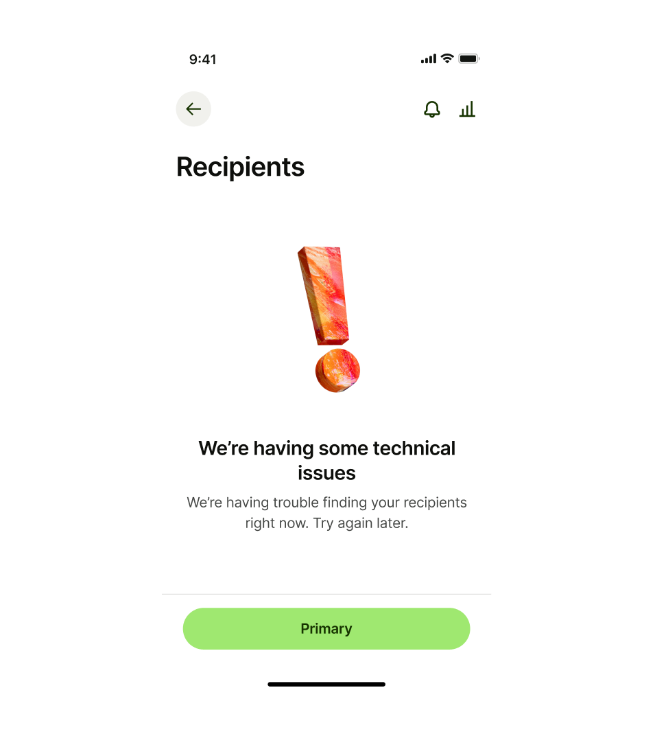
Usage

  • Align the pattern to the top of the main content section in our page template.
  • Use a secondary or tertiary button if there’s a related step that the user could take.
  • Only show 2 buttons at a time.
  • Do not use sticky footer buttons in patterns that are integrated into existing screens that have a page title. Use sticky footer buttons exclusively with full-screen templates.

Empty state desktop
Best practice don't — sticky footer buttons
Don't use sticky footer buttons
Best practice do — use floating buttons
Use floating buttons
Design and content

Error pattern illustrations

There are 5 different illustrations that you can use on an error pattern. Each one has a specific use case.
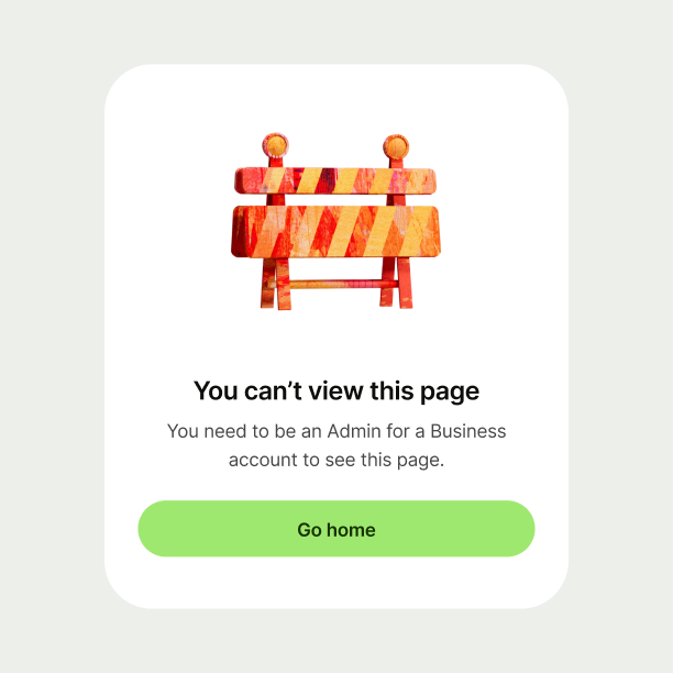
Error state with construction fence illustration
Construction fence

Use construction fence when a user isn’t allowed access to a specific feature.

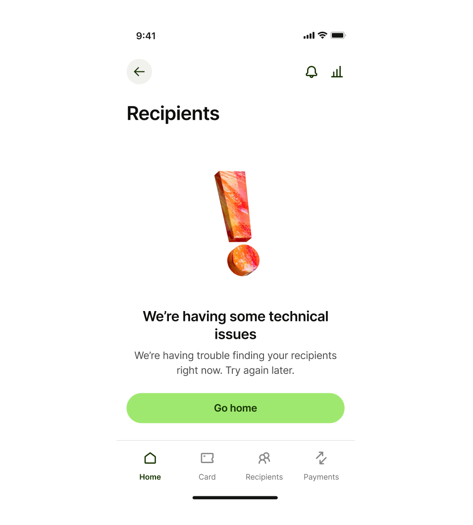
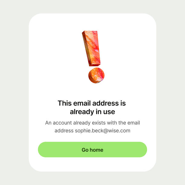
Error state with exclamation illustration
Exclamation mark

Use the exclamation mark for general warnings and for when the user needs to check something.

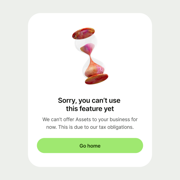
Error state with sand timer illustration
Sand timer

Use the sand timer when Wise has a new feature but the user can’t access it yet. The sand timer can also be used if a transfer is pending.

Error state with plug illustration
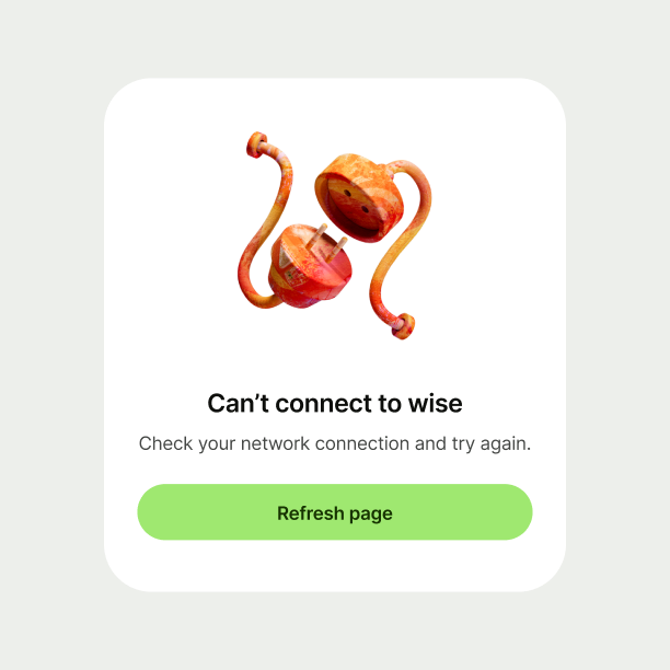
Electric plug

Use the electric plug when a user has no network connection.

Error state with tool illustration
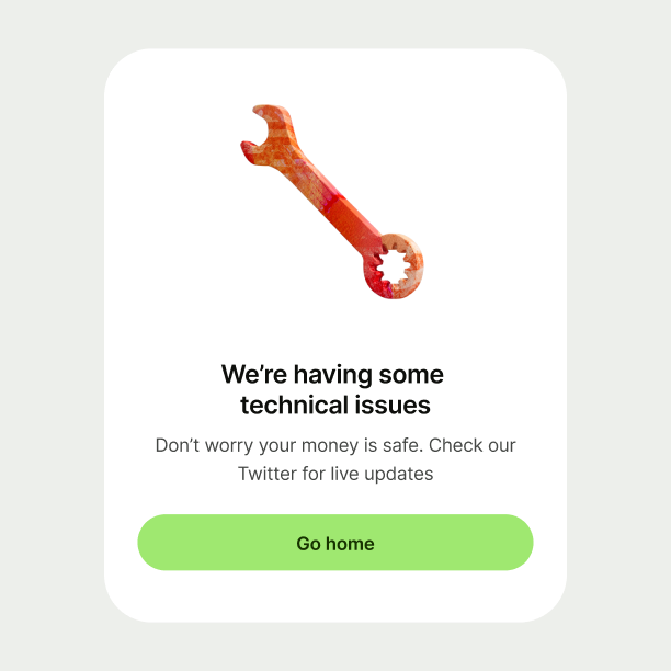
Tool

Use the tool when Wise is experiencing technical issues.

Title

Title copy should:

  • be just a few words

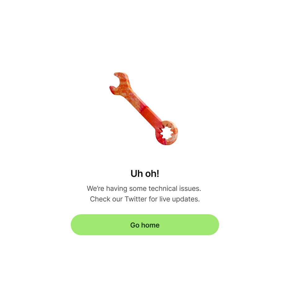
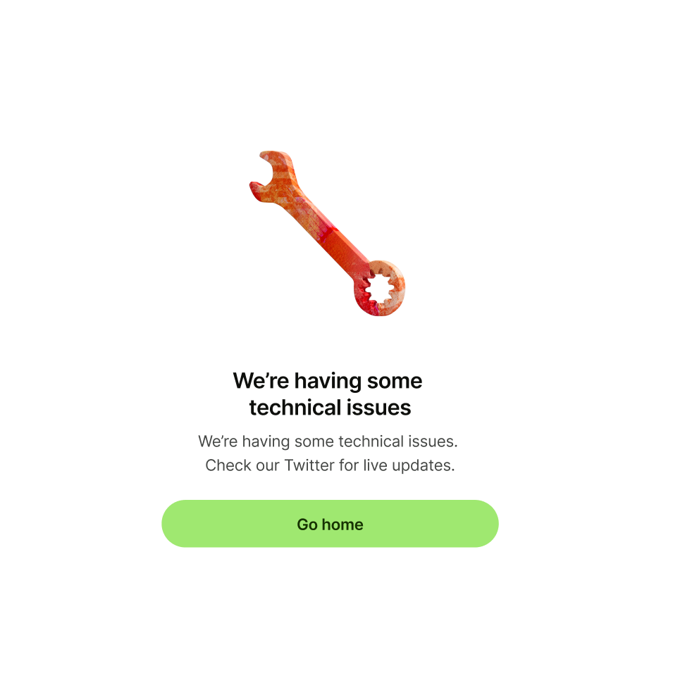
  • clearly explain the error — the user shouldn’t

  • need to read the description to understand the issue

  • not have any punctuation at the end

Error pattern with 'uh oh' as title
Error pattern with 'We’re having some 
technical issues' as title

Description

Description copy should:

  • explain the issue in more detail, and tell the user what to do next, if possible

  • reassure them their money is safe, if relevant

  • be short and sweet — one or two lines is perfect

  • have a full stop at the end

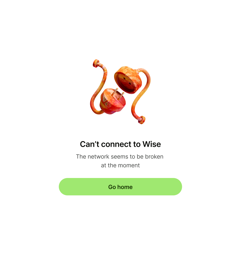
Error message with 'The network seems to be broken 
at the moment' as description
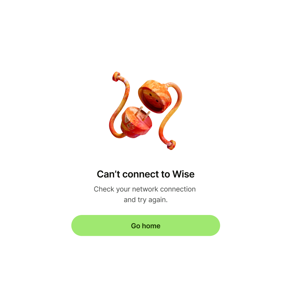
Error message with 'Check your network connection 
and try again.' as description

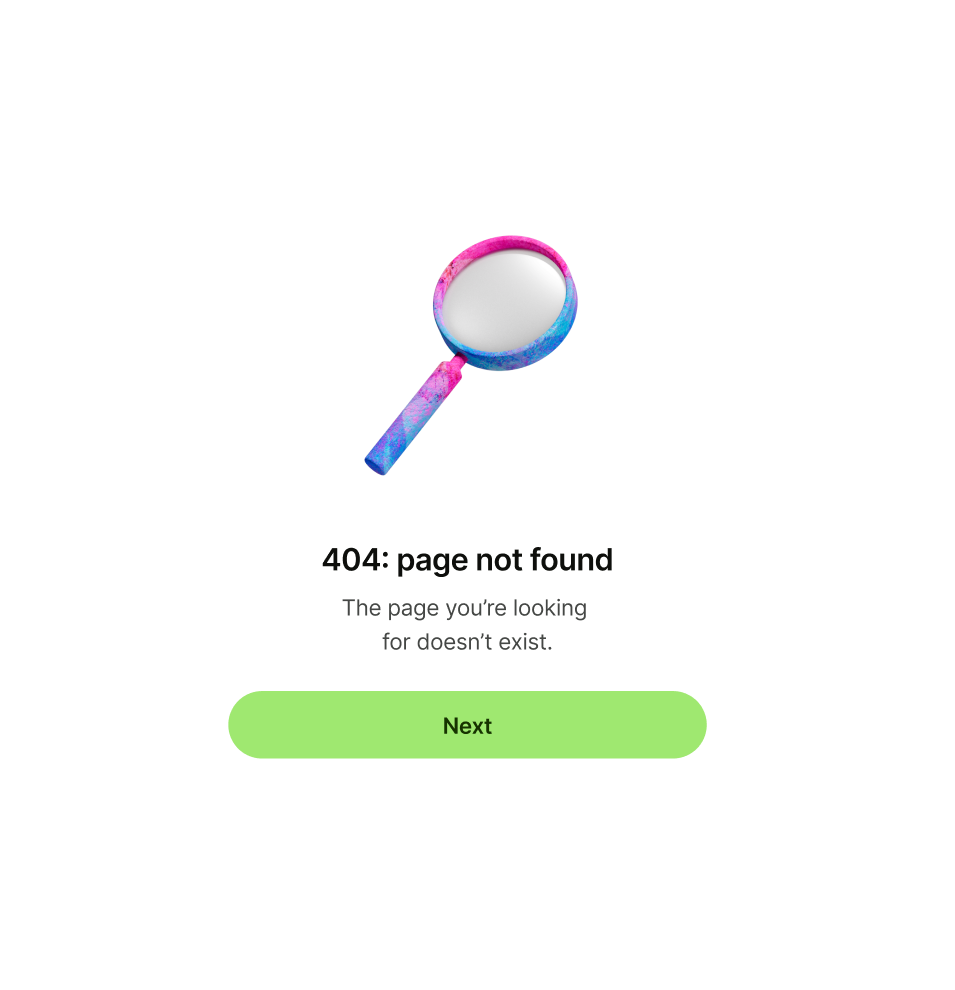
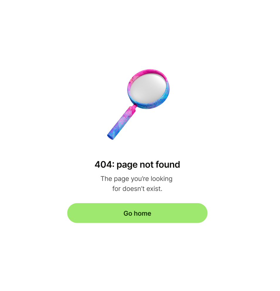
Primary button

Primary button copy should:

  • be one or two words

  • either dismiss the screen, or take the user to a

  • logical next step

  • have no full stop

Error pattern with 'next' as primary button copy
Error pattern with 'go home' as primary button copy

Secondary or tertiary button (optional)

Secondary or tertiary button copy should:

  • be one or two words

  • give an alternative but relevant next step that

  • would take the user to another place in the app

  • have no full stop

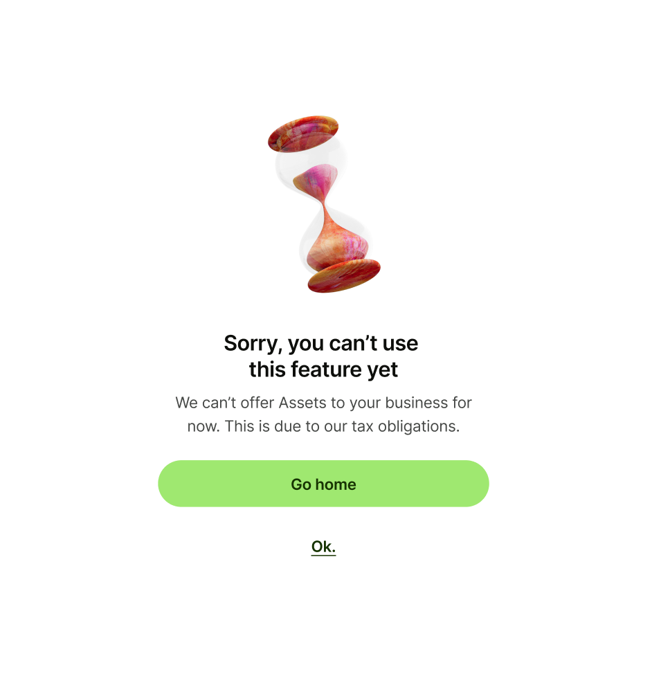
Error pattern with 'Ok.' as tertiary button copy
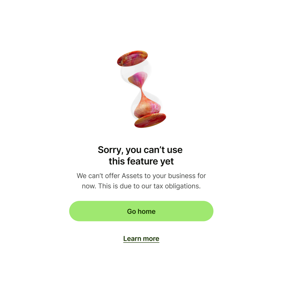
Error pattern with 'Learn more' as tertiary button copy