Success screen

Use a success screen at the end of a flow to let users know they’ve successfully completed a task.

A tick illustration.
Types

There are two types of success screen:

  • Celebration

  • Confirmation

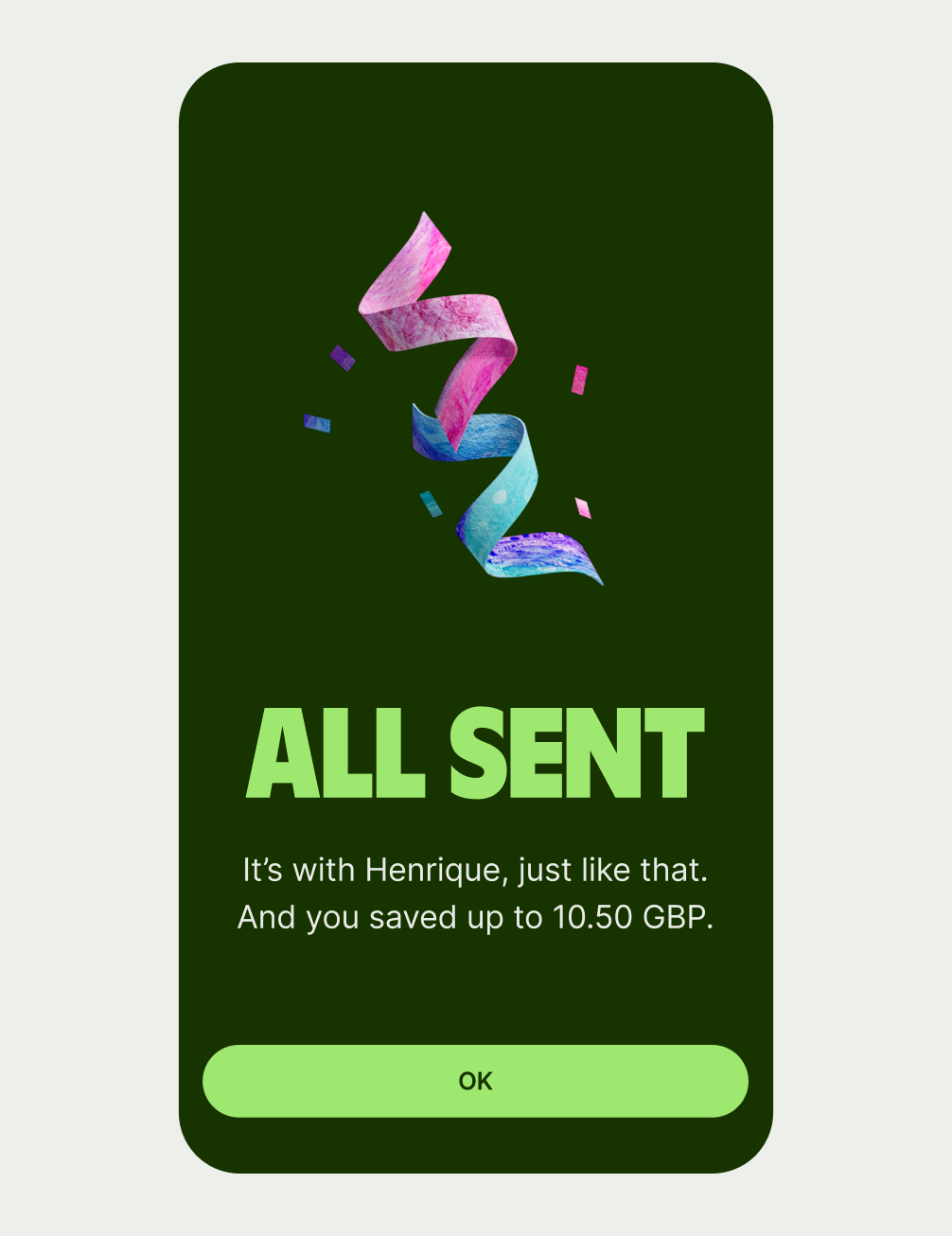
A success screen telling the user their money has sent.
Celebration

Use celebration to mark key brand moments, like:

  • Sending money
  • Converting money
  • Ordering a new card

Celebration should always have a green background.

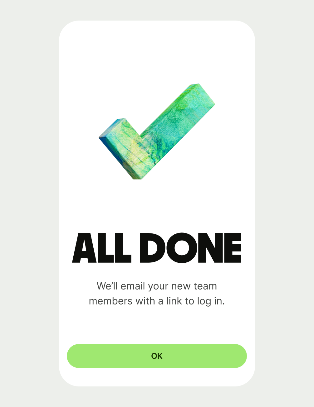
A success screen telling the user they've added a new team member.
Confirmation

Use confirmation for general administrative task, like:

  • Emailing a receipt
  • Adding team members to a business account

Confirmation can have either a white or green background.

Best practice
  • Only use once at the end of a flow.
  • Use the description if you need to give more details about what’s happened.
  • Use a secondary button if there’s a related next step the user could take.

Design and content

Title

Title copy should:

  • be just a few words

  • summarise what’s happened

  • not have any punctuation at the end

Success screens are moments of celebration, where we can show our personality. But it’s still important to clearly communicate to the user what’s happened.

For example, if a user has been trying to send a large amount of money abroad for a family emergency, they want to be reassured their money is there.

But if the situation is less high stakes (for example, a user has just got a digital card, or added money to a jar) then it’s ok to be a bit more playful — as long as it’s still clear.

And keep in mind how often a user might see a particular success screen. They’re going to see the send success screen a lot more than they will see the card order success screen. A moment of delight can quickly turn to dread if you see it 15 times a day.

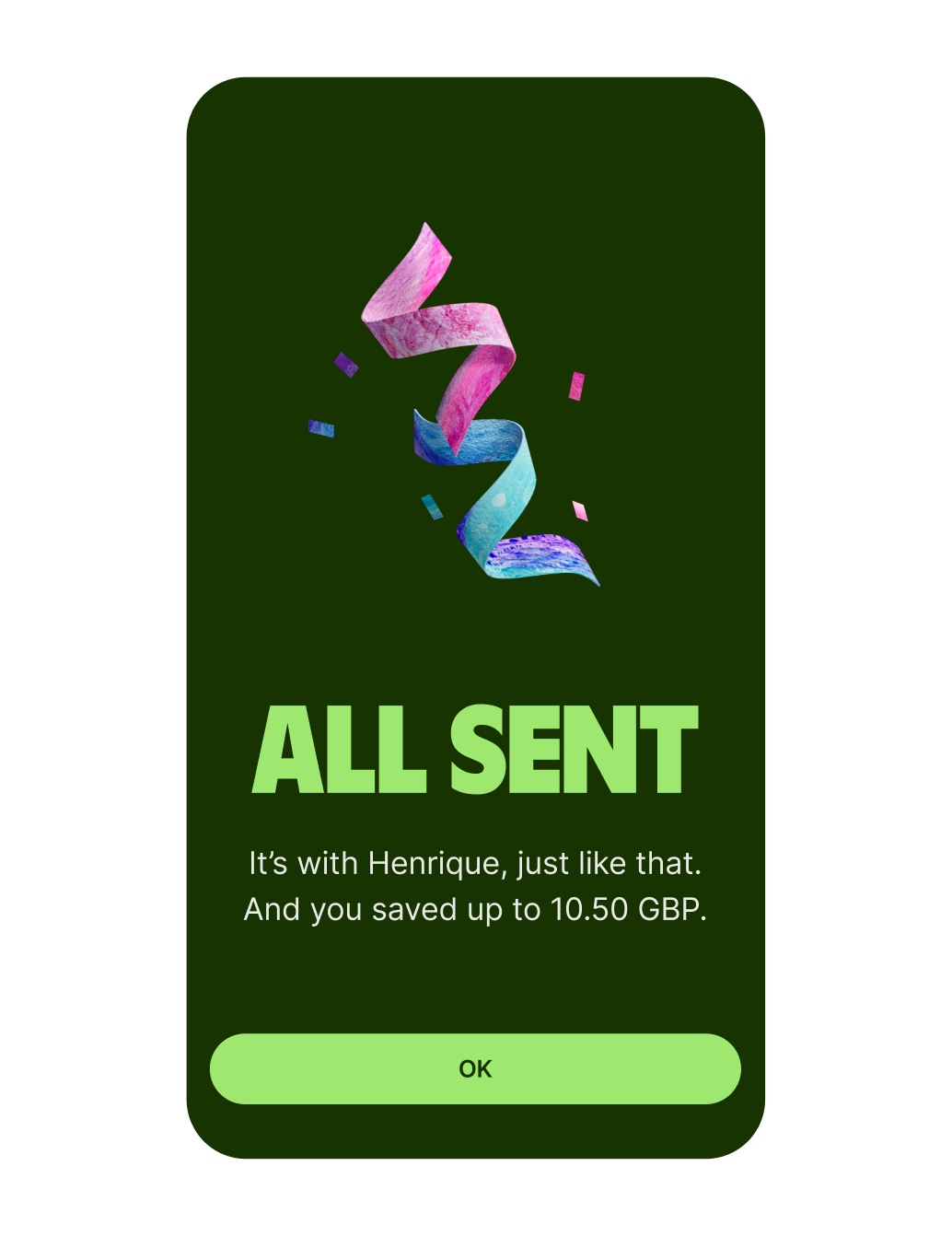
A success screen telling a user they've sent money successfully.
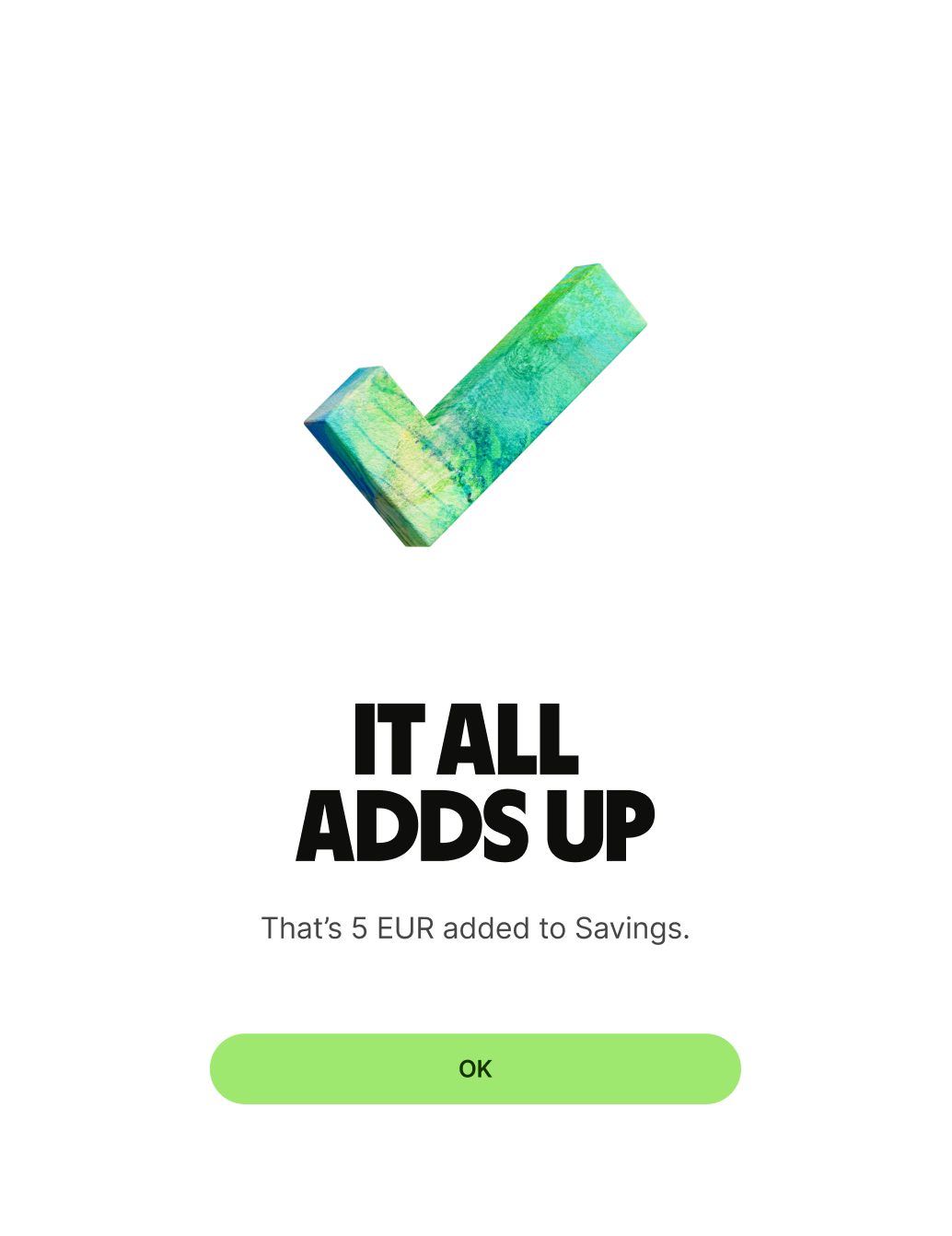
A success screen telling a user they've added money to their savings.

Description (optional)

Description copy should:

  • give some further detail about what's just happened (but not repeat the exact same info)

  • be short and sweet — one or two lines is ideal

  • have a full stop

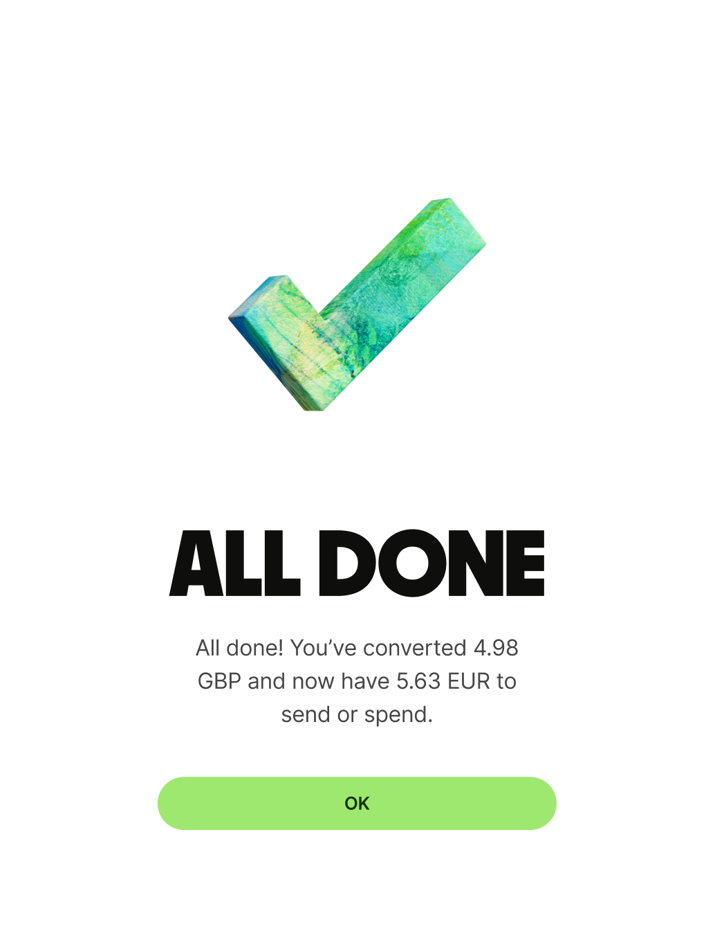
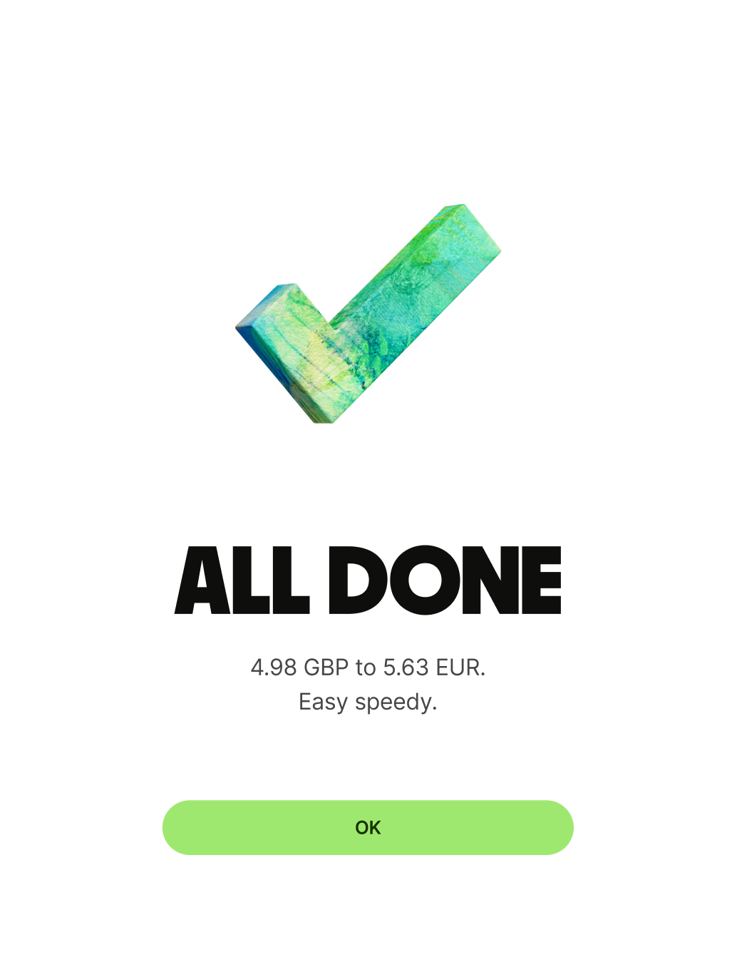
A success screen telling a user they've converted money from GBP to EUR.
A success screen telling the user they've converted money from GBP to EUR.

Primary button

Primary button copy should:

  • be one or two words

  • be clear and confirmative

  • have no full stop

Because the primary button on a success screen marks an the user’s final interaction and end point of a flow, the copy should reflect this. Words like ‘OK’ and ‘Done’ are good. Whereas ‘Continue’ or ‘Next’ suggest there’s still more to come. And be careful with phrases like ‘Got it’. This can work well in some contexts, but not for things like the Send flow, as users might misinterpret it to mean their recipient has already got the money.

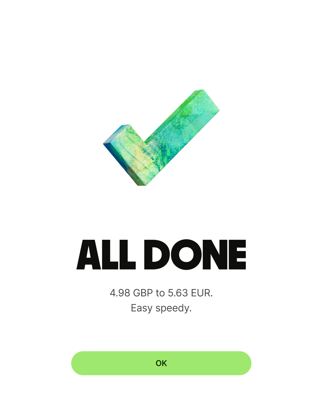
A success screen telling a user they've converted money.

Secondary button (optional)

Secondary button copy should:

  • be one or two words

  • give an alternative but relevant next step that would take the user to another place in the app

  • have no full stop

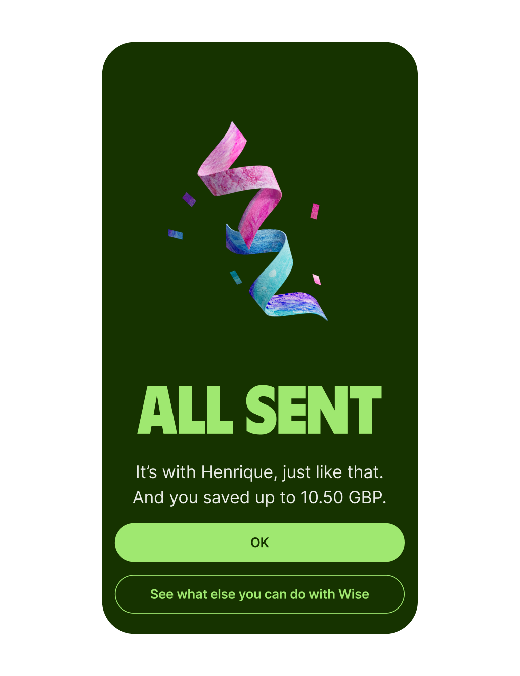
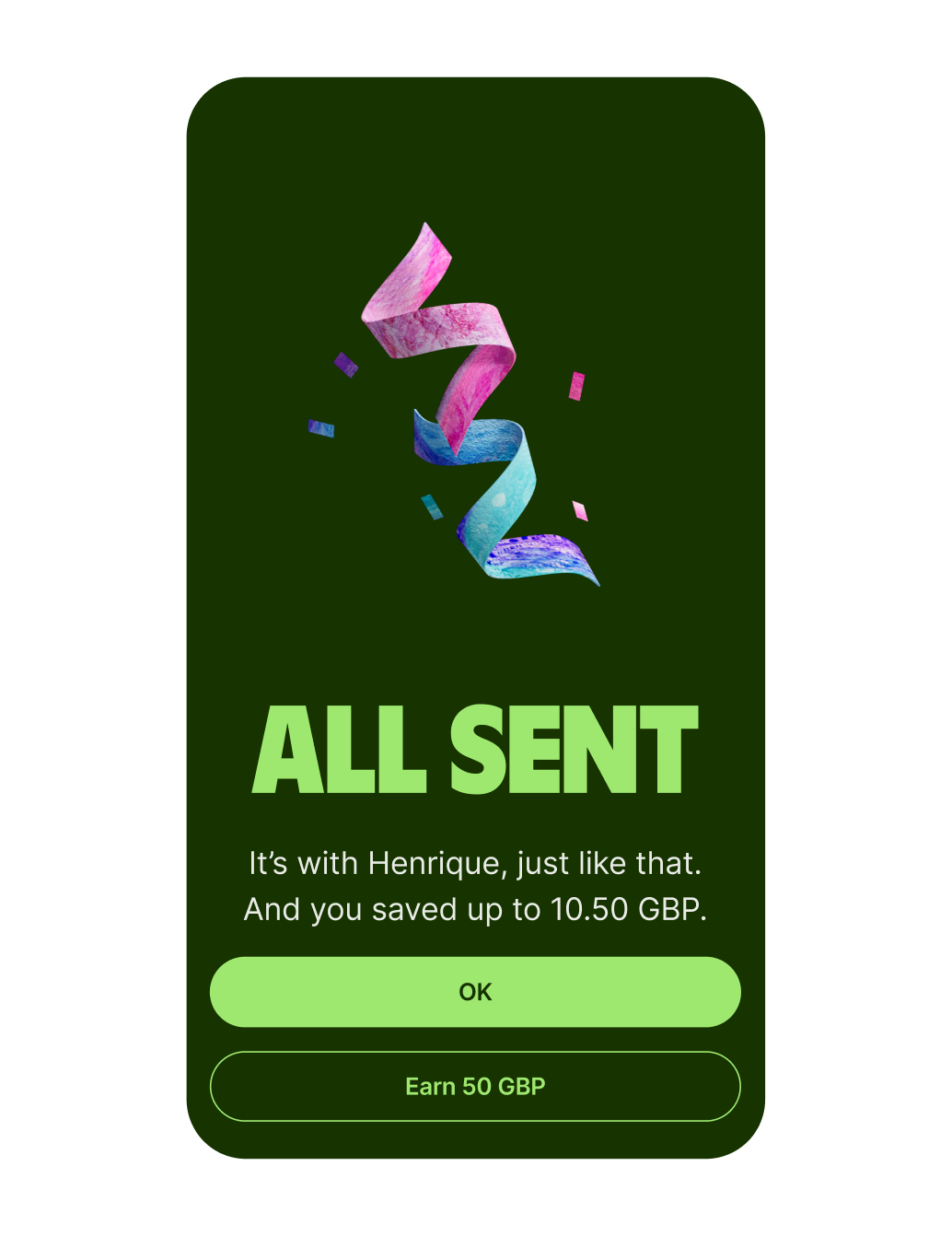
A sent money success screen.
A send money success screen.
Availability

Platform

Available

Android

iOS

Web