Transitions

Transitions occur when users move between screens starting a new flow or navigating within a journey. They help users navigate through the app creating a sense of continuation. These transitions should always be unobtrusive and natural.
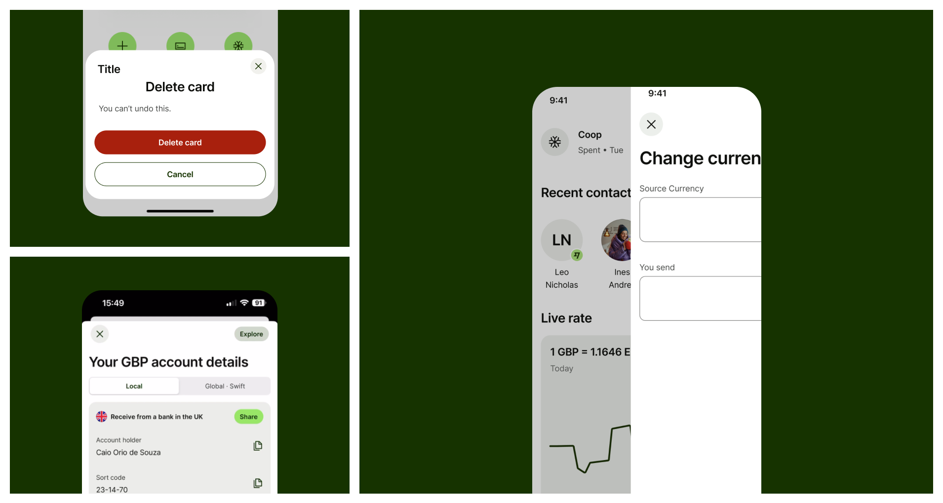
A mosaic of images showing different types of transitions
When to use 
and types

Currently, we support two main kinds of page transitions

  • Upwards

  • Sideways

And two supplementary modals transitions

  • Modals

  • Bottom sheets

Upwards

Indicate the start of a new action. Use it for the opening of a new flow like Send or Request Money.

Sideways

Indicate the continuation of a flow. Use it for consecutive pages within the same flow.

Modal

Use it as a quick supplementary task like selectors or filters during an activity, it should always be dismissible.

Bottom Sheet

Use it as a small supplementary action or content display during a flow or activity.

Upwards

This pattern indicates the start of a new flow/action in the app, such as send or receive money. Its purpose is to communicate that a new user journey or action starts from that point. It must always contain a dismissal button on its top left corner.

Upcoming screen comes in from the bottom fully covering the previous screen.

IOS

Screen slides in from the bottom

Android

Screen slides in from the bottom

Sideways

This pattern indicates the continuation of a flow whenever an action has already been started. It allows the user to navigate forward and backward between pages at consecutive levels within the same hierarchy.

Sideways are lateral transitions used for consecutive screens on the same hierarchy level
IOS

On IOS an overlay is shown below the upcoming page

Android

Android doesn’t use overlay

Web

On web the content moves from forward to backward and disappears quickly with a transparency effect.

modals

A Modal is a container to display supporting content such as selectors or a short supplementary task on mobile experiences and it should always have a dismiss button on the top left corner For more information on this topic, check the Modals page on Components section.

A modal is an overlay that interrupts the user’s task to show an important message, disabling the rest of the screen.

IOS

On IOS a full page bottom sheet is available and recommended to be used for selectors and single page actions.

Android

Bottom sheets are displayed as full pages but serve the same purpose as IOS.

bottom sheets

A bottom sheet is a container you can use to display supporting content or a short, supplementary task on mobile and web experiences, also known as Modals or Pop-ups. For more information on this topic, check the Bottom Sheets page on Components section.
Bottom Sheets supports supplementary tasks on mobile and web experiences.

IOS
Android
Web

Container comes in from the bottom and disappears with a fade when dismissed.

Best practices

Do not use consecutive modals to replace typical page-to-page user flows.

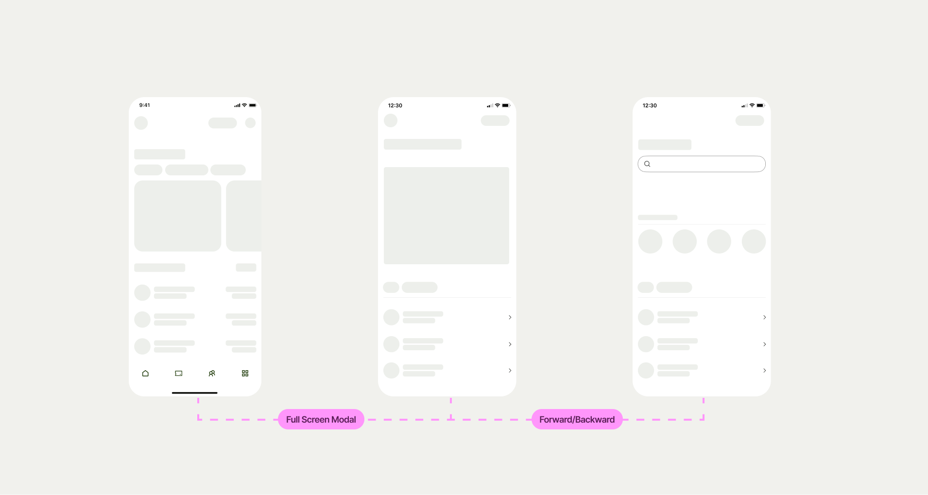
3 mobile screens simulating a Figma file with descriptions of each transition between them

Designers should always specify which kind of transition should be used when handing off flows to Engineers.

Transitions should always be intentional. Avoid using different transition patterns for similar needs.