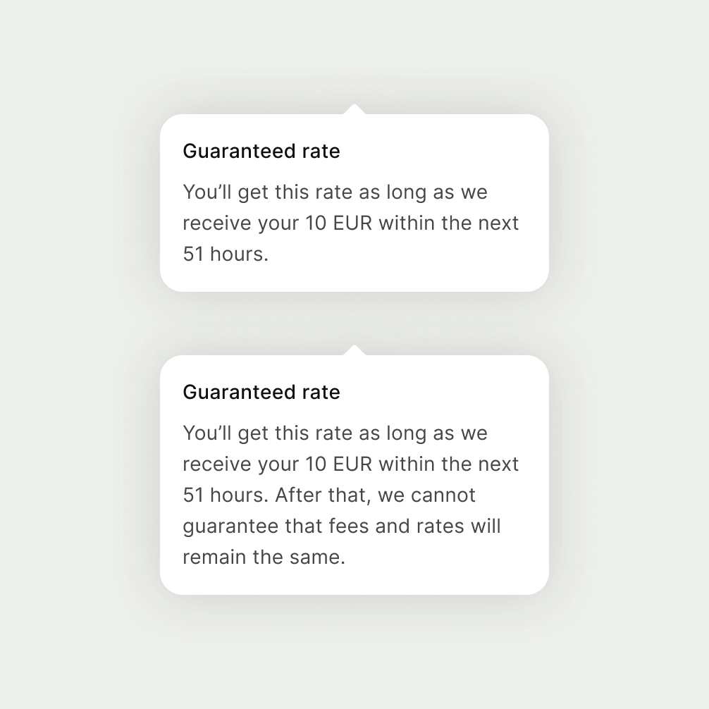
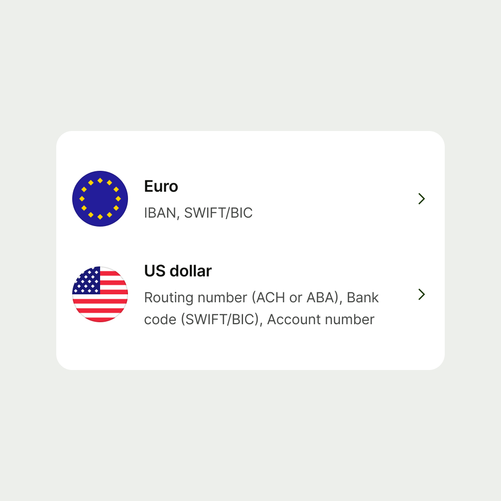
Size is the vertical height of components — whether for variable or as a ‘fixed’ value.
A scale for sizes helps make the Wise experience more consistent. It means there is a more uniform look and feel, which relies on a series of predefined values.

- Use tokens coming from the design system.
- Use semantic tokens instead of token values.
- Don’t use custom or hard-coded values.
Name | Value |
|---|---|
size-x-small | 24px |
size-medium | 40px |
size-large | 48px |
size-x-large | 56px |
size-2x-large | 72px |
The default size for icons is 24px. This is how they are used in the majority of cases.
Tokens:
24px

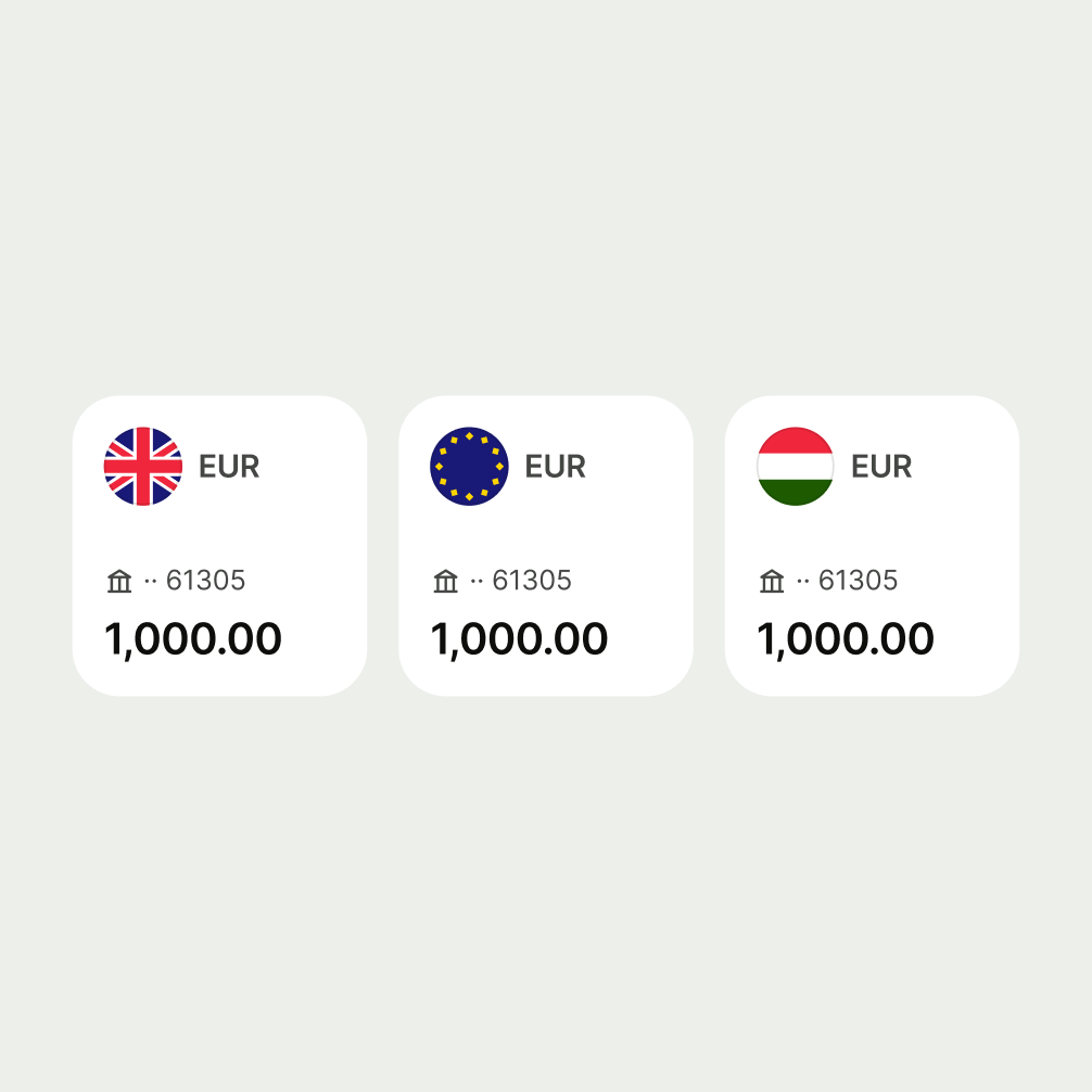
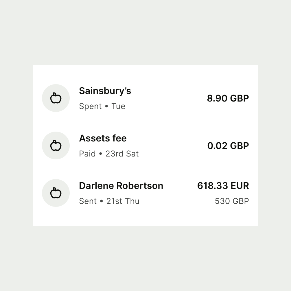
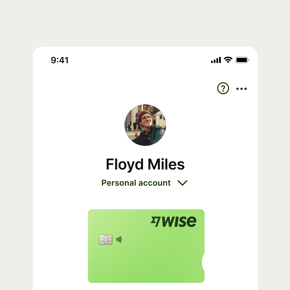
Avatars (used to contain images, flags, initials or icons) can be in 1 of 4 different sizes, depending on their context.
Tokens:
24px
48px
56px
72px
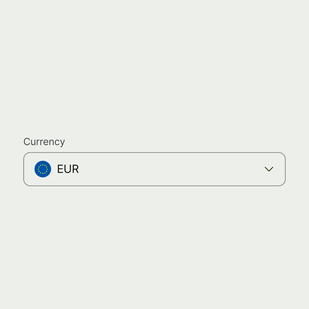

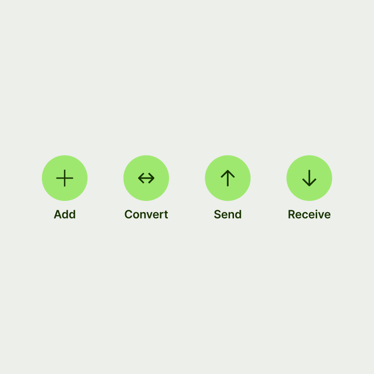
Buttons (and other interactive elements, such as chips) come in different sizes.
Tokens:
32px
48px
56px

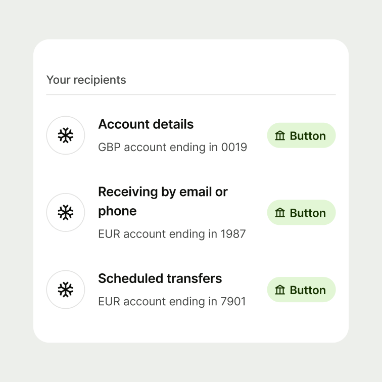

Some components don’t have a fixed height, so they can grow vertically and adapt to the amount of content they hold.
In these components, padding takes priority. This differs from previous components, where the padding needs to serve the desired component height.

