Radius

Radius (or radii) are the rounded corners in components, and other pieces of content. They give the Wise experience a bolder and more expressive appearance.
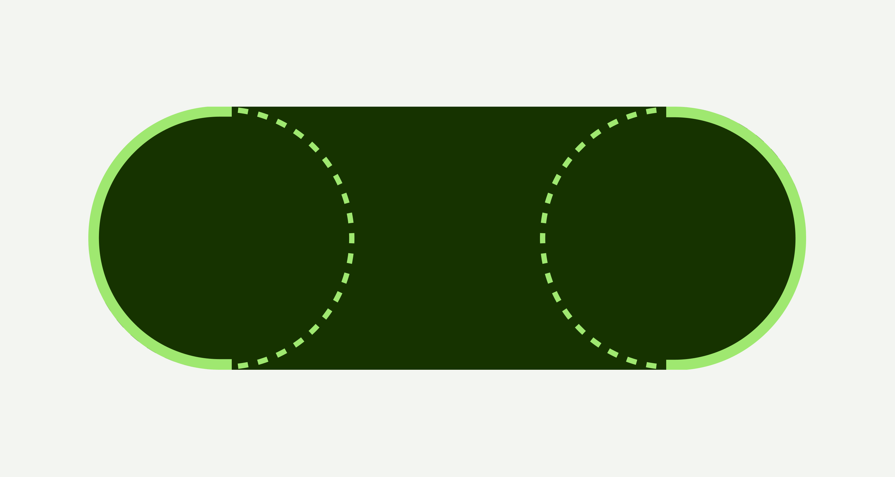
A diagram showing the radius of a circle.
Tokens
  • Use tokens coming from the design system.
  • Use semantic tokens instead of token values.
  • Don’t use custom or hard-coded values.

Name

Value

radius-full

50%

radius-small

10px

radius-medium

16px

radius-large

24px

radius-x-large

32px

Buttons and controls

Most of the interactive components use completely rounded corners, making them distinct.

Tokens:

  • 50%

  • 10px

Two primary buttons what read 'Continue'.
A set of chip components.
The search input component.
A sliding radio group component.
Inputs

Inputs have an accentuated radius that still handles error messages and labels on top, without running into readability issues.

Tokens:

  • 10px

Two text inputs, one displaying an example error message.
An upload component.
A radio button.
Variable height content

Components that have a varying amount of content inside use a border radius that — in combination with padding — gives content space to breathe, making it easier to read and digest.

Tokens:

  • 16px

An alert component.
A nudge component.
A popover component.
Overlaying surfaces

When the area in the component increases, so does the border radius. For our components that occupy more space on screen, we use the most accentuated border radius.

Tokens:

  • 24px

  • 32px

A bottom sheet component.
A modal component.