Padding is the internal spacing in components that separates content from external boundaries.
Padding helps content breath, so places with lot of information don’t feel so crowded — making that content easier to consume.
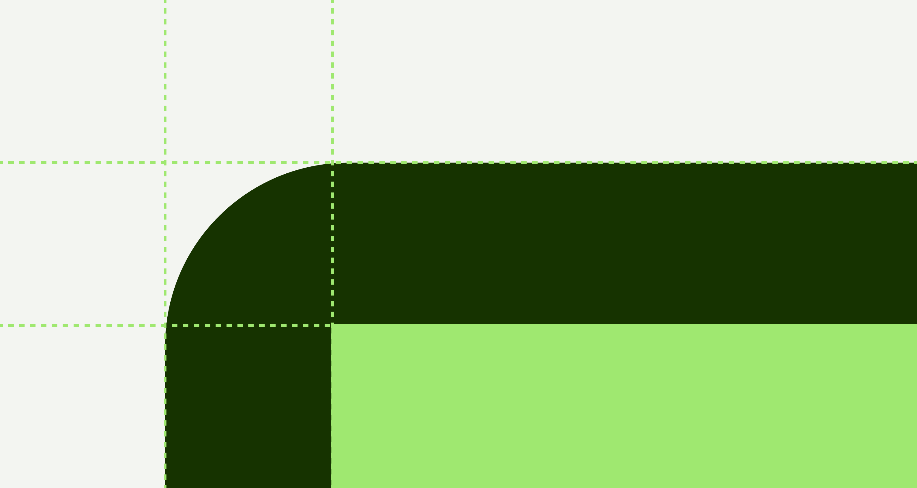
- Use tokens coming from the design system.
- Use semantic tokens instead of token values.
- Don’t use custom or hard-coded values.
Name | Value |
|---|---|
padding-x-small | 8px |
padding-small | 16px |
padding-medium | 24px |
padding-large | 32px |
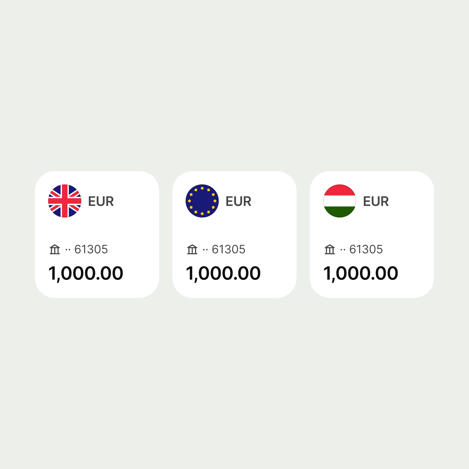
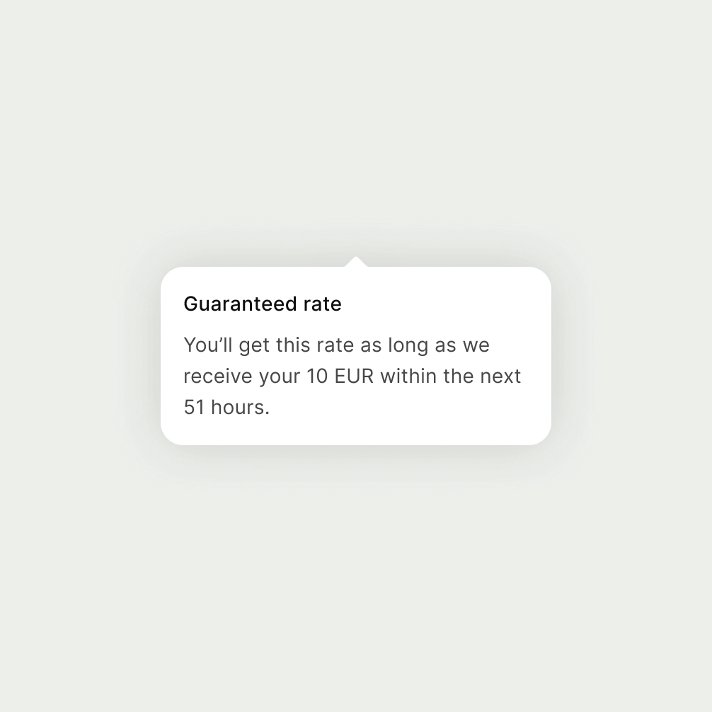
Components that are usually part of a set, and that need to contain distinct information in a small area.
Tokens:
16px
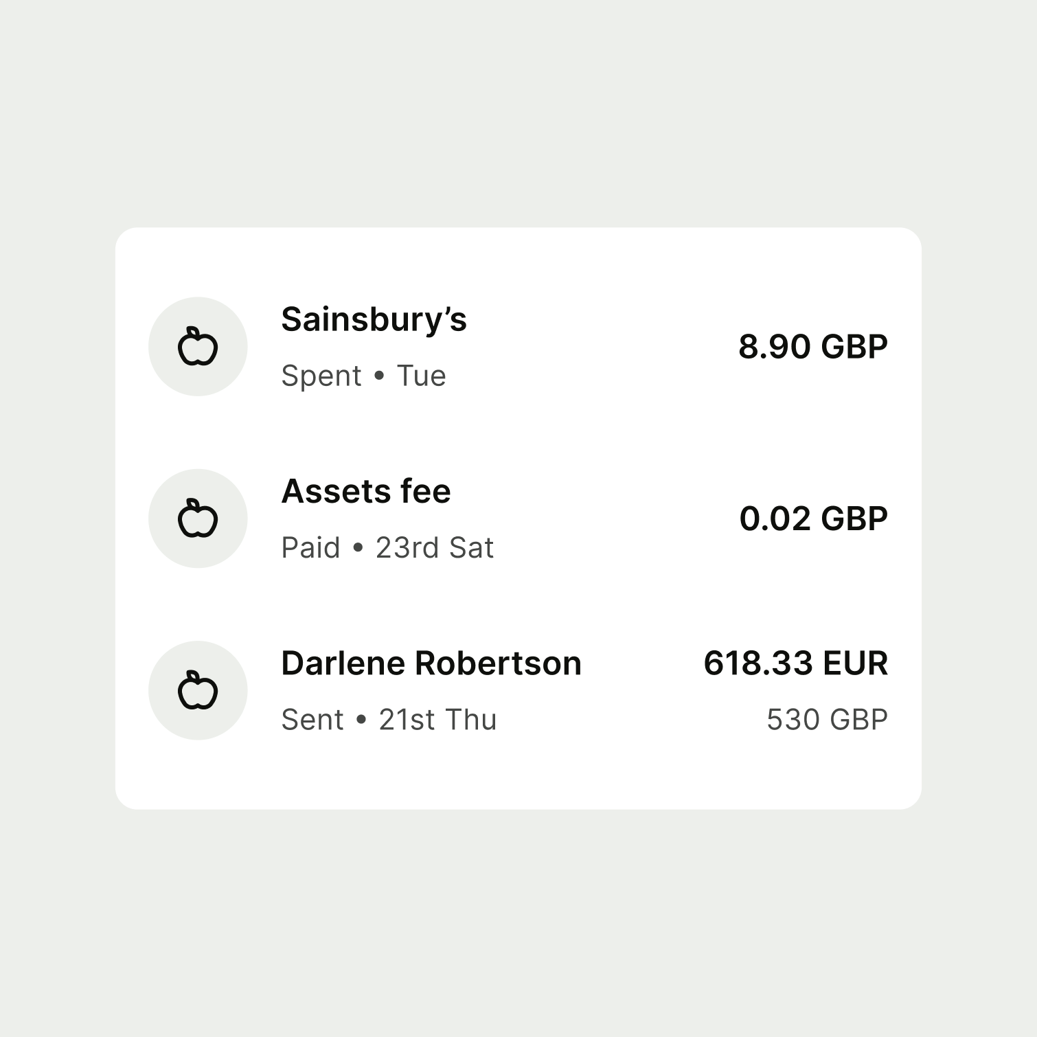
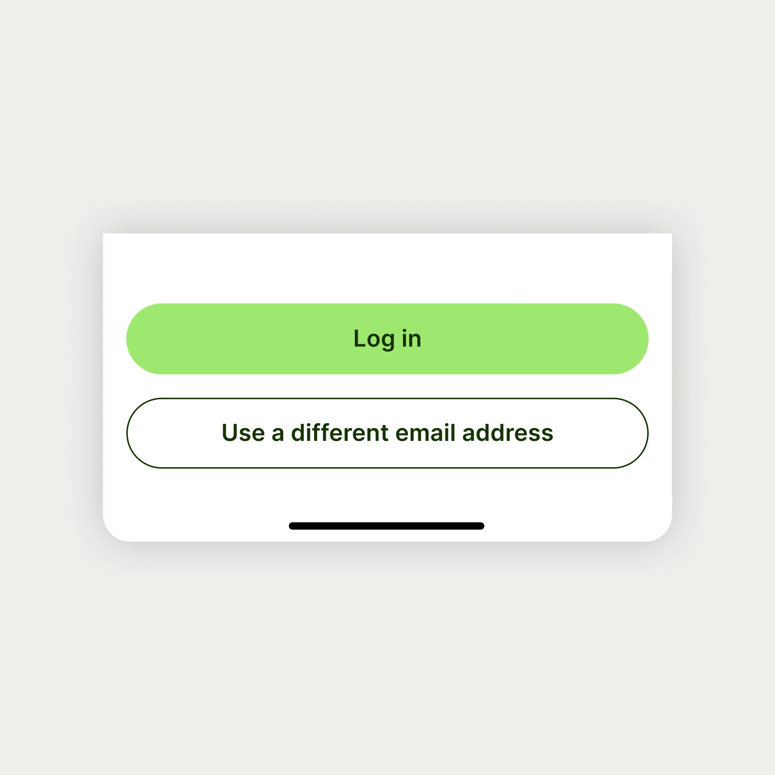
Components that have a varying amount of content inside use paddings that give content space to breathe, make it easier to read and digest.
Tokens:
24px
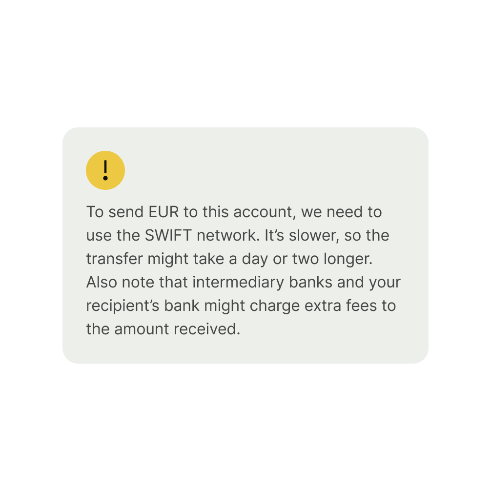
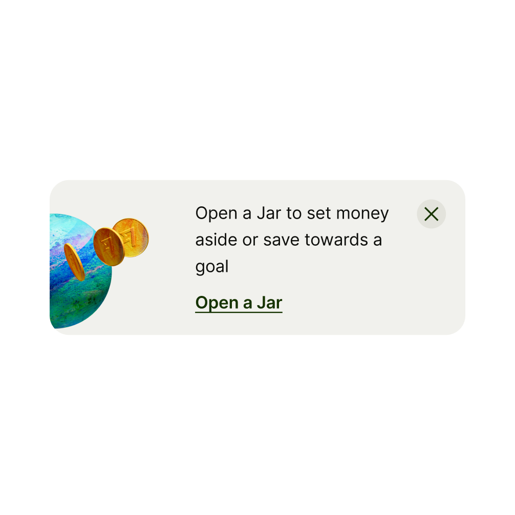
Content that goes inside a card (for example, with a background) may have a small padding area if the amount of information you need to fit inside cannot afford bigger space.
Tokens:
16px
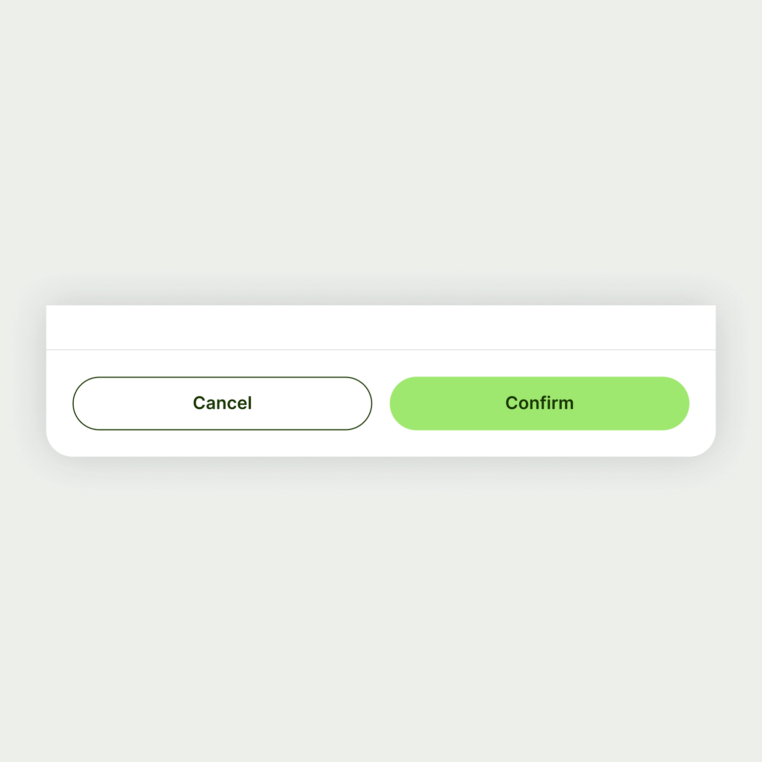
Footers have padding around to separate components from the rest of the content. Mobile has tighter paddings due to screen size, whereas it's bigger on desktop.
Tokens:
16px
24px