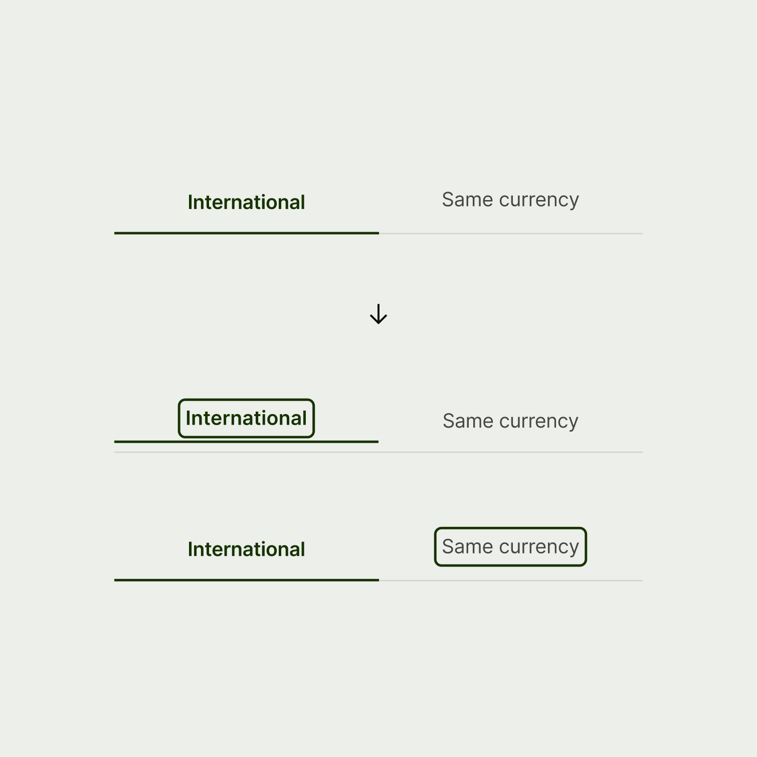
Focus states are the unsung heroes of the web experience. They're essential for users with impairments that make it hard to use a mouse, or who prefer a different method of navigation. They show the user exactly which interactive element they’re on as they tab through the screen using a keyboard or assistive technology.

Style overview
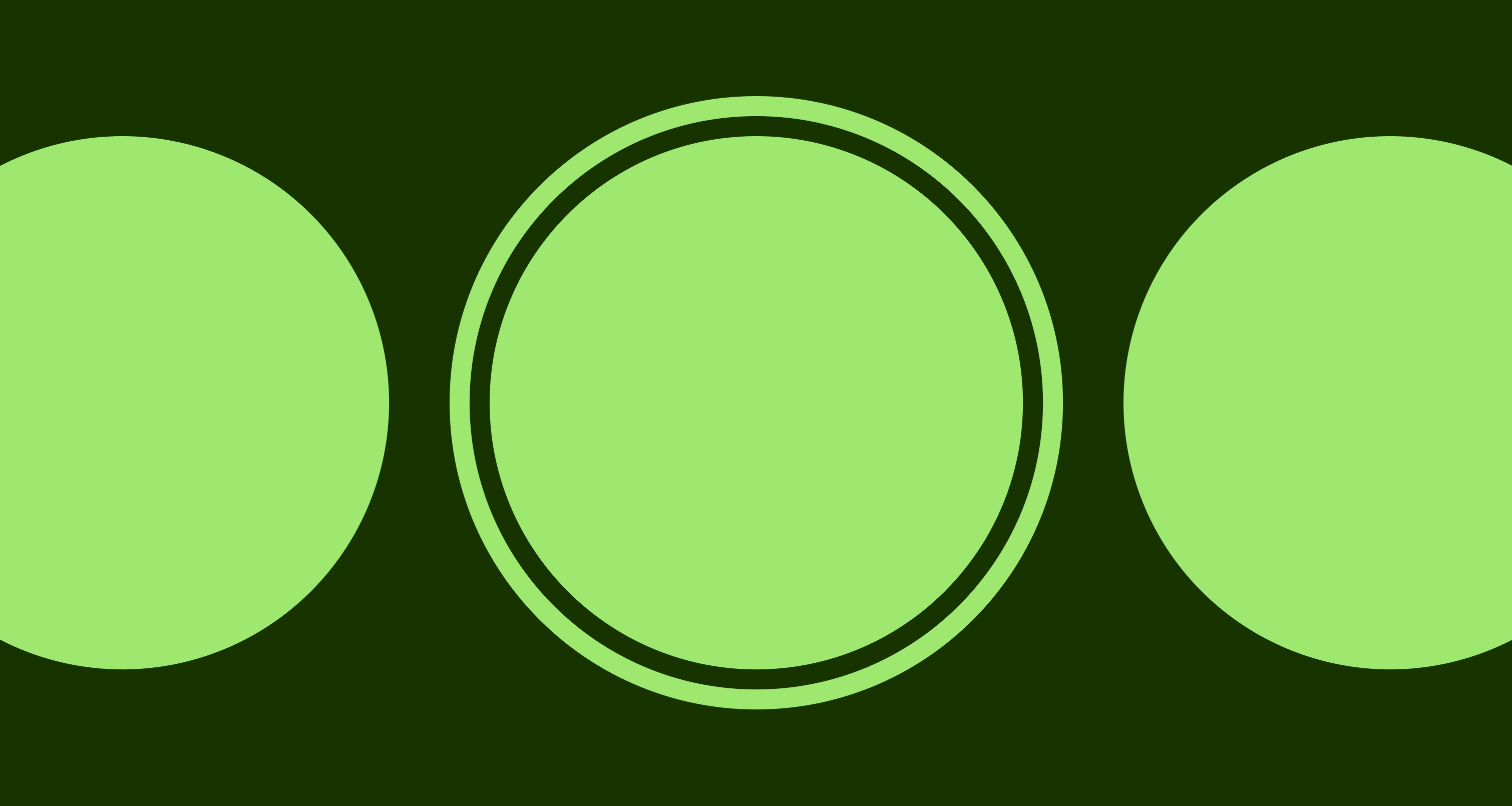
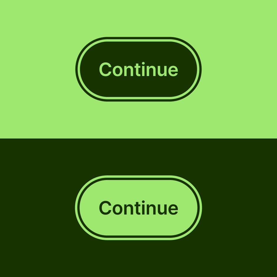
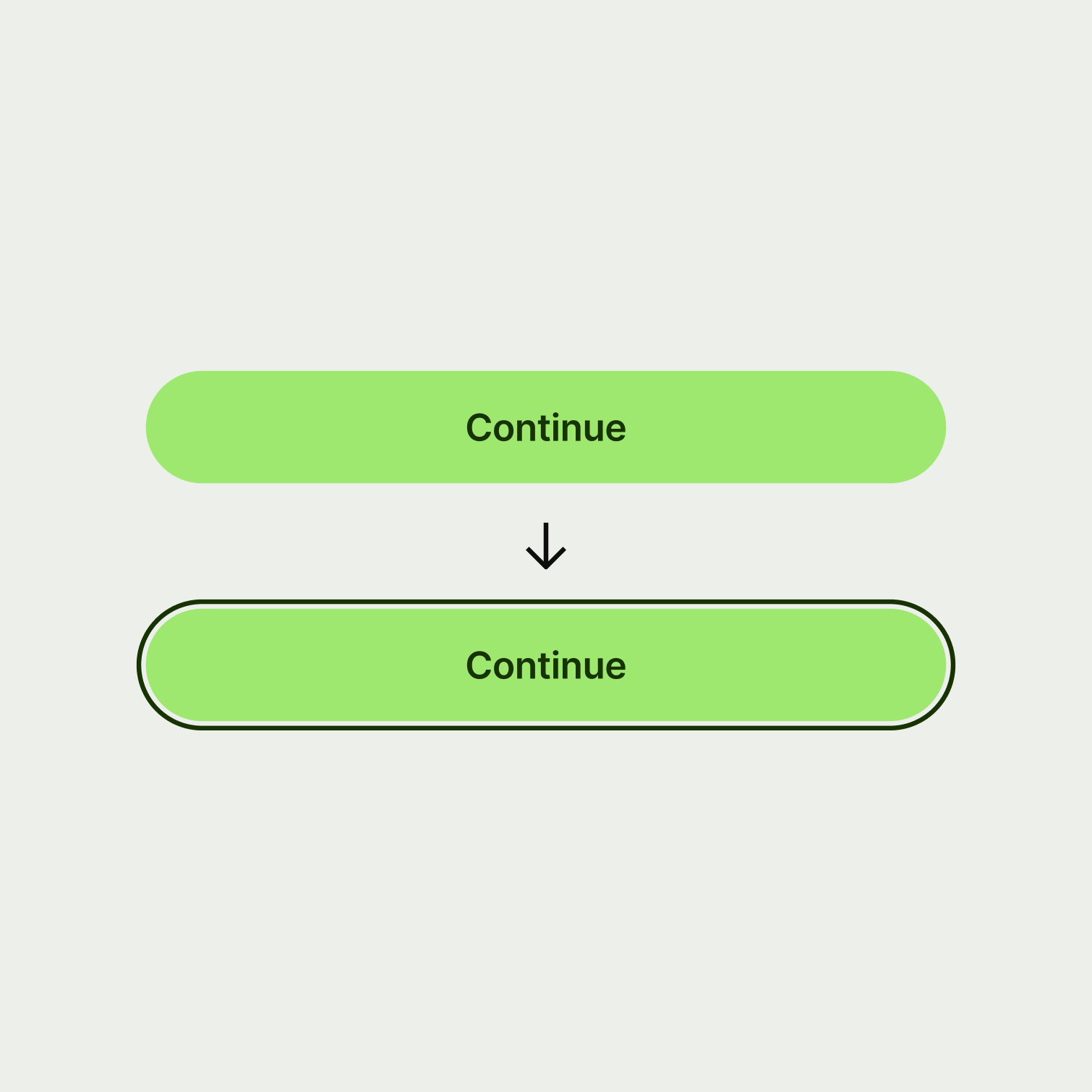
For buttons and components where at least one variant has a filled surface colour that’s different to the screen background, the focus state is a highly contrasting 2 pixel border.
Visibility across colour themes
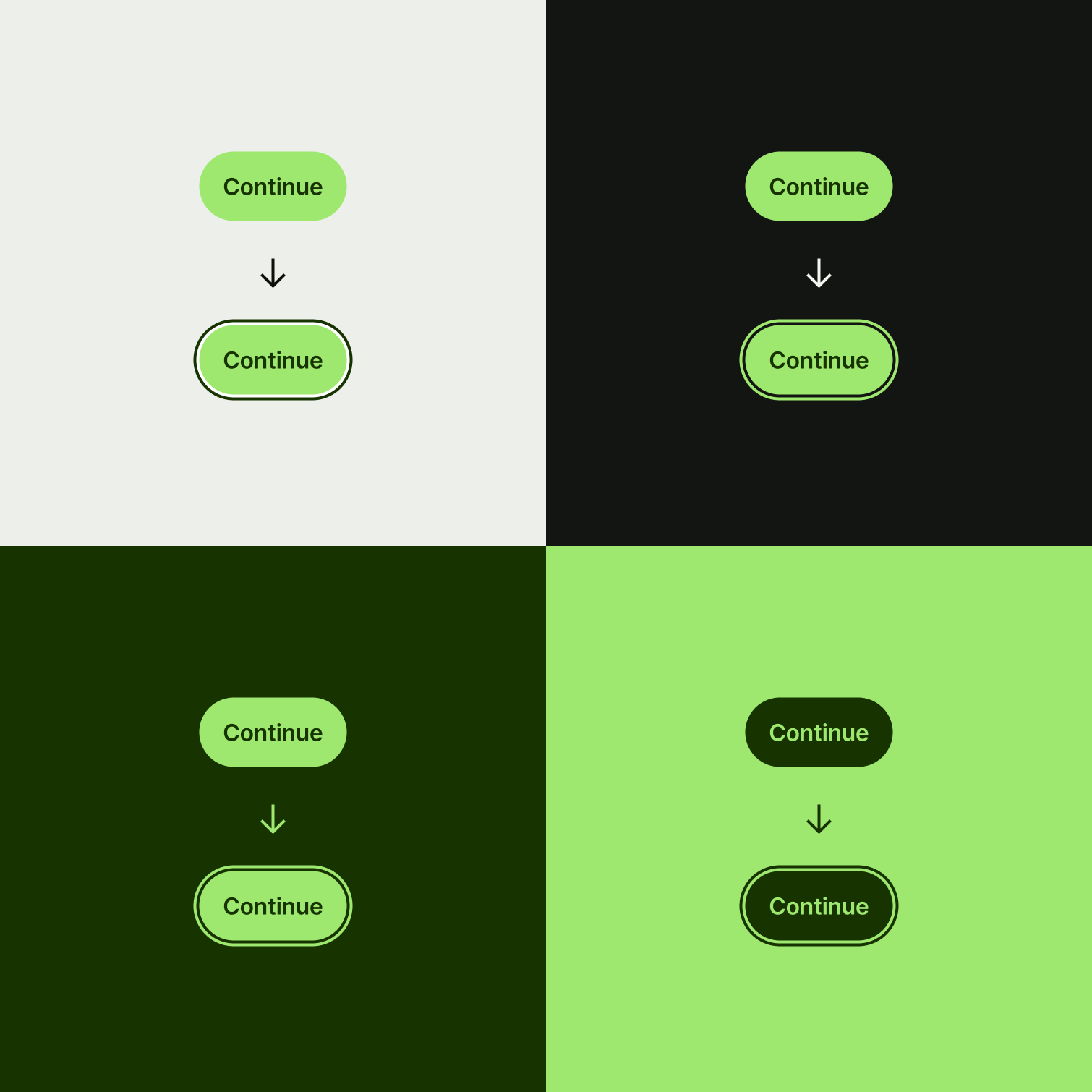
A 2px transparent offset between the focus border and the component keeps the border clearly visible no matter the surface theme.
Focus border colour
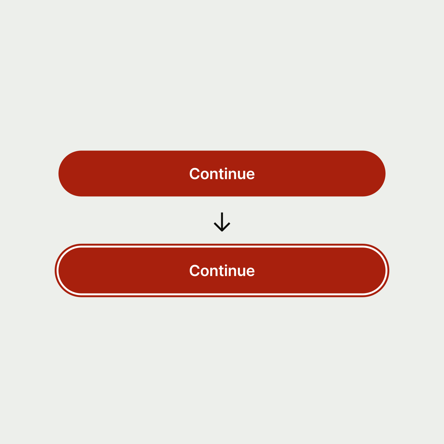
We almost always use our interactive-primary colour for the focus state border. But very occasionally, we might use a different colour token if it helps to keep things looking intentional. For example, on our negative button we make the focus border colour sentiment-negative to match the button surface because it looks cleaner visually.
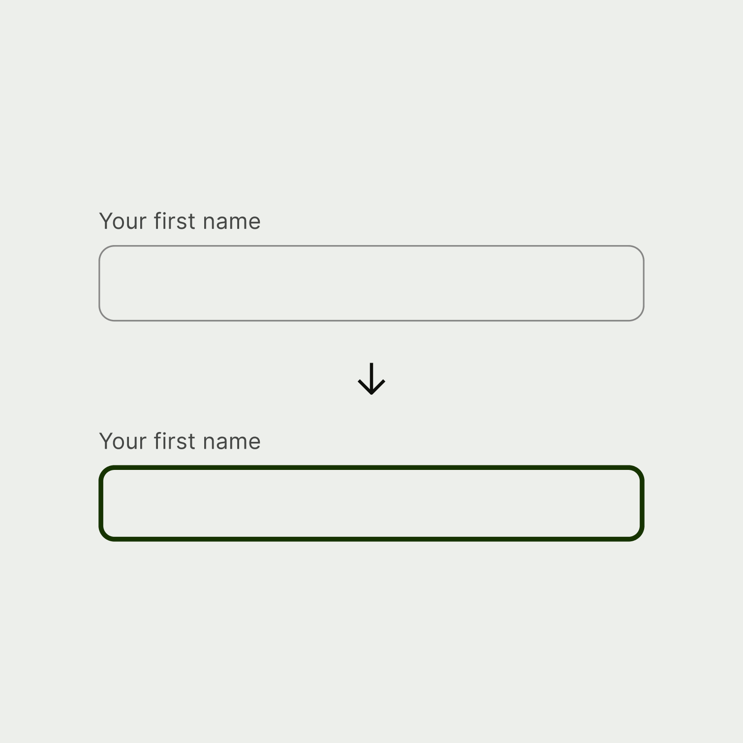
A 3px border in our highly contrasting interactive-primary colour really makes input focus states stand out from the crowd.
Default guidance
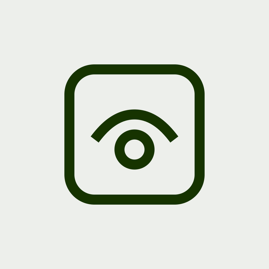
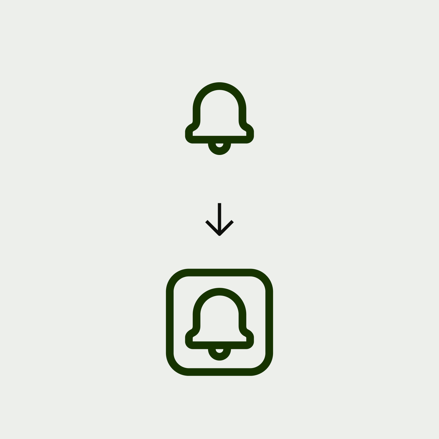
For interactive icons, the focus state is a solid 2 pixel border in our interactive-primary colour. We also round the corners of this container by 4 pixels to keep it on brand.
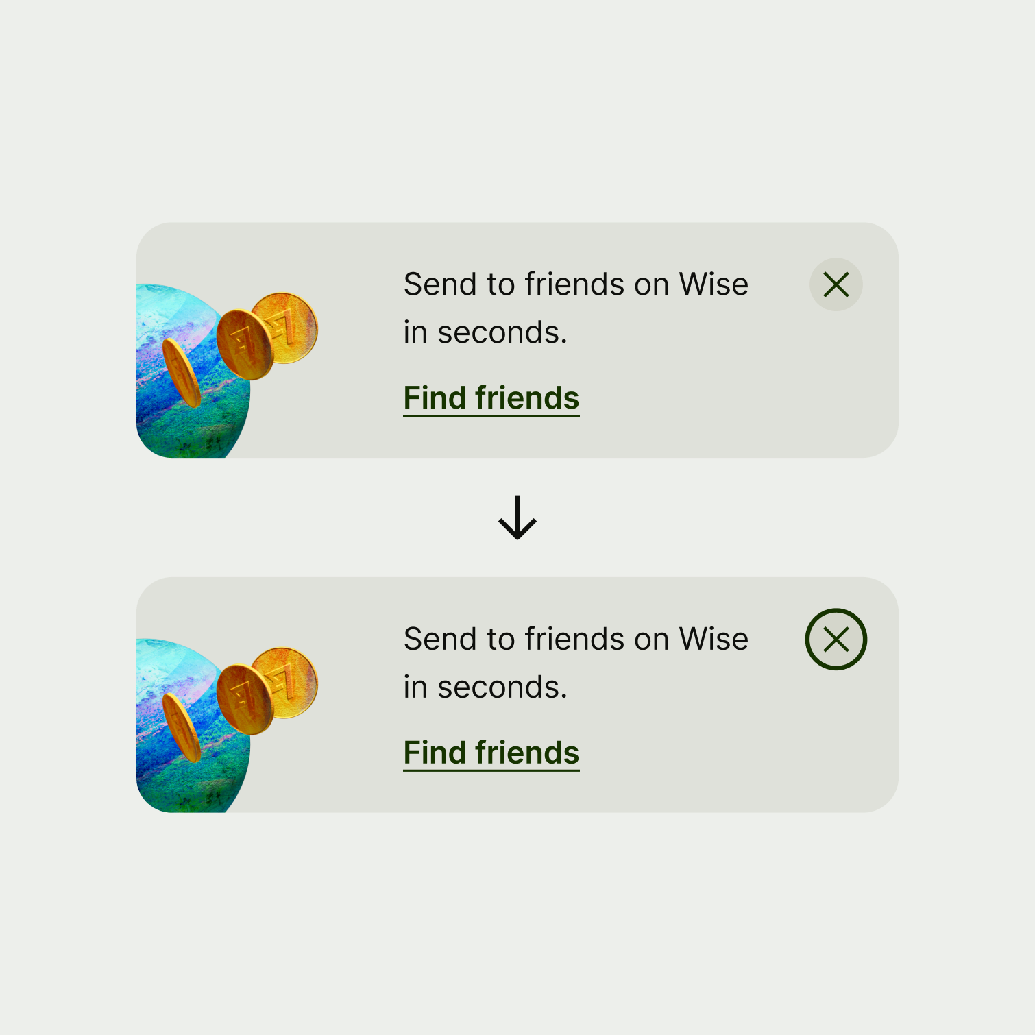
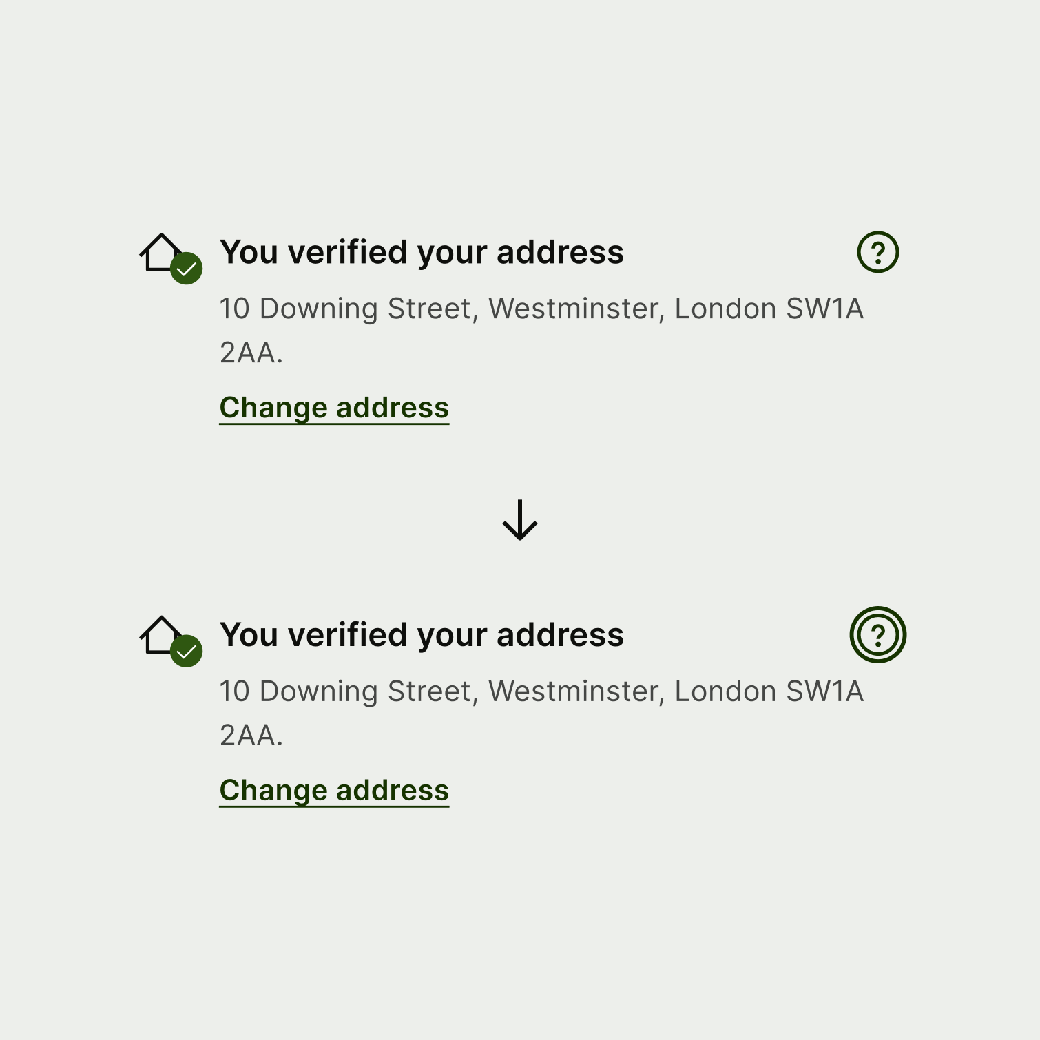
Exceptions
There are a very small number of exceptions where we make the icon's focus state completely rounded to add visual style:
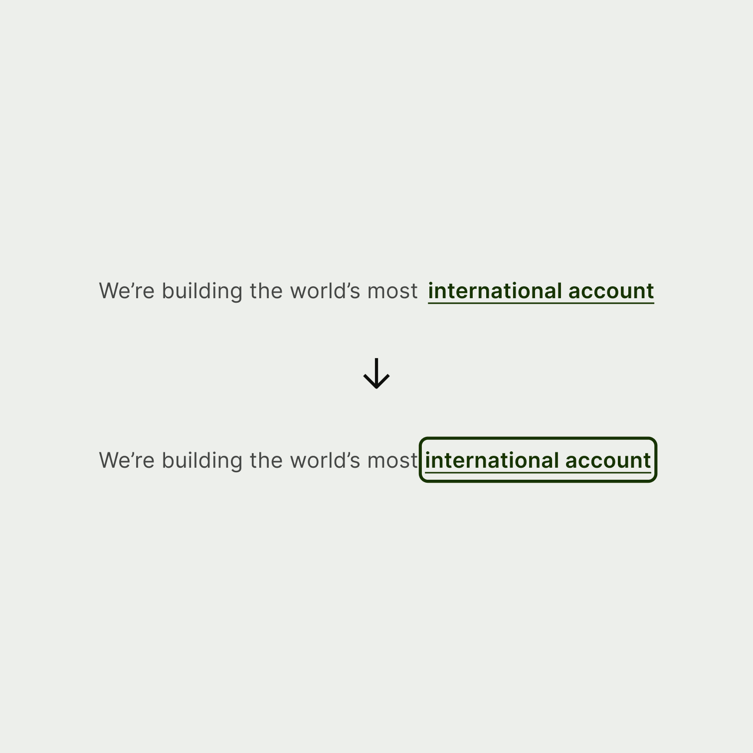
On focus, we surround links with a solid 2 pixel border using our interactive-primary colour and we round the edges by 4 pixels. We also add 2 pixels of internal padding to give the link text space to breathe. Any more, and the focus border would start to overlap other nearby text.
For other UI elements that don’t need to appear in a form alongside inputs, we stick to a 2 pixel border. Here’s an example of a navigation option in focus.
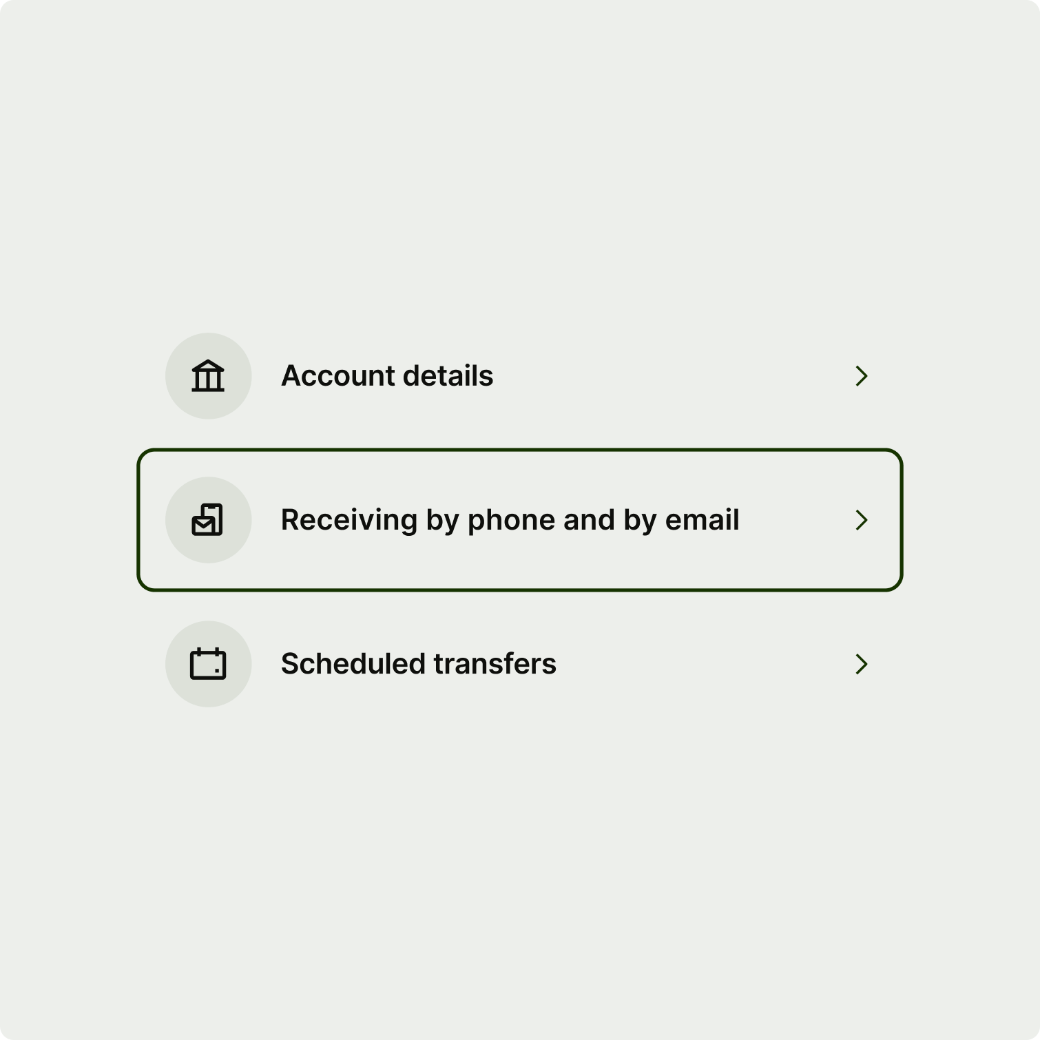
Any UI element that users can interact with needs a focus state, so you’ll need to apply the styles listed above to any custom components your team builds. Never just rely on the browser default styles as they look off-brand and probably won’t have enough contrast against our colours to be accessible.
The system styles are designed to work for all use cases. But if you ever get really stuck and need something custom, make sure you follow the WCAG 2 focus appearance guidelines to keep it accessible. Don’t forget to test on dark mode and all of our other surface themes too. That way you can make sure that the focus states always stay visible and pass WCAG requirements.
You should also make sure the focus state is never obscured. For example, the user shouldn’t be able to tab to an element that they can’t see because it’s offscreen or hidden within an unopened dropdown menu.
