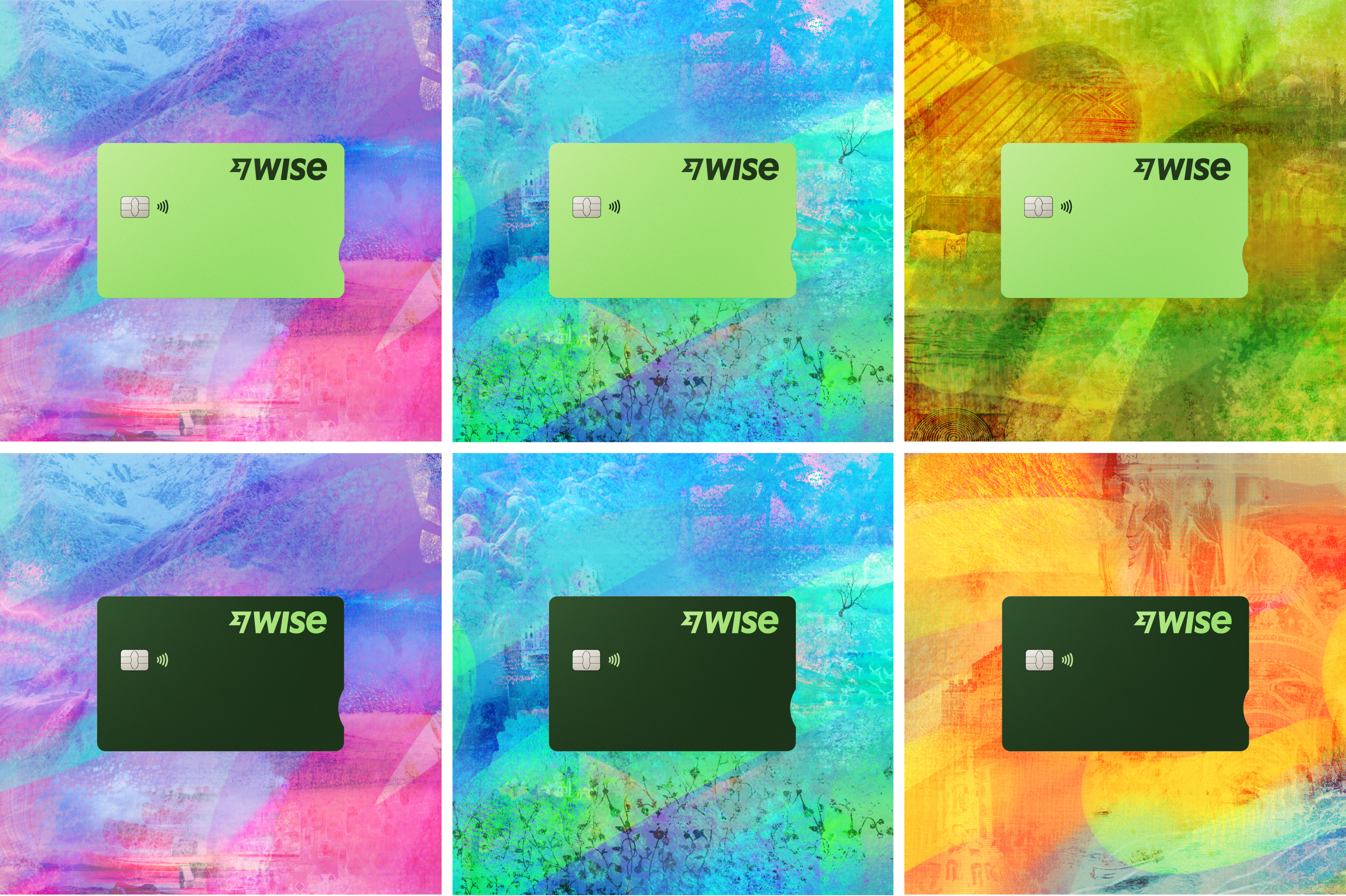
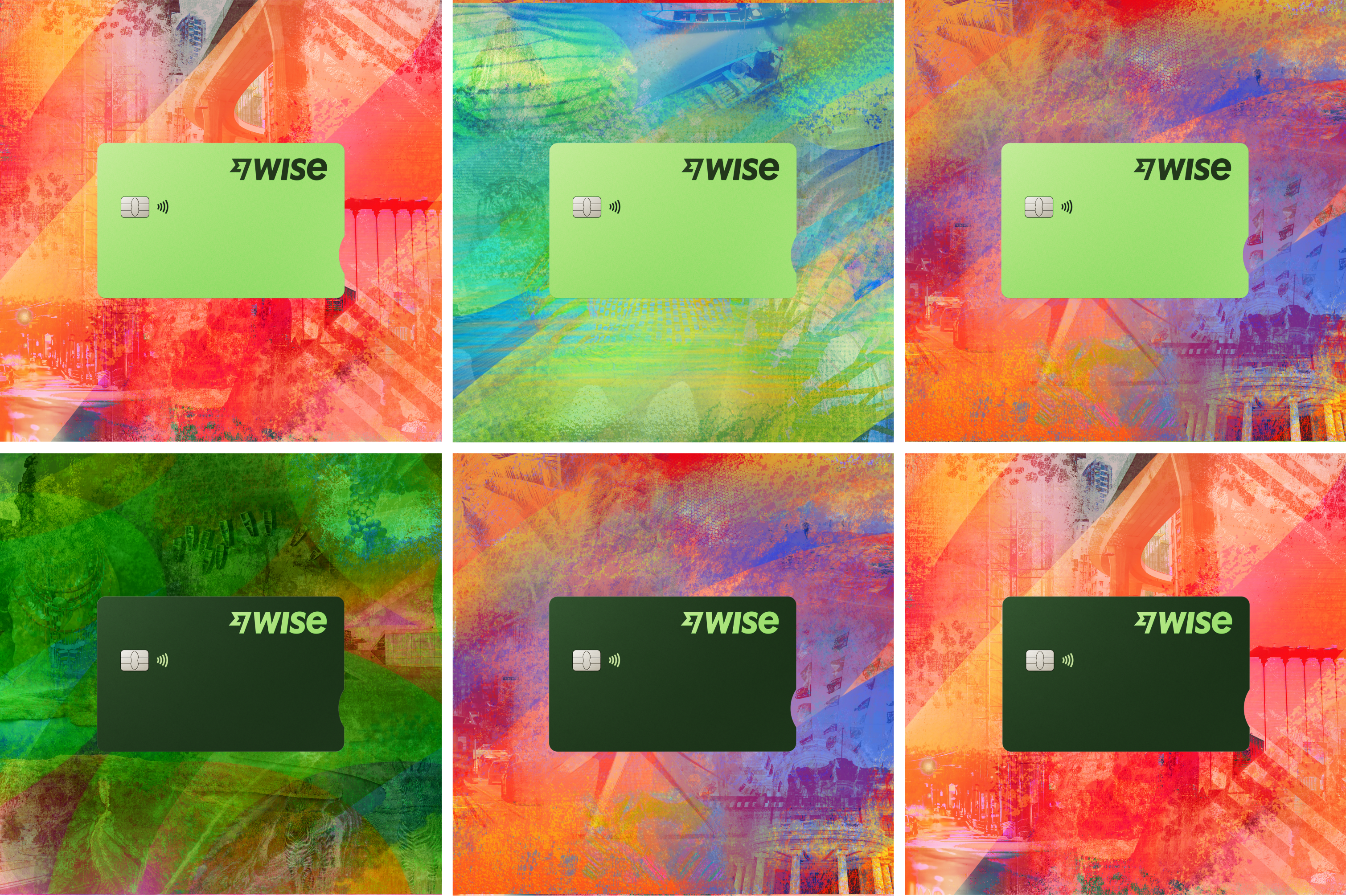
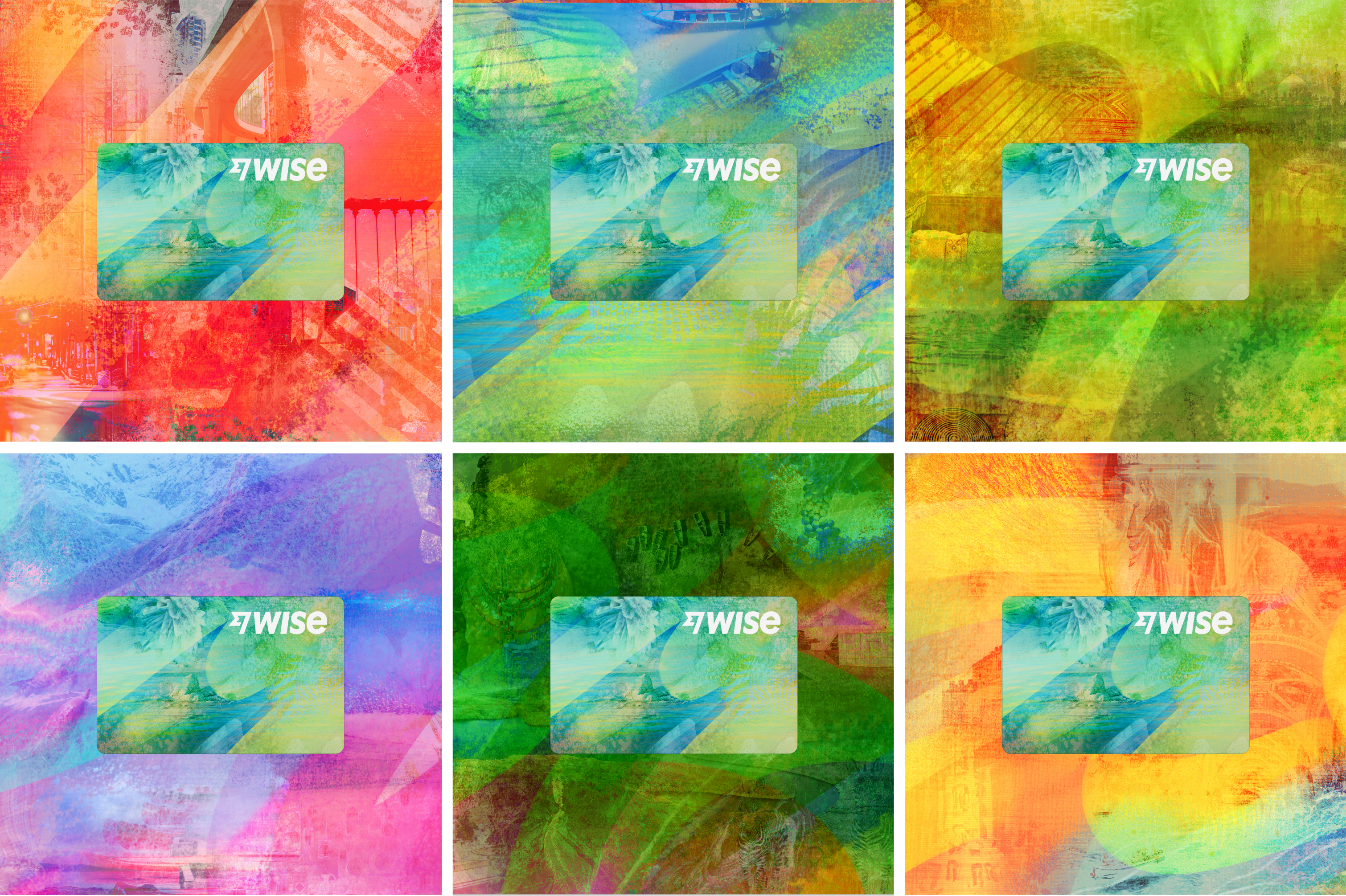
Wise Cards

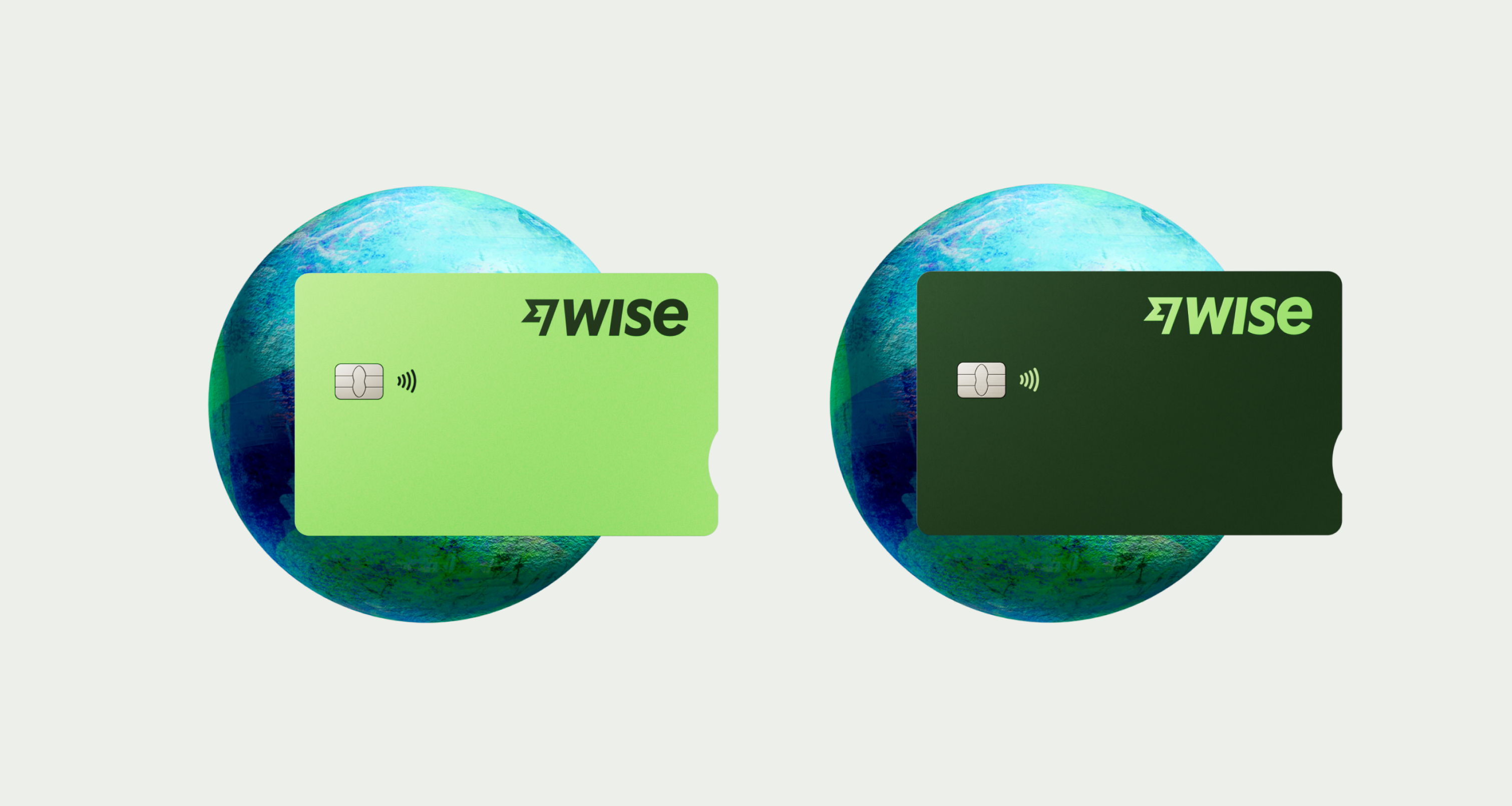
The first TransferWise card was introduced in 2018: a bright green card against our blue branding. In March 2023, we launched our Wise rebrand - a new system to disrupt the old one. Along with a new brand identity, our card also needed a refresh. We kept it simple, clean and accessible.

This guide serves to explain the different elements of all cards visuals in Wise, applications, and its do’s and don’ts.
CardGuidance/HeroVisual
Overview

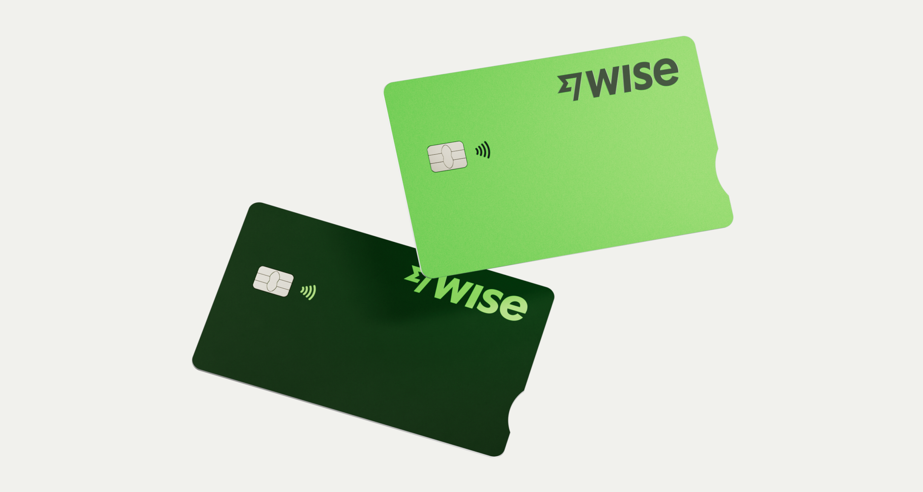
All payment card designs in this guide represent Wise cards in Physical and Digital formats.

Card assets are made by the Design Systems team. They are available as components / downloadable assets in Figma.
CardGuidance/Overview
Wise Physical Cards
Physical and digital cards

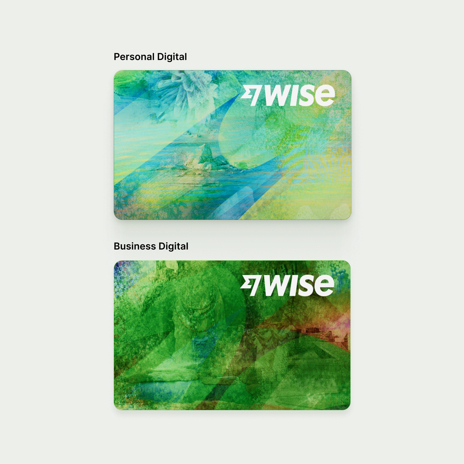
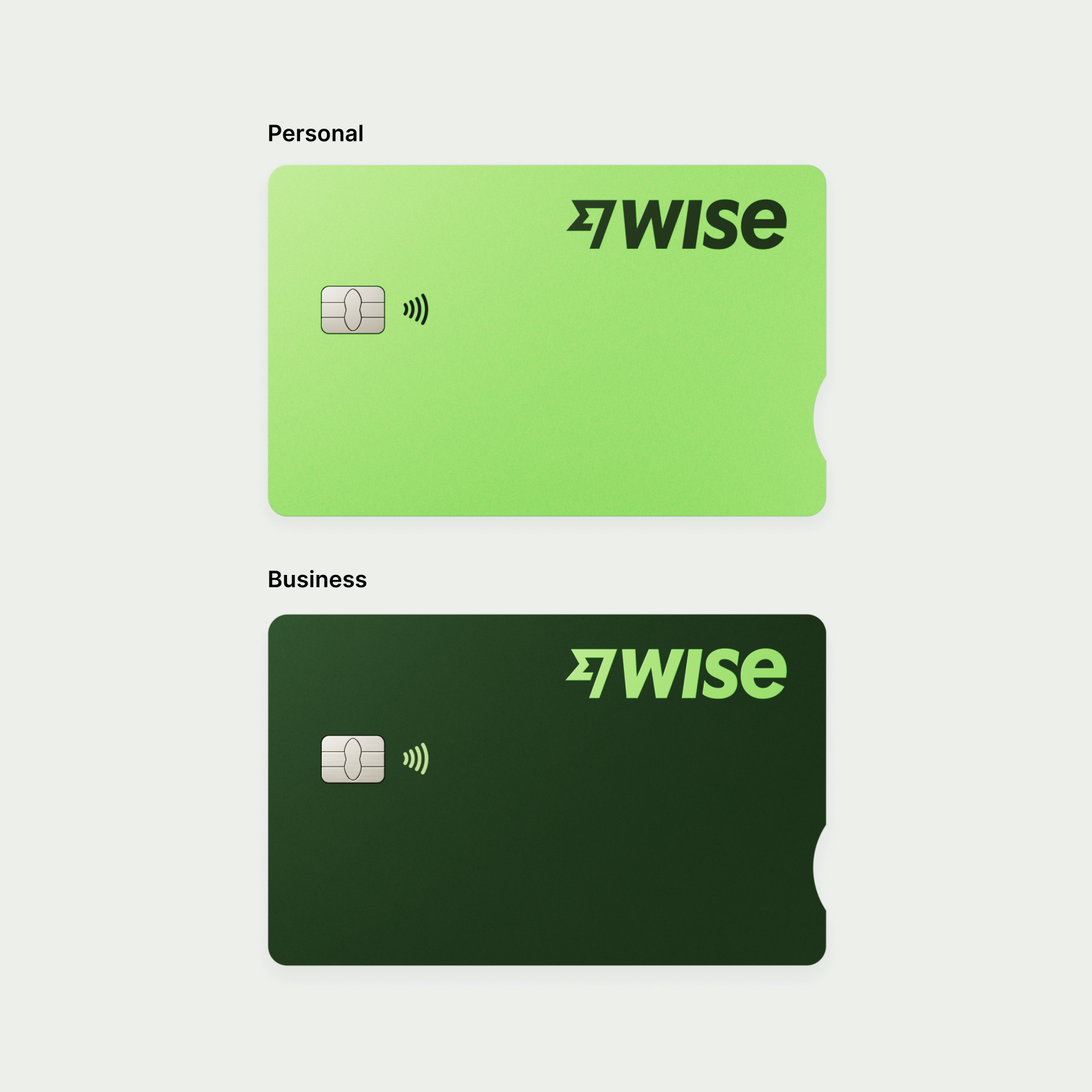
Wise carries both Physical and Digital cards in different designs.
 Both come in Personal and Business versions.
CardGuidance/PhysicalCards1
CardGuidance/PhysicalCards2
Online Card Visuals
CardGuidance/OnlineCardVisuals

Flatlay

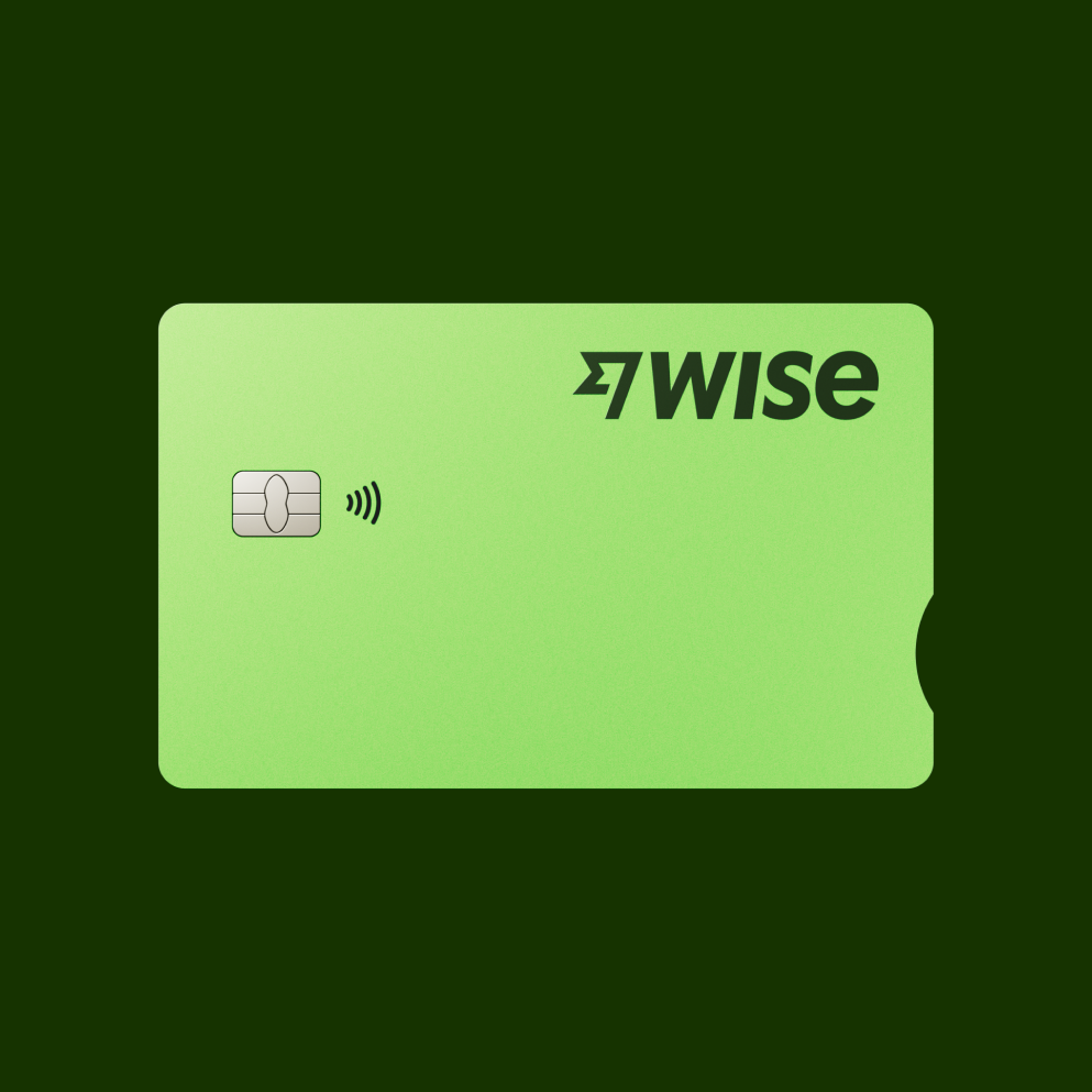
There are 3 types of flatlay cards:

Large, Mini, Micro

They appear in different sizes, and are used across product and editorial.
CardGuidance/Flatlay1
CardGuidance/Flatlay2
CardGuidance/Flatlay3
CardGuidance/Flatlay4
Large

Details the actual card and how it is supposed to look.

How to use them

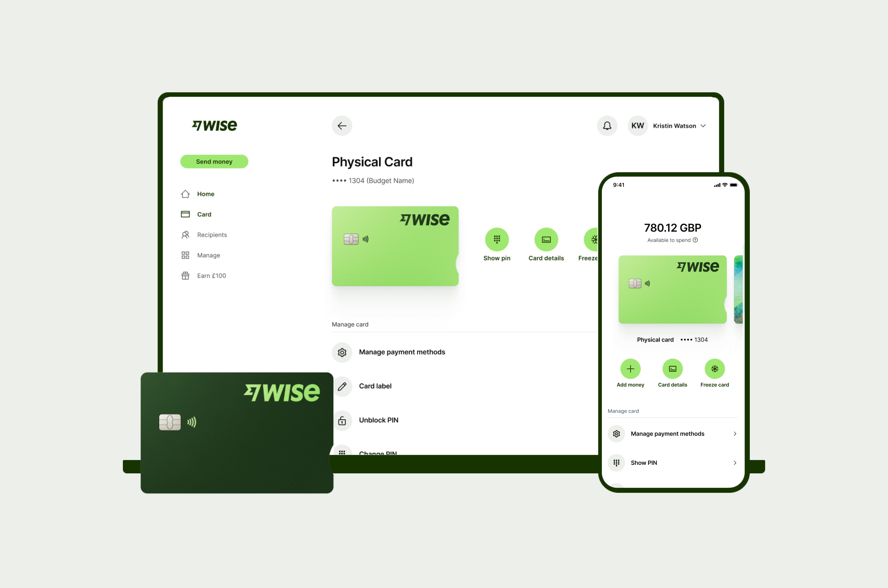
Used best where accurate representation of the card design is needed, such as in card promotions or mobile wallets.

CardGuidance/Flatlay5
Mini (40, 48, 56, 64px)

Simplified version of the large flatlay asset.

How to use them

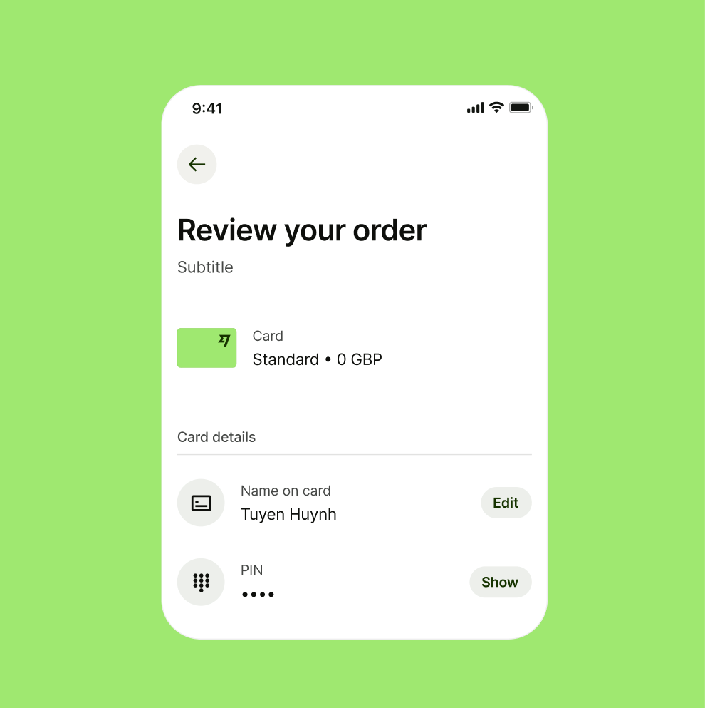
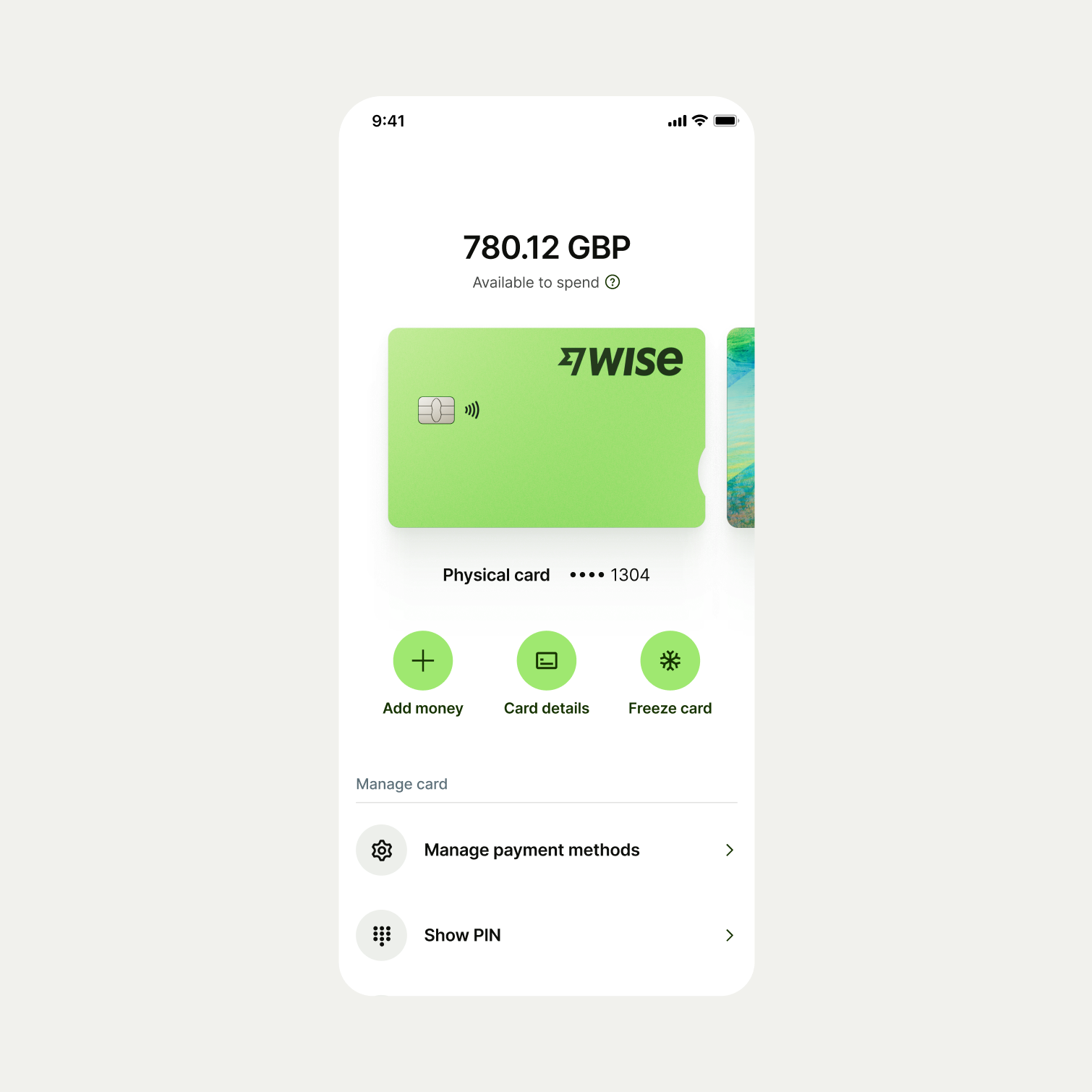
Used for small scale work where card detail is not needed, such as reviewing card orders.

CardGuidance/Flatlay6
Micro (24px)

Shows only colours of the represented card.

How to use them

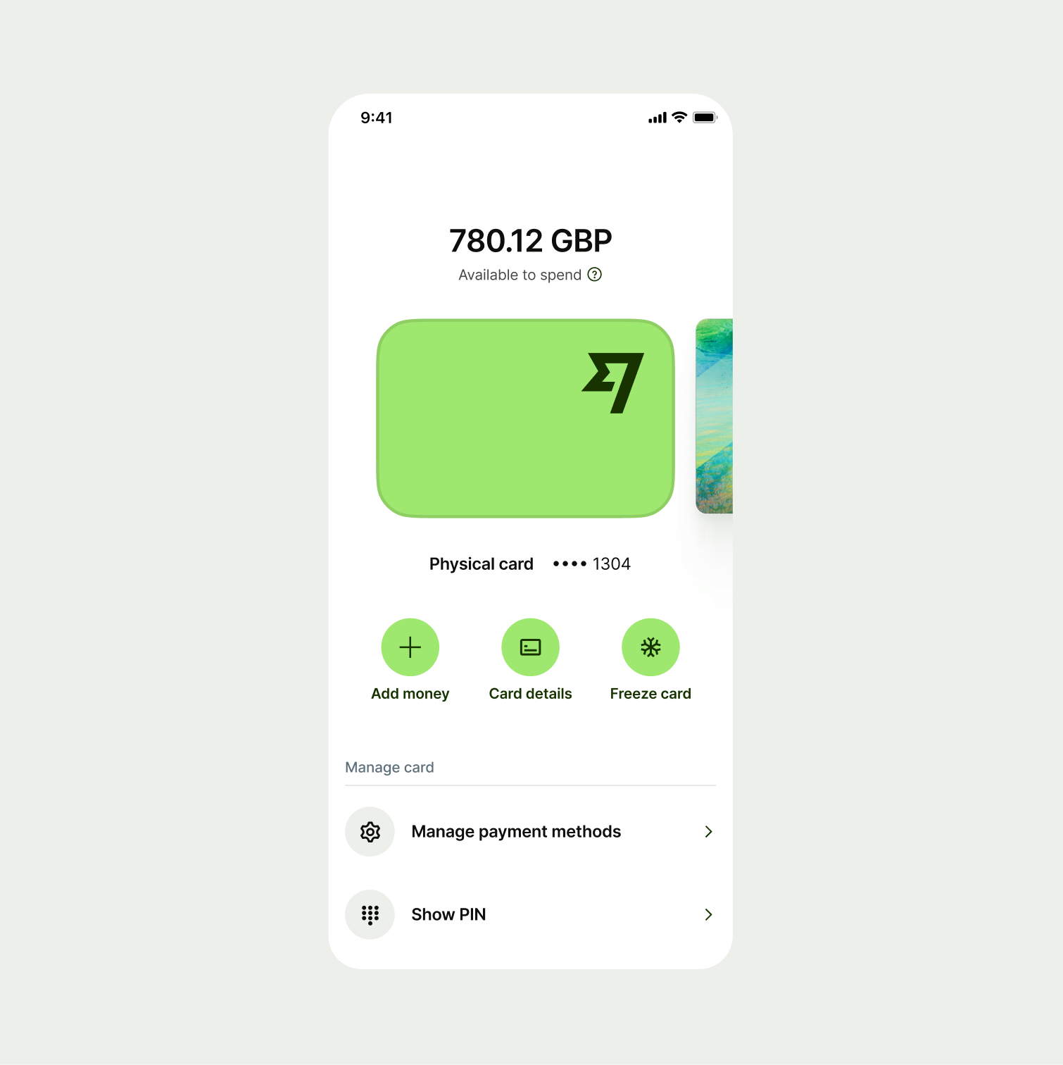
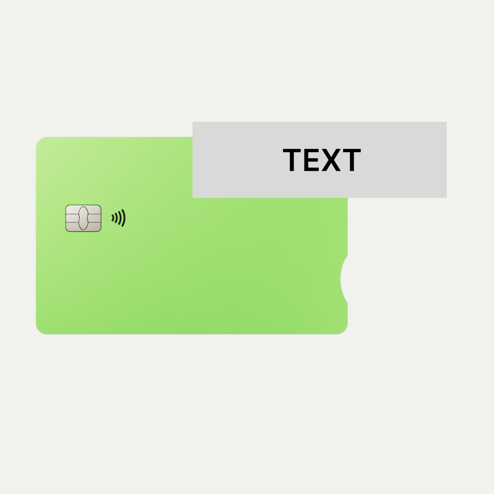
For simple labeling and identification of card usage in areas such as transactions.

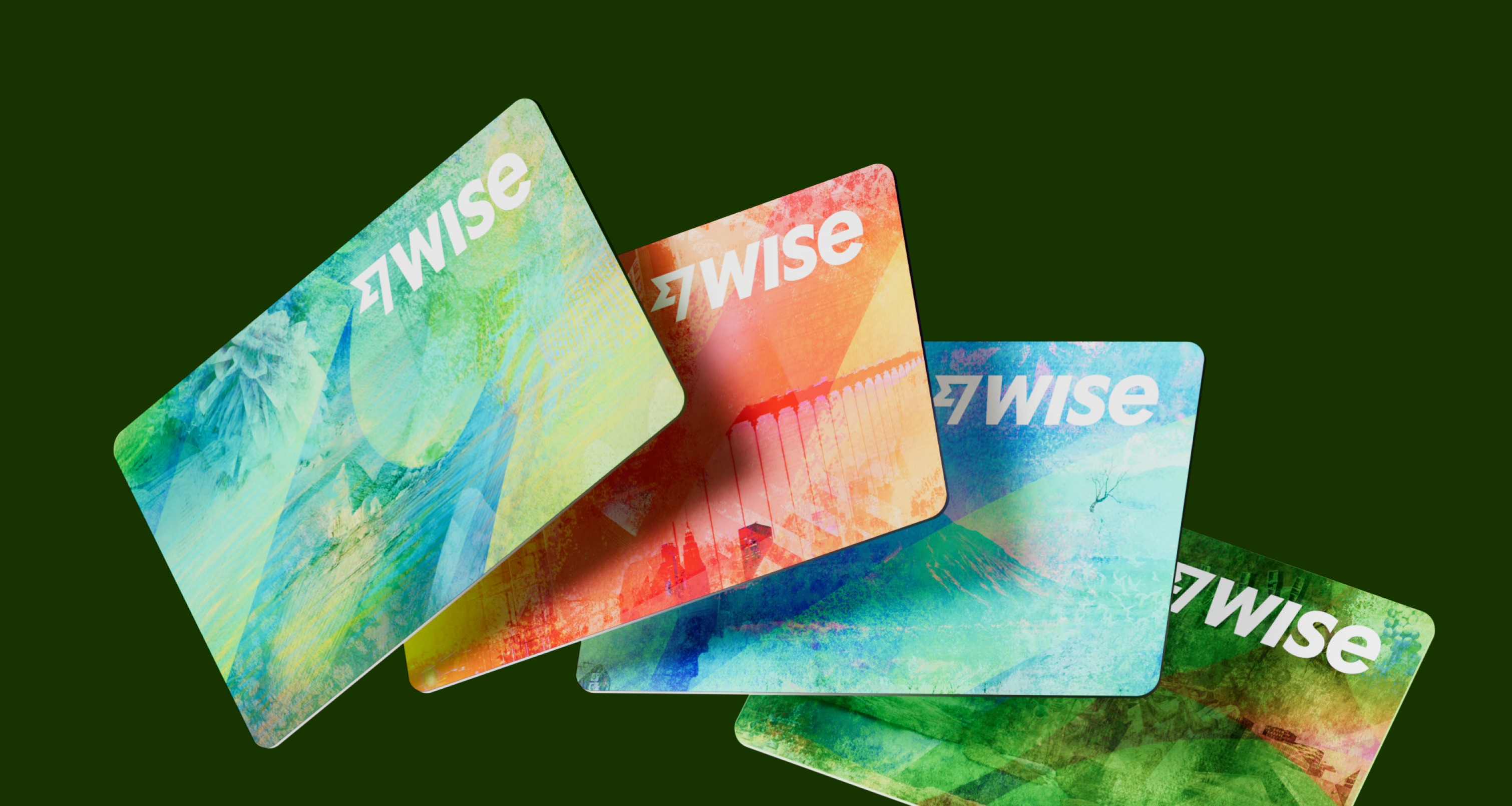
Expressive or 3D

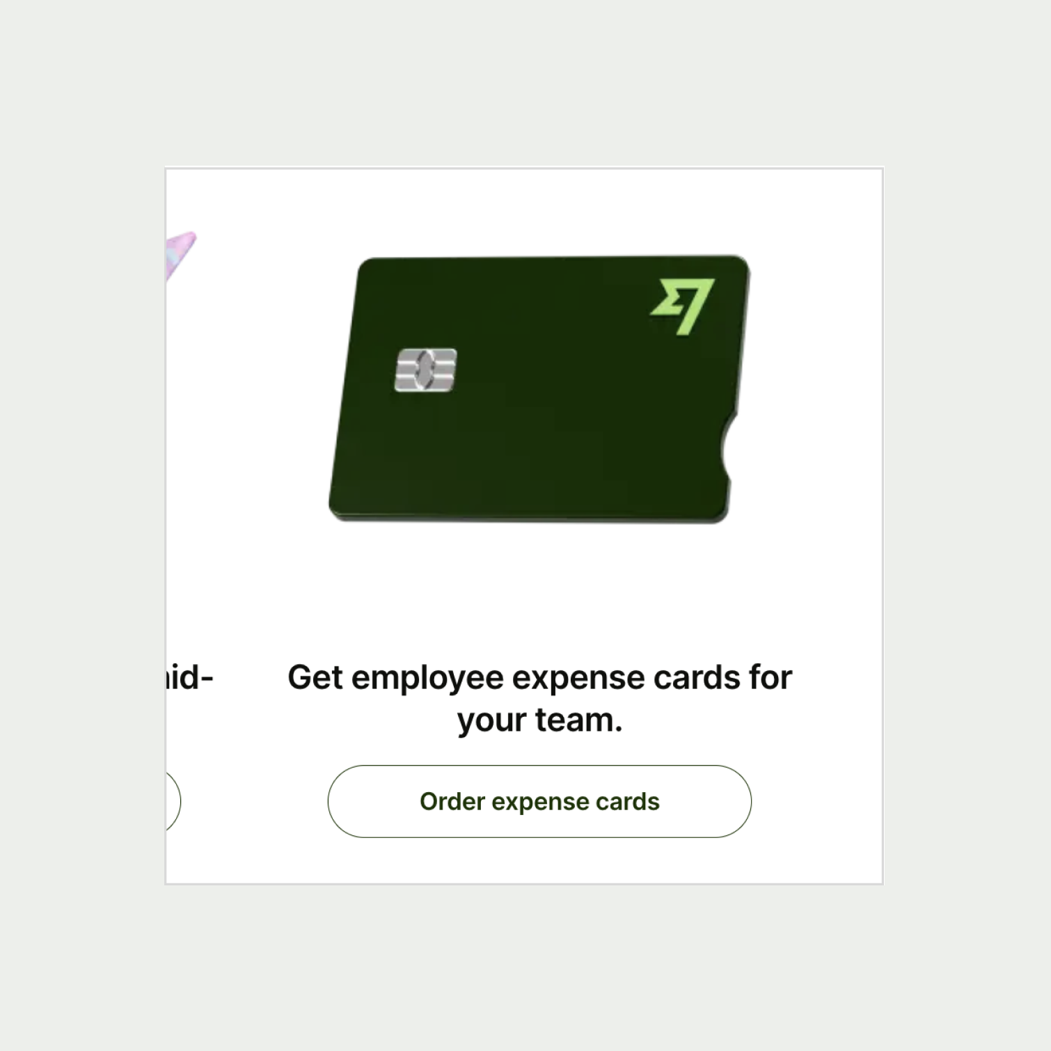
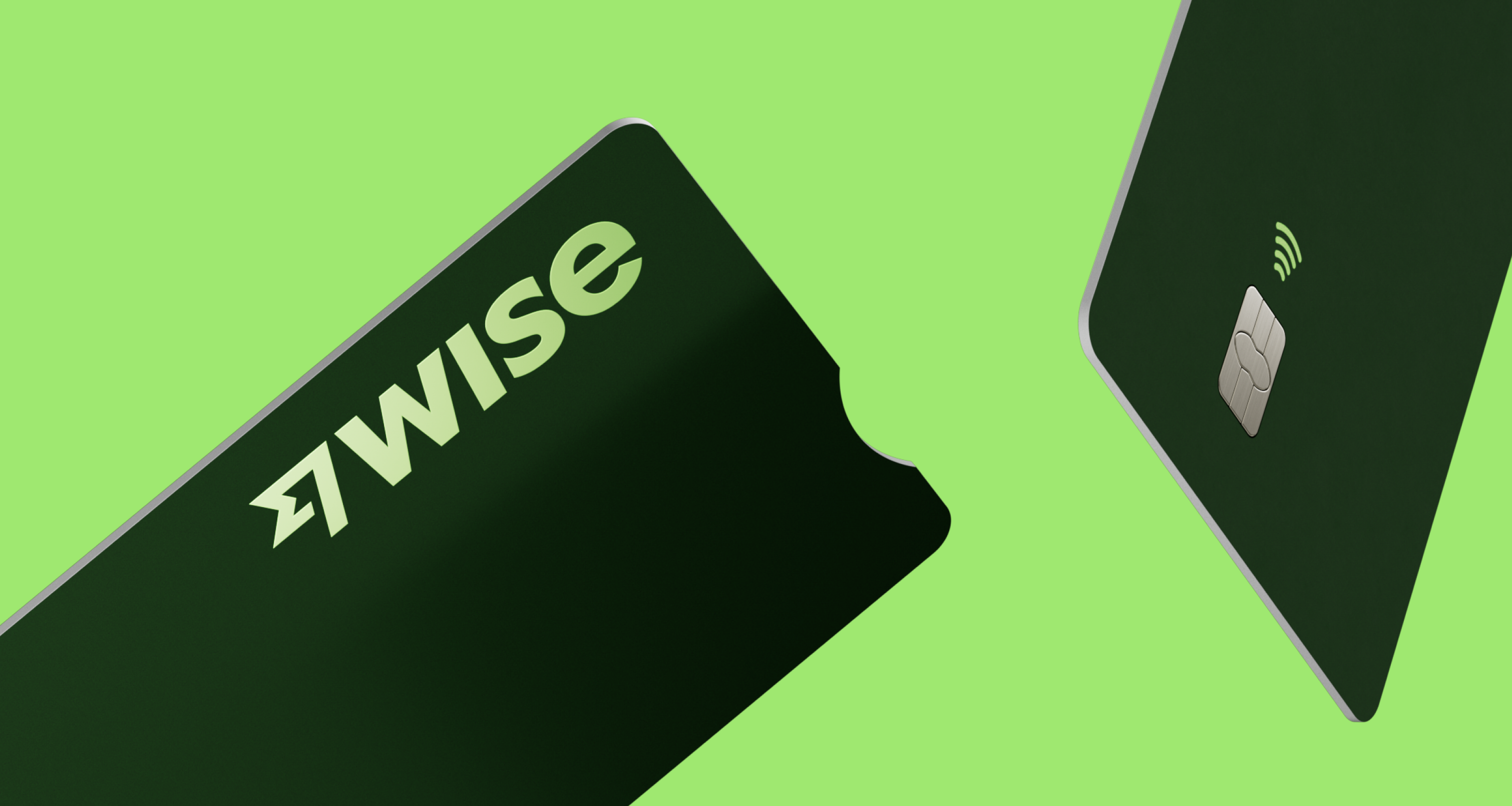
Expressive renders refer to cards that typically show cards in movement. They are utilised mostly for card promotion and marketing.
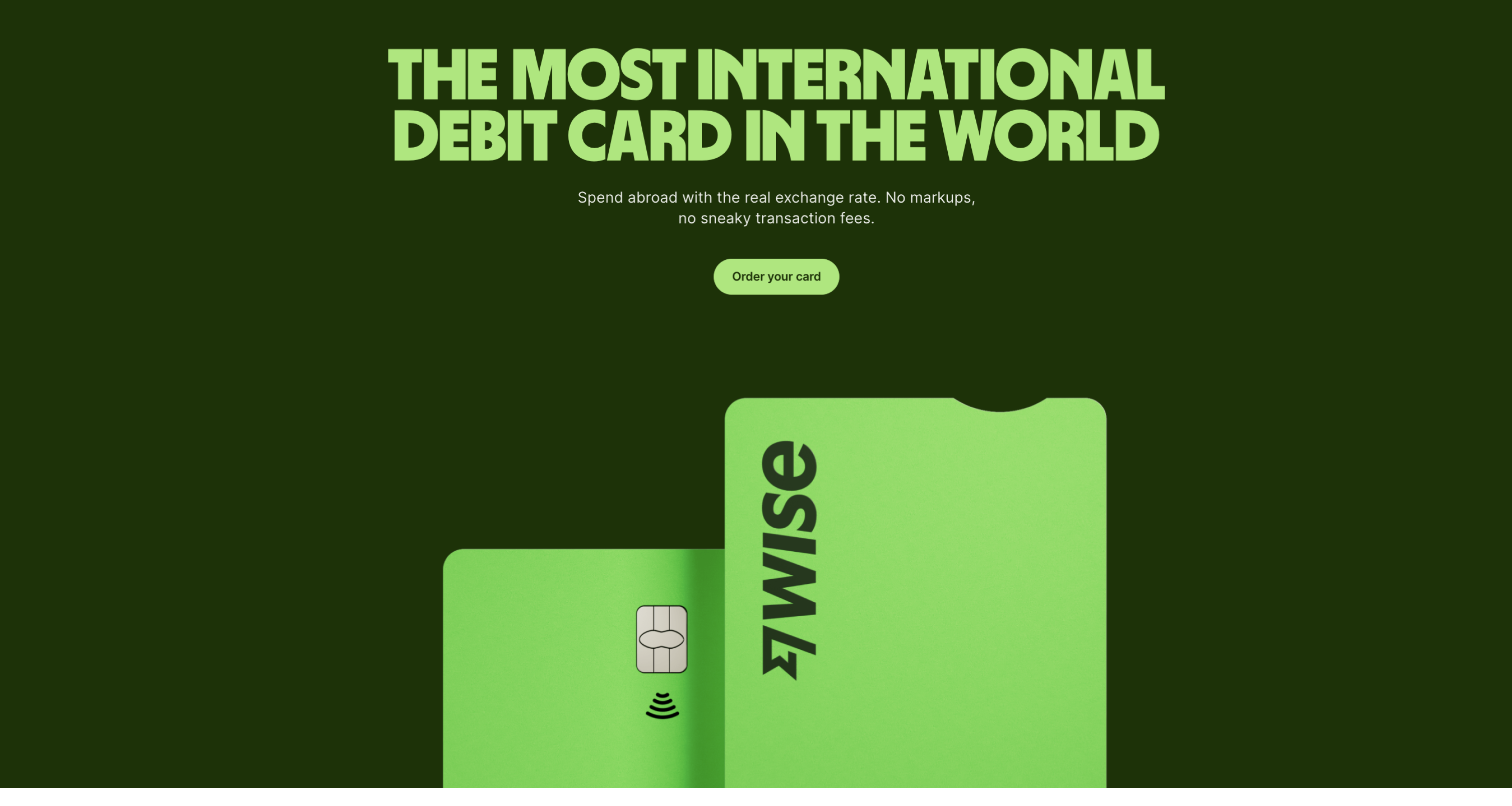
CardGuidance/Expressive3D1
CardGuidance/Expressive3D2

Card promotion on wise.com

Things To Avoid

Card sizing

CardGuidance/ThingsToAvoidLarge1

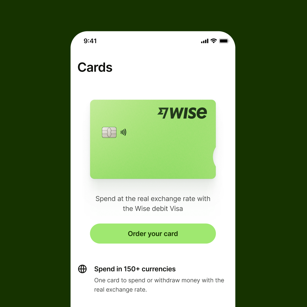
When showing large cards, like in the card tab, the large flatlay card should be used.

CardGuidance/ThingsToAvoidLarge2

Mini or micro flatlay cards should not be scaled up for this purpose.

CardGuidance/ThingsToAvoidTransaction1

For applications that require the use of small cards, the medium and small (mini) cards should be used.

CardGuidance/ThingsToAvoidTransaction2

Large flatlay cards should not be scaled down and used for this purpose.

CardGuidance/ThingsToAvoidNudge1

Sizing adjustments are correctly made without altering or skewing the original artwork.

CardGuidance/ThingsToAvoidNudge2

Do not scale up for large applications. Use large flatlay cards or expressive renders instead.

Scale

Colours of card visuals should never be altered or adjusted in any way that misrepresents its original form.
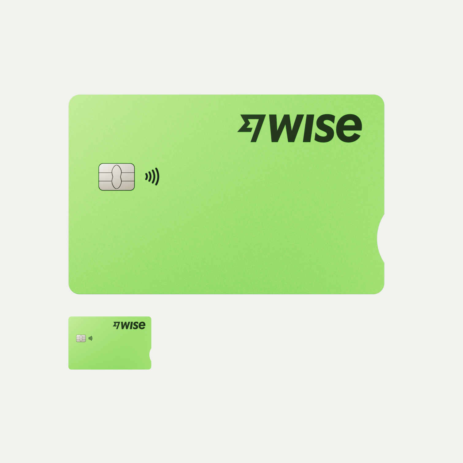
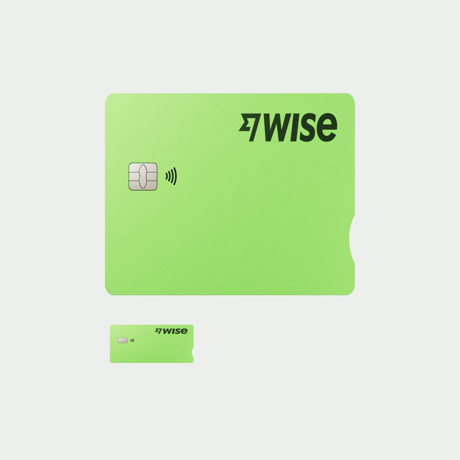
CardGuidance/ThingsToAvoidScale1

Sizing adjustments are correctly made without altering or skewing the original artwork.

CardGuidance/ThingsToAvoidScale2

Sizing adjustments incorrectly alters or skews the original artwork.

Colour

Colours of card visuals should never be altered or adjusted in any way that misrepresents its original form.
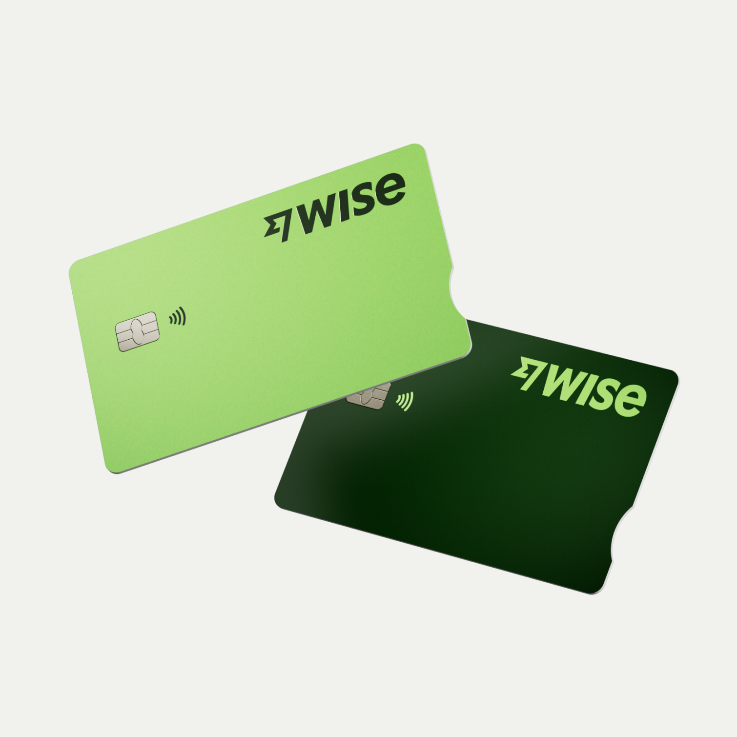
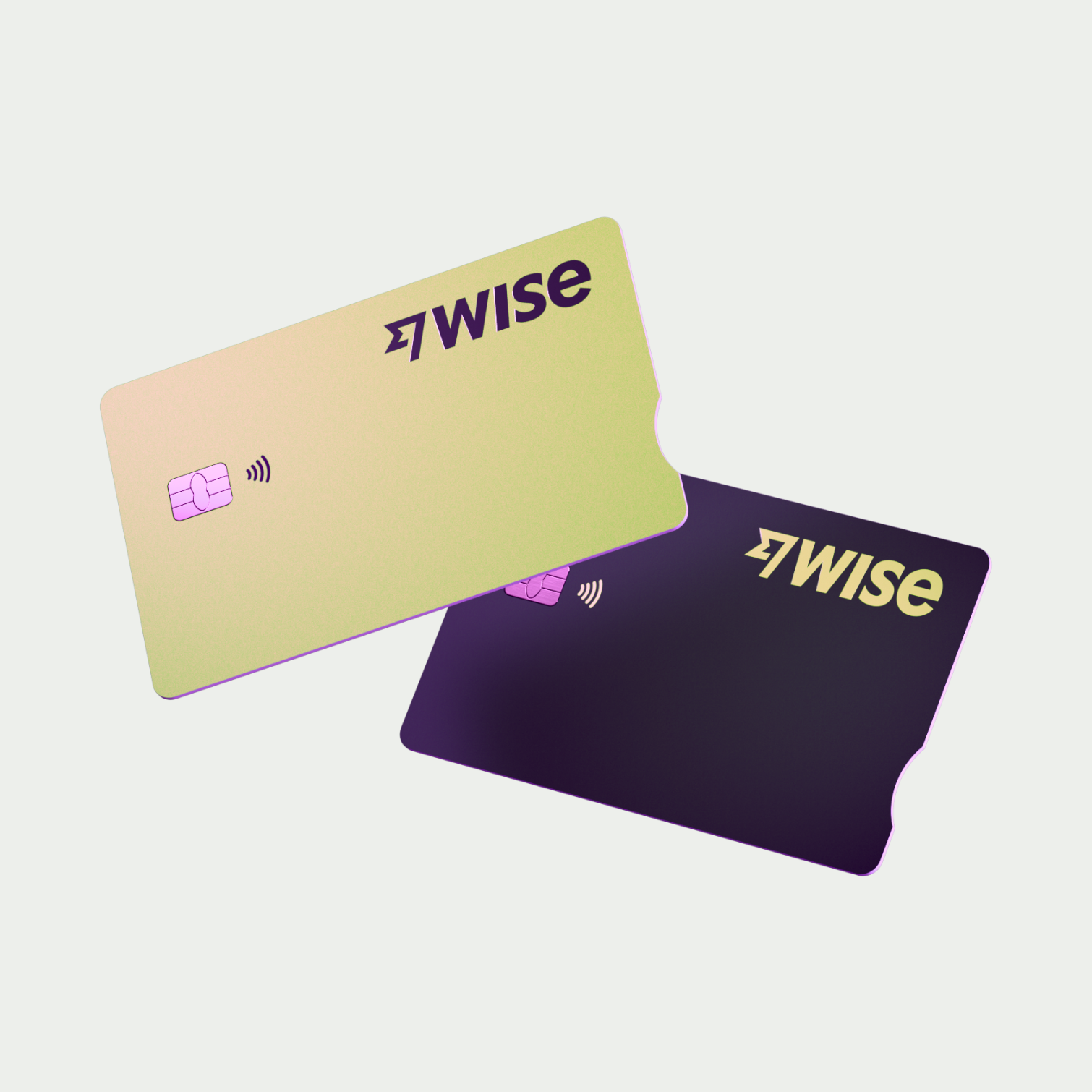
CardGuidance/ThingsToAvoidColour1

Artwork is not adjusted for colour and represents its original form.

CardGuidance/ThingsToAvoidColour2

Artwork has been adjusted with colours that does not represent its original form.

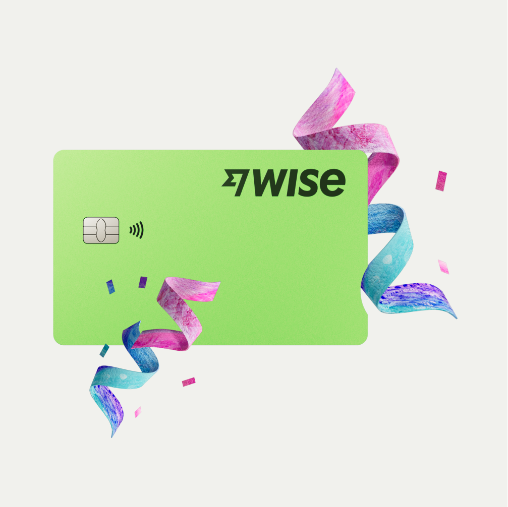
Obstruction of card visual

Card visuals should be the hero. Cards should not have any obstruction such as illustration or text in front or behind the visual, or covering the Wise brand logo.
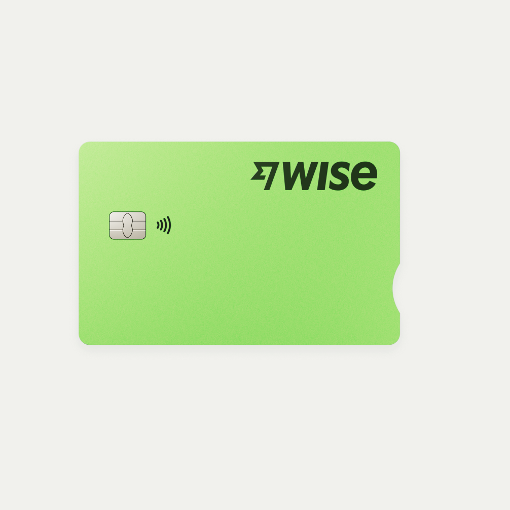
CardGuidance/ThingsToAvoidObstruction1

Card visual does not have elements obstructing the front or back

CardGuidance/ThingsToAvoidObstruction2

Artwork has elements obstructing the front and back

CardGuidance/ThingsToAvoidObstruction3

Artwork has elements obstructing the front

CardGuidance/ThingsToAvoidObstruction4

The only time where cards can be used with other illustrations if they are approved compositions done by the Brand team.

Cards on full tapestry backgrounds

Cards on full tapestry backgrounds need to have good contrast and be complementary. Digital tapestry cards cannot be placed on a tapestry background. 
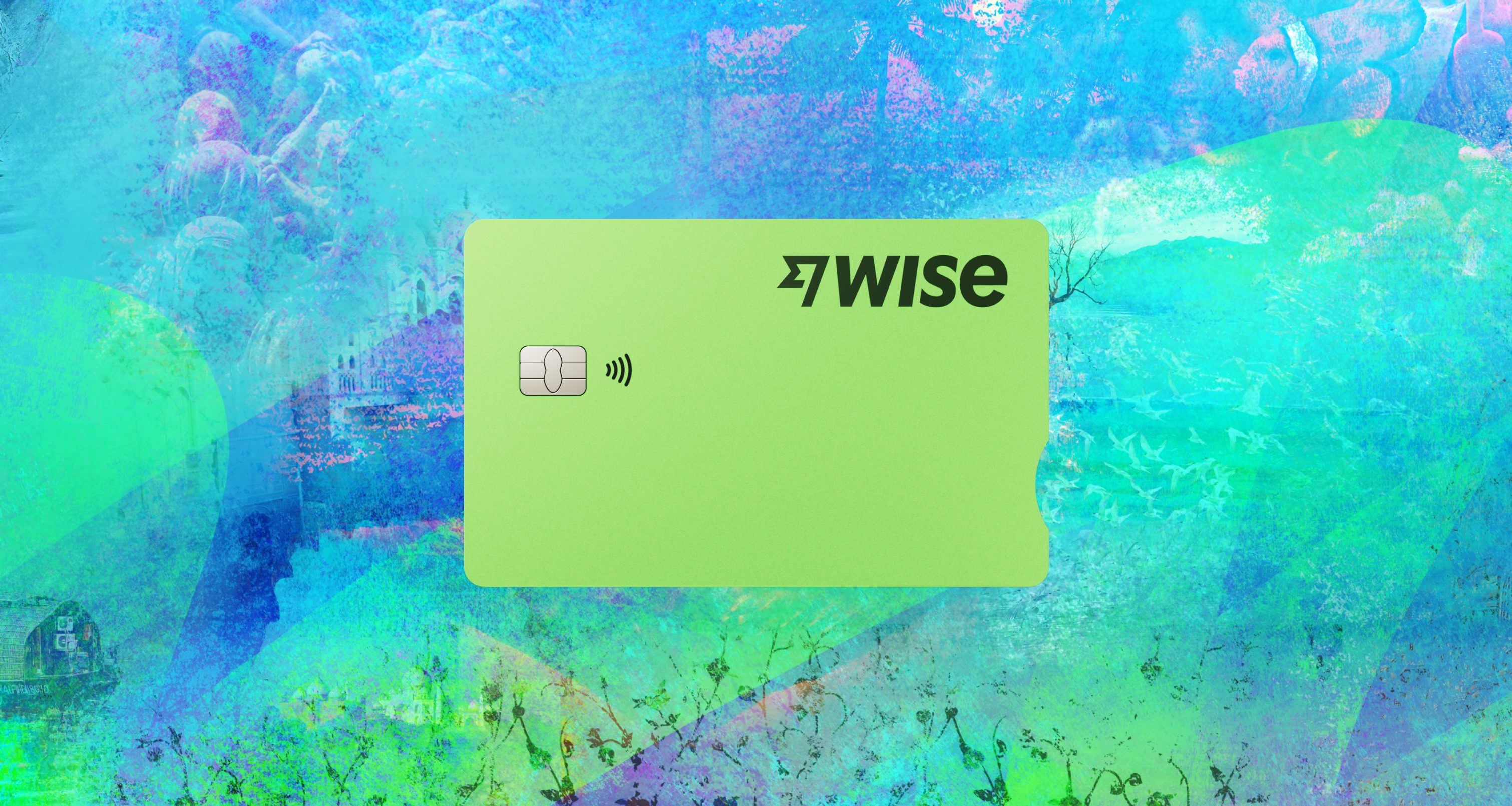


Go to tapestries guidelines.

CardGuidance/TapestryHeader
CardGuidance/TapestryGood

Cards on these backgrounds have good contrast and are complementary.

CardGuidance/TapestryBad1

Cards on these backgrounds fade into the tapestry colours and are incomplementary.

CardGuidance/TapestryBad2

Digital tapestry cards clash with the texture of the tapestries.

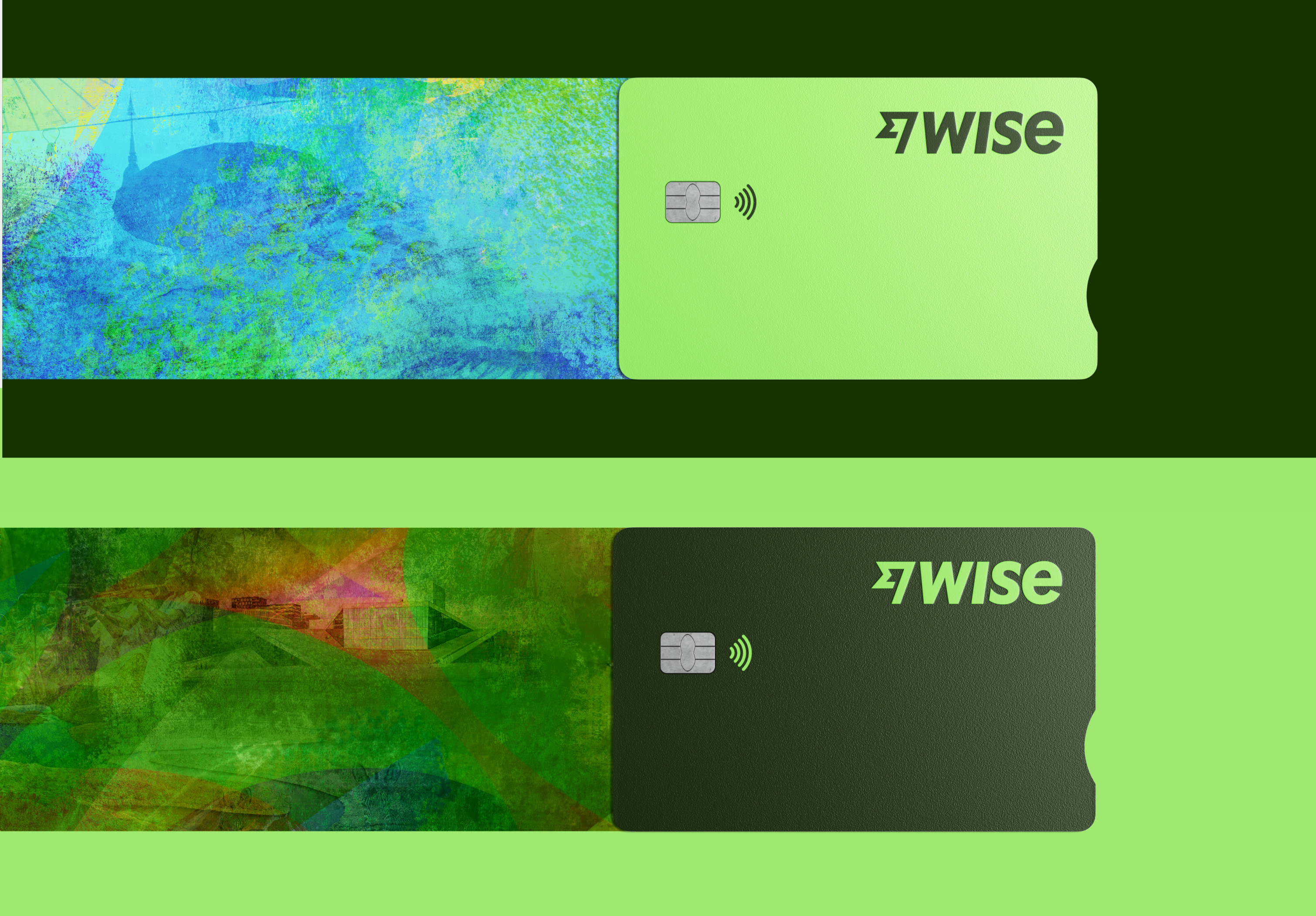
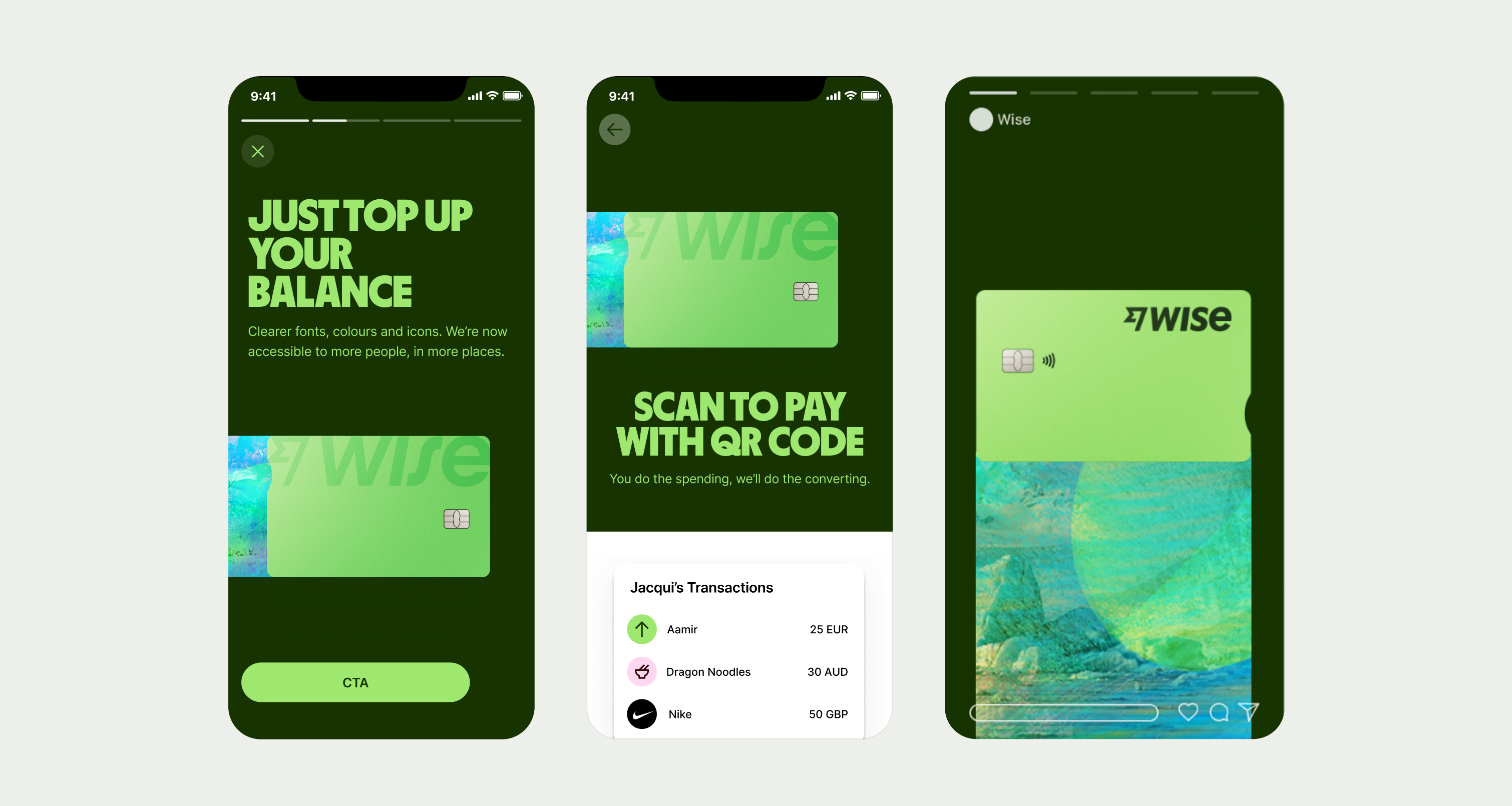
Cards on tapestry trails

Cards on tapestry trails require different guidelines as they only have a small portion of contact and also rely on a flat background for contrast. Only use card tapestry visuals with approved backgrounds from the Brand System team.
CardGuidance/TapestryTrail1
CardGuidance/TapestryTrail2

Cards on these backgrounds have good contrast and are complementary.