A brand that moves money, needs an identity that moves too.
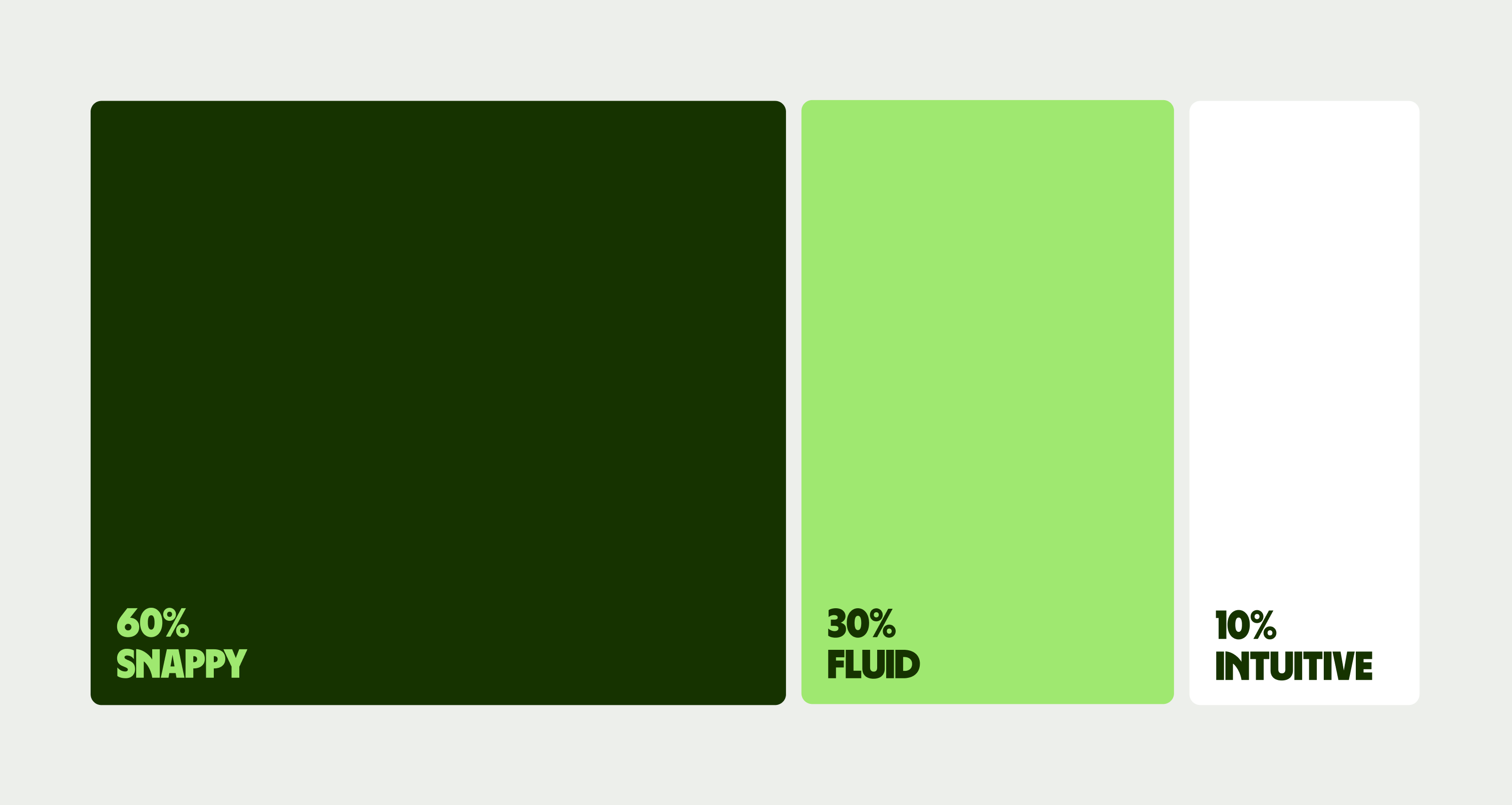
Follow these 3 simple principles to ensure we flow just as the world’s currencies do.
Snappy
Wise is revolutionising banking by challenging old systems that restricted money. In motion we communicate breaking away from institutions with snappy, simple, fast and satisfying movements. Like flipping a coin.
But it’s not hyperactive, erratic or rushed. Let’s not give people motion sickness.
Fluid
Wise is on a mission to make money borderless. For money to become borderless it takes on a fluid state. In motion we communicate fluidity with organic and flowing movements.
Fluid is not a kite in the wind — unstable and directionless, with nothing to hold on to.
Intuitive
People are leading increasingly global lives, yet the tools available for managing money remain outdated. At Wise, we prioritise transparency, speed, and ease of use in the services we offer to our customers. Through motion, we convey our human-centric approach with a natural pace and a sense of physical weight in movement.
Intuitive isn’t crudely handmade, polished to perfection or complicated, intuitive is natural.
Here is a deeper dive into how to apply the motion principles. These aren’t rules, but tips on how to make motion feel distinctly Wise, and how to avoid going too far.

Speed graphs
Our motion should feel natural and human, like the swipe of a finger. Motion shouldn’t feel stiff or mechanical.
Visual intensity
Snappy allows us to be visually bold and exciting. But be careful not to become inaccessible and disorientating.


Repetitive fluidity
Our motion should be fluid and rhythmic, which means hitting the right beats. Motion that doesn't land or rest becomes nauseating.
Our tapestries are bold and expressive. But with motion, they really come alive.
Add an extra dimension to illustrations with motion. Both objects and tapestries can move to bring them to life. Just make sure things feel fluid, appropriately paced and looped to get the best desired effect.
Animating tapestries
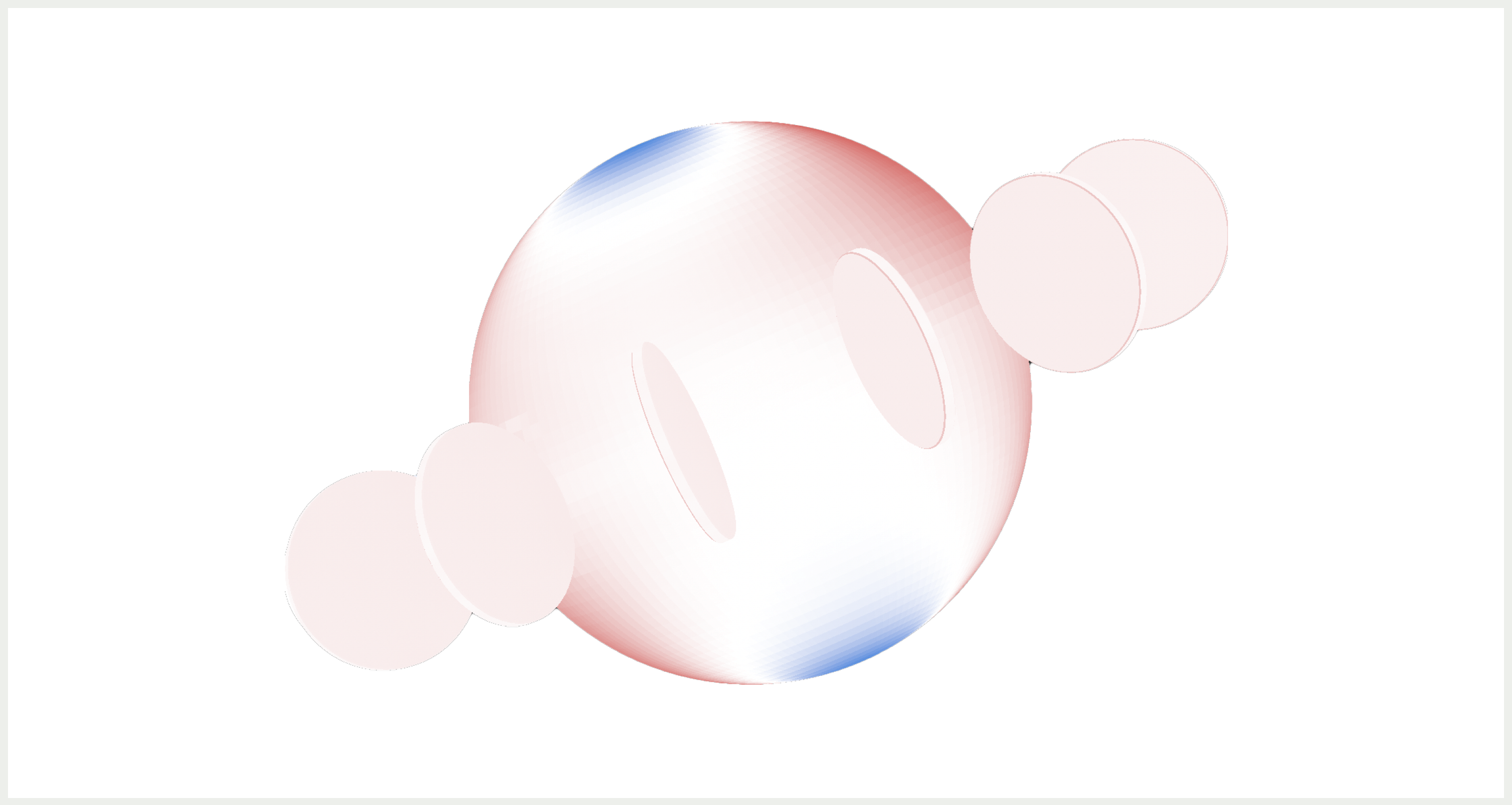
We’ve applied distortions to our tapestries to create areas of fast and slow movement, giving each a slightly magical way of moving. We achieve this by warping the object UVs to create areas of high and low tension. In Cinema 4D this can be done simply by distorting the UV mesh slightly with soft selection turned on, or by using the ‘weld and relax’ command with a only a few discreet edge cuts.

Animating form
To make the most of our message we can also animate the form of the illustration itself. This can be a slippery slope, so here's a few tips on to stay on your feet (and on brand).
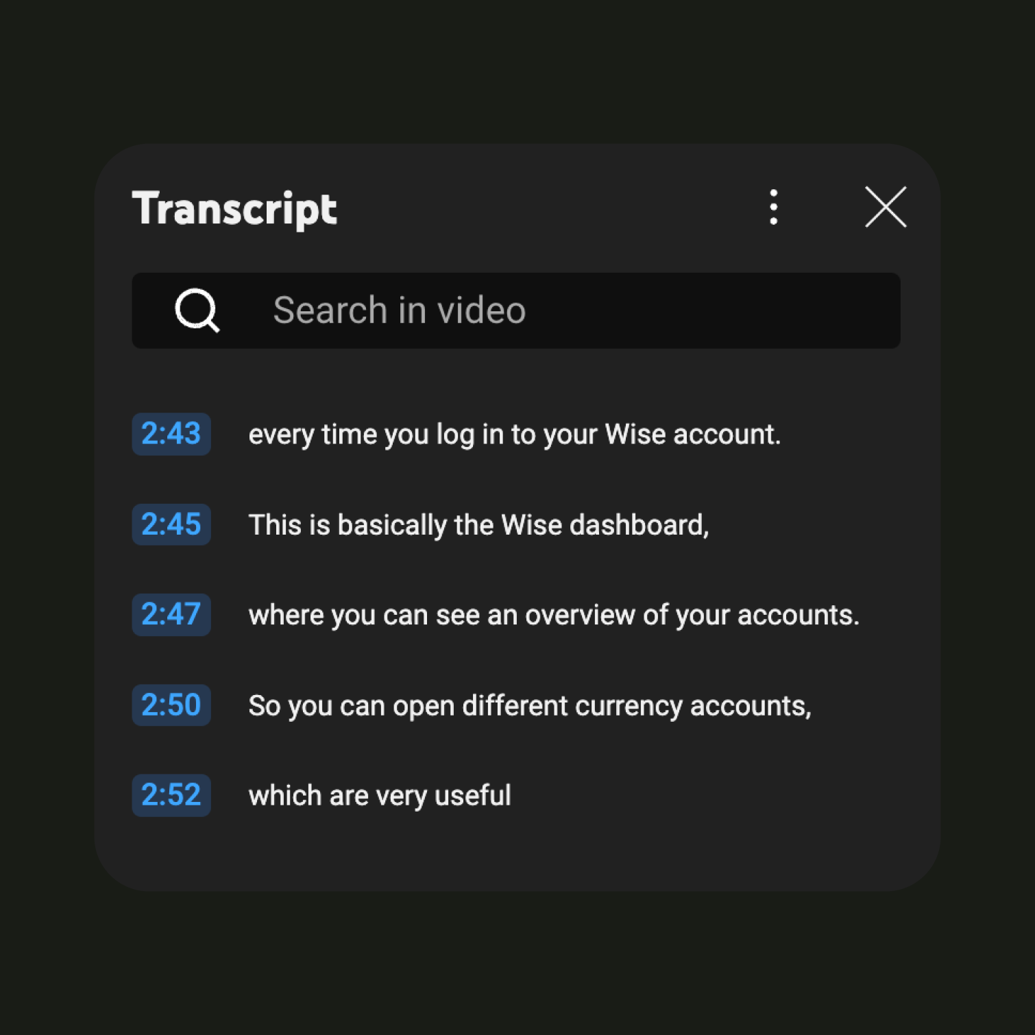
All video content should be accessible to people with visual and/or hearing impairments. Below are a four ways you can make your videos more inclusive and compliant.


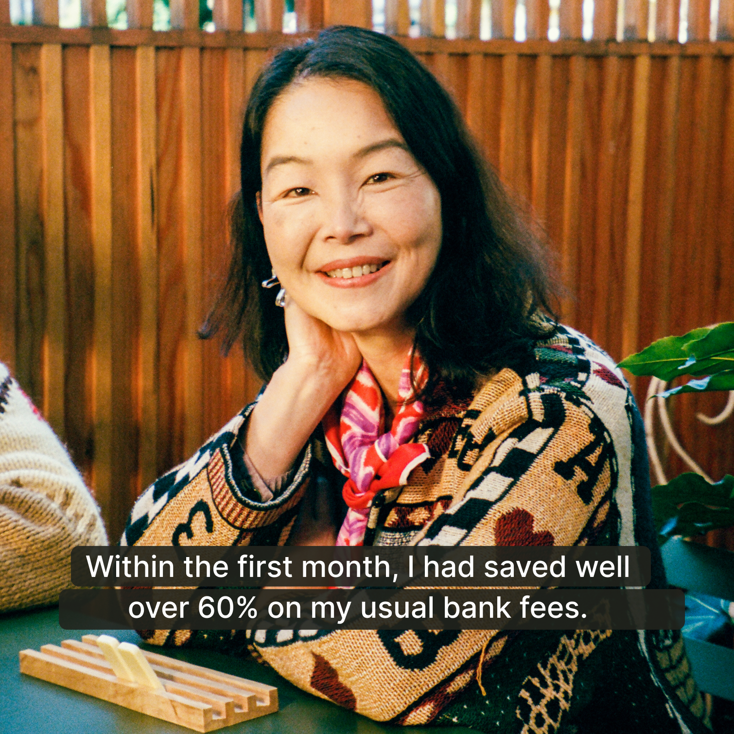
Caption best practices
Below are a few best practices when using captions on your videos. For more information you can also refer to our typography page or the UK government accessibility guidelines.


