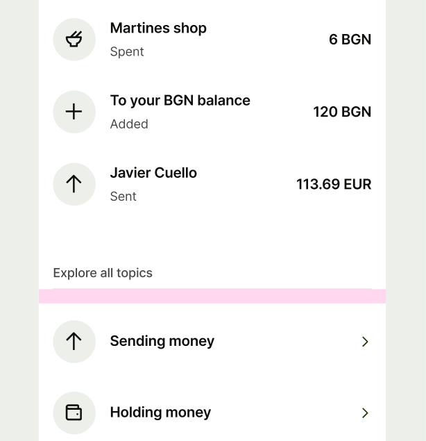
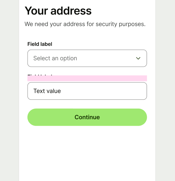
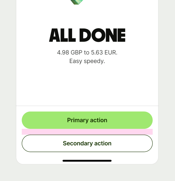
Spacing tokens separate elements inside components and layout blocks — both horizontally, and vertically.
Our spacing scale helps make things consistent, while also making content easier to scan in a screen layout.
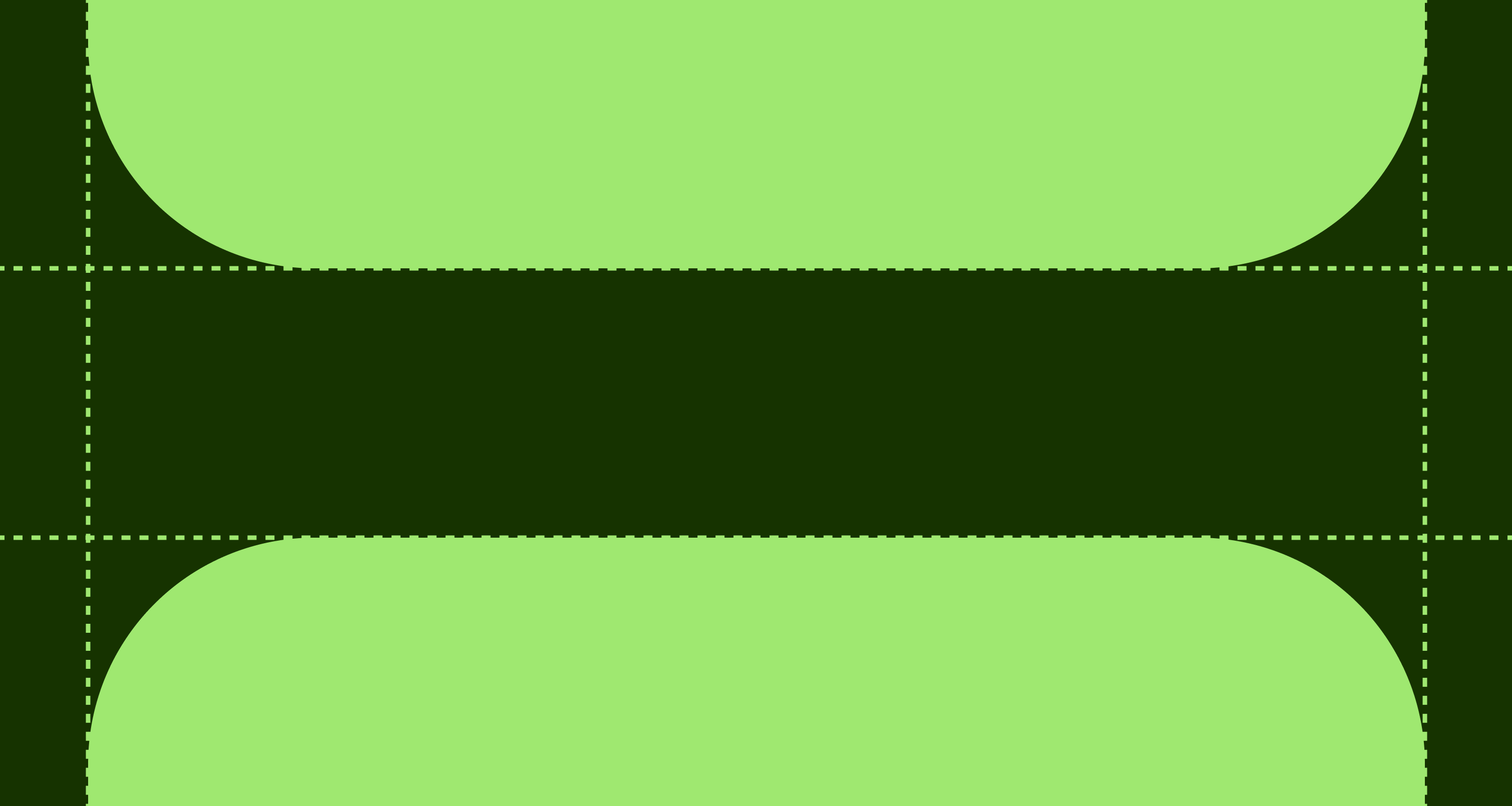
We use foundational tokens to set up all of our components and templates. They are used as a base for our semantic tokens.
Name | Value |
|---|---|
size-4 | 4px |
size-8 | 8px |
size-12 | 12px |
size-16 | 16px |
size-24 | 24px |
size-32 | 32px |
size-40 | 40px |
size-48 | 48px |
size-56 | 56px |
size-64 | 64px |
size-72 | 72px |
size-80 | 80px |
size-88 | 88px |
size-96 | 96px |
size-104 | 104px |
size-112 | 112px |
size-120 | 120px |
size-128 | 128px |
We have a defined scale for accessibility so that when screens are increased in size our content dynamically grows. This is so our customers continue to get that incredible Wise experience no matter what settings they have switched on.
100% | 85% | 130% | 155% |
|---|---|---|---|
4px | 3px | 5px | 6px |
8px | 7px | 10px | 12px |
12px | 10px | 16px | 19px |
16px | 14px | 21px | 25px |
24px | 20px | 31px | 37px |
etc... |
So you know what space to use, and where, we use semantic tokens. These tokens are linked to our foundational tokens so that you don’t need to remember that component default is size-16 — neat, huh.
Usage
- Use semantic tokens from the design system.
- Use semantic tokens, not foundational tokens in your work.
- Don’t use custom or hard-coded values.
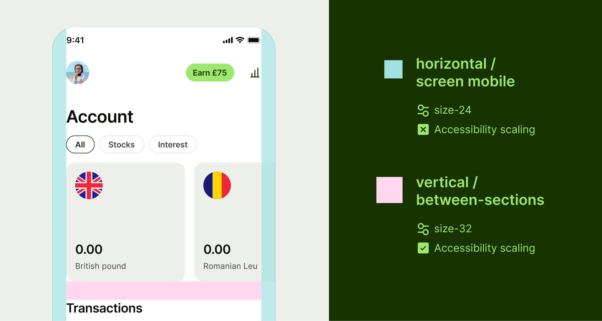
Horizontal spacing refers to elements that go next to each other.
Name | Value | Accessibility scaling |
|---|---|---|
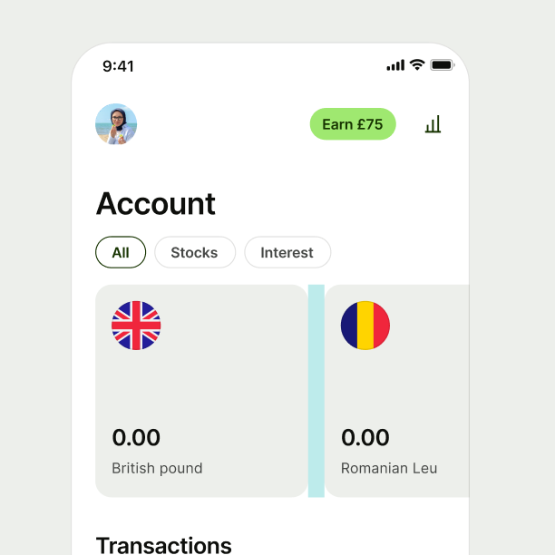
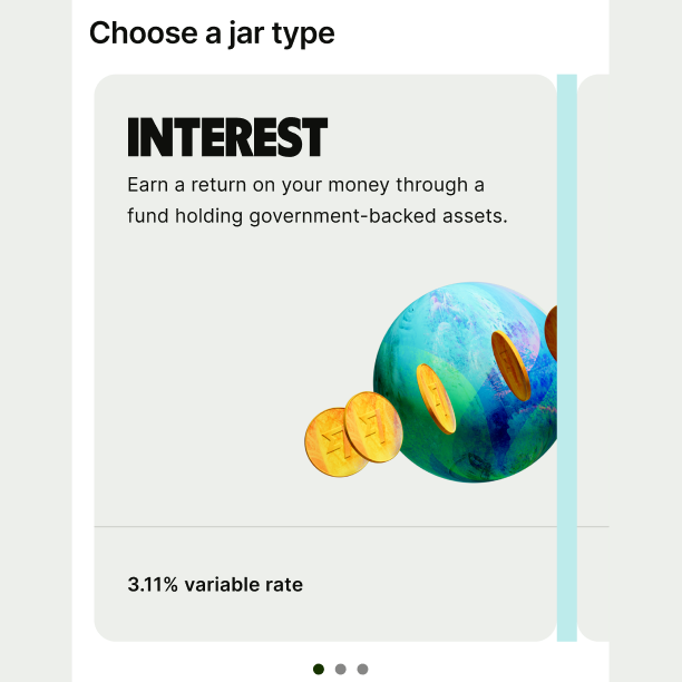
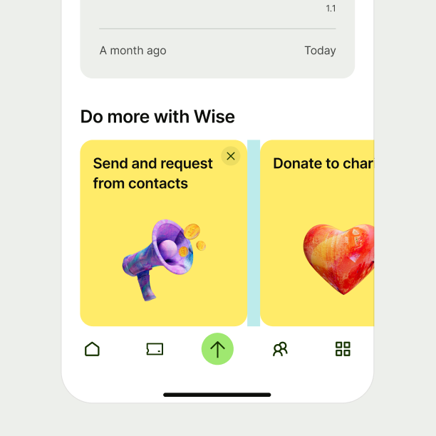
between-cards | size-12 | |
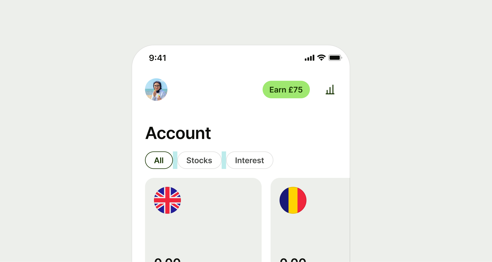
between-chips | size-8 | |
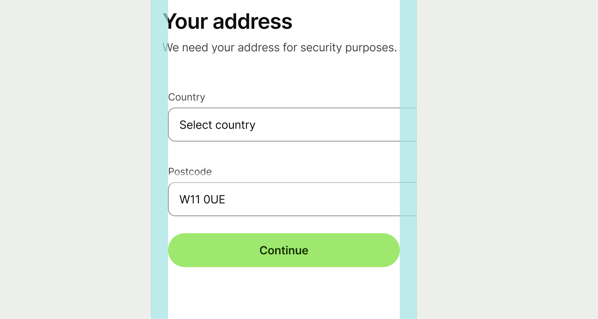
screen-mobile | size-24 | |
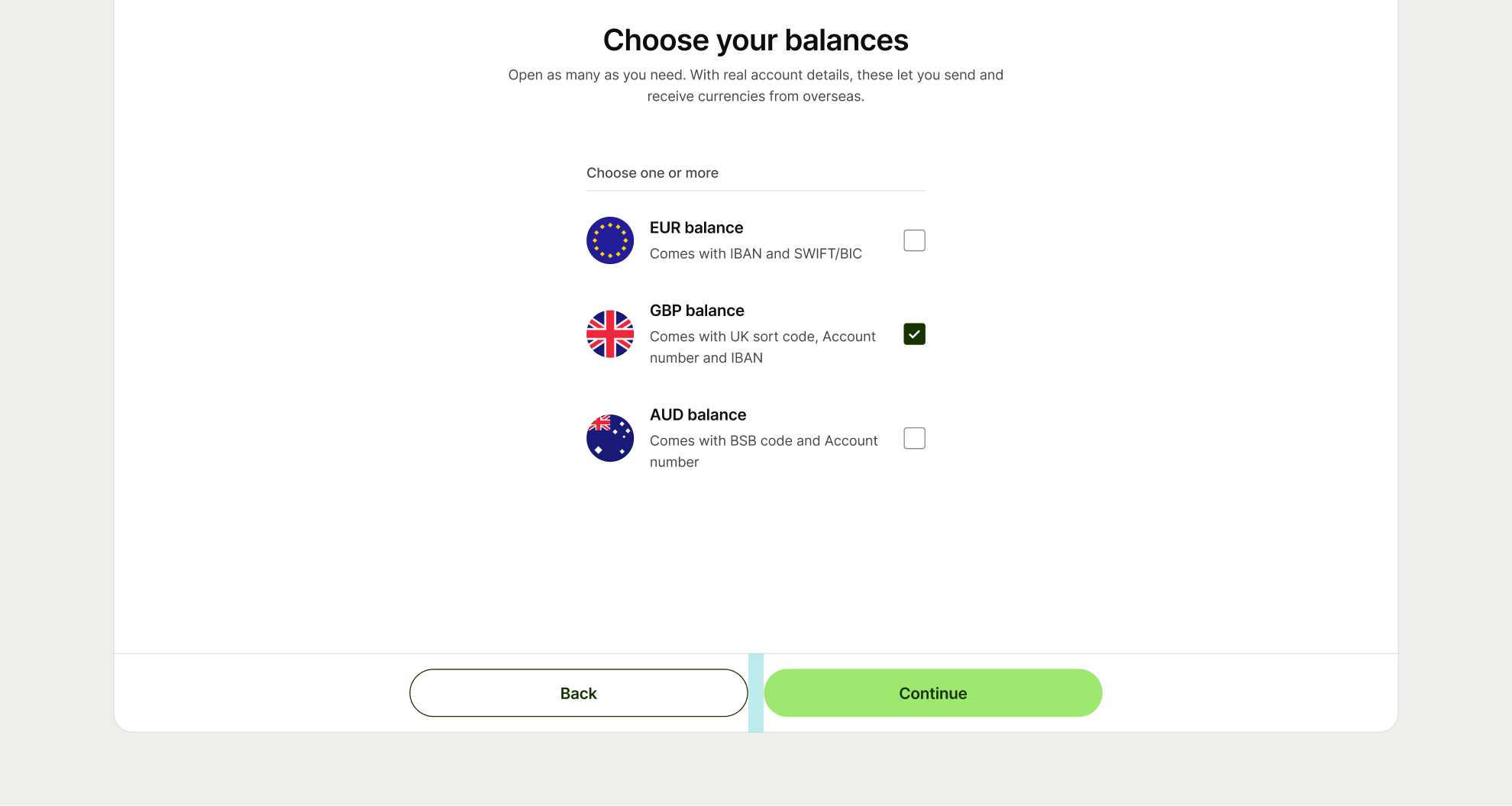
component-default | size-16 |
Between cards
Cards are self contained blocks of content. In product these can be placed next to one another and scroll off screen.
Between chips
Chips allow us to filter content and are typically placed next to one another and scroll off screen.
Screen mobile
This is the overarching spacing that contains our mobile designs.
Component default
When there are no other specific spacing tokens for components, use component default.
Vertical spacing refers to how sections of a screen are separated. It also applies to the spacing between components.
Name | Value | Accessibility scaling |
|---|---|---|
between-text | size-8 | |
image-bottom | size-8 | |
display-text-bottom | size-16 | |
text-to-component | size-16 | |
content-to-button | size-24 | |
between-sections | size-32 | |
between-options | size-0 | |
component-default | size-16 |
Between text
Text is any copy that isn’t using a display style.
It’s built into our text styles, but you’ll need to add it in when they’re not in the same block of content.
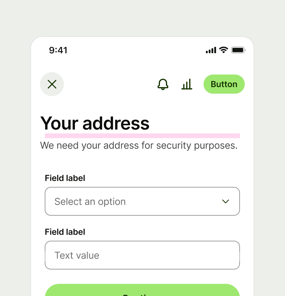

Image bottom
Our 3D assets contain built in padding, but sometimes require a little bit of extra breathing room.

Display text bottom
Display text require a bit of extra space before other text due to their tight line height, uppercase and bold format.

Text to component
This refers to any text style that isn’t using a display style to any component.
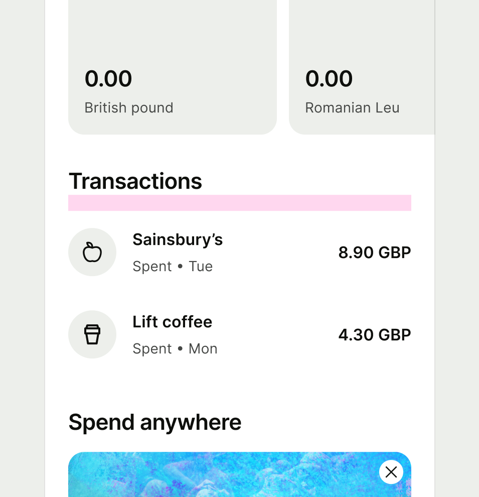

Content to button
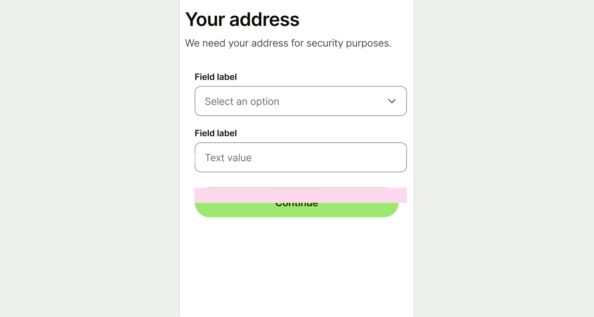
When a button is displayed directly below the content or form and not in a footer.
Between sections
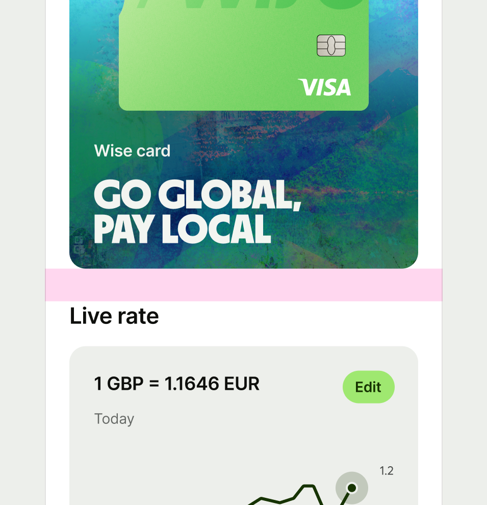
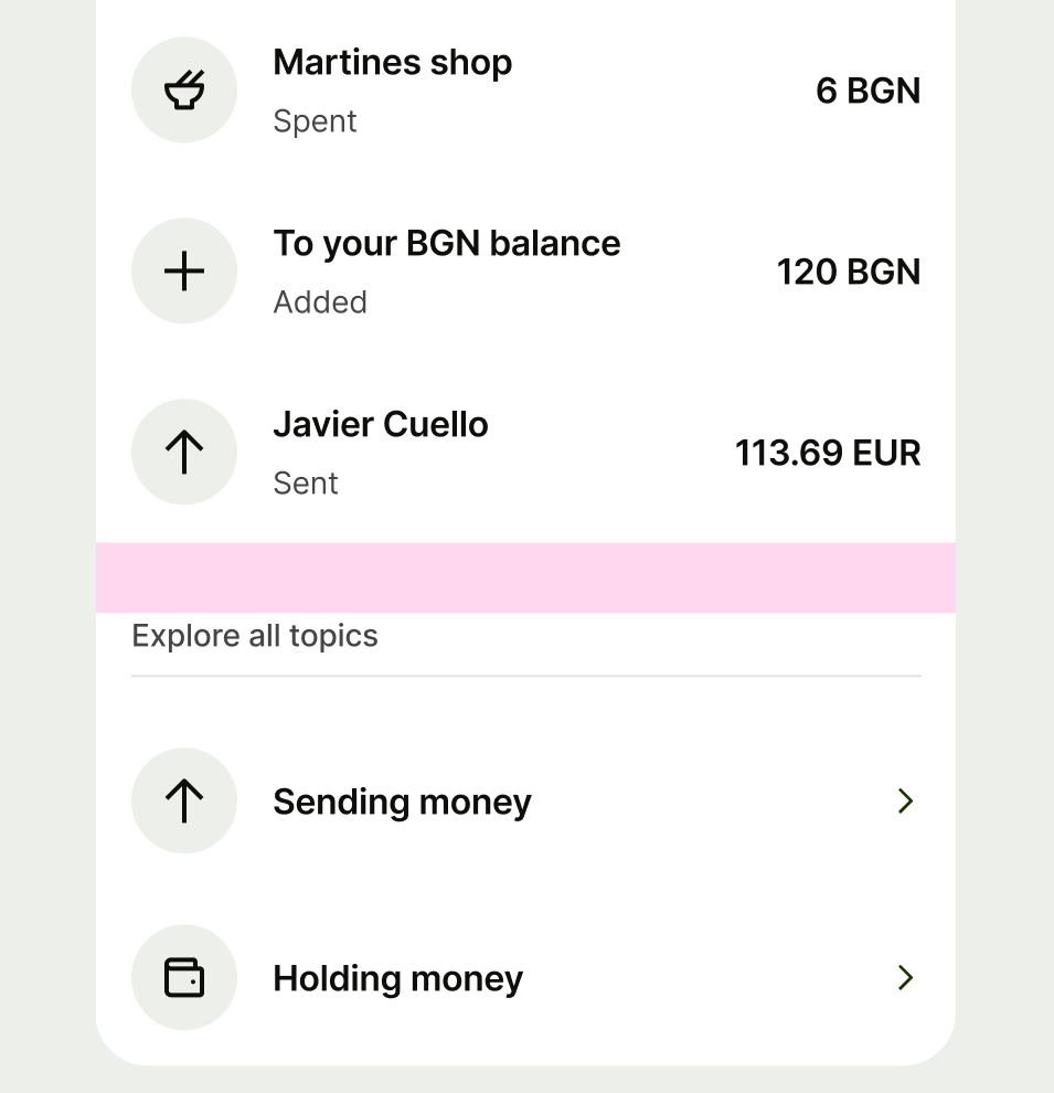
Sections are groups of content that we need stronger proximity between so that it’s evident they’re separate.
Between options
Spacing is built in to all option components due to the large touch area. This means spacing between options is set to 0px by default.
Component default
When there are no other specific component spacing tokens, use component default.
