Typography

Our typographic system is built on legibility and accessibility. It’s clear, bold, and — when we use our international glyphs — endlessly expressive.
Dollars, to pesos, to pounds, to euros.
Approach
Text in Inter font with a bolded title of "One account, all kinds of money" and body text below, "For people who use money wherever they go".
Inter

Use Inter for most things. It’s clean and legible in both headings and body copy.

Bright green Parafina text on a forest green background with the words "Use invest transfer keep"
Wise Sans

Our display font is clear and bold. Use it for short and sweet headlines — usually to celebrate or shout about something.

Sent.
International glyphs

A range of glyphs, for when you need even more expression. Use them big, use them bold, and use them sparingly.

Product text styles

Inter
Semi bold 30px
Line height 34px
Letter spacing -2.5%
Paragraph Spacing 8px

Title screen

Used for the main screen title, should be used only once per screen. It pairs with large body.

Inter
Semi bold 26px
Line height 32px
Letter spacing -1.5%
Paragraph Spacing 8px

Title section

Handy for dividing your screen into sections. It pairs perfectly with large body.

Inter
Semi bold 22px
Line height 28px
Letter spacing -1.5%
Paragraph Spacing 8px

Title subsection

Designed for sections within sections to increase the information hierarchy.

Inter
Semi bold 18px
Line height 24px
Letter spacing -1%
Paragraph Spacing 8px

Title body

Perfect for large amounts of content. Pairs with large body and default body.

Inter
Medium 14px
Line height 20px
Letter spacing 1.5%

Title group

Inter
Regular 16px
Line height 24px
Letter spacing -0.5%
Paragraph Spacing 8px

Body large
Used for for paragraphs. Pairs with screen title and section title.

Inter
Semi bold 16px
Line height 24px
Letter spacing 0.5%
Paragraph Spacing 8px

Body large bold
Emphasises and highlights important words or small titles. It’s used in expressive components, such as buttons and links.

Inter
Regular 14px
Line height 22px
Letter spacing 1%
Paragraph Spacing 8px

Body default
When you need something a little smaller than large, or to compliment large body.

Inter
Semi bold 14px
Line height 22px
Letter spacing 1.25%
Paragraph Spacing 8px

Body default bold
Emphasises and highlights important words or small titles. 
It’s used in expressive components, such as buttons and links.

Inter
Semi bold underlined 16px
Line height 24px
Letter spacing 1%
Paragraph Spacing 8px

Link large
Used in line with large body, or when you need a large link.

Inter
Semi bold underlined 14px
Line height 22px
Letter spacing 1.25%
Underlined

Link default
Used in line with default body, or when you need a smaller link.
Inter

Inter’s simplicity, clarity and rounded forms make it the perfect functional typeface for us. Always default to Inter. Unless you’re being expressive, use Inter to make sure you communicate easily with everyone, especially in product.

Inter Medium

A
B
C
D
E
F
G
H
I
J
K
L
M
N
O
P
Q
R
S
T
U
V
W
X
Y
Z
a
b
c
d
e
f
g
h
i
j
k
l
m
n
o
p
q
r
s
t
u
v
w
x
y
z
1
2
3
4
5
6
7
8
9
0
£
$
!
?
#
%
&
¢
¥
@
Ω
ω

Inter Semi Bold

A
B
C
D
E
F
G
H
I
J
K
L
M
N
O
P
Q
R
S
T
U
V
W
X
Y
Z
a
b
c
d
e
f
g
h
i
j
k
l
m
n
o
p
q
r
s
t
u
v
w
x
y
z
1
2
3
4
5
6
7
8
9
0
£
$
!
?
#
%
&
¢
¥
@
Ω
ω

Currency symbols

Inter was already an international typeface spanning countless languages, and we worked with a typographer to add more currency symbols that make it even more international.
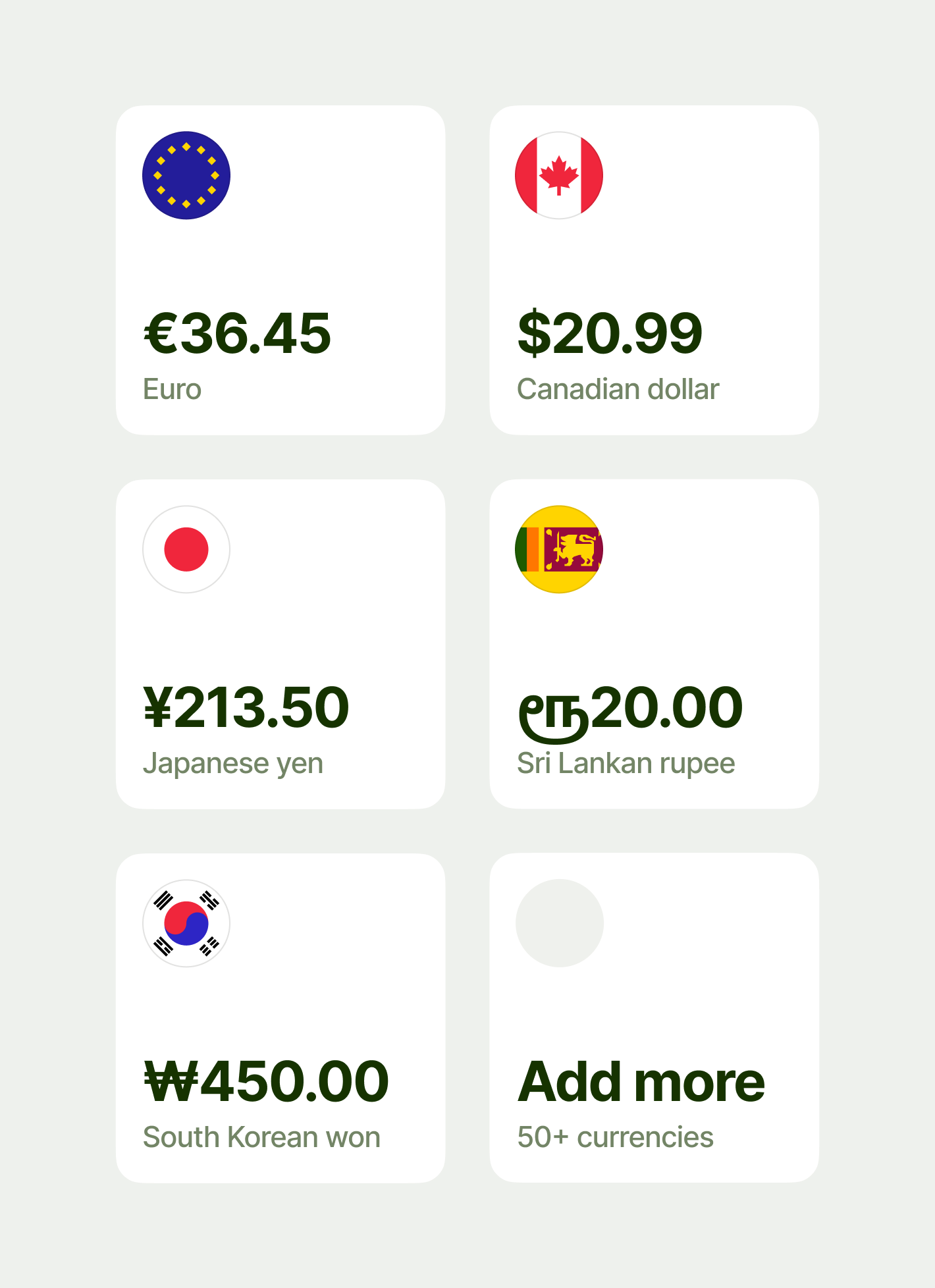
Six examples of our Account squares in a 2x3 grid

Alignment

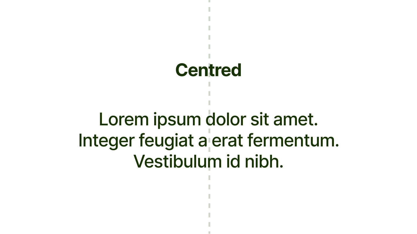
You should left-align or centre text in Inter. But right-align it if you’re using a right-to-left language. And keep line lengths between 50 and 60 characters.
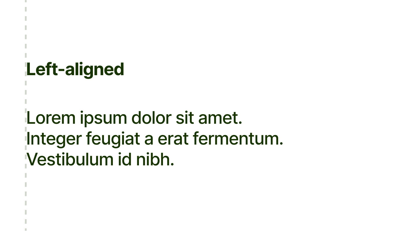
Some text shown left-aligned.

Left-align text

Some text shown centre-aligned.

Centre-align text

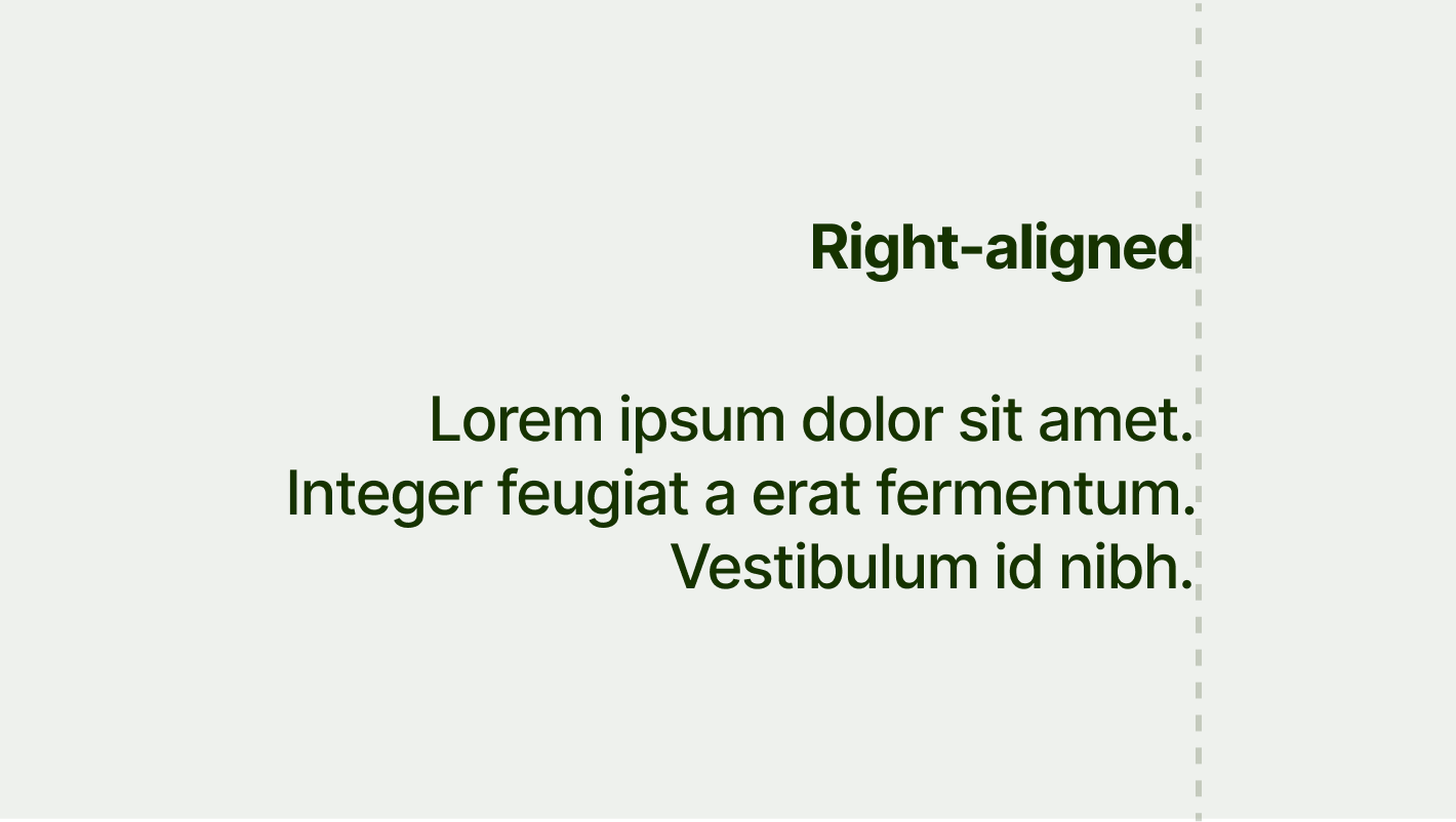
Some text shown right-aligned.

Right-align text for right-to-left languages

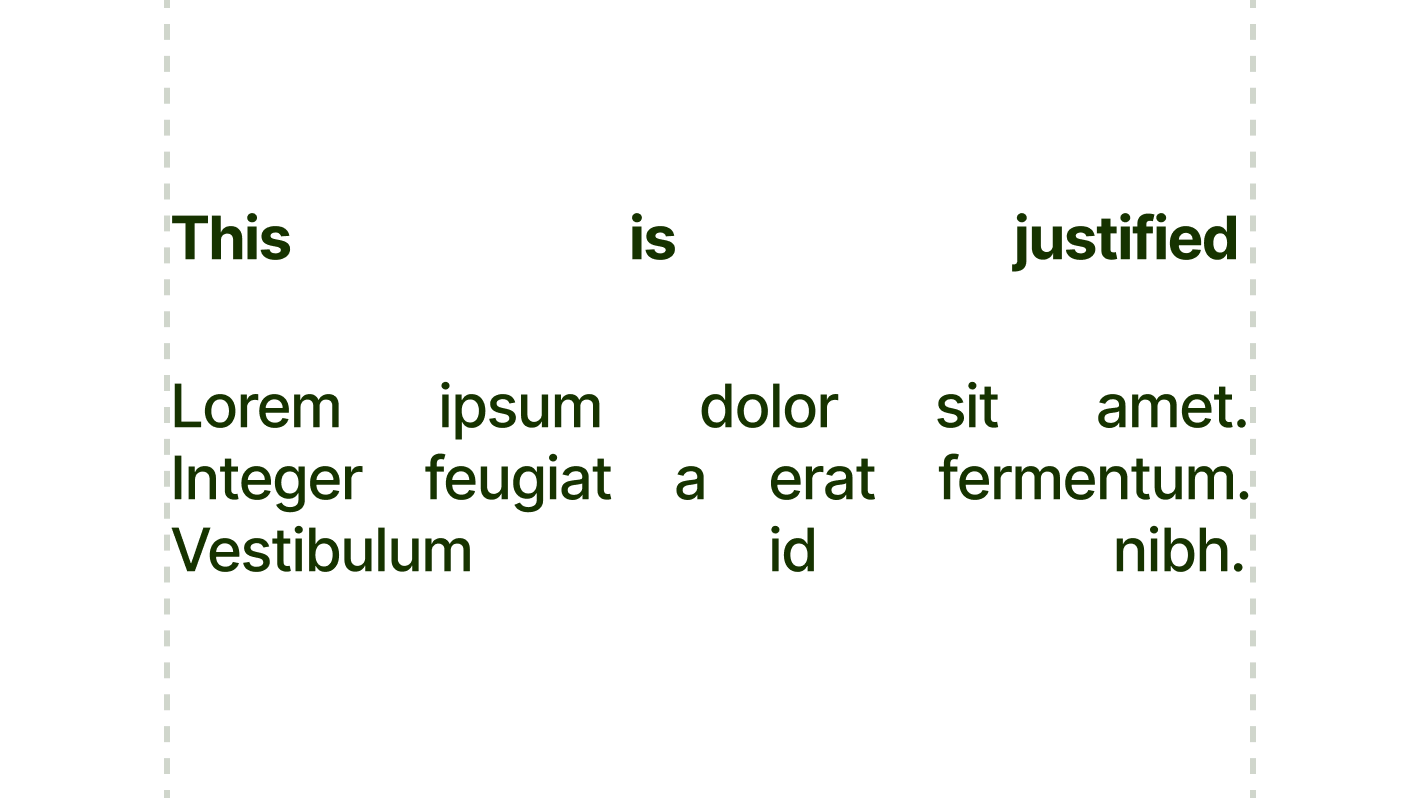
Some text shown justified.

Don’t justify text

Things to avoid

Inter is versatile enough to apply in a variety of ways. But also versatile enough to get it wrong.

Here are some mistakes to avoid.
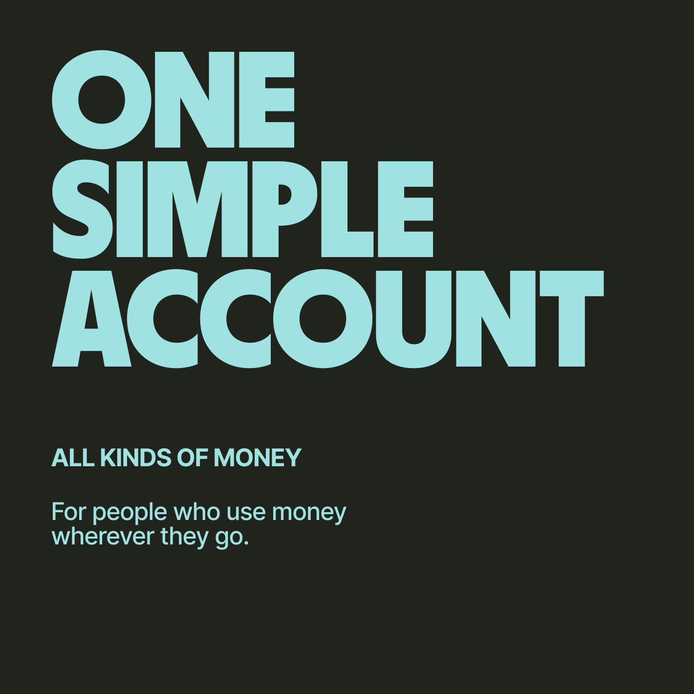
An example of text with a header in Worldwide Sans and a subheader in Inter with all capital letters.

Don’t use Inter in all caps, even for headlines.

Two paragraphs of text, each with bold text and italicized text.

Don’t mix up different treatments too close together.

Wise Sans

Wise Sans is our clean, bold, display typeface. It’s loud, proud, and perfect for headlines.

Wise Sans

A
B
C
D
E
F
G
H
I
J
K
L
M
N
O
P
Q
R
S
T
U
V
W
X
Y
Z
1
2
3
4
5
6
7
8
9
0
£
$
!
?
#
%
&
¢
¥
@
Ω
ω

Using Wise Sans in product

Use Wise Sans for key success and selling moments to add that extra bounce to our brand. It's designed to be short, sharp and stand out. Like a pinch of spice to give a little flavour, we don't want to overdo it.

Key moments include:

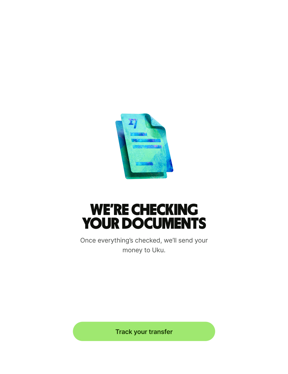
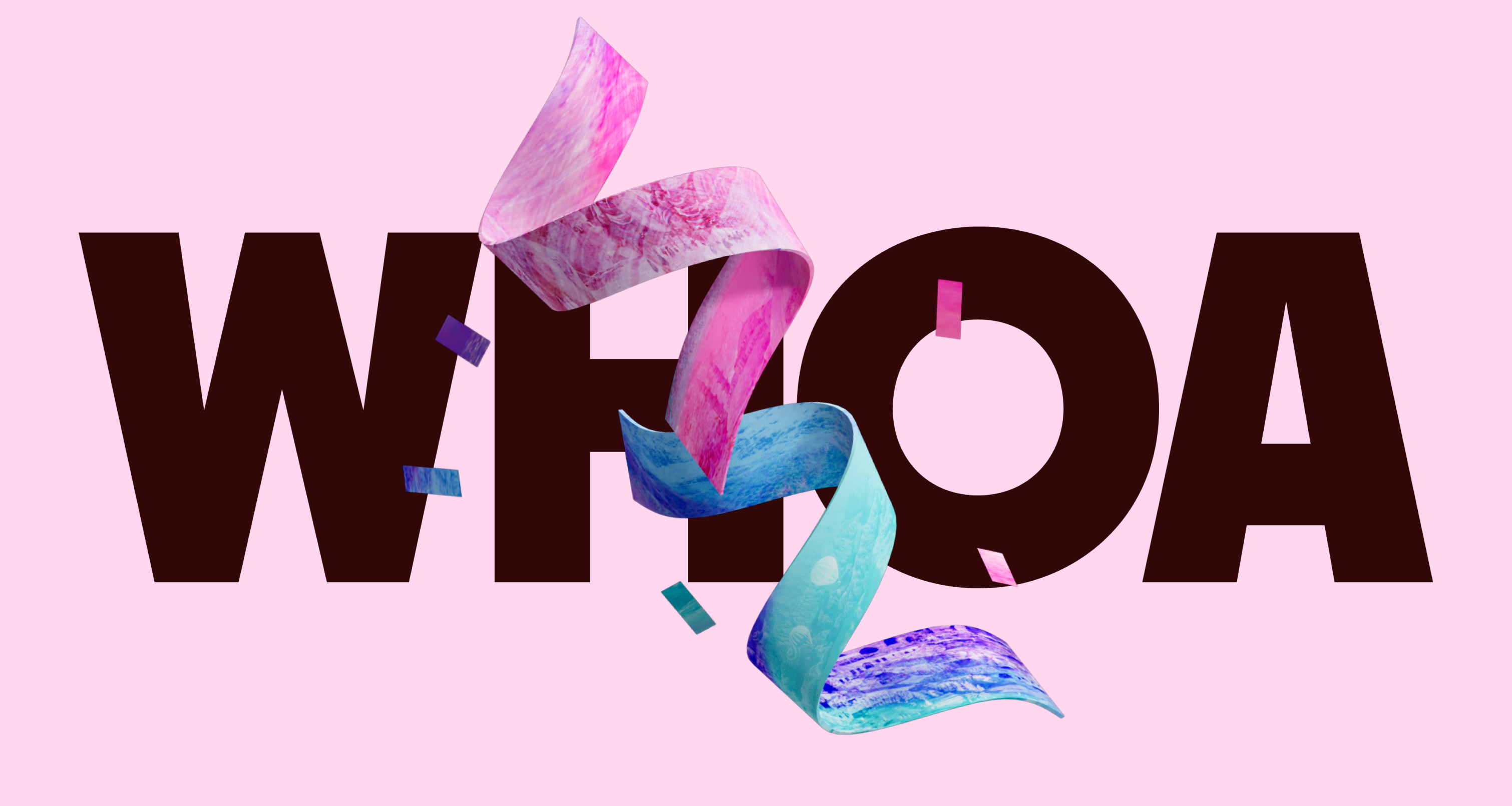
  • success screens — wham, bam, thank you ma'am

  • success progress screens — let users know what's cooking

  • feature intro screens — all caps for all aboard

It can also be used sparingly across product to enhance key brand features where relevant, these can be reviewed on a case by case basis.

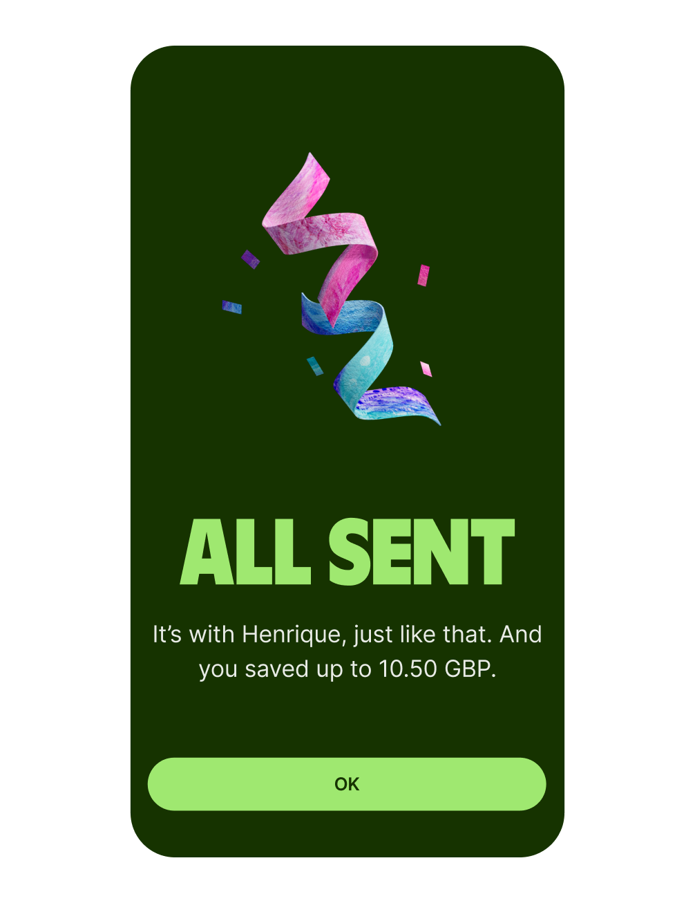
Wise sans feature intro

Feature intros

Wise sans success confetti

Success screens

Wise sans success progress

Success progress

Currency symbols

Handy for a business built around money, Wise Sans also comes with currency symbols. Feel free to use them when appropriate.
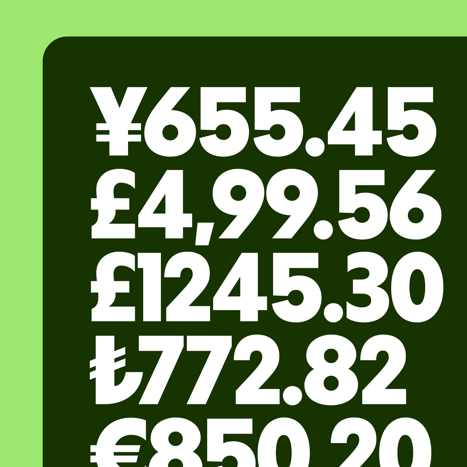
Currency symbols

Accents

Accents, dots and squiggles. Wise Sans has a lot, so make sure when we speak to someone, we speak in their language completely.

Text which reads 'Deja vu'.

Headline alignment

Wise Sans is one of our most distinctive brand elements. It speaks for us when we're not in the room, so it's essential that it’s free to express itself.

You can align headlines any way you want — just make sure they’re always clear.

Text shown as left-aligned.
Text shown centred.
Text which is right-aligned.
Text show as justified.

Wise Sans on tapestries

You can use Wise Display with tapestries — as a background or a mask — to make messages even more expressive and vivid.

Go to tapestries guidance.

Text which reads, 'From here to anywhere'.
International glyphs

When you want typography brimming with character from the world over, use international glyphs.

If you’re using longer text or talking about a more serious topic, it’s best to stick with clean Wise Sans. But if you find yourself with a short, punchy headline that you want to celebrate, give it that extra moment of surprise with international glyphs.
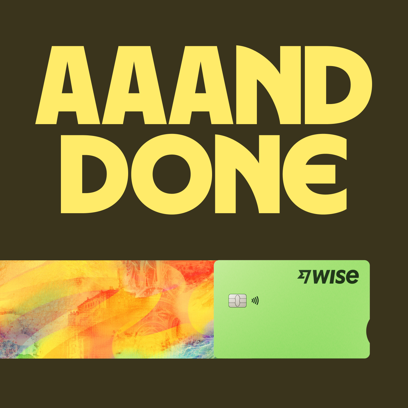
Wise debit card with a tapestry trail to its left, with "Annnd done." as a large title at the top.

Use international glyphs for large, expressive headlines.

Text which reads 'Cafe cliche'.

Use international glyphs to enhance a message.

Using multiple glyphs

International glyphs are like seasoning — don’t overdo it. As a general rule, allow yourself 3 letters to swap out for custom glyphs. But always use your own judgement.
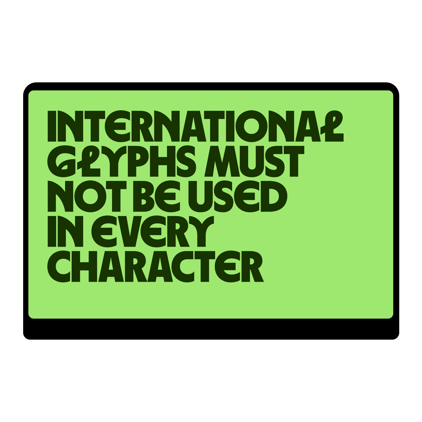
An example web screen announcing upcoming Wise features.

Don't use international glyphs for every possible letter.

Repeating glyphs

Pay special attention to frequent repeating glyphs. For simpler alternates, like our E, feel free to replace every E in a headline to give it consistency.

But for more distinct letters, like our L, it’s best not to go overboard and hinder legibility. Stick to peppering in 1 or 2 for complex glyphs.

Text which reads 'From here to anywhere'.

Repeat glyphs in a balanced and considered way.

Text which reads 'Riyal to Real, really fast'.

Don't repeat glyphs too much as this hinders legibility.

Accents

International glyphs also work with accents, so don’t forget to use them when appropriate.
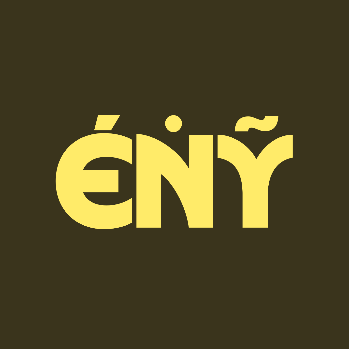
The letters 'G', 'N' and 'Y' with accents.