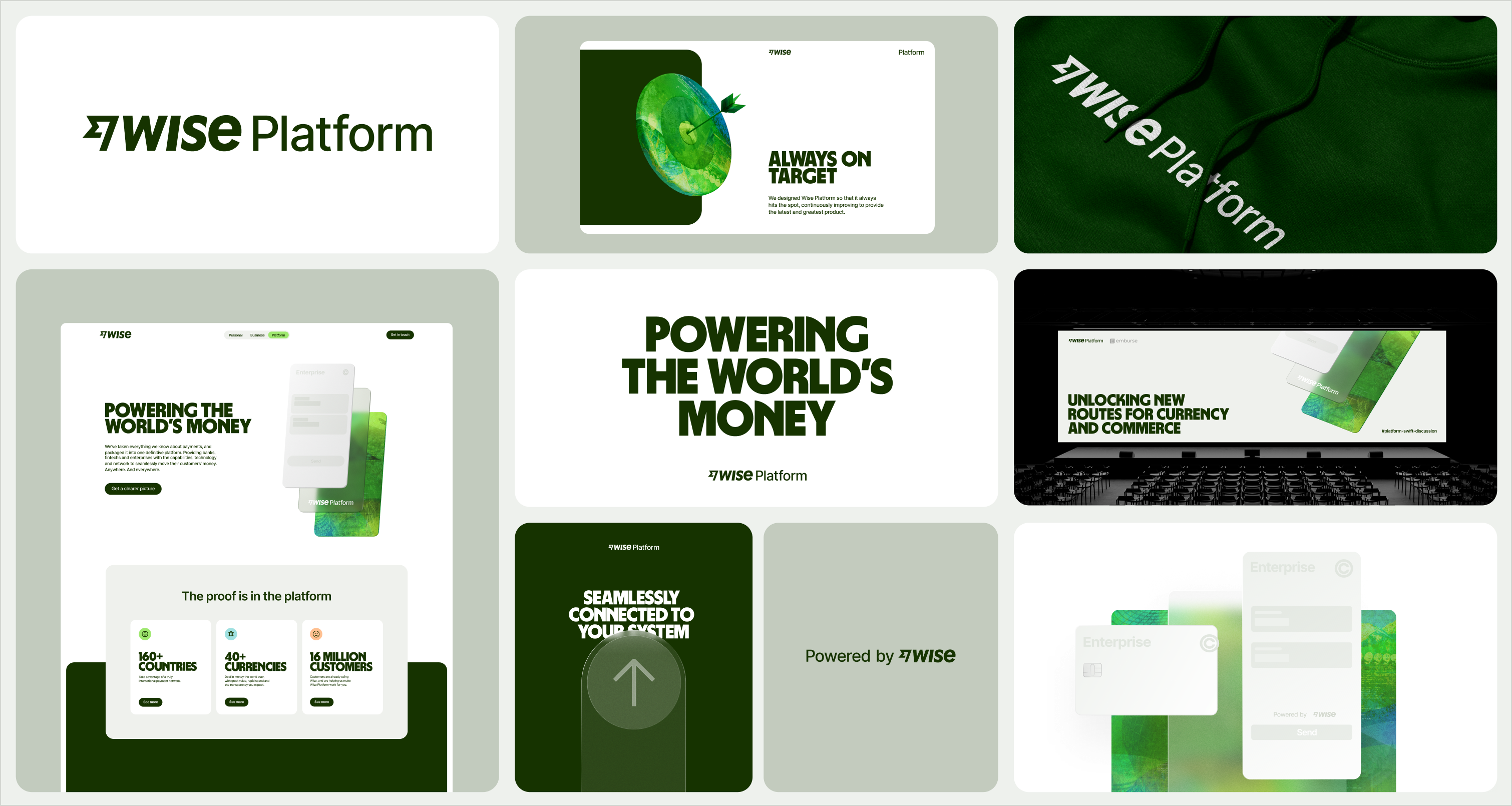
A partner to banks and large enterprises, the sub-brand includes a stripped-back palette and more restrained use of text and type. It has a hero visual and illustrations that’s Wise Platform specific.
As our most distinctive asset, our logo – and logo suite – are designed to keep our brand consistent and strong everywhere and anywhere it appears. Check our motion toolkit guidelines for Wise Platform logo animations.
Brand endorsement
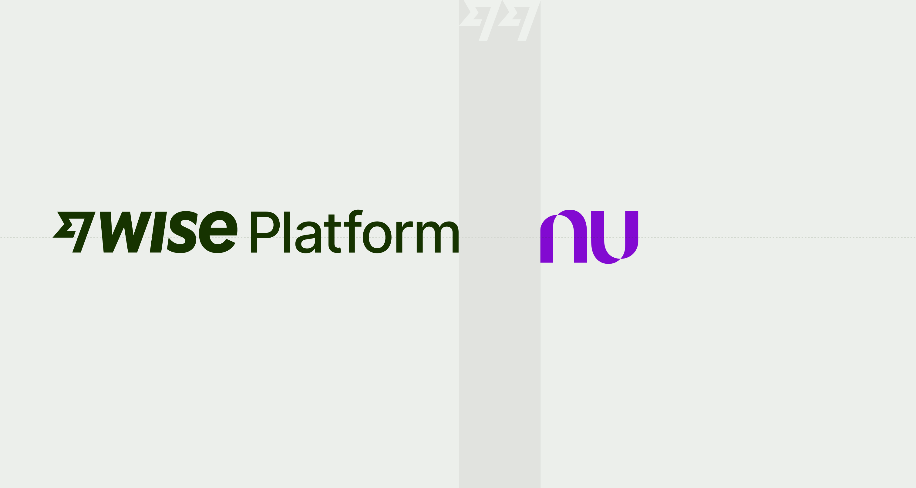
Whenever we partner with someone, we optically centre the two brand logos, separating them by a space equal to two Fast Flags.
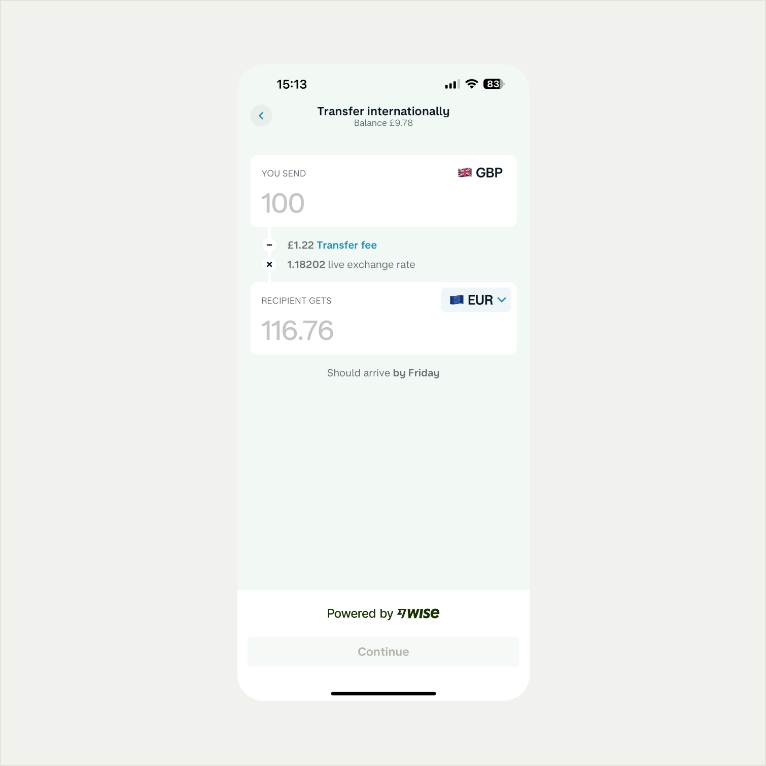
Powered by Wise
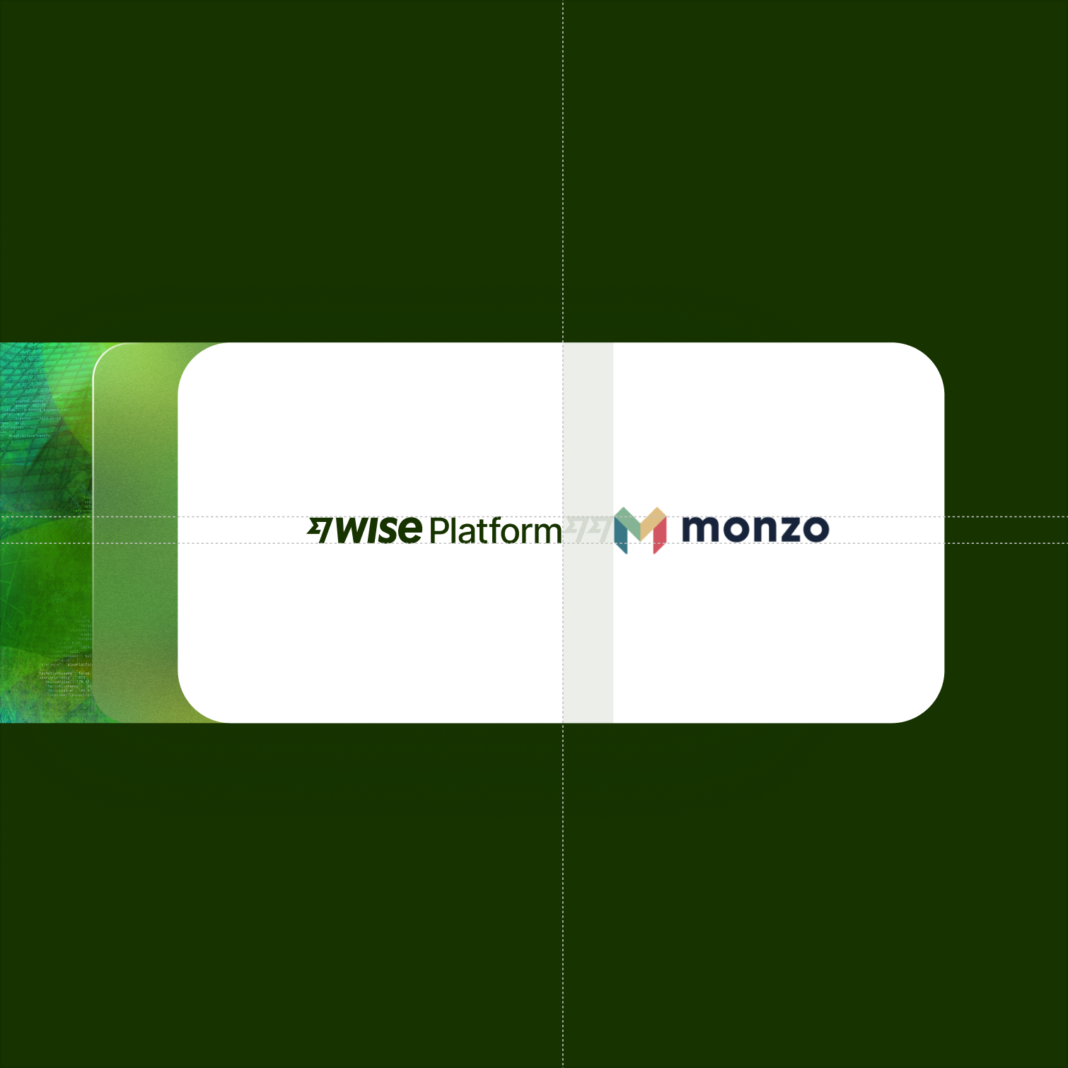
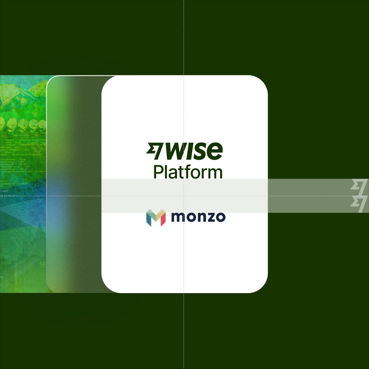
When supporting our partners that use Wise technology, the Powered by Wise lockup is used on partner’s interface. Like the primary Platform logo, the lockup is crafted from an optically kerned Inter Medium and should never be modified.

Pulling back the visual punch of the Wise Masterbrand, Platform presents a more neutral palette with subtle pops of secondary colour.
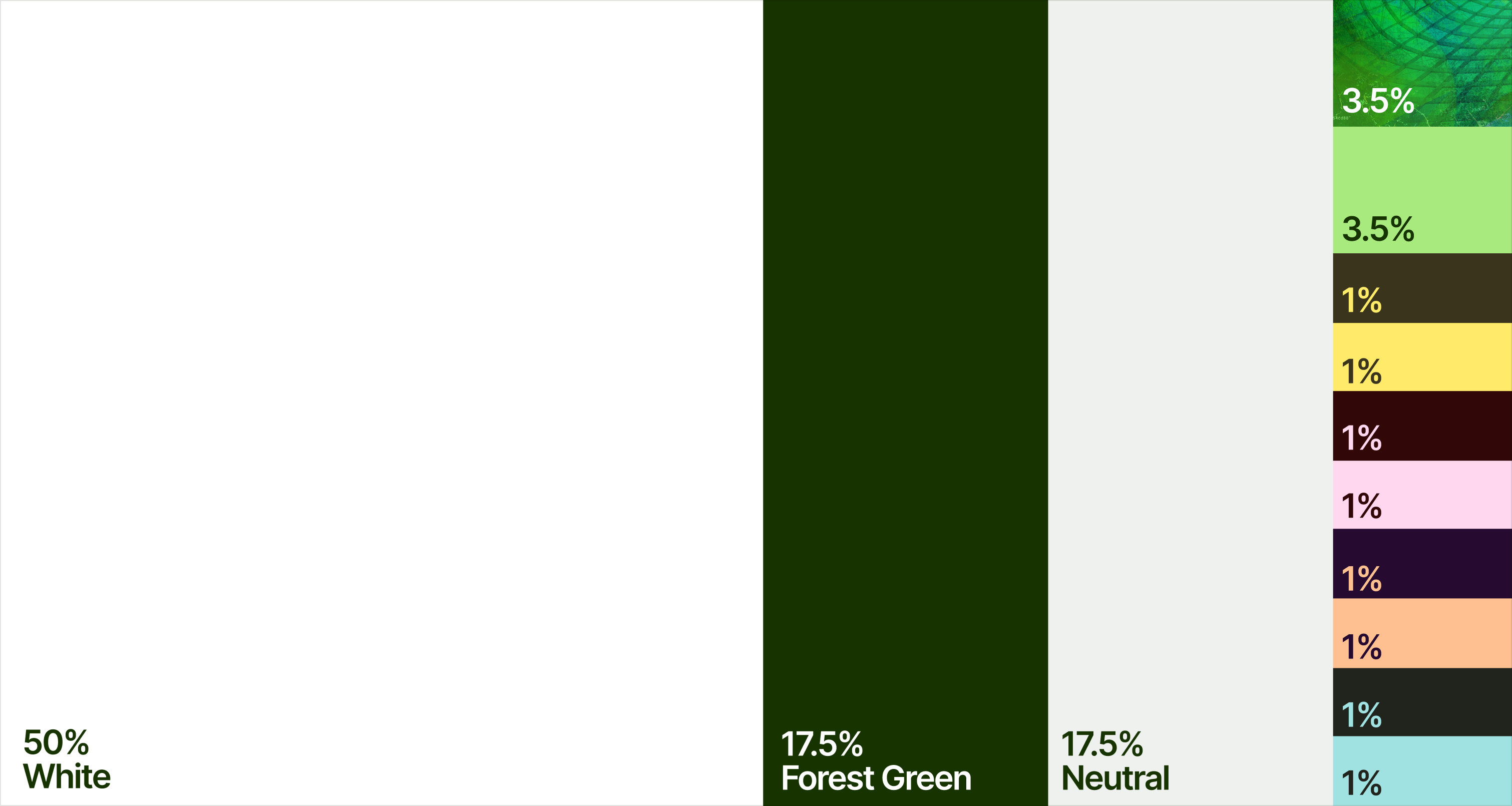
Colour proportions
To complement the primary palette, we use our secondary colours to add pops of colour. We first lean on our Bright Green and tapestry for a hint of vibrancy. Our remaining eight secondary colours are used for iconography. The colour codes for the Wise palette can be found on Wise Brand Guidelines foundations.
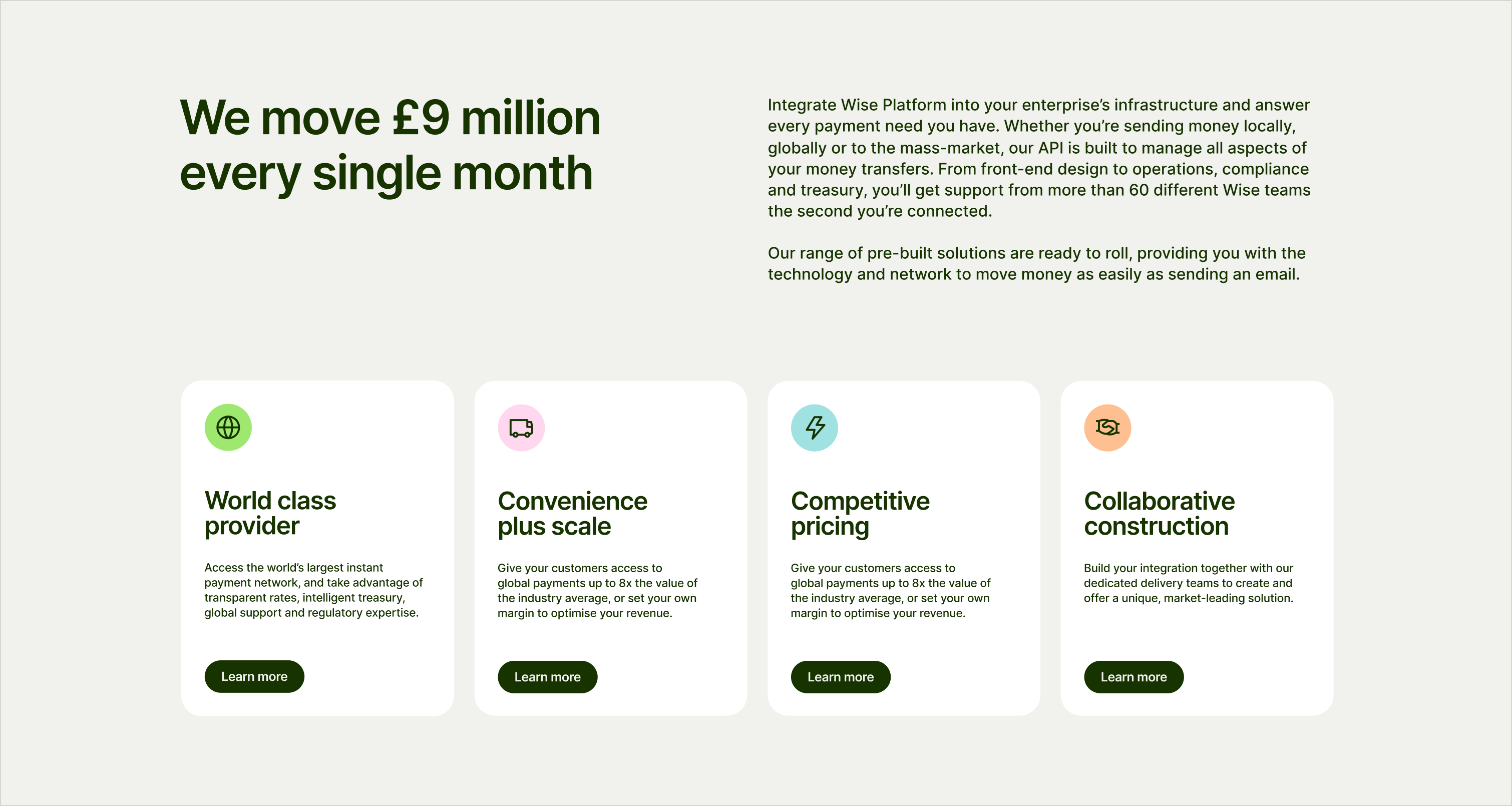
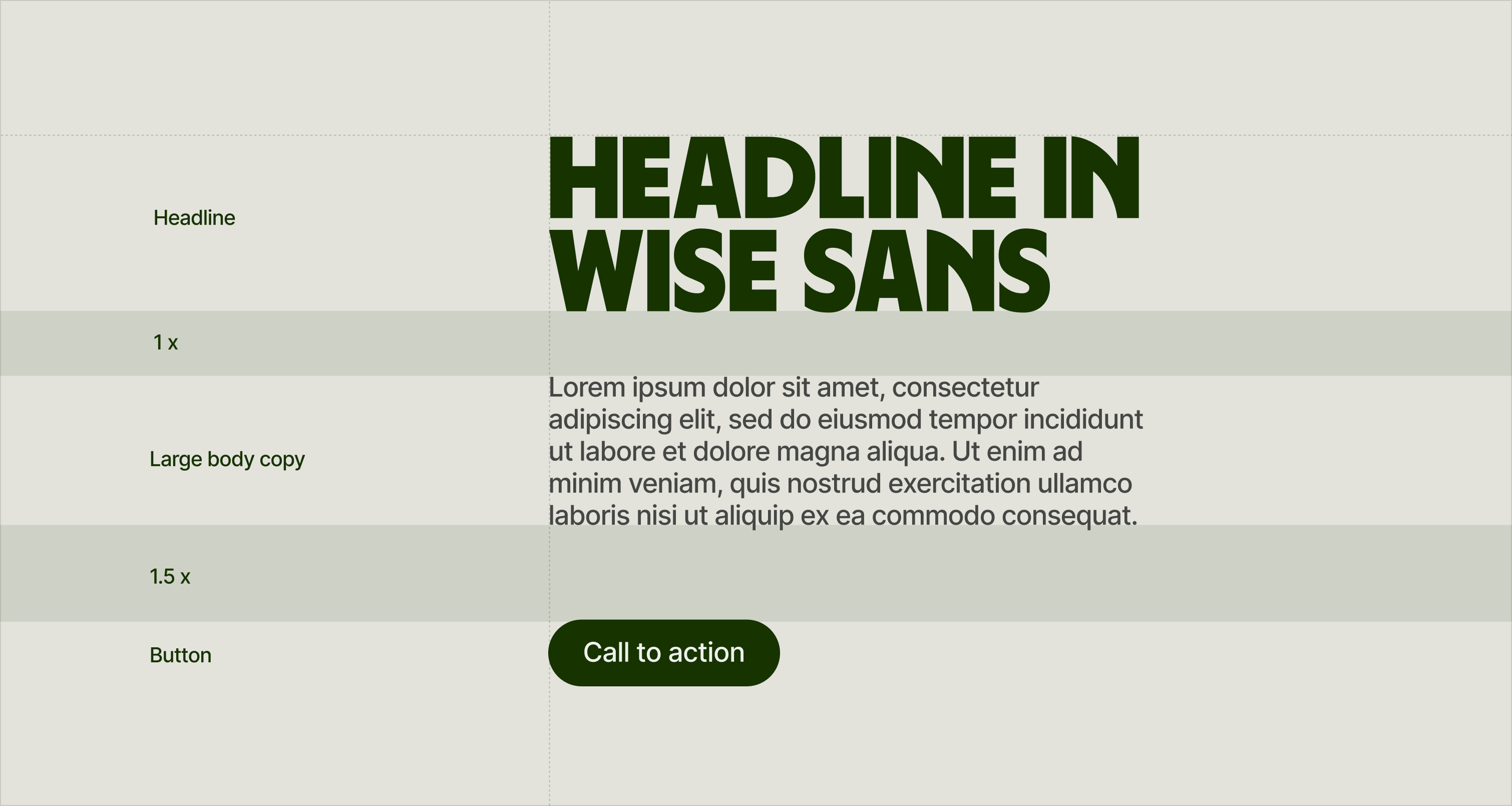
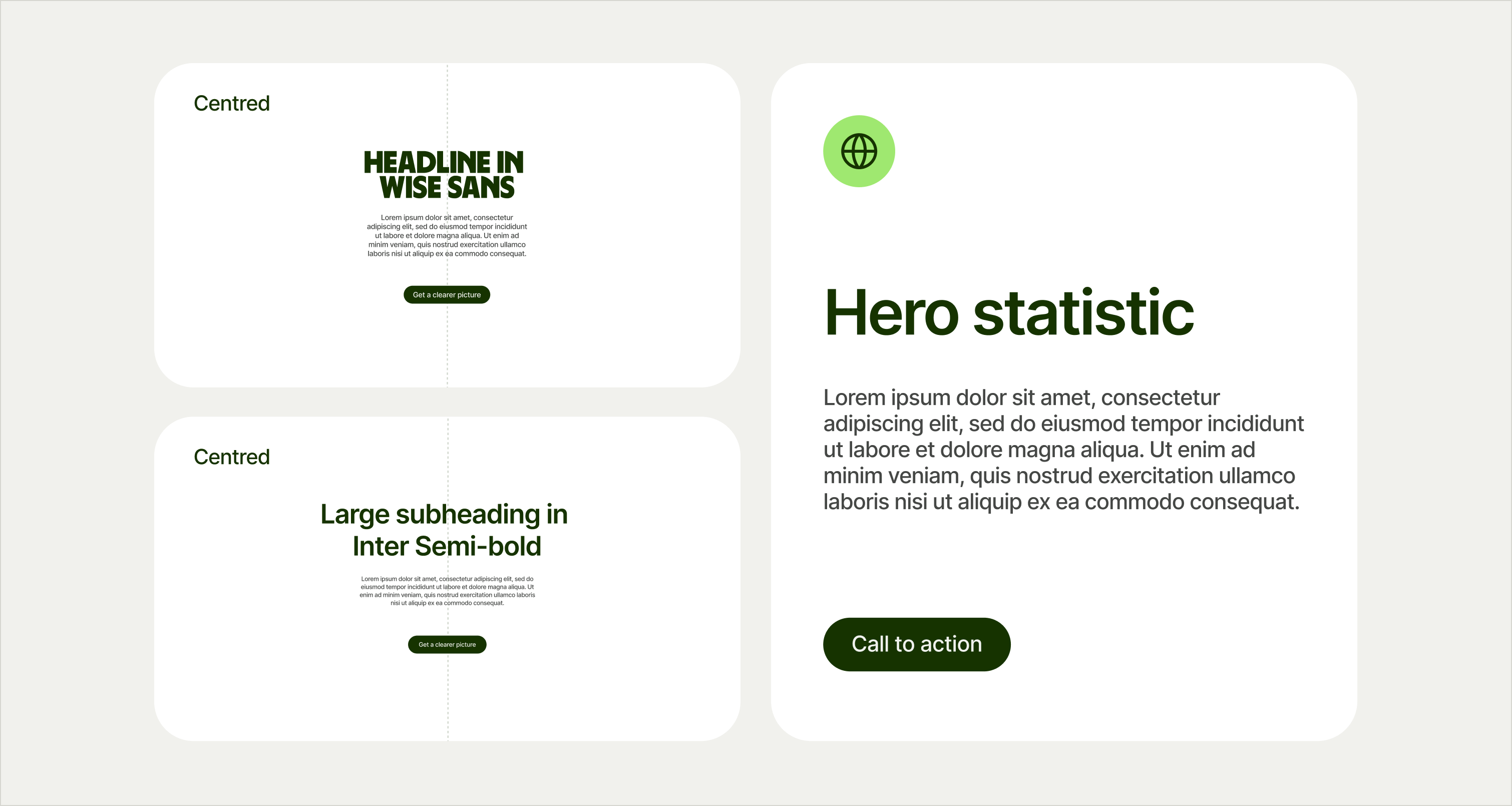
Our type treatments rein in the Wise Masterbrand’s high impact and maxi approach by upscaling the use of Inter and selecting composed moments for Wise Sans.
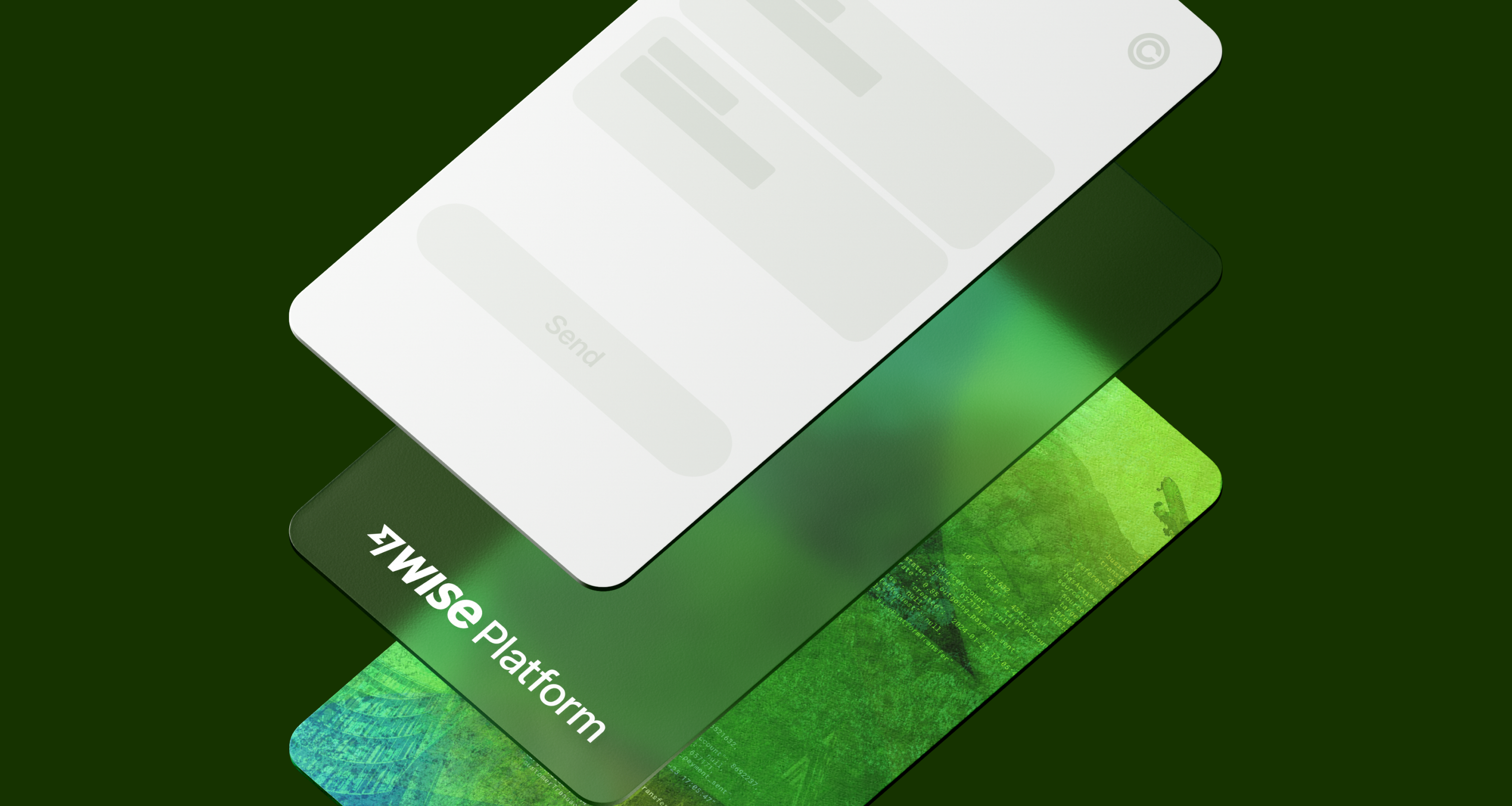
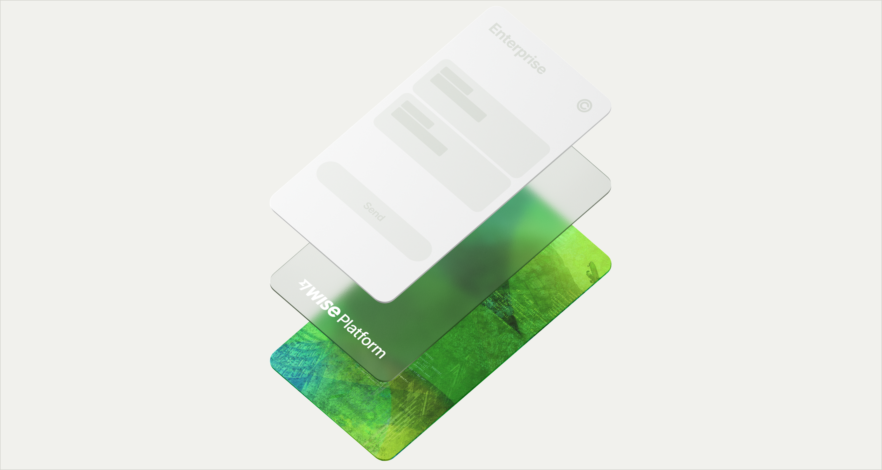
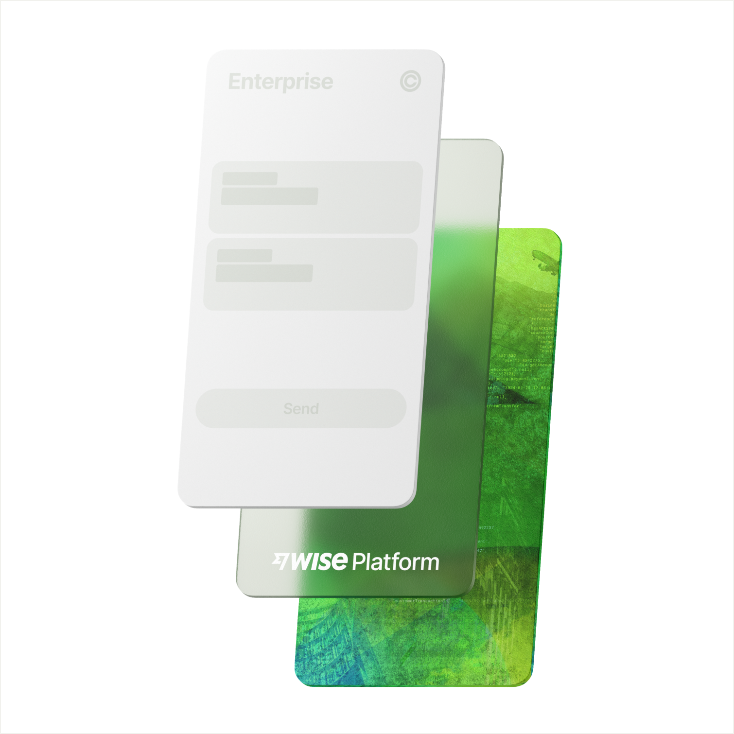
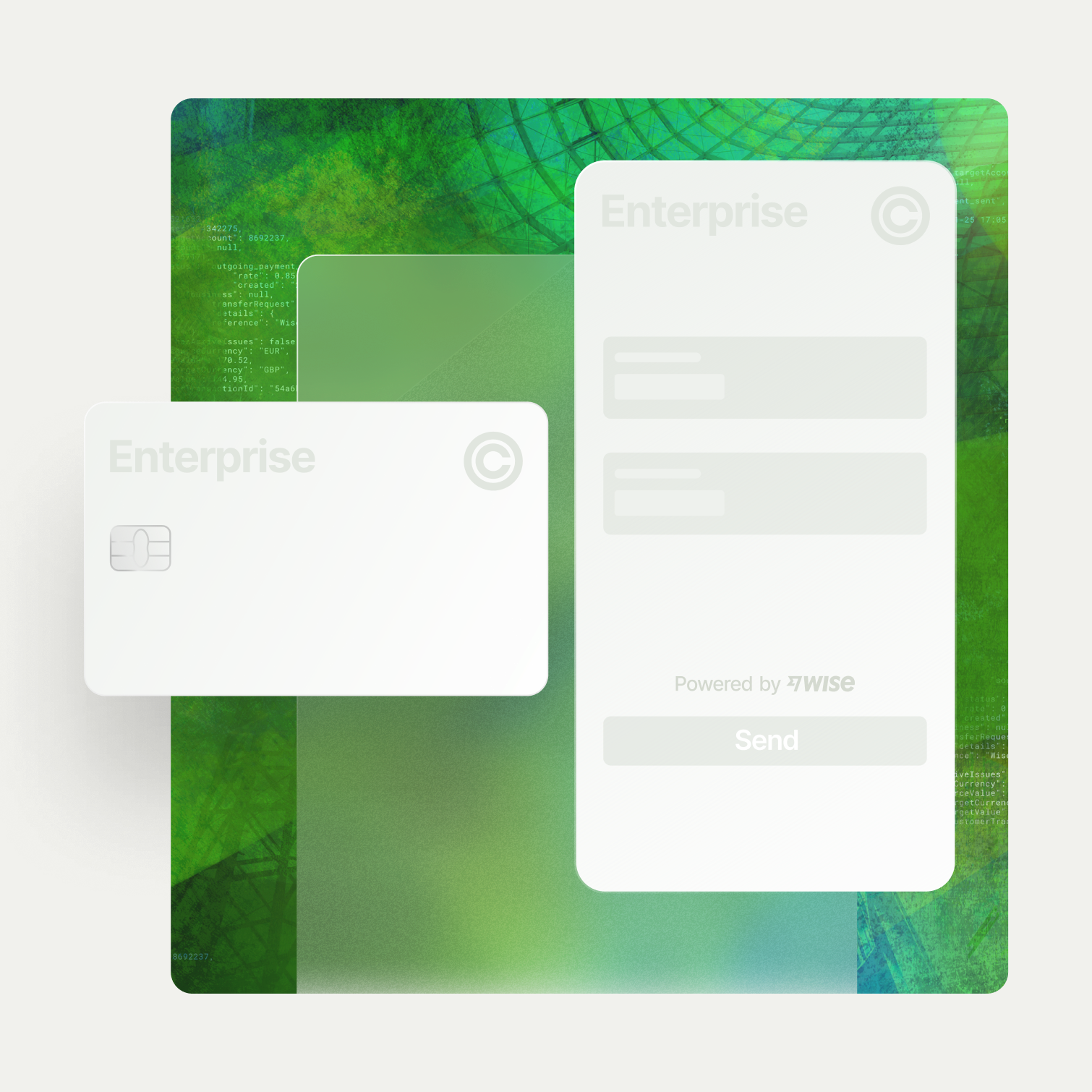
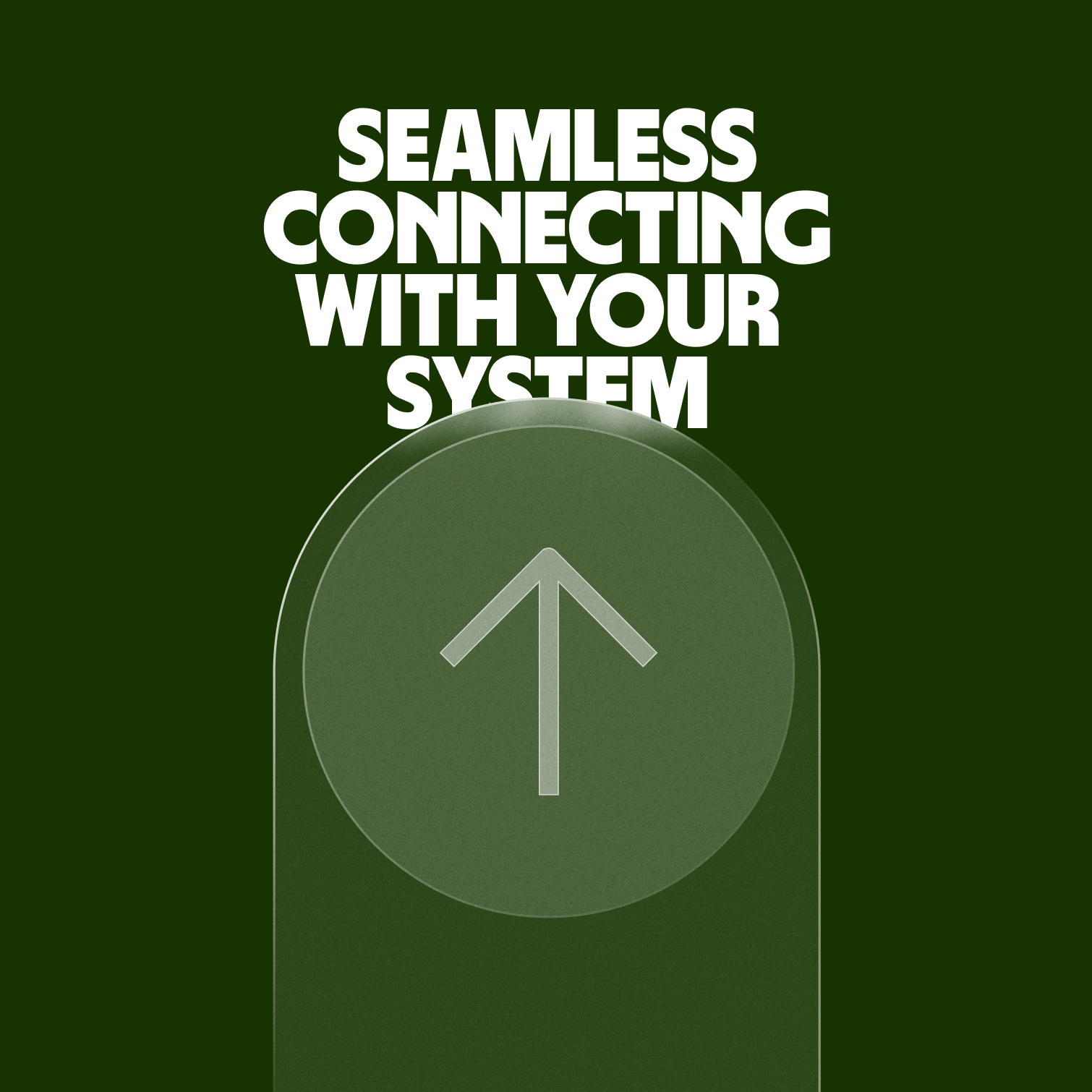
The Platform Stack is our hero brand visual. Inspired by our overarching concept, it highlights how Wise Platform seamlessly connects with banks and large enterprises.
Stack overview
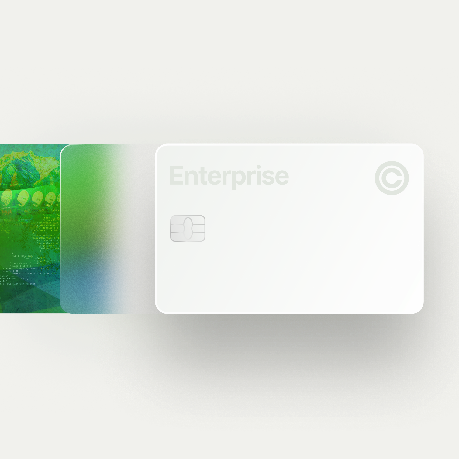
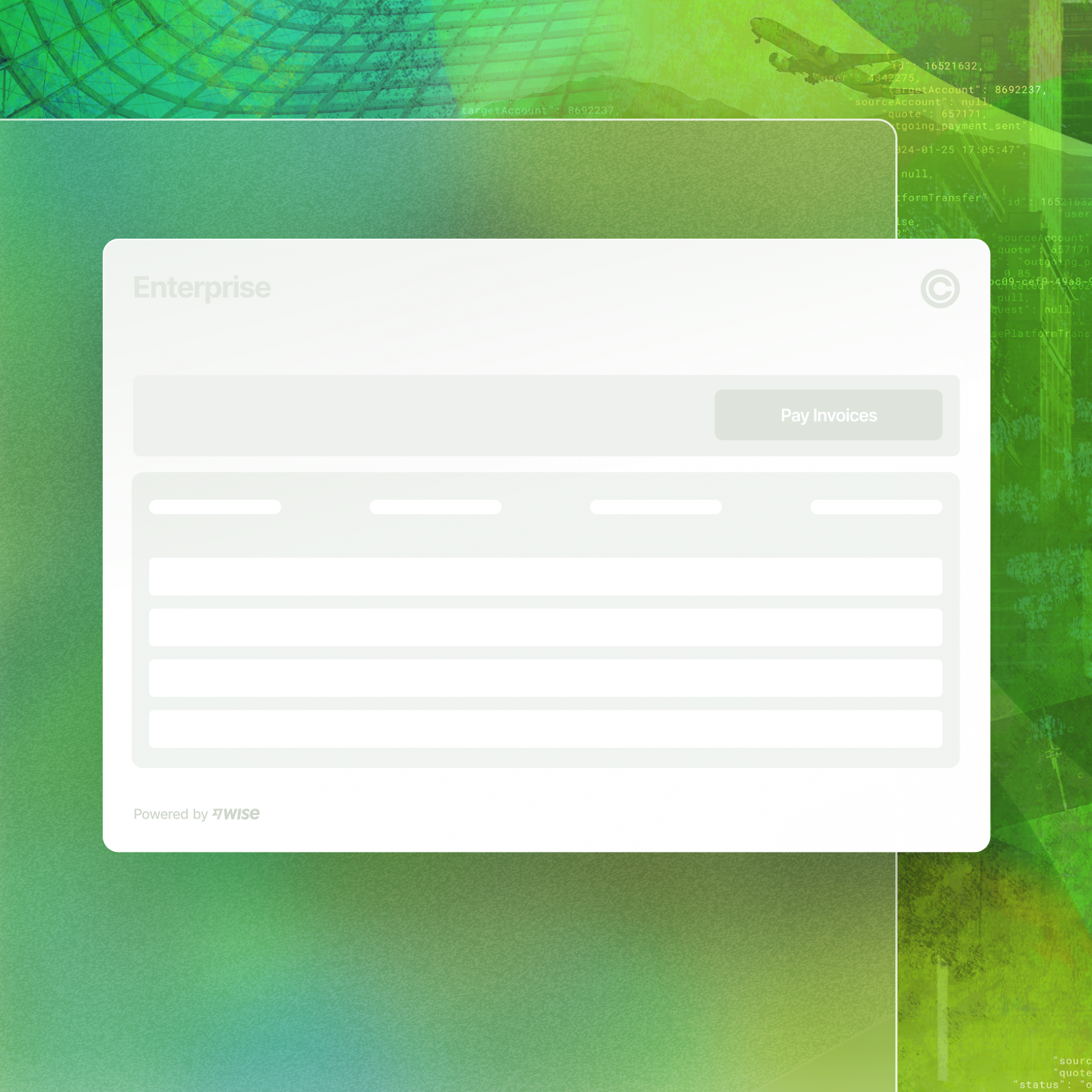
The Platform Stack is made up of three distinctive layers. A base Tapestry Layer, featuring a bespoke Wise Platform tapestry that symbolises the technology powering our infrastructure. A middle Seamless Layer, representing the Wise Platform interface and its ability to seamlessly handle complex technology. And a top White Label Layer, representing the banks and institutions integrating Wise Platform into their offer.
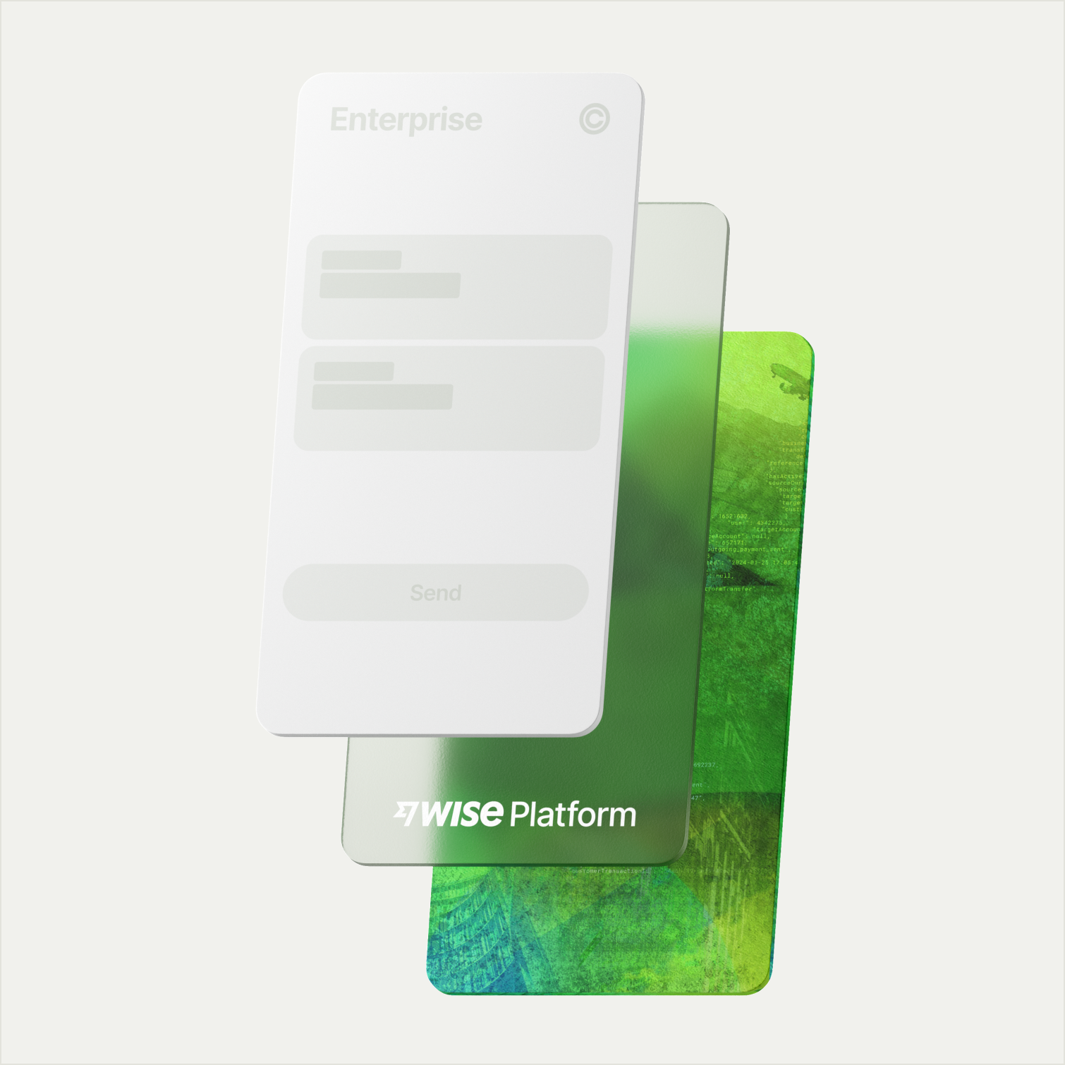
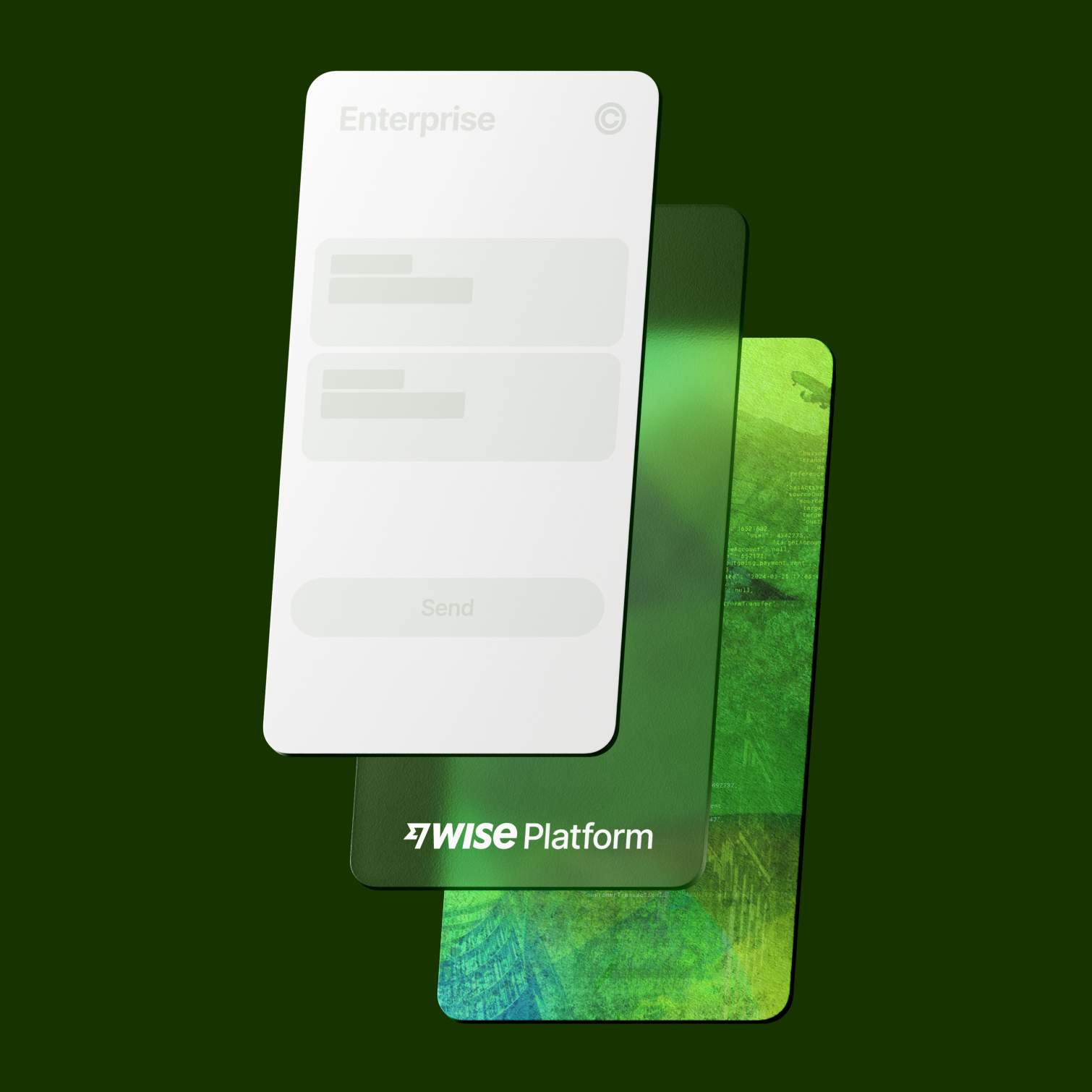
As the name suggests, our first layer is made up of the Wise Platform tapestry, an evolved take on the Wise tapestries including a line of code from Platform API.

Tapestry crops
Just like the Wise Masterbrand, the tapestry should never be used at full scale. We always crop into it, allowing details to flow in and out of focus, and ensuring no two compositions ever feel the same.

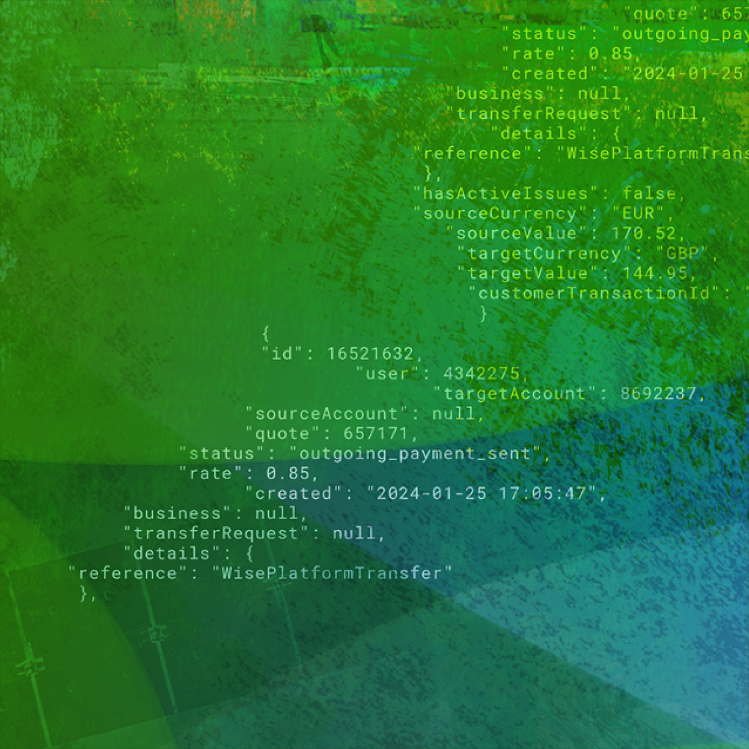
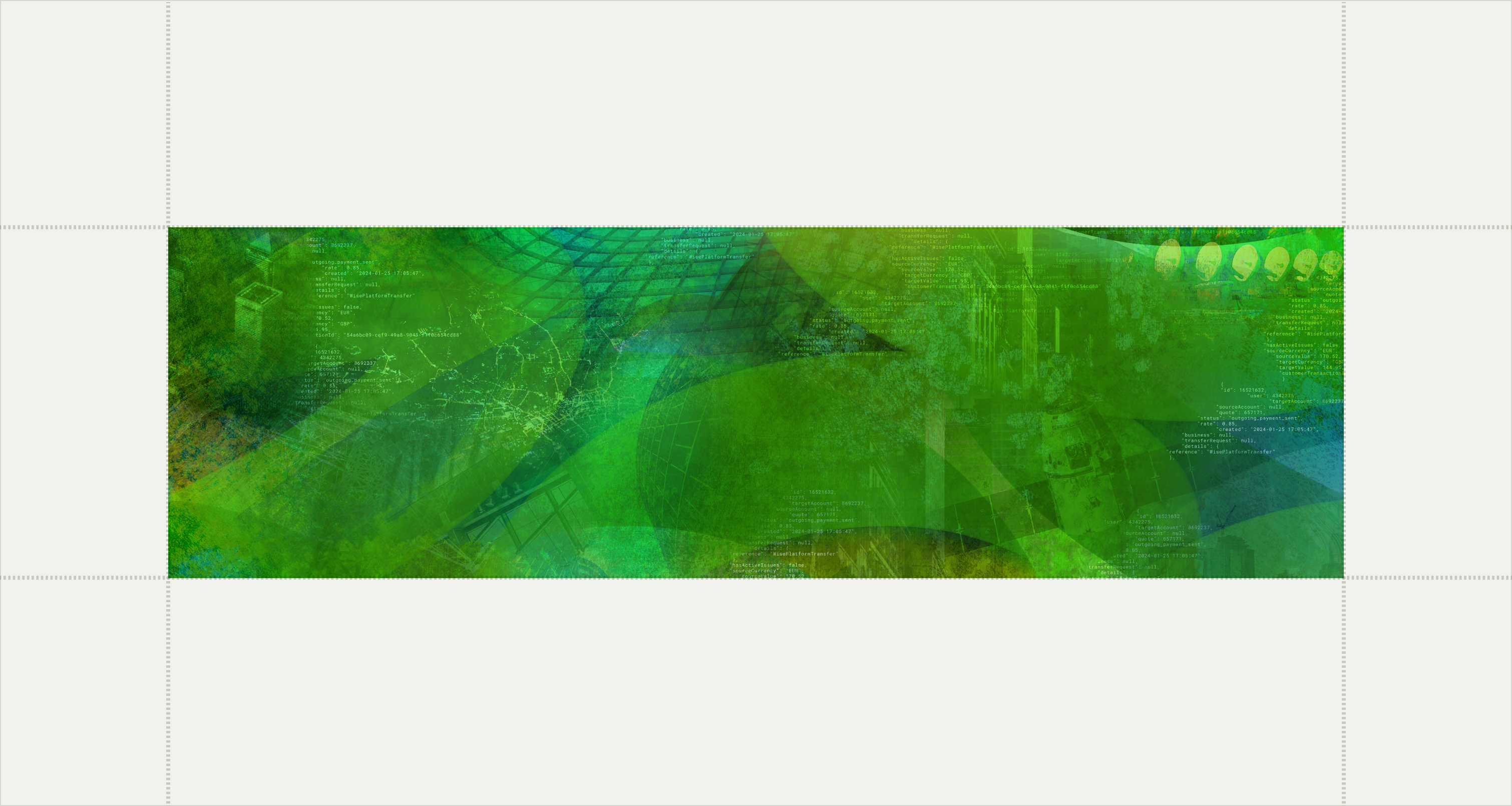
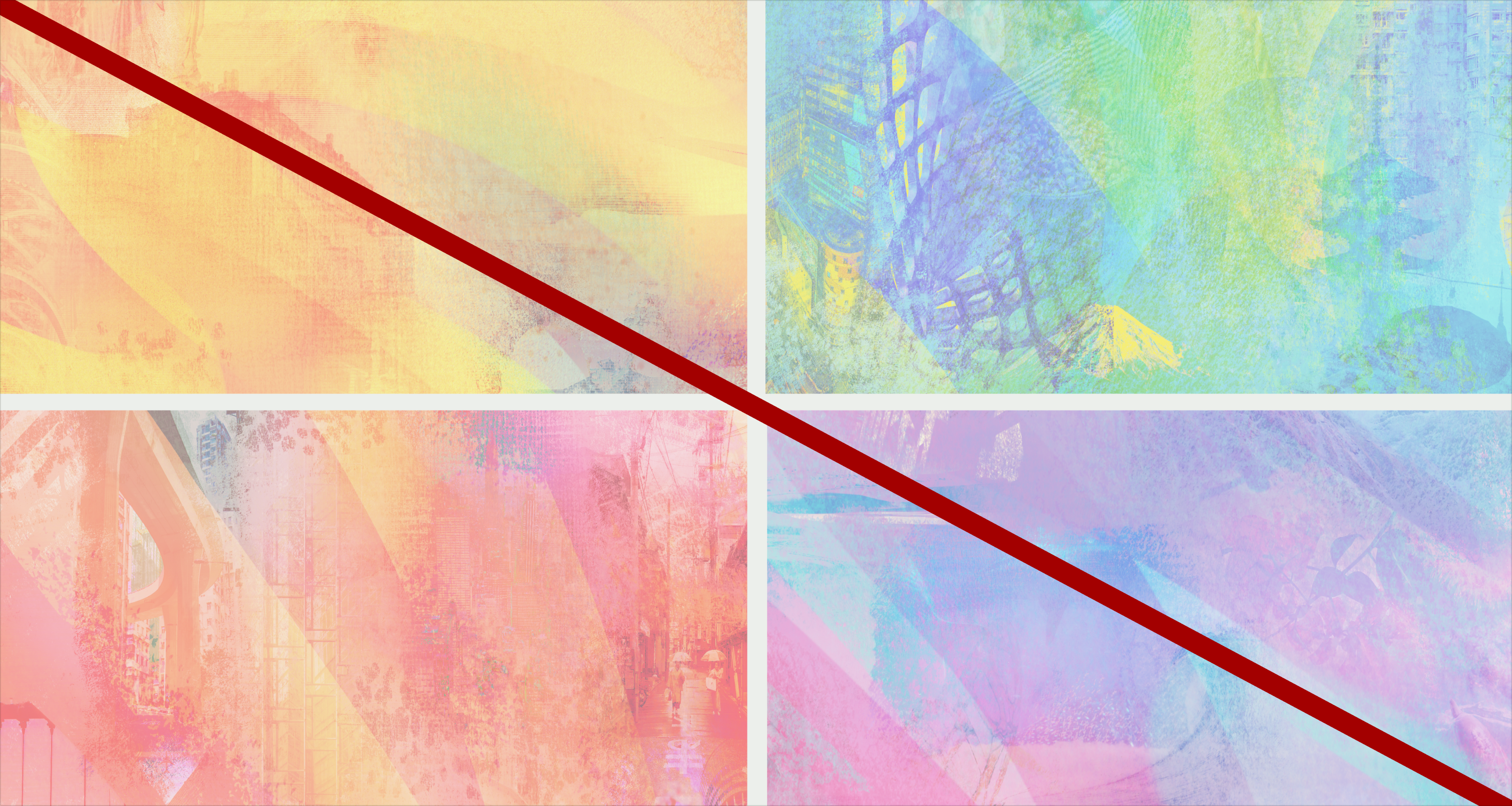
Stylistically, our illustrations are similar to the Wise Masterbrand. Conceptually they’re 100% Wise Platform. Wise Platform illustrations differ from the Wise Masterbrand in two ways: one, through the use of the Wise Platform tapestry, and two, through themes related to banks and large enterprises.






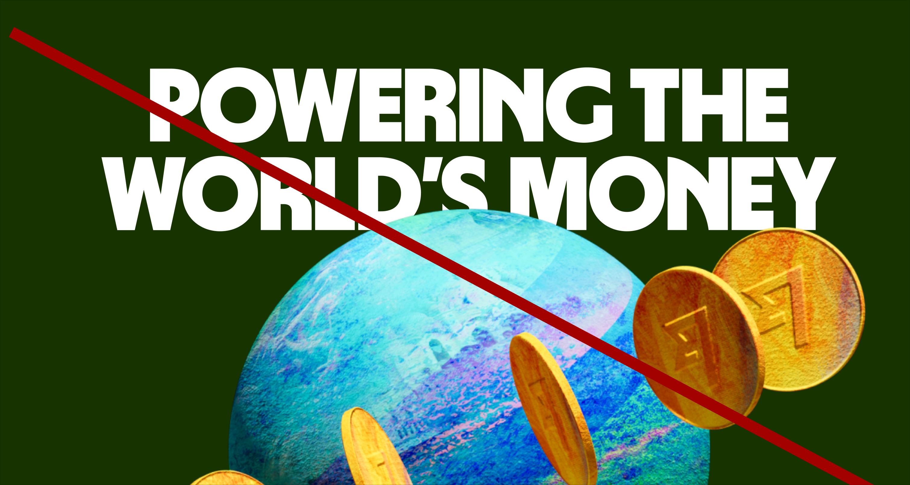
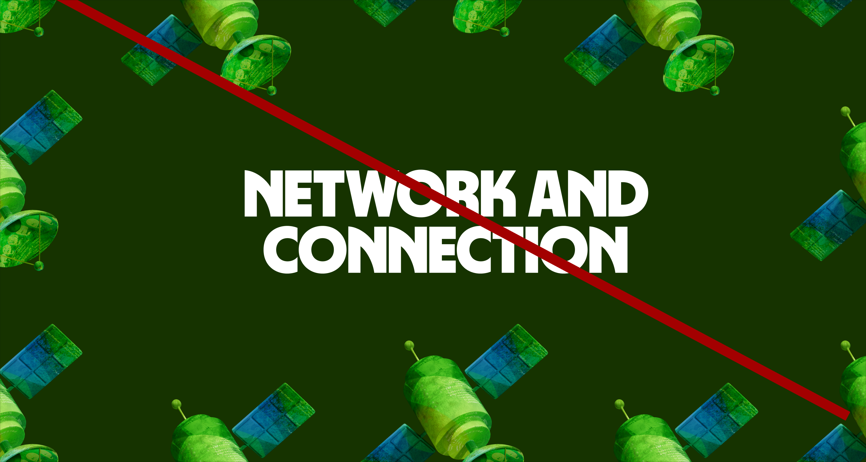
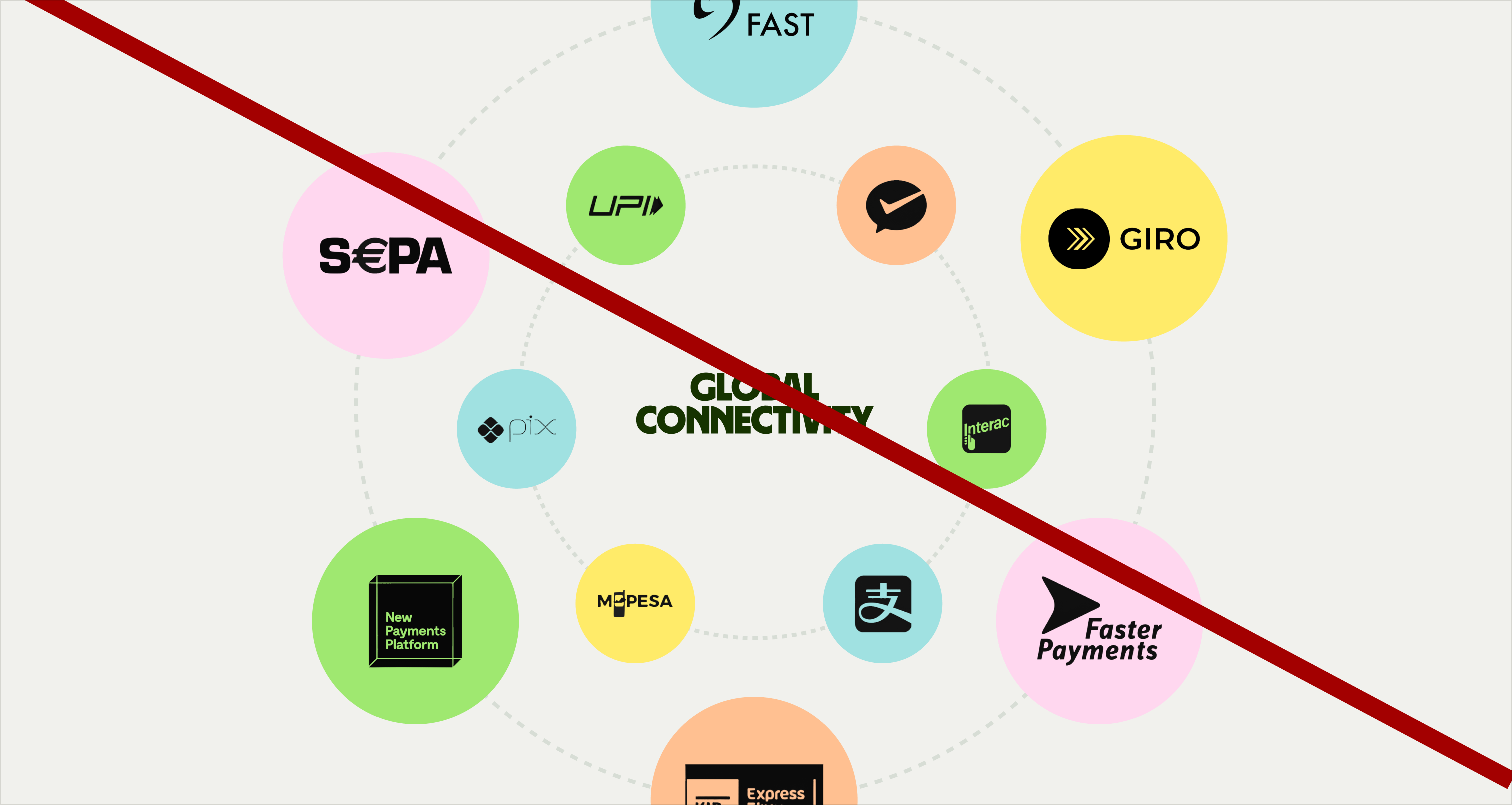
The Seamless Layer reflects the connection between Wise and its financial partners, and the expertise and capabilities we offer them. We use these visual resources to promote Wise Platform services and capabilities.

Follow the best practices and reach out to Brand Systems if you have any doubts. For more detailed information check the Wise Platform style guide and Motion guidance for animated assets.
