Multi-user access (MUA) allows business customers to add team members with different permissions to their account.
Follow these guidelines to make sure your designs work for all team members with different levels of access.

MUA
MUA is a feature on the business account that allows customers to invite other users to have access to their account.
These invited users are called team members.
Permissions
Each team member has a set of permissions that determine what they can see and do on the account.
For example, they could have permission to view all transactions. Or they could have permission to convert money between currencies. For a full list of the permissions team members can have, see the permissions table in resources.
Customers choose the permissions they want their team members to have when adding them to the account.
They can also update a team member's permissions at any time on the Team page.

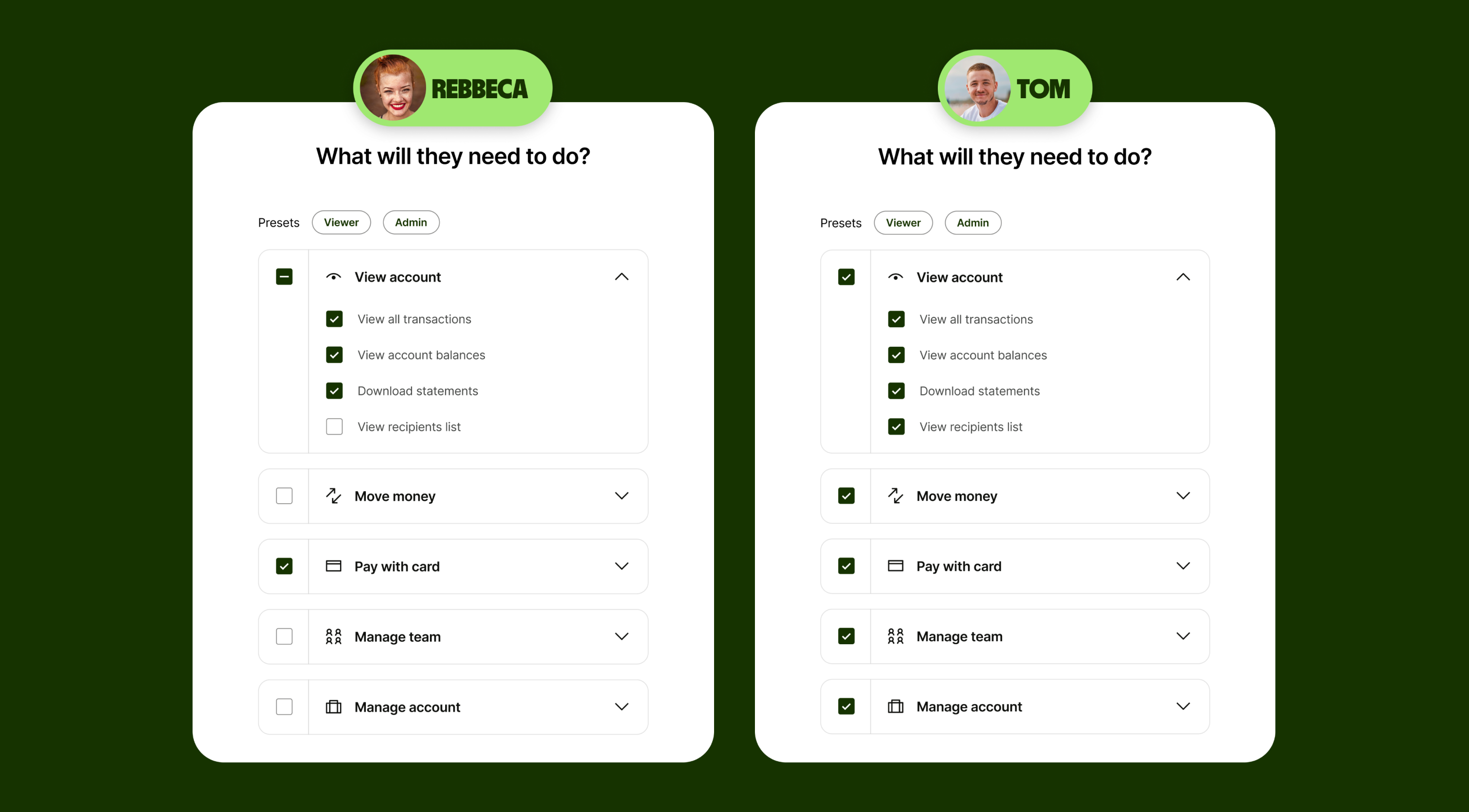
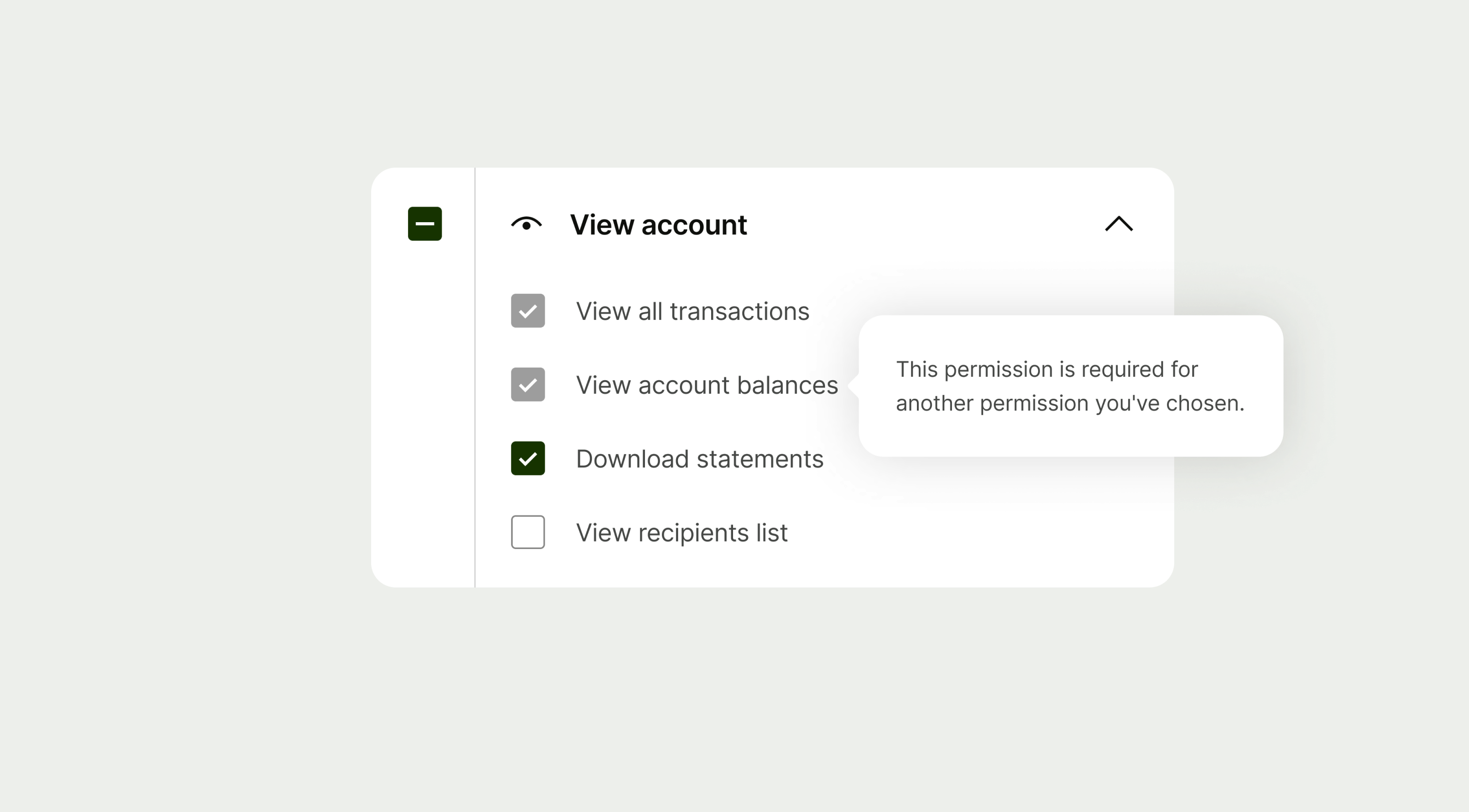
Permission dependencies
Some permissions are dependent on others. This can be because some features require multiple permissions to work, or because of technical limitations.
For example, someone with permission to download statements will also need permission to view all transactions.
Dependent permissions are automatically selected on the permissions configuration screen.


MUA should be considered at two points in the design process: while preparing designs for handover and during QA before release.
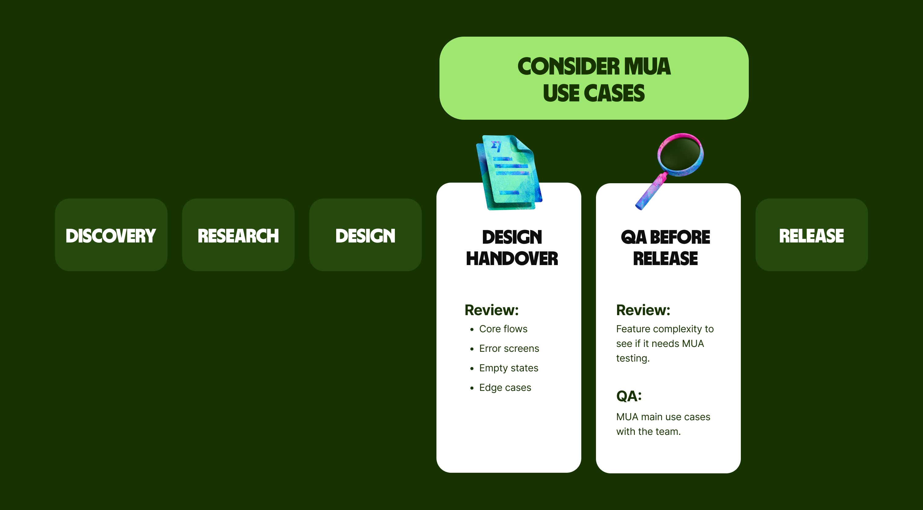
Follow these steps to help you design with MUA in mind.
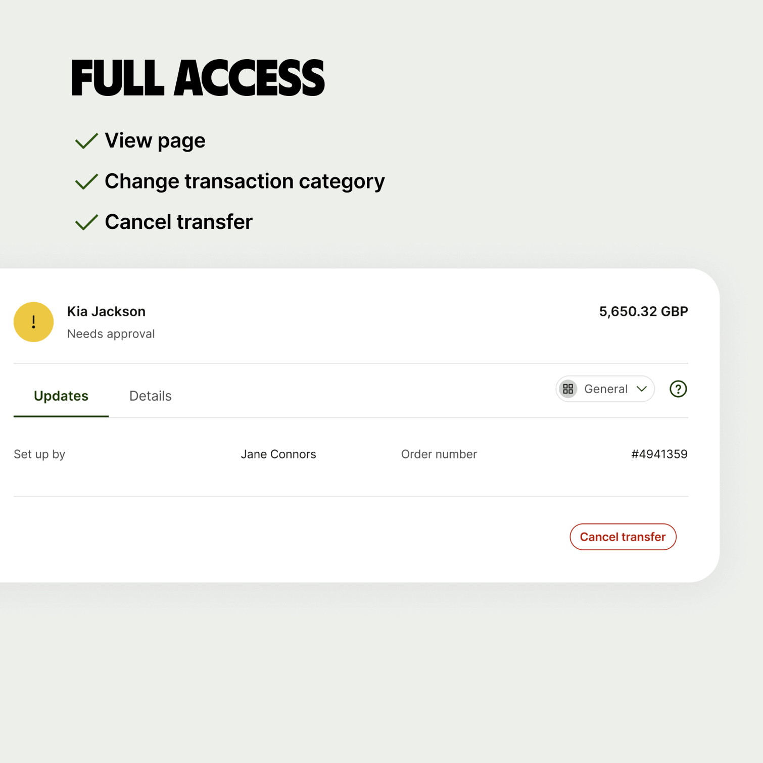
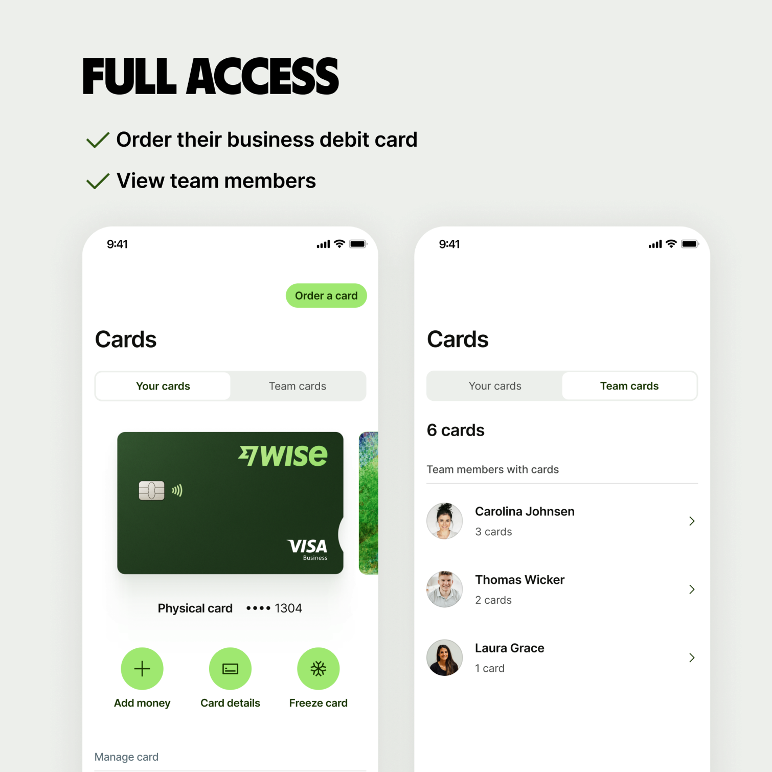
Step 1 – Start with full access
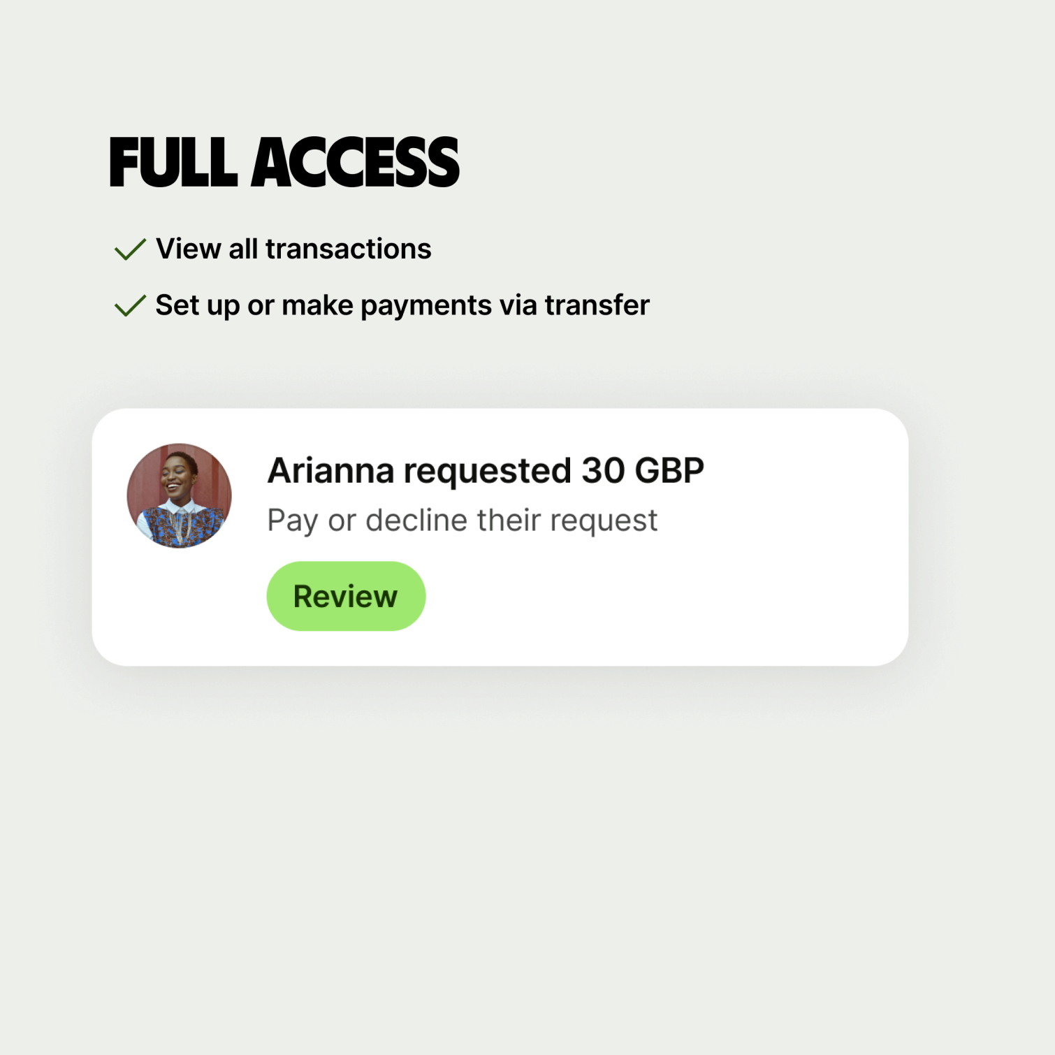
Team members with full access have all account permissions. This means they can access all screens and surfaces, and perform all actions.
Use the experience of a user who has full access as a starting point for considering MUA. This is likely just your current design.
When designing for full access:
Users should be able to see everything — all entry points, screens, sections and CTAs
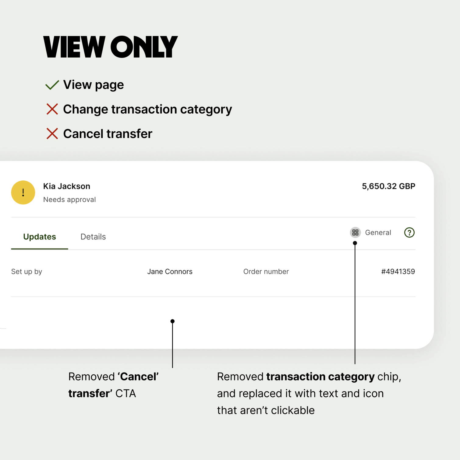
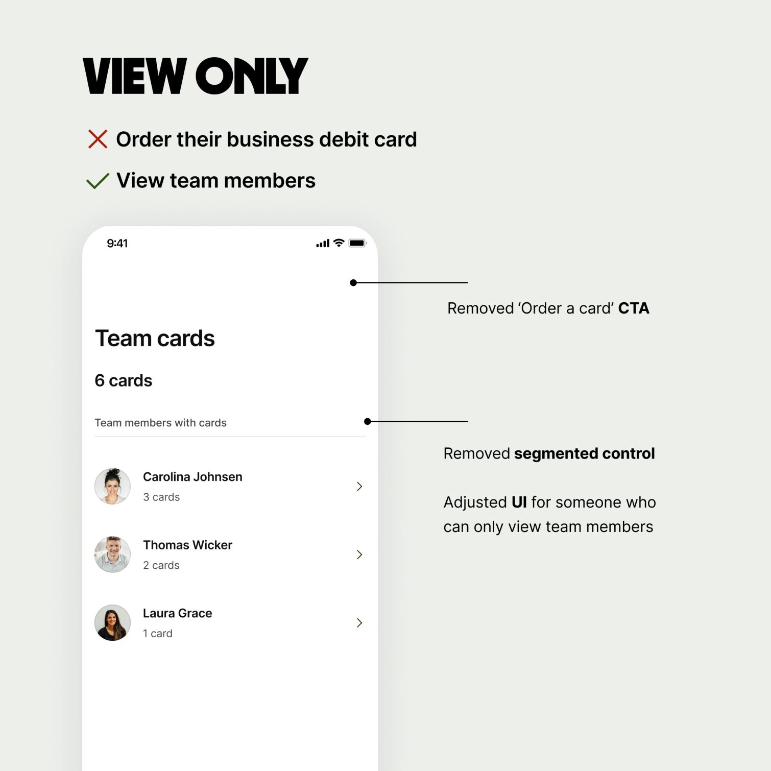
Step 2 – Consider view only access
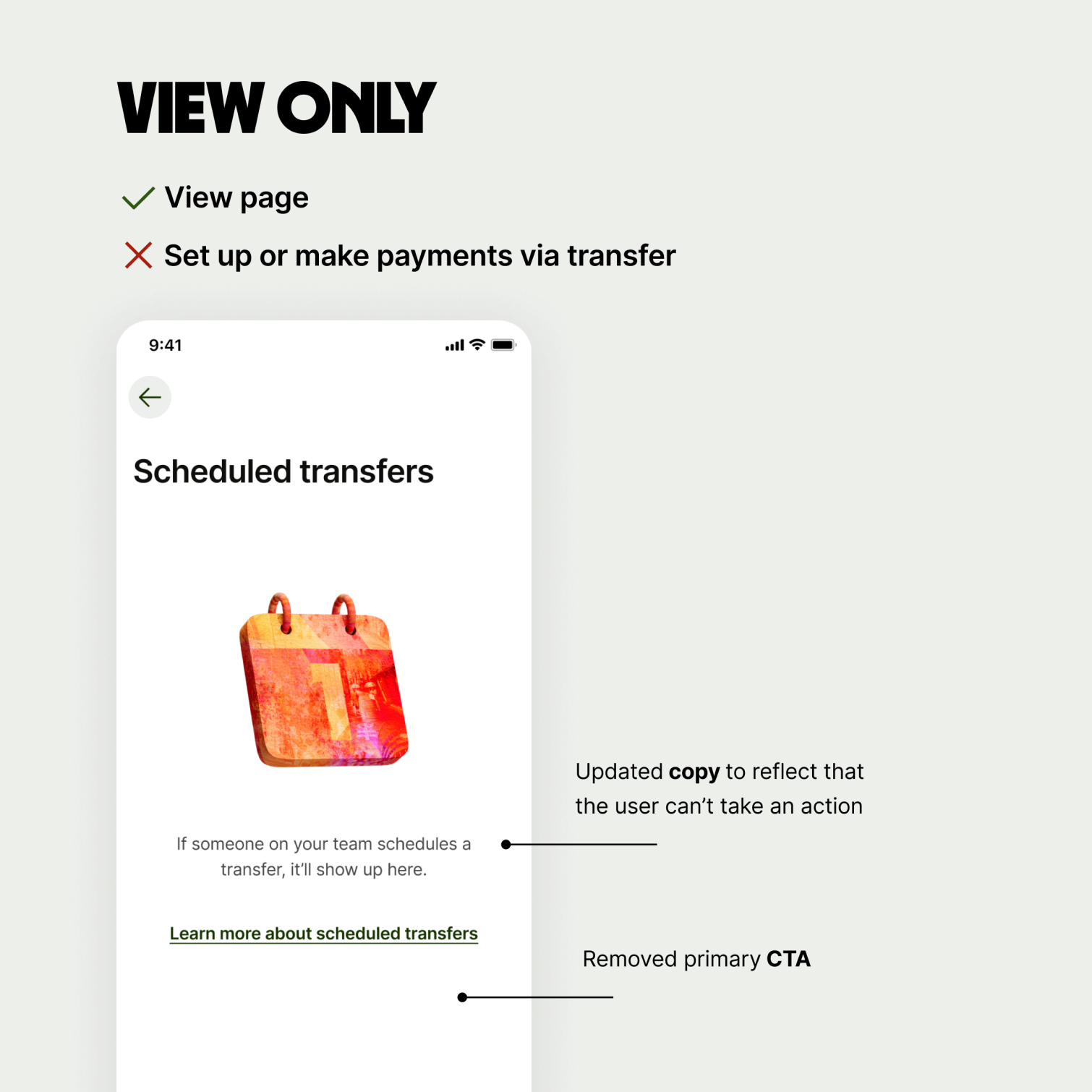
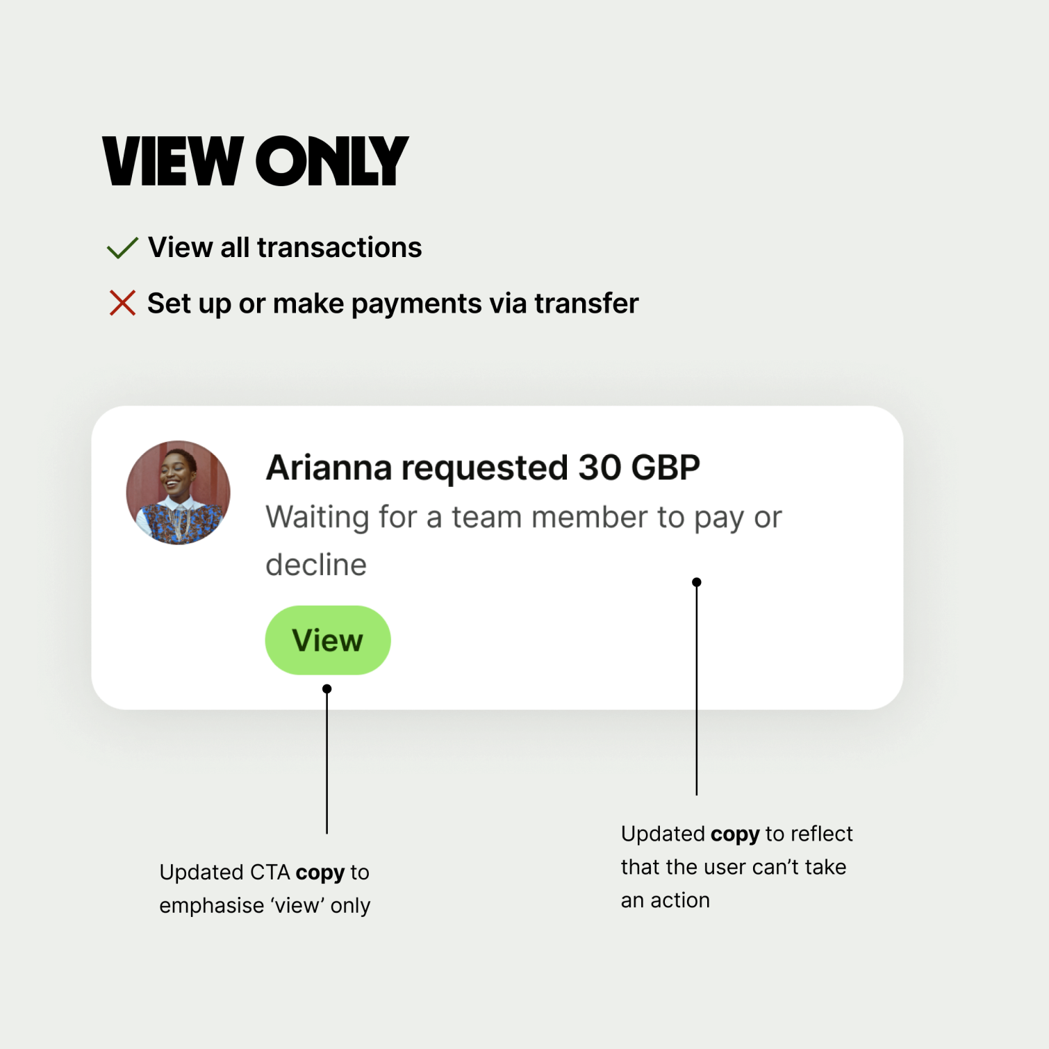
Team members with view only access only have permission to view the screen or section, but not to take any action.
Consider how your full access experience may differ for a user with view only access.
When designing for view only:
Hide any CTAs that perform an action
Adjust any copy that mentions taking an action
Review the UX and UI — does the experience still work with things hidden? Does anything look misaligned?
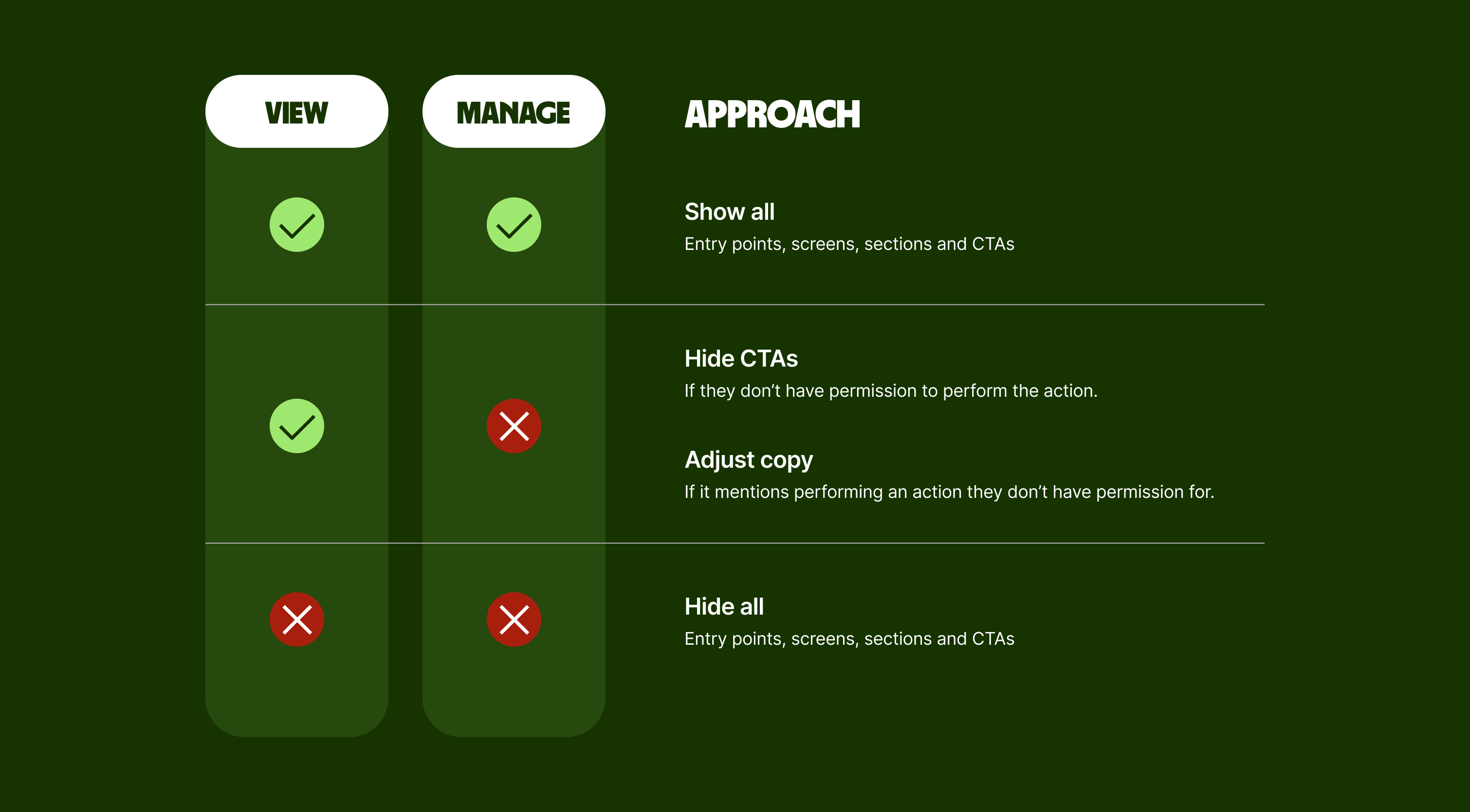
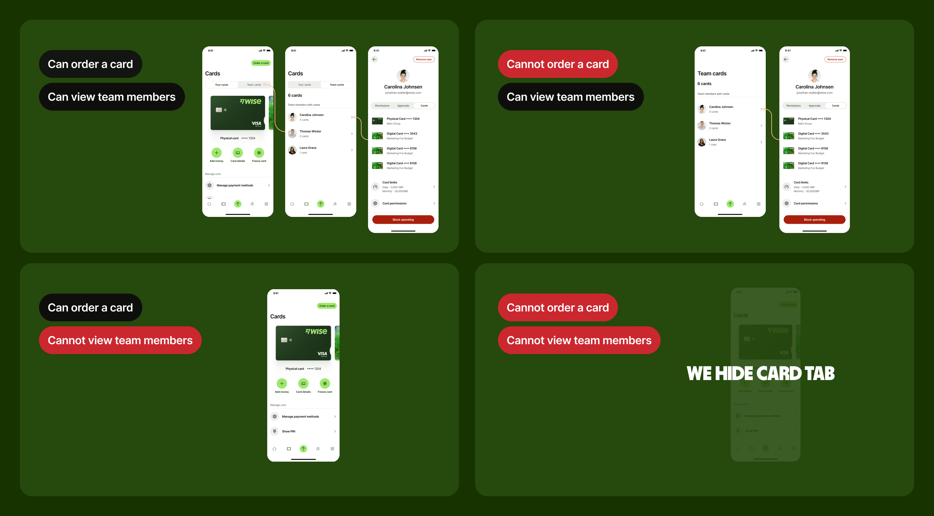
Step 3 – Consider other relevant permissions
Identify which specific permissions are relevant to your feature.
Consider how your experience will work for team members with and without these permissions.
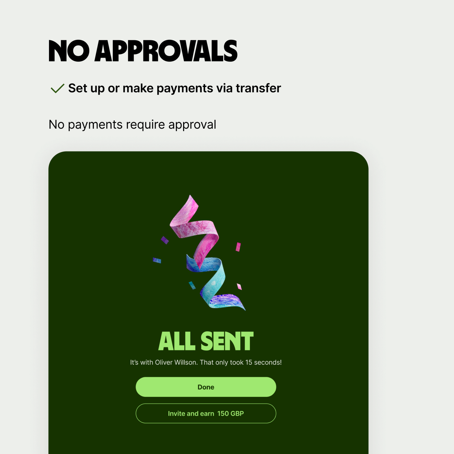
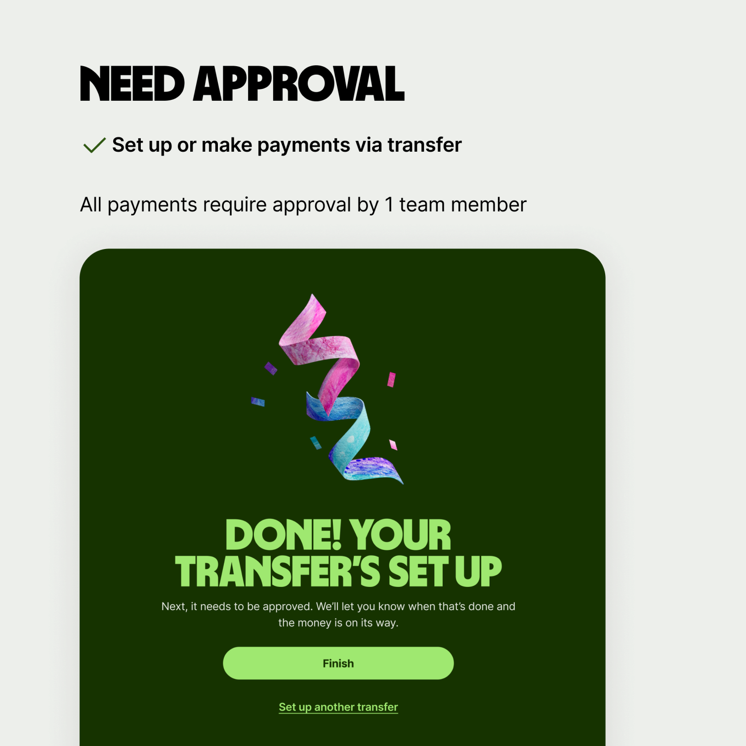
For example, for the Send flow, a relevant permission would be ‘Set up or make payments via transfer’.
You need to consider what the Send flow looks like for someone who:
Has this permission, and their payments aren’t subject to approval
Has this permission, but their payments are subject to approval
Doesn’t have this permission
When designing for specific permissions:
Hide any entry points, screens or sections they don’t have permission to view
Hide any CTAs relating to actions they don’t have permission to perform
Adjust any copy that mentions taking an action they don’t have permission to do
Review the UX and UI — does the experience still work with things hidden? Does anything look misaligned?
Here are some further examples to demonstrate how you should change your designs for users with different permissions.

It’s important to consider MUA while you’re designing to make sure all team members have a smooth and consistent experience.
Below are two examples of what has happened in the past when MUA use cases haven’t been considered.
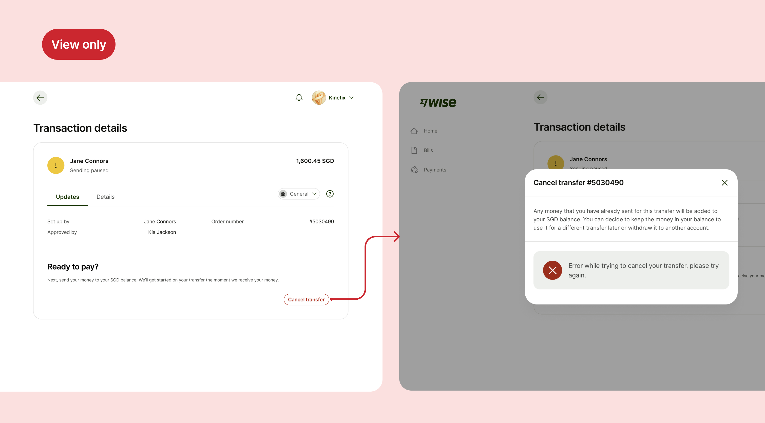
Example 1
Here, because the user has view only access, they can’t cancel transfers.
However, they’re still able to select the Cancel transfer button, and they’re shown a generic error message.
This is confusing for the user, because they’re able to start a journey but can’t complete it. Ideally, they shouldn’t be able to see the button in the first place.
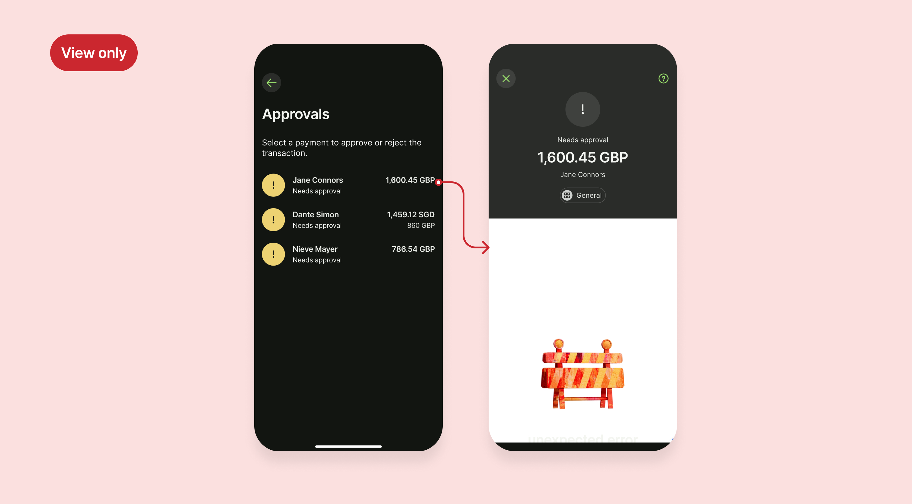
Example 2
Again, in this example the user has view only access, so they don’t have permission to approve payments created by other team members.
When they select a payment to approve, they’re presented with a jarring broken screen.
The copy on this first page also encourages the user to try and approve or reject payments, even though they can’t.
In this case, the user shouldn’t be able to select the transfer needing approval, and the copy should be changed.